
Pantone's Color of the Year is Ultraviolet... How are You Using It?
/
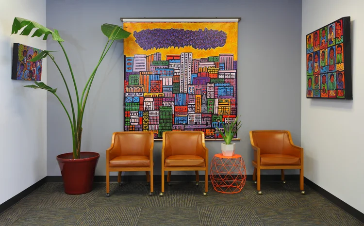
A quick snapshot from Sarah Barnard Design's office late last year.
Ultraviolet, an intense and bold shade of purple, is suggestive of the cosmos and the future, while still reminiscent of royalty, wealth, and creativity. It's also Pantone's color of the year. Pantone, the global authority on accurate color matching, is known worldwide for its standard color language which allows designers, manufacturers, retailers, and consumers to accurately produce the same colors across platforms and industries. (If you're not familiar with Pantone, you may have seen their swatch books or their line in Sephora!) They research style trends in art, fashion, and design, and predict the upcoming year's most popular trends.
This year they've selected ultraviolet as their "Color of the Year," so if you were waiting for the opportunity to make a bold change in your home design, it has arrived!

“In interiors, Ultra Violet can transform a room into one of extraordinary self-expression, or conversely its polish can tone down a room with subdued, modern pairings. Adding spice and brightness, Ultra Violet calls attention to a tufted couch, piece of art, or accent wall. As a color that can take you in so many directions, Ultra Violet makes a statement in any space, whether it’s one of tradition and elegance or unexpected boldness. In hospitality, we are seeing purples like Ultra Violet take center stage in interior spaces as large and small hotels harness color and design to entice travelers and stay relevant.”
Trends go in and out of fashion–unless you already love ultraviolet and had plans to use it, it may not be a good idea to paint your whole house purple. However, there are many ways you can feature violet and freshen your home or office, such as adding a bold color in through plants, linens, or art, which will allow you to animate the space in a way that won’t be out of style by the end of the year.
Let’s take a look at some of our favorite design strategies and items in ultraviolet and purple:


While some might relish the opportunity to use this news as an excuse to paint their entire house violet, most people will find ultraviolet to be an intimidating color with which to decorate. So how might you use it? Consider bringing in a small splash of violet. Flowers, for example, are a beautiful, healthy way to add a pop of bold color that will not be out of fashion in a year.
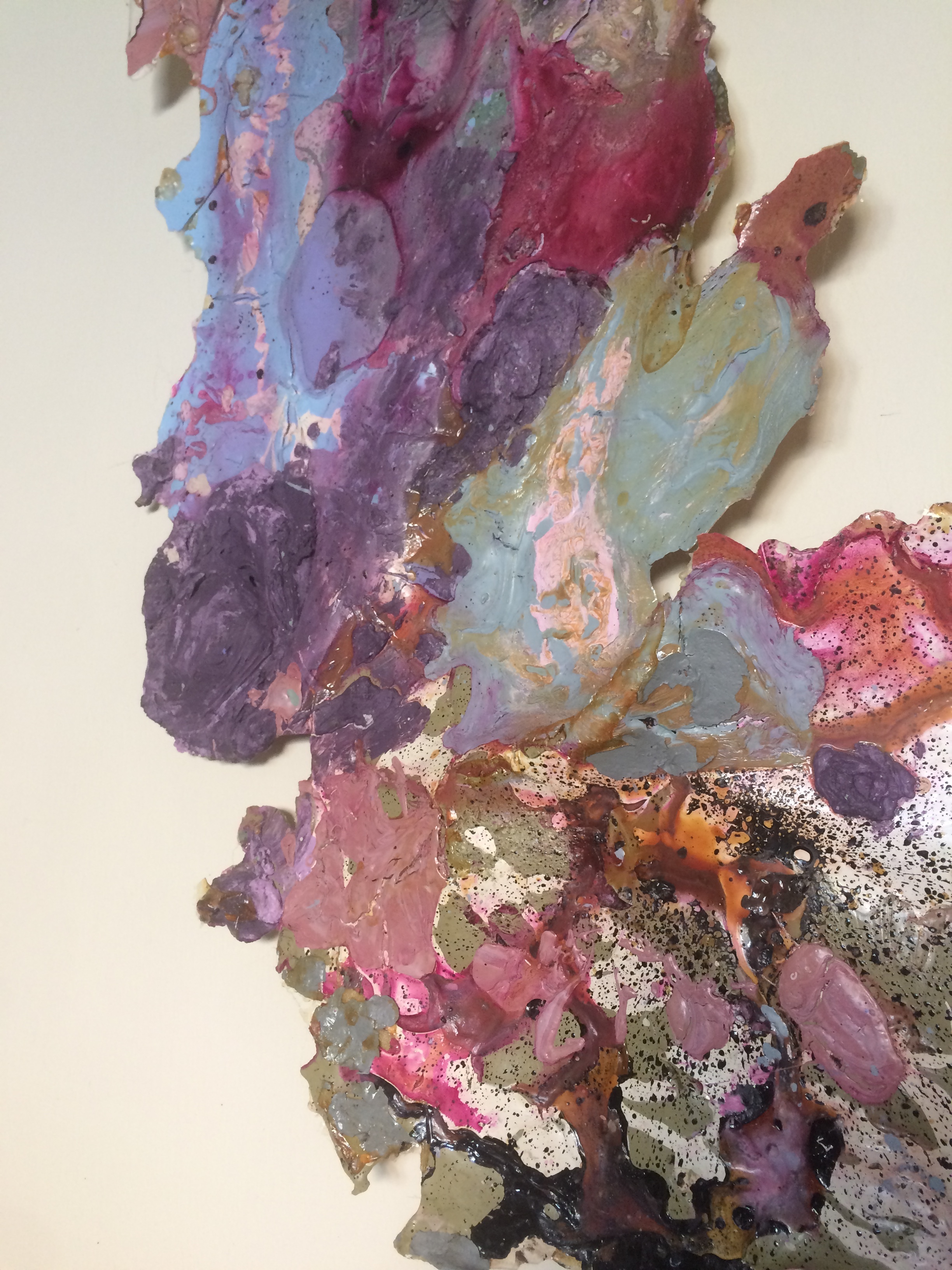
Adding art to your walls is a fantastic way to add color and interest to a space. This piece by Renae Barnard has swirling shades of violet, blue and pink. An elegant art installation like this will never go out of style.


Lavender and violet: together at last. Invigorating a traditional girl’s room palette of lilac or lavender by adding violet is a great way to keep your daughter's room from getting tired.
For the National Immigration Law Center, jewel tones were the perfect choice to convey richness and sophistication. Violet and yellow are complementary colors, meaning they are opposite each other on the color wheel. Their opposing hues and differing values are naturally striking when used together, and add energy to the area.
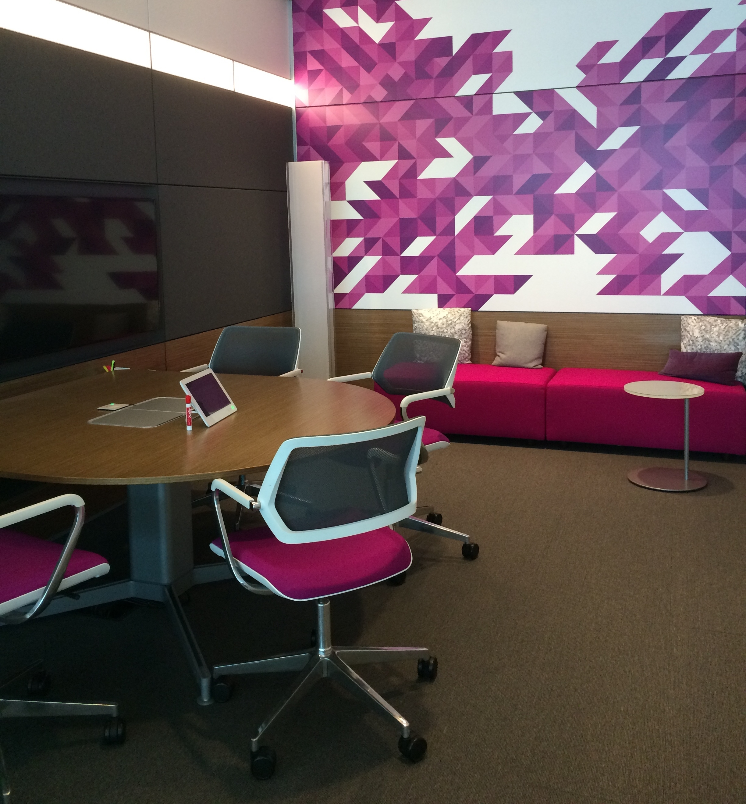
For an ultra-sleek look, Steelcase's office in Grand Rapids, MI vibrates with a mix of ultraviolet and neutrals. Mixing many colors can get too intense too quickly, so using a bold violet with white is a fresh but straightforward way to modernize an office.

Last but not least, this beautiful space sits right next to the ocean. Many people's first instinct is to add blue to a beach home to echo the sea. However the area is quite literally surrounded by blue, so adding more can quickly get tired and dull. Instead, analogous colors–bright green and purple–were used to add life to the room and complement the ocean outside.
Pantone's annual announcement is an opportunity to be creative and update your home or office. Ultraviolet is daring and sophisticated. If you are interested in adding an air of curiosity, wisdom, and richness to your home, give it a pop of Ultraviolet!
Sarah Barnard designs healthy, happy, personalized spaces that are deeply connected to nature and art.
To learn more about Sarah Barnard Design, please visit www.SarahBarnard.com.
Photos by Chas Metivier, Steven Dewall.