

Classic Blue, Pantone's Color of the Year creates calm and inspires clarity in interior spaces.

INTERIOR DESIGN: SARAH BARNARD, PHOTOS: STEVEN DEWALL, PAINTING: REID WINFREY
Blue brings us a sense of peace, offers us refuge, aids concentration, and brings us clarity. It is a reflective tone that fosters resilience and gives us hope, qualities we look toward during this uneasy time in the world. Pantone's Color of the Year is Classic Blue, chosen to reflect our desire for a stable future as we enter into a new decade. TIME calls the Color of the Year, "both constant and classic." It is reminiscent of a serene sea and the sky at dusk.


Pantone provides a universal language of color that is used by more than ten million designers and producers around the world to define colors accurately across different platforms and industries. Their Color Institute is dedicated to researching purchasing trends across various industries to determine each year's color. Pantone has been naming a Color of the Year since 2000 and has influenced product development and purchasing decisions in fashion, interior design, industrial design, graphic design, and advertising.

Classic Blue is akin to the very first Color of the Year, Cerulean. The hue represented the excitement of a new millennium, while also offering a sense of protection and serenity amidst the feared approach of Y2K. This year, we are experiencing a similar feeling of trepidation from the United States to the United Kingdom, Hong Kong, Syria, and across the globe.

The reigning Color of the Year offers reassurance, confidence, and connection for us in a time of uncertainty. "When we look at the world around us, we know that we're living with a lot of unrest, where some days don't feel quite as secure," said Leatrice Eiseman, Executive Director of the Pantone Color Institute, in an interview with Architectural Digest. "Blue from an emotional, psychological standpoint, has always represented a certain amount of calm and dependability. It's a color that you can rely on."

Classic Blue is the color of deep ocean water or a handful of ripe blueberries. It is a part of the art market, the beauty industry, automotive manufacturing, tech, and space sciences. Its associations with dependability, trustworthiness, and constancy make it a great color to incorporate into your home design.

My work as a LEED and WELL-accredited home designer is deeply rooted in wellness and biophilia. Biophilia is our innate desire to be close to nature, and biophilic design aims to create healthy and comfortable interiors by meaningfully incorporating natural elements into our home and work environments. Integrating Classic Blue into our spaces builds on the principle of biophilic design because of its presence in nature.

Art, textiles, furniture, and accents are all great ways to introduce soothing Classic Blue to your home or office. A project I recently completed features oceanic shades of blue that act almost like neutrals. I took inspiration from the home's beachy surroundings, bringing in a Classic Blue velvet sofa. I then repeated the color through vintage ceramic vases, books, and toss pillows.
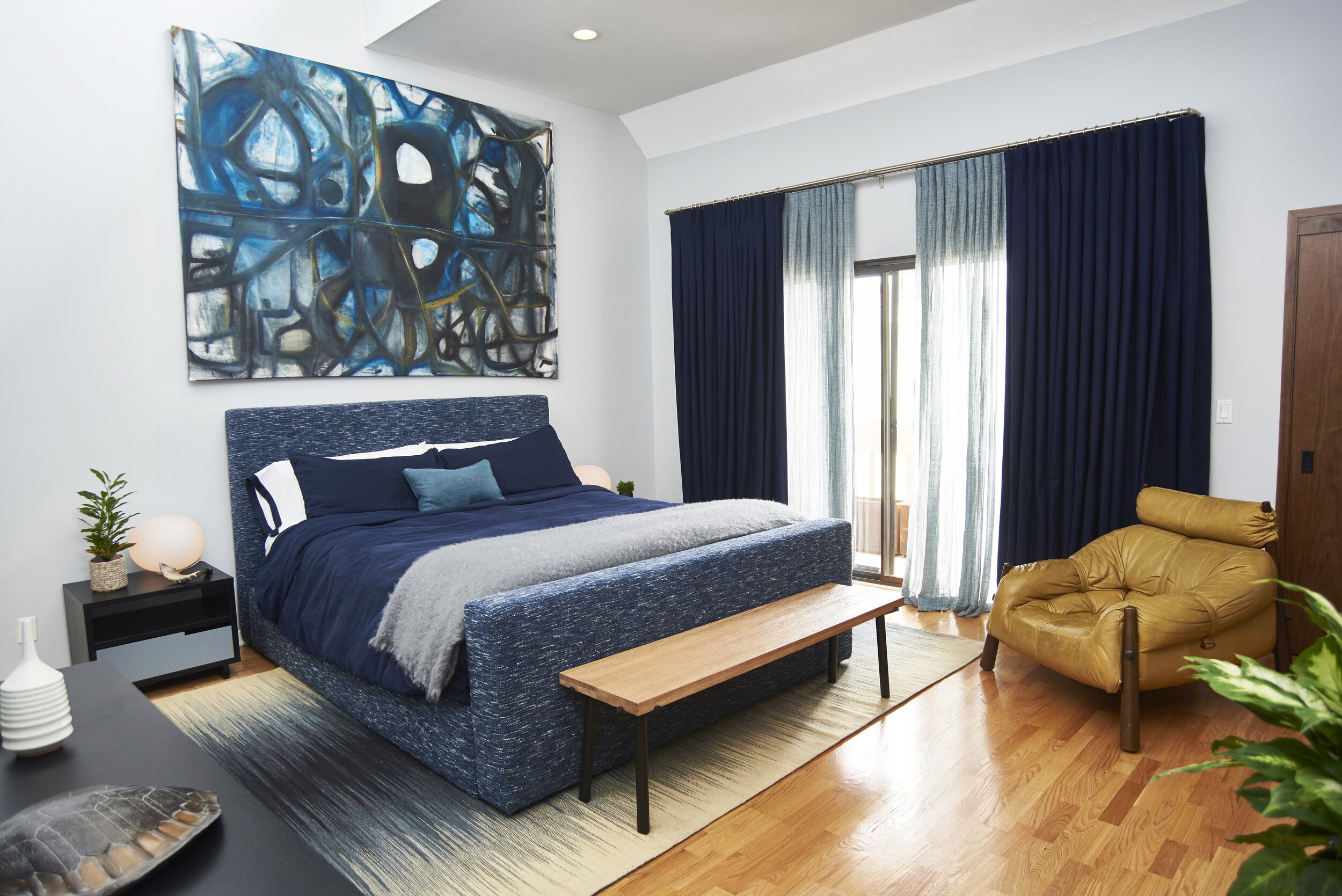
When acting as a base layer, Classic Blue can be paired with a multitude of colors, including other shades of blue. For the client's bedroom, I selected a handmade upholstered bed, Belgian linen bedding, wool drapery, and an abstract painting by Jonathan Elder, all wed by various blue tones. The buttery vintage leather chair and wooden bench at the foot of the bed complete the space, providing visual warmth and balance.
Consider adding serene, calming, earth-focused tones to your home in the new year. Whether you choose Classic Blue as an all-over hue or an accent, you can't go wrong with a color that takes its cues from nature.

Sarah Barnard, WELL AP, and LEED AP specializes in creating calming restorative environments that support physical, emotional, and mental well-being. Her interior design practice centers around her client's health and wellness while incorporating natural elements into every space she designs.

Meet the Bedroom that Feels Like a Hug

Award-winning Interior Designer and American Society of Interior Designers (ASID) Ones to Watch Scholar Sarah Barnard has unveiled a happiness-inducing home design project— the bedroom that feels like a hug.
“We need a safe, restorative space to help our bodies rest and recharge,” says Barnard. A hug has many of the same characteristics, it makes us feel secure and comforted, and when we let go of the embrace, there’s a rush of oxytocin that leaves us with a sense of lightness.

Oxytocin is a neurotransmitter that acts on the brain’s emotional center, promoting feelings of contentment, reducing anxiety and stress. When you hug often, your level of oxytocin increases, which strengthens social bonds. Hugging also stimulates dopamine and serotonin production in the body. Dopamine is a pleasure hormone that’s part of the brain’s reward mechanism, while serotonin is responsible for maintaining mood balance.

The jumping-off point for the bedroom was the curvilinear bed frame, an award-winning design by Autoban, carved from American black walnut. Its silhouette mimics the action of hugging, and the interior is lined with purple velvet, blending the natural texture with dark, feminine styling. To further the feeling of intimacy, Barnard chose a non-toxic, king-size organic coconut mattress topped with a reversible duvet in a custom, color-blocking scheme.

The word ‘phantasmagoria’ is scrawled across the wall behind the bed — a neon homage to the images that flicker by in our dreams. The client, a self-proclaimed bookworm, chose the word herself after much deliberation. High-pile black carpeting delivers a softness underfoot, and layered window treatments allow the client to sleep undisturbed in total darkness. “Window coverings serve many purposes,” says Barnard. “Not only do they block out sunlight and create privacy, but they add a decorative element to the room that unifies the composition.”

The two-tone wall color, a marriage of plum and lavender, envelops the space. These hues were intentionally chosen to saturate the formerly bright bedroom, establishing a cozy, cocoon-like atmosphere. “The ceiling color extends to the walls, linking the two colors together in a way that the sharp ceiling line never could,” explains Barnard.
Hanging above the bespoke American Walnut nightstands are a pair of cloud-like pendant lights that emit a soft glow. A wall of concealed storage eliminates visual clutter, which can heighten our anxiety levels and impact sleep quality. Upholstered benches at the foot of the bed and by the entryway provide a comfortable spot to rest or dress in the morning.

It was the client who initially requested the space “feel like a hug,” which Barnard describes as a “brilliant explanation of what good bedroom design should do.” The revamped primary bedroom, a physical embodiment of a hug, provides all the comfort, safety, and well-being her client needs to settle into a restful slumber and wake up feeling warm and fuzzy.
See the rest of this home here Featured in LA Dreams Magazine