

Pantone’s Color of the Year: Living Coral

The family cat is the primary resident of this guest suite featuring a pink and coral color scheme.
Coral reefs are disappearing from our oceans at an alarming rate. It is imperative to the ocean’s ecosystems, and as much as a quarter of all ocean species depend upon it for food and shelter. Precious marine lifeforms are also the inspiration for Pantone’s color of the year: Living Coral.

CORAL AND LUSH GREENS CREATE A LIVELY AND INVITING ATMOSPHERE FOR AN OUTSIDE SPACE.
Sarah Barnard, a Los Angeles-based interior designer, WELL AP and LEED AP, specializes in home design that contributes to her client’s health and wellness and strives to make nature a part of each home she creates. “A happy and uplifting color reminiscent of the ocean is the perfect starting point for a happy, healthy home.”

CORAL COLORED TILES AND BEAUTIFUL GLOSSY STONE SLABS MAKE THIS COASTAL BATHROOM WARM AND BRIGHT.
Coral colored tiles and beautiful glossy stone slabs make this coastal bathroom warm and bright.
This color takes its name from the beautiful coral marine invertebrates that build extensive coral reefs, habitats for a vast diversity of life in the ocean. Sometimes referred to as the "rainforests of the sea," coral reefs are quickly dying, and are projected to reduce to 10% by 2050. Half of the world's coral has died since 2016, due to rising sea temperatures, pollution, destructive fishing, invasive species, and changing sea chemistry.
"The timely selection of this color by Pantone should be an important reminder to all of us that nature inspires beautiful interiors. If we aren't careful to preserve the natural world, we will have nothing left to take inspiration from," said Barnard.

CORAL NATURALLY COMPLEMENTS WITH BLUES AND OCEAN TONES. CORAL EMBROIDERY WAS A PERFECT COMPANION (COMPLEMENT?) FOR A THROW PILLOW IN A COASTAL HOME.
Pantone is most widely known for their color swatch books. It is the company responsible for color matching paints and graphics; and now devotes the time and resources of Pantone Color Institute to research the purchasing trends of various industries. With this information, Pantone determines this year's color. The naming process regularly pulls inspiration from the natural and human-made world, naming colors such as "rose quartz" or "millennial pink." Pantone's color of the year for 2018 was ultraviolet, a beautiful, energizing shade of purple reminiscent of bright flowers and the sky at sunset. This year's choice is PANTONE 16-1546 Living Coral, a potent reminder to preserve and protect ocean life.

CORAL COLORED CERAMIC PROVIDES EARTHY CONTRAST AGAINST THE EBONIZED TABLE AND BLACK LAMP.
Coral is vibrant, cheerful, delicate and energizing, and the perfect shade to start the New Year. Living coral, described by the Pantone team as “An animating and life-affirming coral hue with a golden undertone that energizes and enlivens with a softer edge.”

THE BATH AND SHOWER FEATURE LOCALLY SOURCED HANDMADE CERAMIC TILES IN A CORAL GLOSS.
Pantone published, “Vibrant, yet mellow PANTONE 16-1546 Living Coral embraces us with warmth and nourishment to provide comfort and buoyancy in our continually shifting environment. [...] Representing the fusion of modern life, PANTONE Living Coral is a nurturing color that appears in our natural surroundings and at the same time, displays a lively presence within social media.”

CORAL AND PINK SHADES BLEND BEAUTIFULLY WITH WOOD TONES. ART IS A SUBTLE AND SEAMLESS WAY TO INTRODUCE COLORS LIKE CORAL.
While top interior designers don’t necessarily recommend painting one’s home to match the color of the year, art, accents, and of course plants are an easy and safe way to introduce vibrancy to your living or work space through home decorating.

PINKS AND CORAL CREATE AN INVITING ATMOSPHERE.
For those interested in using Living Color in their home, Sarah Barnard said, "Living Coral is a perfect complement to blue shades, and pairs well with coastal or beachy interiors. For the daring, reupholstering a treasured piece in a bright color like Living Coral can revitalize a space. For those who prefer to mix pops of color with neutrals, I recommend starting with small accents."
Pantone's Color of the Year is an excellent opportunity to add lively, earth-focused tones to your home. Make having a happy and healthy home your New Year's resolution.

CREAM AND CORAL CERAMIC JARS ARE A PERFECT STORAGE SOLUTION FOR BATHROOM NECESSITIES.
Sarah Barnard designs healthy, happy, personalized spaces that are deeply connected to nature and art.
To learn more about Sarah Barnard Design, please visit www.SarahBarnard.com.
Photos by Abby Siniscal, Chas Metivier, and Charlie Daniels

Home Design Tips for Small Spaces

Designing small functional spaces is always a challenge, but when done right, they create a cozy environment. Learn how to maximize your space with these tips! For kitchens, utilize built-ins to help organize storage. Use the built-ins to generate height and open up your room vertically.
Lighter colors help to make the area appear more spacious, while blues recede into the background.


Glass shower doors help this bathroom feel open and unrestricted.

Mirrors can give the illusion that the room is bigger than it appears.
Decorating with furniture that fits the scale of the room will also help make the room feel less cramped. Feel free to add pops of color with accessories, but avoid clutter to maintain openness.
Sarah Barnard designs healthy, happy, personalized spaces that are deeply connected to nature and art.
To learn more about Sarah Barnard Design, please visit www.SarahBarnard.com.

Restaurant Design with Cuban Flair

Add a tropical flair to your household by drawing inspiration from Cuba! Mix earth tones and tropical colors with mid-century decor, and you'll instantly feel like you're on vacation. Use your chosen color scheme to color block the walls, pairing a bright color with a neutral like Terra-cotta. Explore natural elements like rich wood grains, and add tropical household plants to enliven your space. Choose furniture that predates the 1950's, and feel free to mix and match styles to give the area a vintage flea market look. The masonry walls, exposed beams, and outdoor style lighting create the illusion that the diners of this Cuban Café are relaxing on a cozy patio.

THE LOUNGE AREA IN THE REAR ALLOWS PATRONS TO RELAX AND ENJOY THE INFECTIOUS CUBAN ATMOSPHERE WHILE PLAYING DOMINOES OR LISTENING TO LIVE MUSIC.
The lounge area in the rear allows patrons to relax and enjoy the infectious Cuban atmosphere while playing dominoes or listening to live music.
Sarah Barnard designs healthy, happy, personalized spaces that are deeply connected to nature and art.
To learn more about Sarah Barnard Design, please visit www.SarahBarnard.com.

Colors From the Garden
Choosing colors for your home can be difficult when there are so many from which to choose. Sometimes the answer can be as simple as looking for inspiration in your garden. Nature's color palette provides the perfect balance of neutral tones, vibrant greens, and lively colors.


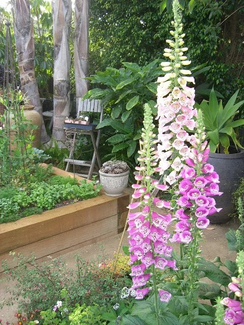

Elements from your garden can serve as decor. Not only do they tie your interior and exterior design together, but they bring freshness, life, and color into a room.


Potted succulents serve as great centerpieces, and are easy to take care of for they need little water to thrive. Pair them with interesting found objects such as rocks and found wood to add organic shapes to a room.
Sarah Barnard designs healthy, happy, personalized spaces that are deeply connected to nature and art.
To learn more about Sarah Barnard Design, please visit www.SarahBarnard.com.

Best and Blue-est Blues for Home Design
Blue is a versatile color that looks great in any room. Often used in home design, blue can be calming, peaceful, and charming. Check out these great blue rooms by Sarah Barnard Design.


The existing antique brick and the chosen cool blue tones of the locally made cabinetry make for a delightful collection of old and new in this Scandifornian style home. Founded in a Scandinavian aesthetic with an appreciation of natural materials, light and bright spaces and a California cozy style all it’s own makes this eco-friendly kitchen one of them most loved rooms in the house.

Refreshing blue tiles offset a limestone niche and give the serene primary bath a splash of color.

Blue, a predictable choice for a boy's bedroom, transforms this 'little man's' room with the warmth of traditional design elements and cutting edge details to create a youthful, contemporary space.

This mural, featuring a vintage Aston Martin inspired by the classic James Bond film 'Goldfinger,' is paired with blue wainscoting.

The soaking tub echoes the oval forms present elsewhere in the space and allows for a feeling of lightness overall.

A sea of blue ceramic tile paired with organic form glass floor tiles and an orb-like wall sconce create a fresh aesthetic for a child's bathroom.

Quarts countertops infused with real seashells pair nicely with the seaside location of the residence.
Sarah Barnard designs healthy, happy, personalized spaces that are deeply connected to nature and art.
To learn more about Sarah Barnard Design, please visit www.SarahBarnard.com.