


How Color Impacts Feelings and Emotions

THE COLOR OF YOUR BEDROOM COULD BE IMPACTING YOUR ABILITY TO GET A GOOD NIGHT’S REST. THIS RICH INDIGO SCHEME NEUTRALIZES STRESS AND PROVIDES A SANCTIMONIOUS SPACE FOR SLEEP.
The color of your bedroom could be impacting your ability to get a good night’s rest. This rich indigo scheme neutralizes stress and provides a sanctimonious space for sleep.
Imagine your favorite color. Classic, reliable, and looks great on you. By some metaphysical magicalness, this inanimate projection of light makes you feel something. It can’t explain it- but it quiets the storm, inspires the artist, and invites introspection. Like a Netflix original series or the air we breathe, we can’t get enough of it- but why? What gives color such a powerful influence?
The answer exists somewhere between science and socialization in an area of study called color psychology.
Color is a fundamental element in life. It can alter an individual’s mood, behavior, even their appetite. Although some studies suggest that color interpretation is based on ‘pseudo-scientific assertions’ rather than scientific data, color psychology is the study of how the way we experience color has long been a valuable facet of the human experience.

TAKING INTO CONSIDERATION THE HEALTHY LIFESTYLE OF THE RESIDENTS, SARAH OPTED FOR A CONIFEROUS GREEN AS A SYMBOLIC TRIBUTE. GREEN IS A GREAT SHADE TO LIVEN UP A SPACE WITH A NATURAL LOOK.
Taking into consideration the healthy lifestyle of the residents, Sarah opted for a coniferous green as a symbolic tribute. Green is a great shade to liven up a space with a natural look.
Color psychology is the study of how color impacts mood and behavior. When studying color’s effect on mood, a color’s hue, saturation, and brightness must all be accounted for. Color perception can be affected by a series of factors, and the same color may appear different to various people.
Intro to color psychology’s kid brother: Color Theory.
While there are multiple definitions of Color Theory, there is a basic knowledge that helps define the essence of it. Color Theory is not only the series of hues known as the color wheel, but it is also a valuable structure of guidance to mixing color, and the visual emotions it invokes. The color wheel is composed of primary, secondary and tertiary colors. The primary colors are red, yellow, and blue. These three pigments remain solid on the color wheel, as they cannot be formed by the combination of any other colors. Primary colors are the true originators- hues from which all other colors are derived. Secondary colors are created when mixing primary colors; resulting with green, orange, and purple. Tertiary colors are formed by mixing a primary and a secondary color, creating yellow-orange, red-orange, red-violet, blue-violet, blue-green, and yellow-green. Colors are categorized into three hue variant descriptors; cool, warm and neutral.

IT’S EASY TO FEEL ENERGIZED IN THIS BUNGALOW BATHROOM COVERED HEAD-TO-TOE IN ORANGE TILES. THIS CHEERFUL AND VIBRANT SECONDARY COLOR COMBINES THE ENERGY OF RED AND THE HAPPINESS OF YELLOW.
It’s easy to feel energized in this Bungalow bathroom covered head-to-toe in orange tiles. This cheerful and vibrant secondary color combines the energy of red and the happiness of yellow.
By mixing colors and exploring different color combinations, one can reap the benefits of different colors’ impacts by carefully integrating them into a single space.
Interior designer Sarah Barnard (WELL AP + LEED AP) further explains, “In spaces like the minimalist coastal retreat where the dominant color scheme is a pure, dove white- the minimal use of color is emphasized by contrast. The analogous color scheme [colors adjacent to one another on the color wheel] like yellow, green, and blue, inspire a light, energetic space that feels alive and vibrant.”

PERSONAL POSSESSIONS, PLANTS, AND EVEN FOOD CAN PROVIDE ADDITIONAL COLOR. GROUPING THE DRAGON FRUIT AND STAR FRUIT TOGETHER BRINGS TWO DISTINCT POPS OF RED AND YELLOW.
In this personalized family home, each room embodies its own personality, attributed to the diverse use of color. Home to 3 children, each impassioned youth expressed themselves by participating in the selection of colors in their room. In one space; a rustic orange courts a creative, comfy atmosphere. While in the other, a softened lavender beckons a certain subtle sophistication blended with an imaginative air.
It’s not all about the striking shades. “Neutral tone-on-tone schemes create a very harmonious, feeling of cohesiveness. It’s organic and natural, evoking an earthly feeling of connectedness.” Sarah Barnard goes on, “When brighter colors are used to accent these more neutral scenes, we see more distinction in the color due to contrast. These cool, warm, and neutral tones can communicate everything from peace to activity.”
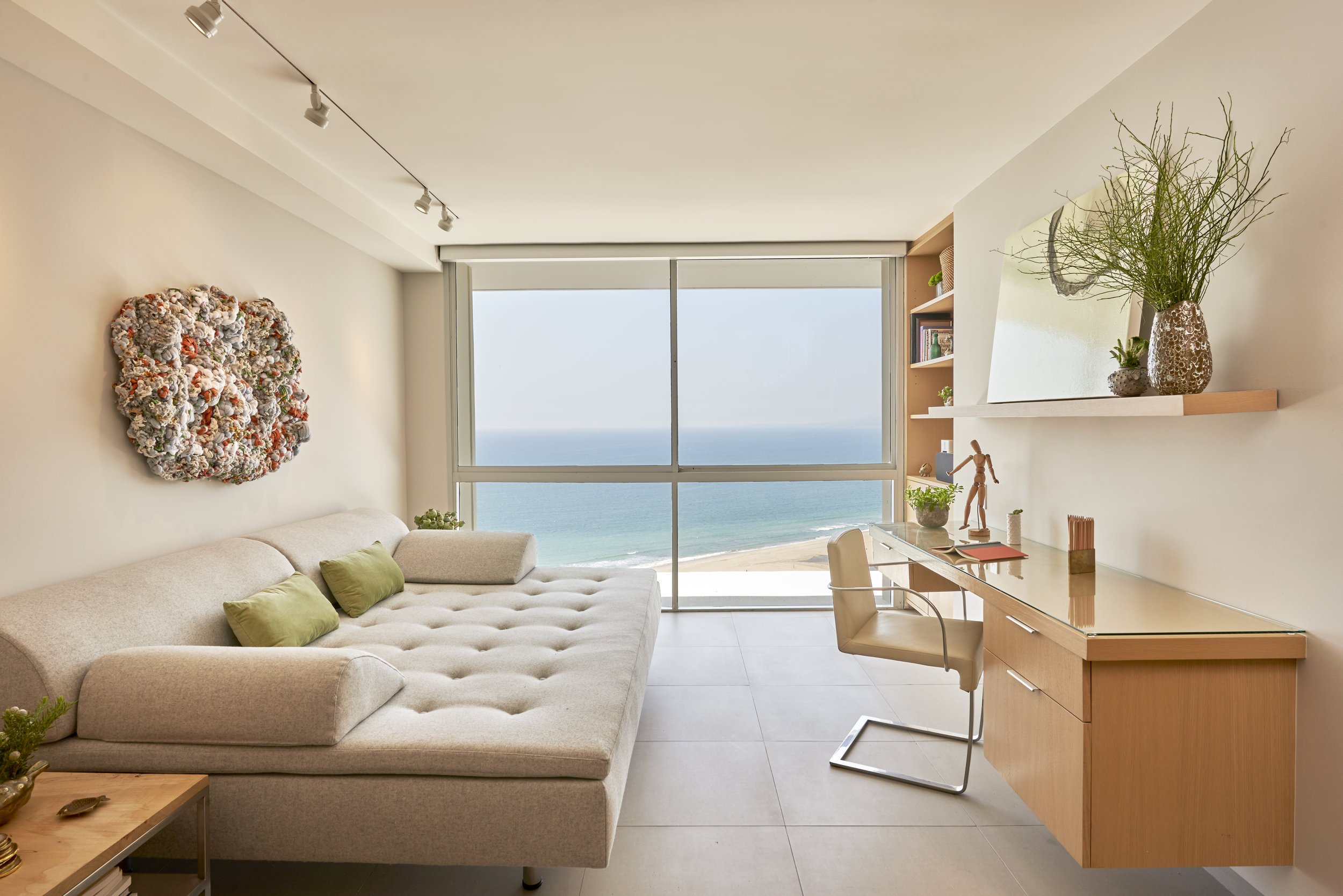
SARAH BARNARD USES THE OCEAN AS A FOCAL POINT OF THIS PENTHOUSE LIVING ROOM BY UTILIZING A BEAUTIFUL NEUTRAL COLOR SCHEME THAT PREVENTS THE EYE FROM BECOMING TOO DISTRACTED OR STRAINED.
In 1666, Sir Isaac Newton discovered that pure white light, when viewed through a prism, separates into the visible color spectrum. However, our understanding of color’s unique mood enhancement and health benefits extend far beyond this point in history. Ancient cultures around the world embraced the power of color and practiced chromotherapy. Chromotherapy, also known as ‘light therapy,’ employs colors to heal various ailments and is still currently used as a holistic or alternative method.
This treatment uses the color red to stimulate the mind and body, and increase circulation. Yellow to stimulate the nerves and detoxify the body. Orange heals the lungs and increases energy levels. Blue is believed to soothe or treat any illnesses or pain, while indigo shades are used to treat skin problems. Regardless of the scientific validity of the practice of chromotherapy, color is an indisputably important feature in our visual environment and can create a sanctuary in which we manifest healing.
There are color interpretations that have an ordinary meaning. For example; traffic lights—green means go, yellow indicates a yield, and red most recognizably signals a stop. However, most color perceptions tend to be subjective and contingent on the application.
A red room might make some feel anxious, while blue walls can induce a sense of calmness or relaxation. There are plenty of reasons why a person might react a certain way towards color, and an explanation can be the location or amount of color used even the culture someone comes from, or their personal experiences. As in all things, there exists a duality to every color archetype. While bold hues of red have given some evidence to have adverse effects in cognitive ability in children and adults, there is also evidence to show it can increase appetite, enhance athletic performance, and spark feelings of excitement and arousal. While a red bedroom may inhibit sleep, a red locker room can rally a team for competition.
Sarah Barnard illuminates the topic further, “It’s important to consider the space you’re occupying and the emotions you would like to experience there. Is this a place of rest, work, or activity? These are some of the elements I consider when introducing color to space.”
Due to this variation in interpretation, many psychologists express skepticism of the validity of color theory’s effect on an individual. In truth, this variation exemplifies the way the usage of color can be just as impactful as the color itself. Complimenting the fluidity of Color Theory, this allowance grants validity to each of our experiences that have helped inform our perception of color.
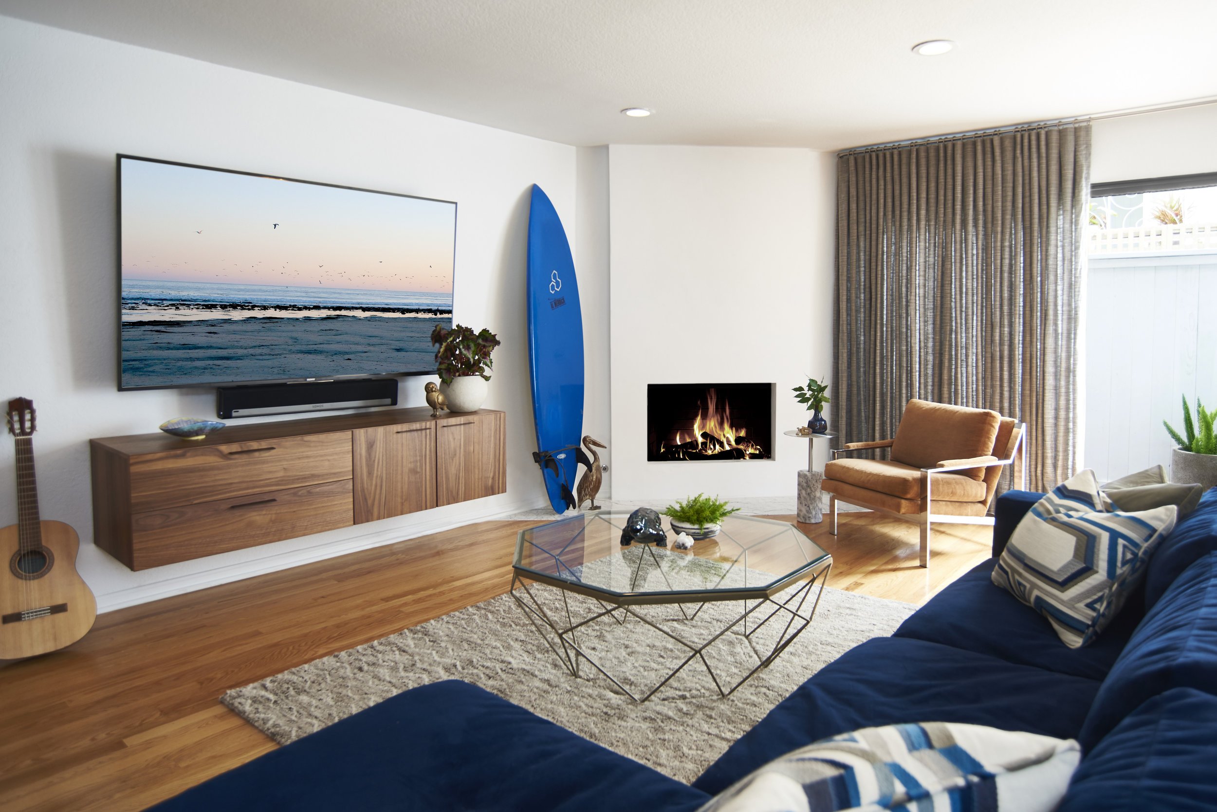
THE COLOR BLUE IS VERY VERSATILE IN THAT, WHILE IT CAN BE USED AS A CALMING ELEMENT, IT CAN ALSO SYMBOLIZE ENERGETIC FORCES LIKE THE OCEAN OR PROVIDE A MASCULINE TOUCH DEPENDING ON ITS TONES.
The color blue is very versatile in that, while it can be used as a calming element, it can also symbolize energetic forces like the ocean or provide a masculine touch depending on its tones.
By juxtaposing projects like the custom-built bedrooms of this California family residence with the masculine townhouse, we can see the breadth of emotion just one shade can bring forth. Both utilize a similar palette, a combination of vibrant blues and natural greens against natural wood and white backdrops. Despite their similarities in color, both spaces pique very different energies. A blue surfboard emanates the raw excitement of the open ocean, while blue bunk beds manifest a dreamy, youthful coziness reminiscent of pillow forts and camping in the backyard. Because of their application, the blue tones inspire very different moods, although they are similar in hue and saturation.
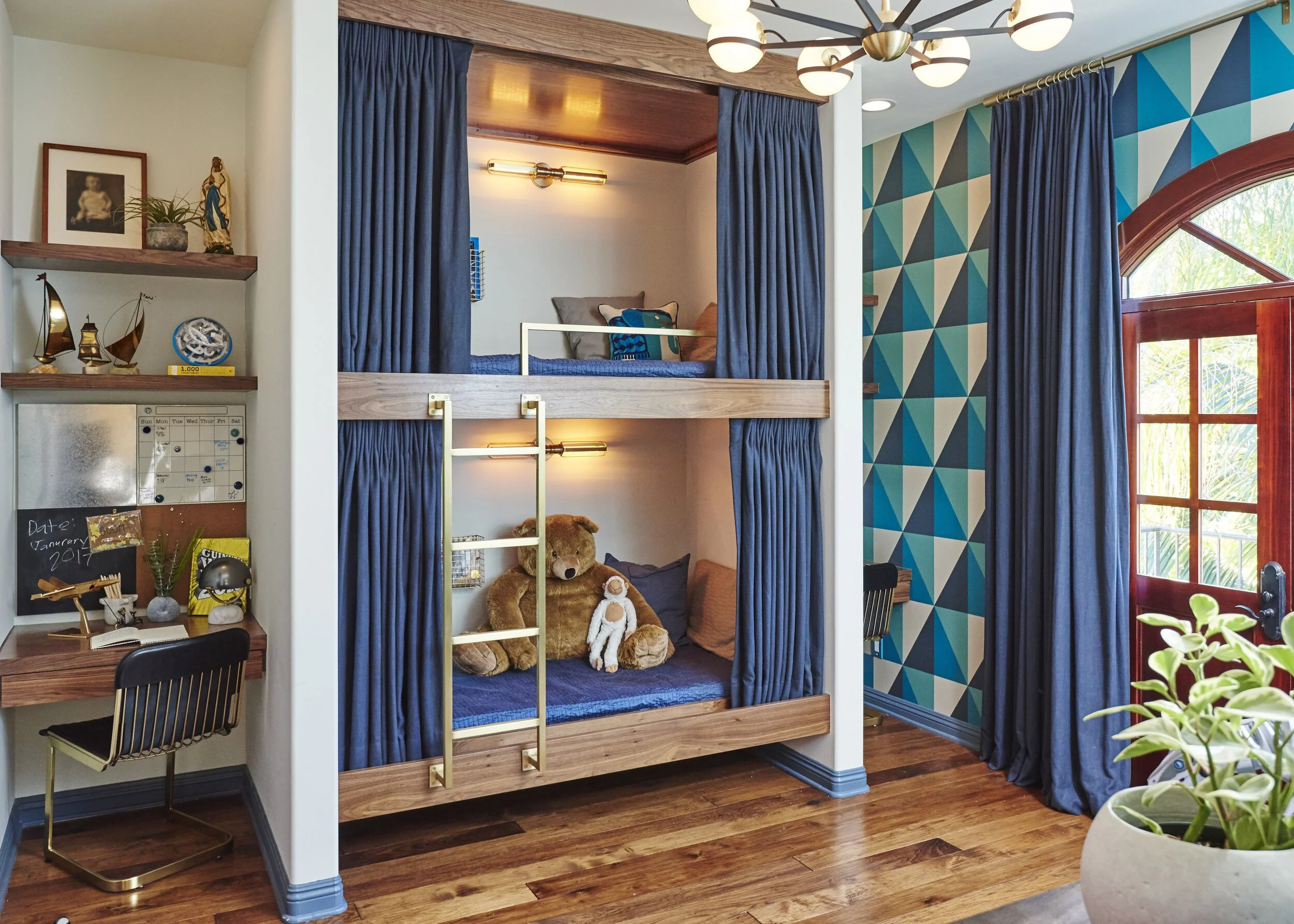
IN THIS BOY’S ROOM IN THE CALIFORNIA FAMILY RESIDENCE, SARAH UTILIZES THE DUALITY OF THE COLOR BLUE TO CREATE A SPACE THAT ENCOURAGES BOTH PLAY AND RELAXATION. SEE YOU IN DREAMLAND!
In this boy’s room in the California family residence, Sarah utilizes the duality of the color blue to create a space that encourages both play and relaxation. See you in dreamland!
Proper color selection is crucial in our everyday lives. Color can be overwhelming or healing, so it is crucial to understand how color can affect the dynamics of a room and the people in it. Interior designers deeply believe that color can drastically alter moods, feelings, and emotions. Before designing your space or switching up your color scheme, pay close attention to the way your mind and body feel when you experience different colors and consult with your designer.
”It goes beyond creating something beautiful to look at- it’s an integration of the self into the space we occupy and nourishing ourselves. The colors we see affect how we feel and how we engage with the people around us.” Sarah Barnard concludes, “It’s absolutely vital.”
Regardless of age, it is evident both adults and children are affected by color in a multitude of ways. While color interpretation can vary between cultures and people, we are unified in the power of color- the magical and visceral ways it influences us as we move through our day. It can provoke us to be more active or optimistic, or it can be the visual lullaby we need to rest peacefully at night. Positive and thoughtful applications of Color Theory have many benefits; inspiring us to play, grow, and find peace.
Sarah Barnard designs healthy, happy, personalized spaces that are deeply connected to nature and art.
To learn more about Sarah Barnard Design, please visit www.SarahBarnard.com.

Biophilia: Nature & Design

You may have seen the terms "biophilia" or "biophilic design" brandished around the internet lately, posted between beautiful images of sprawling home design and architecture filled with plants and nature-inspired sculpture installations. Biophilia isn't new–but it is a growing discipline in home design. If you are interested in healthy living or are a building owner, it's a subject worth learning.
Biophilia is our innate desire to be close to nature–and biophilic design aims to make healthy and comfortable interiors by meaningfully incorporating natural elements into our home and work environments. Los Angeles-based interior designer Sarah Barnard sat down with me to explain how she uses biophilic principles to create healthful, smart spaces for her clients. "It's intuitive when you think about it. Biophilia exists because we are comforted by nature, and we all understand that on some level. Nobody wants to live in a little grey box–we want to live in open spaces connected with the environment, plant-life, and the seasons."

Biophilic design puts a few simple principles to use to create spaces that are both visually beautiful and spiritually healthful. As more and more of us make our careers our focus, calmness, serenity and healthy living can be challenging to achieve without the help of nature and smart design. There are years of study to support what we already know in our bones: spaces that have nature incorporated are more appealing to us, and they have marked health benefits.
Terrapin Bright Green is a consulting firm specializing in sustainability to create a healthy, prosperous, and regenerative future for all. They produce workshops, research, planning, guidelines, and product development. They have researched biophilia and organized their findings into 14 principles of biophilic design and have studied the effects of biophilia on our health and wellness. For the most part, many of the principles are simple and intuitive, such as ‘Visual Connection with Nature,’ which is just what it sounds like: adding natural elements or a view to nature into your space.However if you’d like to read an in-depth, thorough explanation of all 14 principles, you can see the results of Terrapin’s research here: https://www.terrapinbrightgreen.com/reports/14-patterns/ . For today, we need only to talk about the three subcategories of the design principles: Nature in the Space, Natural Analogies, and Nature of the Space.

Nature in the space refers to the presence of natural elements in an interior. For example, that could mean having plants, shells, or water features. But it could also mean more abstract features, like natural light or light that changes throughout the day, air circulation, and a view to the outdoors. “What you exclude is just as important as what you include,” said Barnard. “I choose art made with natural materials or vintage art that has off-gassed to avoid putting noxious smells or chemicals into a space. Indoor air quality accounts for part of how we feel about our homes and how comfortable we are.” All of her designs include live plants, working in tandem with HEPA filtration systems to contribute improved air quality, a non-visual connection with nature.
Natural analogies refers to art and forms inspired by nature: a light fixture that looks like a plant or a sculpture that looks like an animal, for example. A good designer will find natural forms and art for you to choose from so you can have art that imitates nature. Barnard walked me through a project she made custom light fixtures for. “The home was beside the ocean, and I wanted to make something inspired by the beautiful surroundings of that space. I started by sketching forms inspired by coral reefs, and I made miniatures in clay by hand. When they were ready, I had them fabricated by a local craftsman. Having forms that imitated the shape and texture of coral and having light cast in beautiful organic patterns made the space feel natural and serene.”


Nature of the space means making the space itself seem like nature. Having a large open space through which you can see an expanse of space, as well as an enclosed room that feels safe fulfills this need. When asked for an example of how Nature of the Space might be used, Barnard said “I finished a project recently where the space had floor-to-ceiling windows with a view to the ocean. I selected low profile furniture to preserve the open space of the room and the sightline to the sea.”

Terrapin also explains that there are three basic types of “nature-health” relationships: cognitive functionality and performance, psychological health and well-being, and physiological health and well-being. Cognitive functionality and performance is our mental acuity and focus. Psychological health and well-being refers to our mood, perception, and emotional state. Physiological health and well-being is our bodily health and performance.
All three areas of well-being see improvement when the 14 principles of biophilic design are applied in a space. The benefits have been thoroughly studied: each principle has been individually tested and shown improvements such as concentration, stress hormone levels, overall happiness, and numerous other positive effects.

In fact, research by other sources has yielded similar results. The Human Spaces Global Report also found greater levels of well being in subjects with a view of natural elements rather than urban settings, according to a recent article by Steelcase’s magazine 360.
Steelcase, the largest furniture manufacturer in the world, is dedicated to sustainability, innovation, and wellness. They too have invested into researching biophilia in order to produce furniture for healthy, sustainable spaces. They describe the human experience with nature in four categories:
Sensory richness: mixing colors, textures, sizes and shapes. Varied elements in a space mimics nature and puts us at ease.
Natural rhythms and signals: anything that reminds us of natural processes can help restore us. Natural lighting that allows real sunlight, or artificial light that changes to mimic natural light.

Challenges in nature: the idea is that our challenging environment is what pushed humanity to grow into what we are today, so there should be encouragement towards effort.
Local distinctiveness: having a feature that does not repeat anywhere else in the building can help large offices from becoming soulless or bleak. Reserving a certain material or color for one room can make it and the surrounding space more special and pleasant.
These four principles are a useful way to understand how we are affected by nature, and offer another way to begin tackling the design challenges you may be facing in your home or workspace. Whether you use these four facets or the 14 principles of biophilic design as a jumping off point to improve your space, a deeper connection with nature is healthy and beneficial.
“When you strip it down to basics, using biophilic design means including pieces of nature in the design, elements inspired by nature, and mimicking natural environments with layout, architecture and planning,” Barnard said. Homeowners and building owners especially might consider taking these premises into account in order to make their home or office a place that promotes their mental and physical wellbeing. Getting started can be as simple as purchasing a few plants. If you aren’t sure where to go from there, a designer can help you put all the principles into practice. Ideally, your space incorporates nature, smart design and healthy living.
Photos by Chas Metivier and Steven DeWall
Sarah Barnard designs healthy, happy, personalized spaces that are deeply connected to nature and art.
To learn more about Sarah Barnard Design, please visit www.SarahBarnard.com.