
Hummingbird Hill: The Art of Inclusive Design
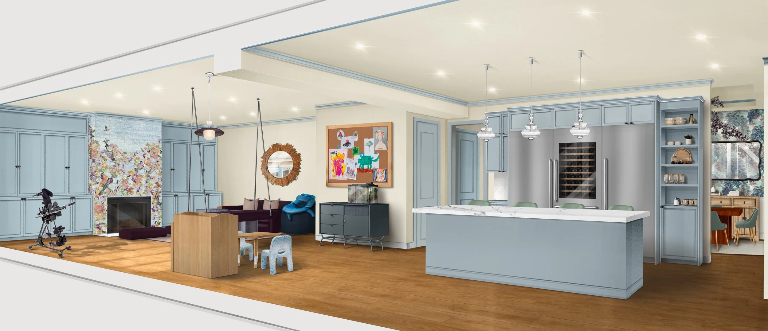
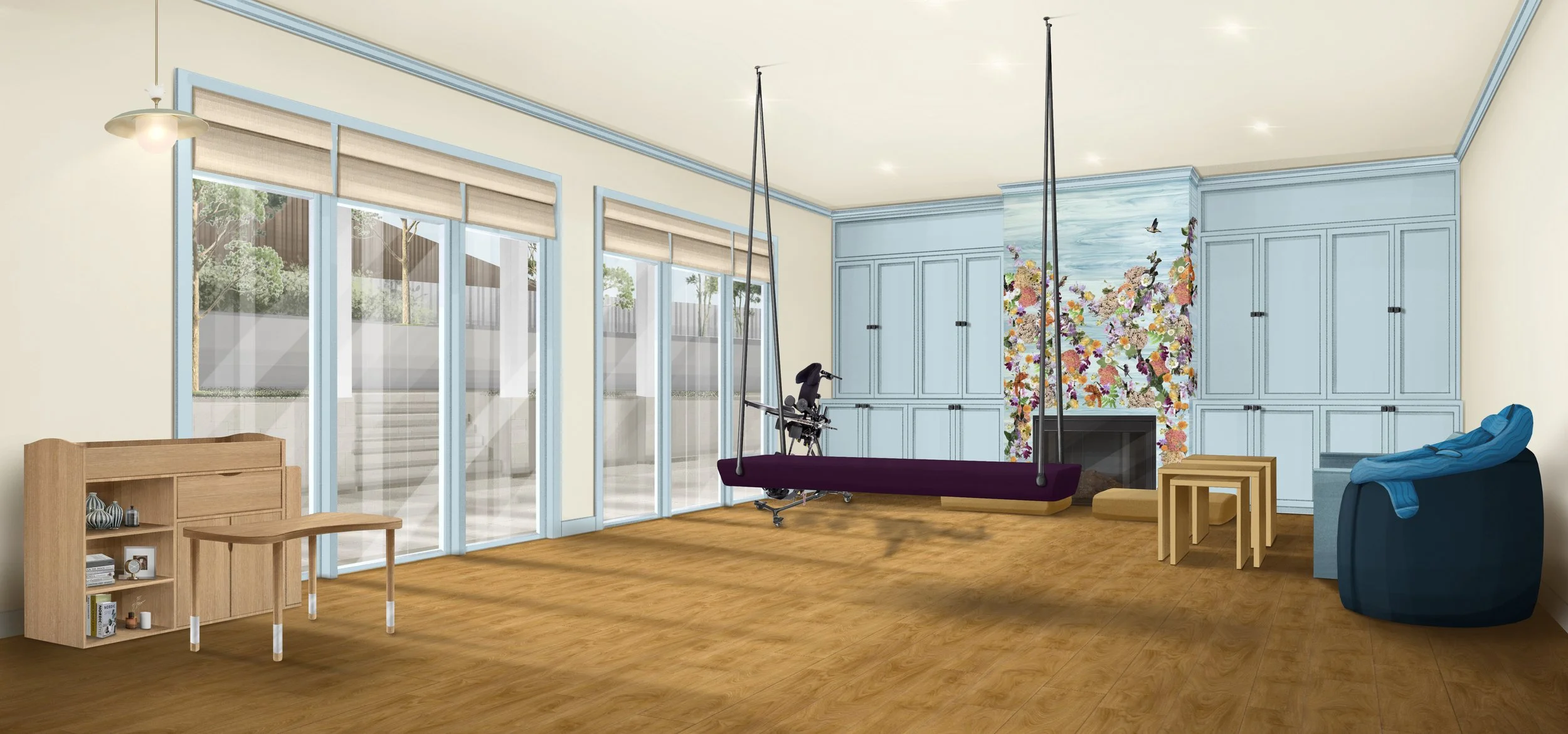
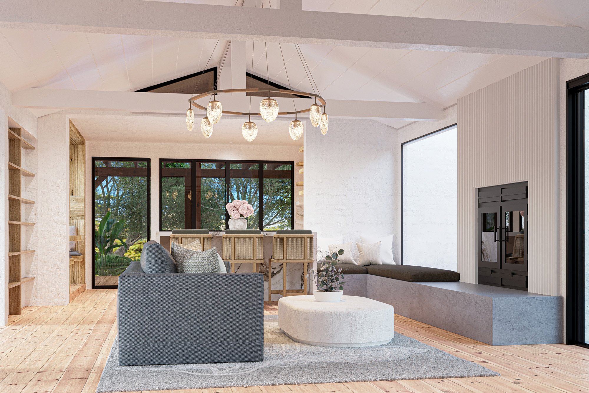
Conceived as a joyful, multi-functional sanctuary, the residential narrative begins in this vibrant family room engineered to balance creative play with therapeutic support. A plum-colored tulip pendant light illuminates a dedicated children's art table paired with eco-friendly chairs crafted from upcycled toys, sitting adjacent to a custom blue storage console and an expansive pinboard gallery. The comprehensive interior design plan natively integrates specialized pediatric mobility equipment, featuring a dedicated zone that seamlessly accommodates the user's stander within the active family environment. Overhead, a structurally reinforced ceiling securely anchors a therapeutic swing upholstered in outdoor-rated velvet. Fluid, safe travel across the room is assisted by an exceptionally flat, washable area rug.
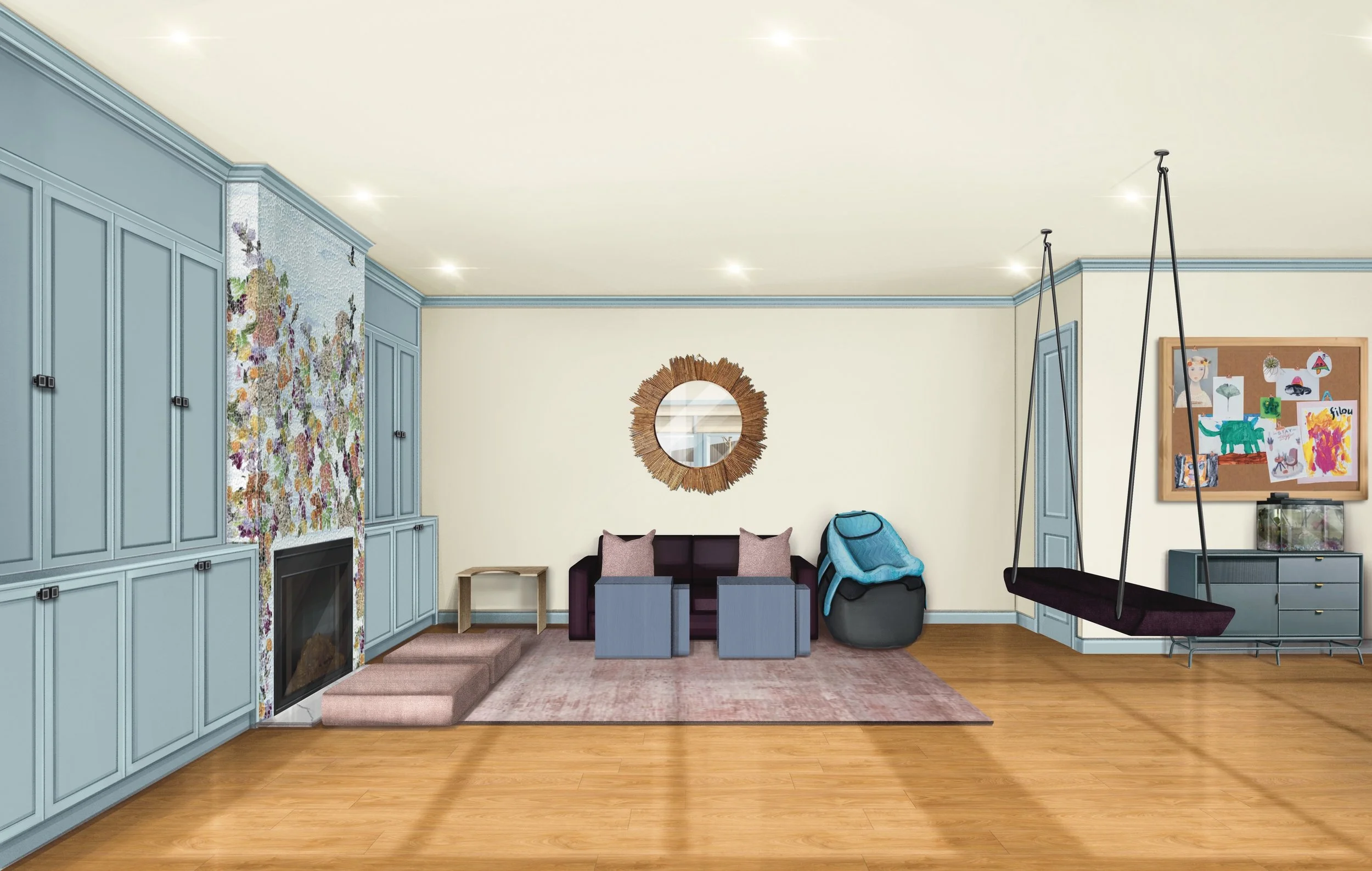
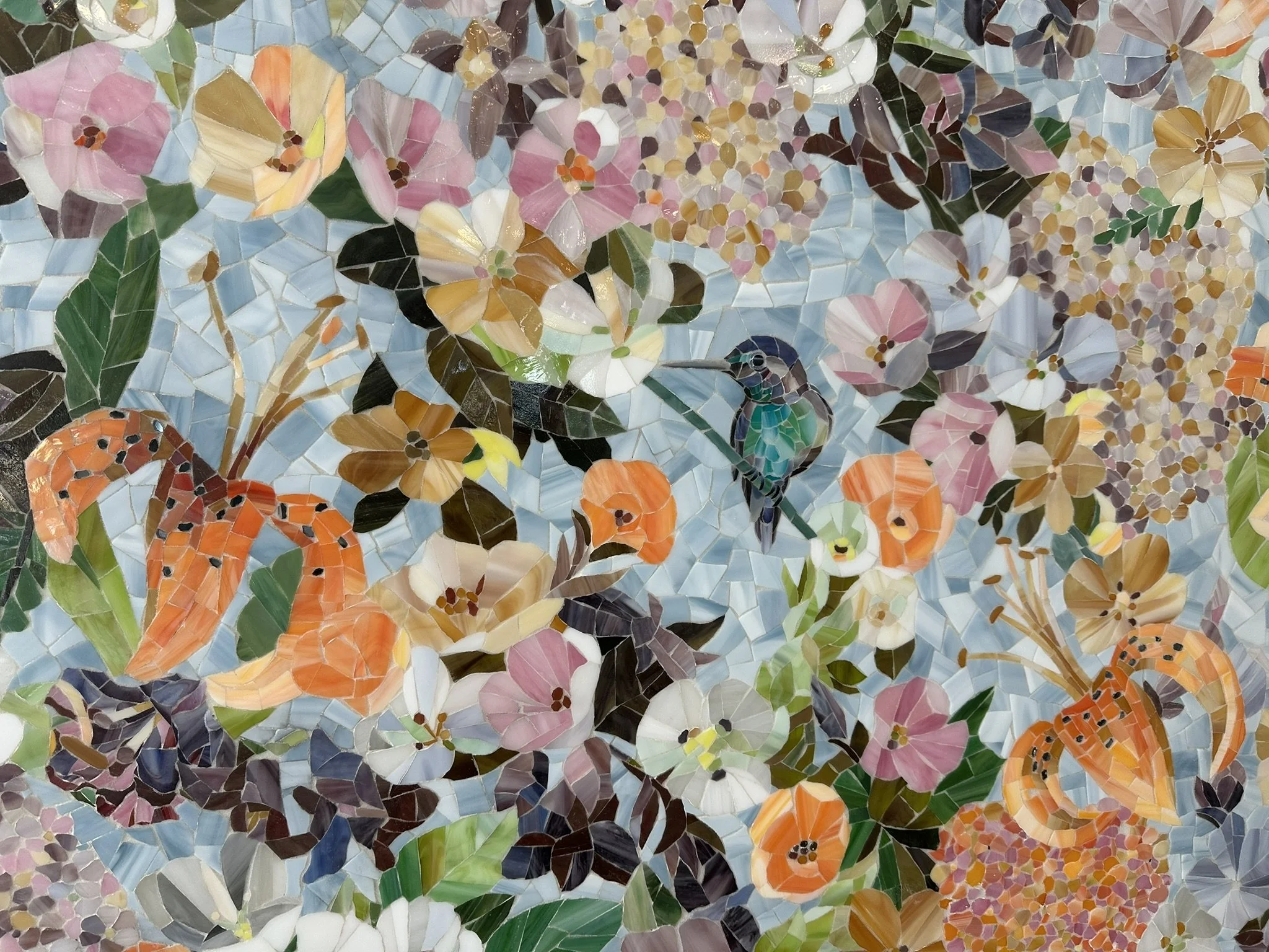
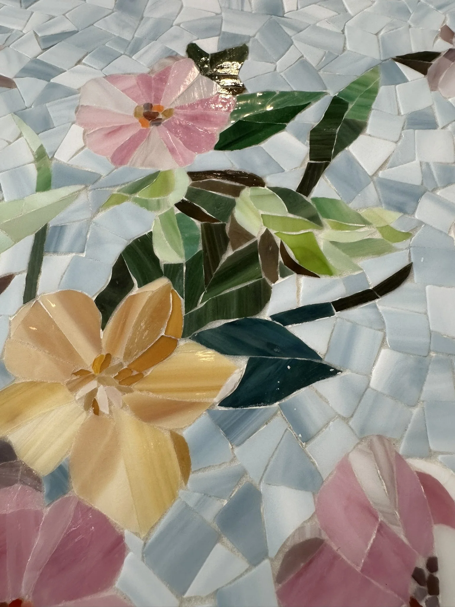
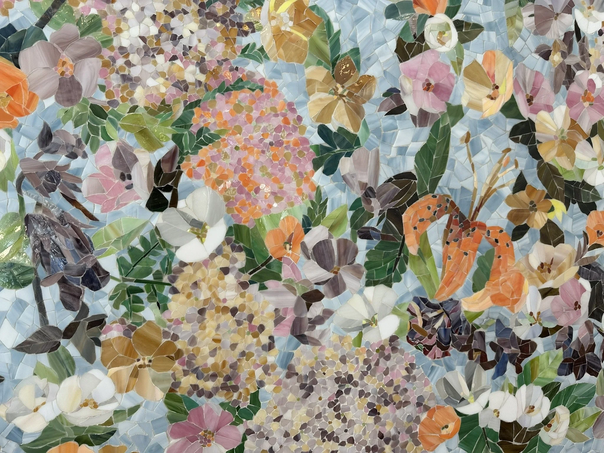
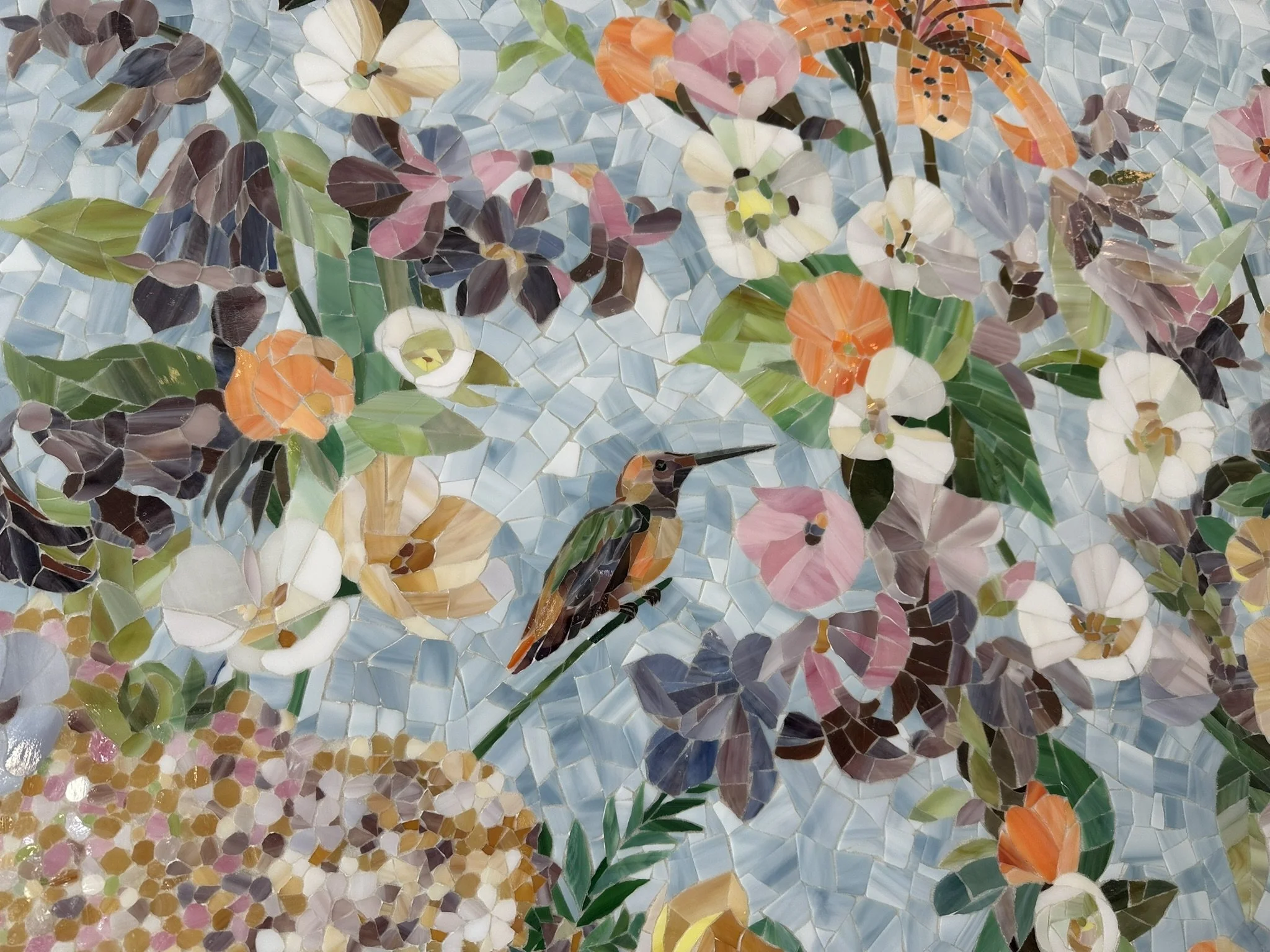
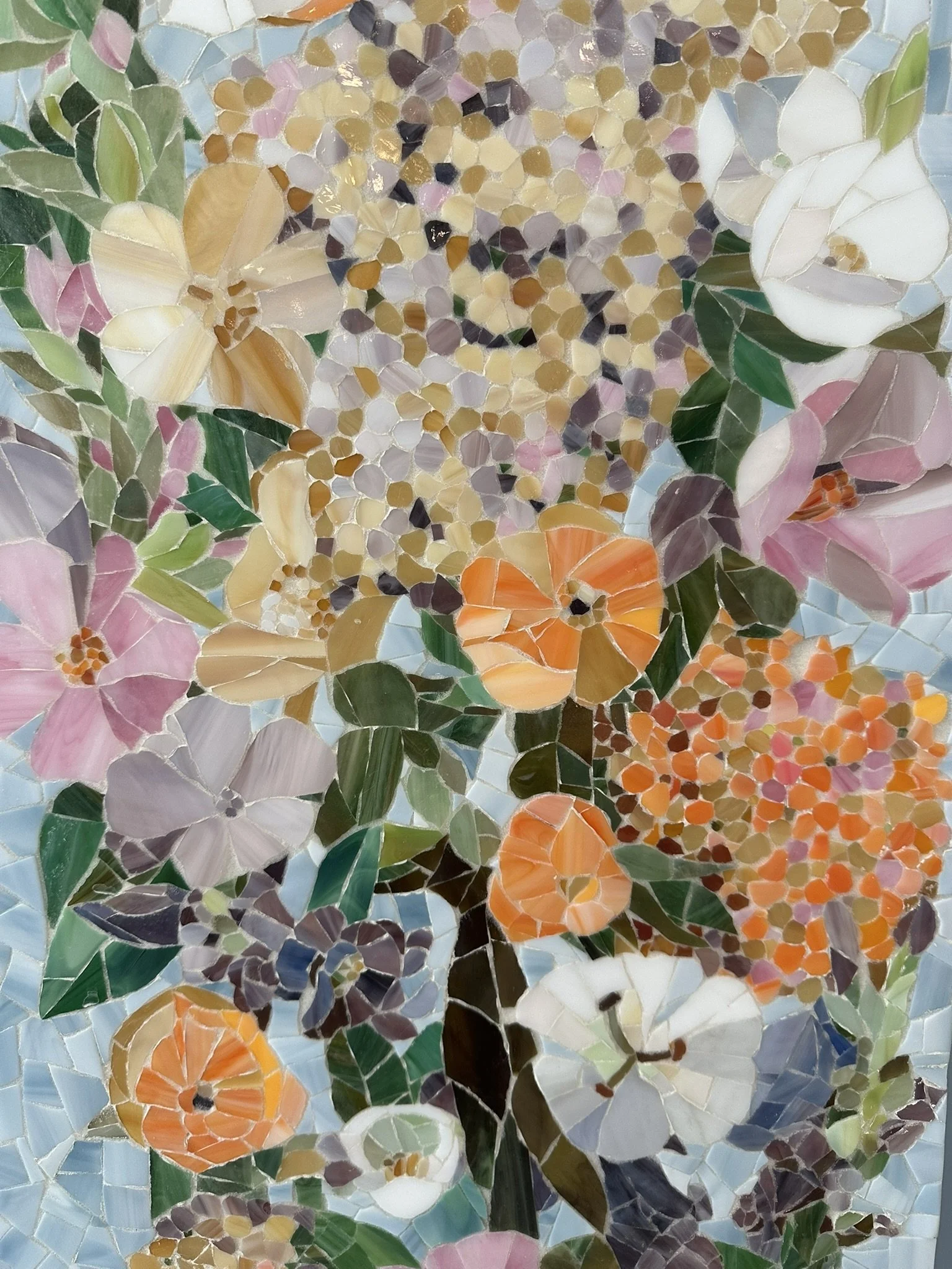
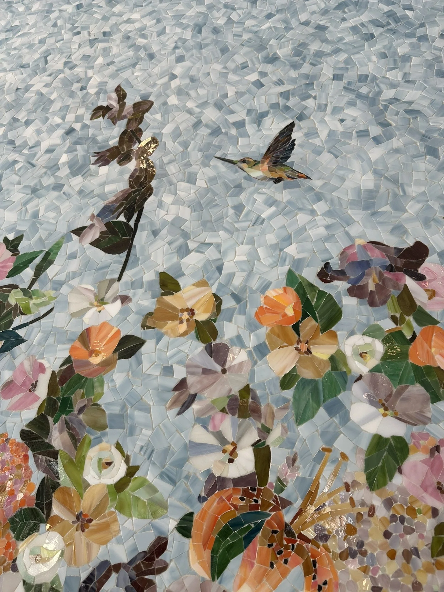
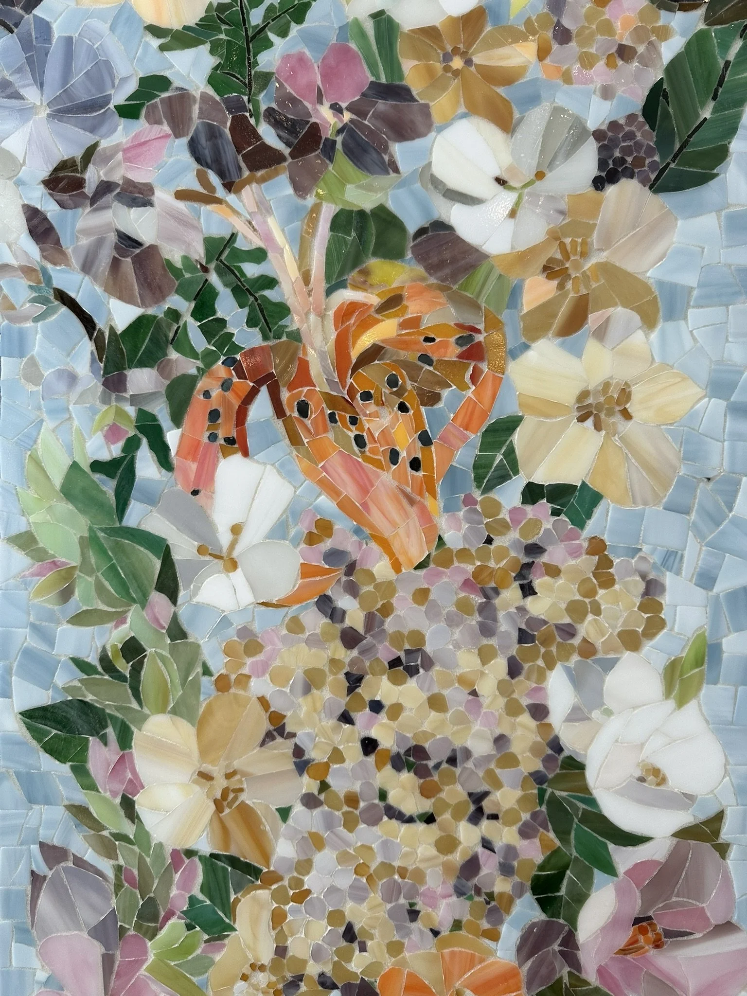
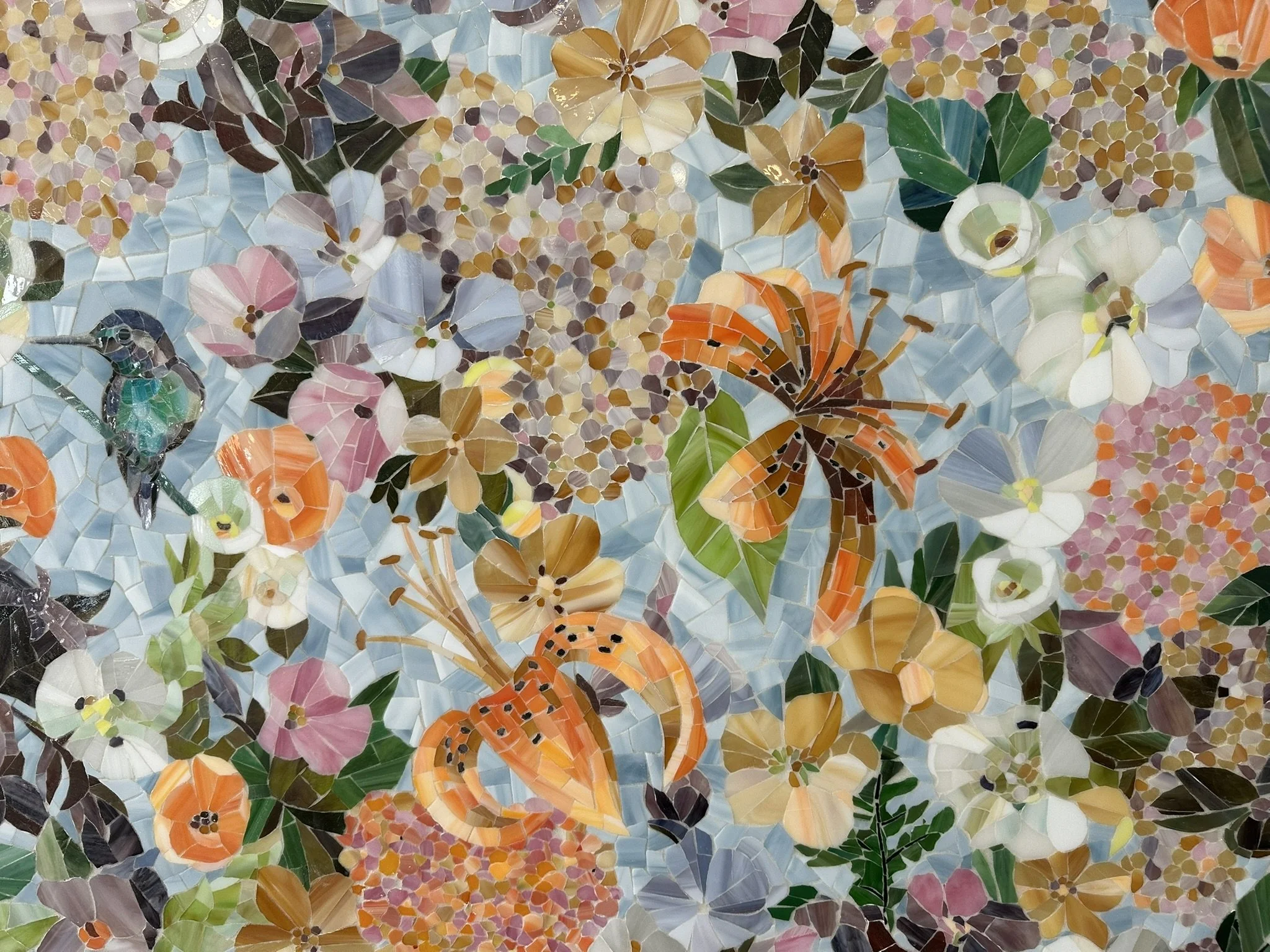
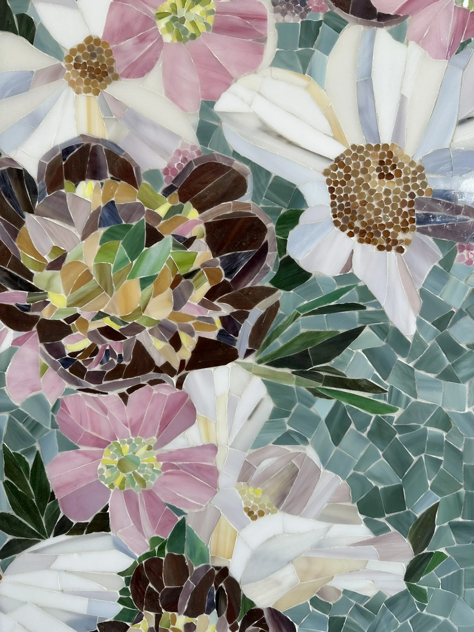
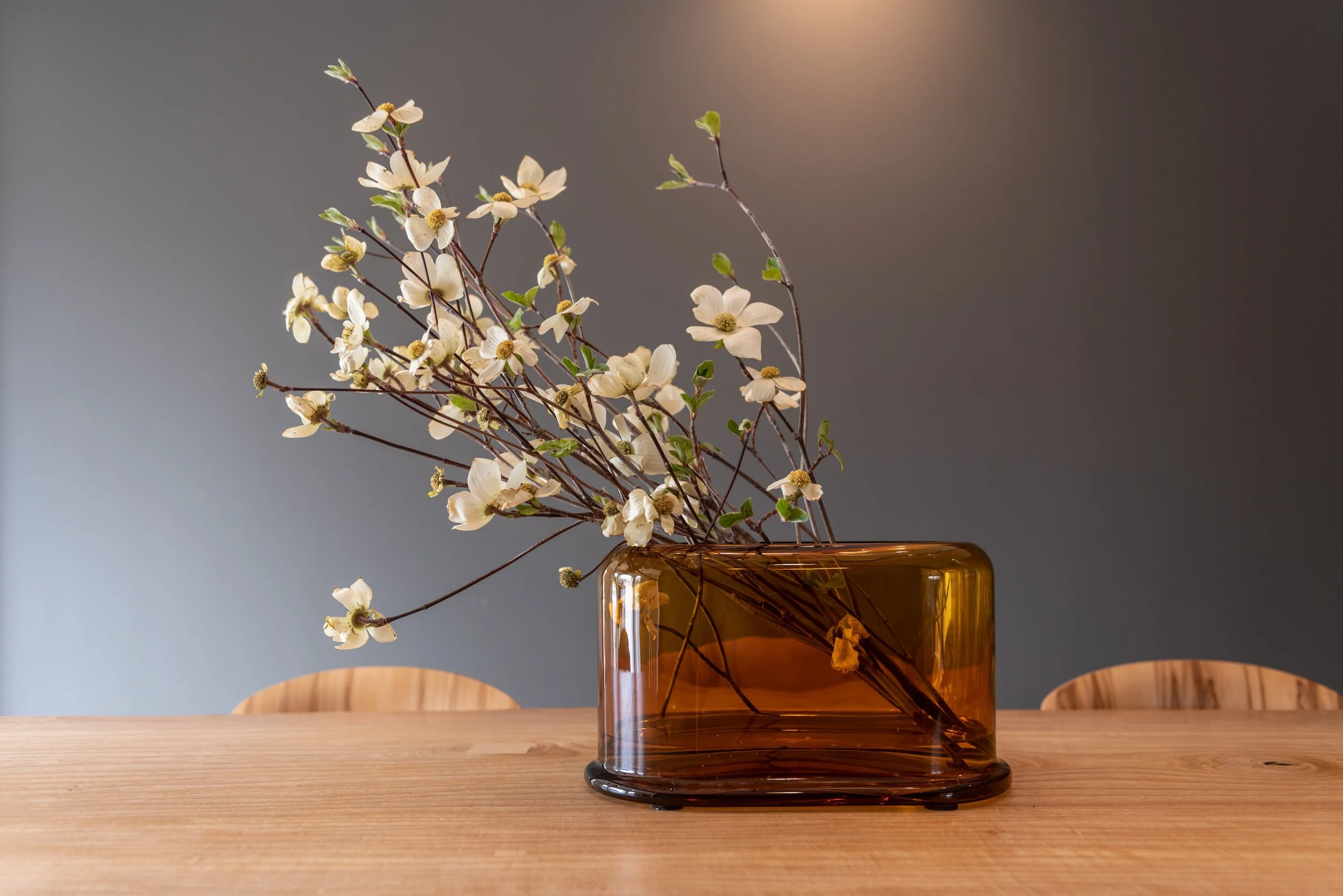
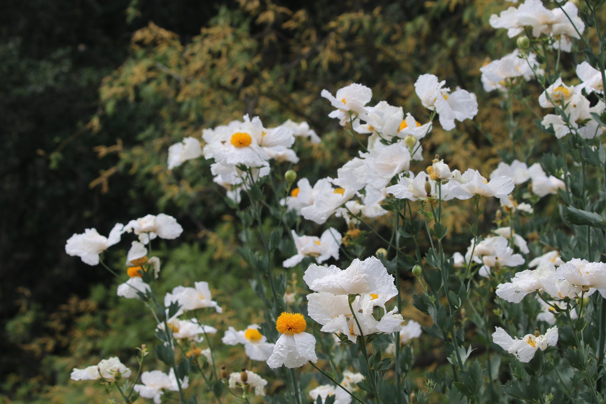
This perspective features the room’s deeper connection to the natural world, anchored by a vintage sunburst mirror hanging above a family sofa reupholstered in a high-performance, easy-to-clean textile. The true focal point is a magnificent, one-of-a-kind fine-art mosaic mural celebrating regional California wildlife, intricately depicting Curly Herissantia, Cambria Bush mallow, Salmon Beauty Yarrow, Palmer's Indian Mallow, Humboldt's Lily, Golden back Fern, and Allen's Hummingbird. A specialized postural support beanbag system rests nearby, providing a comfortable, supportive environment. Mirroring the home's pet-inclusive philosophy, custom dog beds crafted from coordinating textiles ensure companion animals are warmly welcomed in this shared oasis. The layout balances a warm, traditional aesthetic with a footprint built for long-term durability.
This detailed view highlights the meticulous artistry of the custom mosaic mural, bringing the vibrant ecosystem of California's flora and fauna directly into the home's interior. The design beautifully showcases the delicate textures of native species like Humboldt's Lily and Palmer's Indian Mallow, offering a highly tactile and visual experience for family members. This artwork exemplifies the project's core philosophy of naturalist glamour, connecting therapeutic, accessible spaces to fine art.

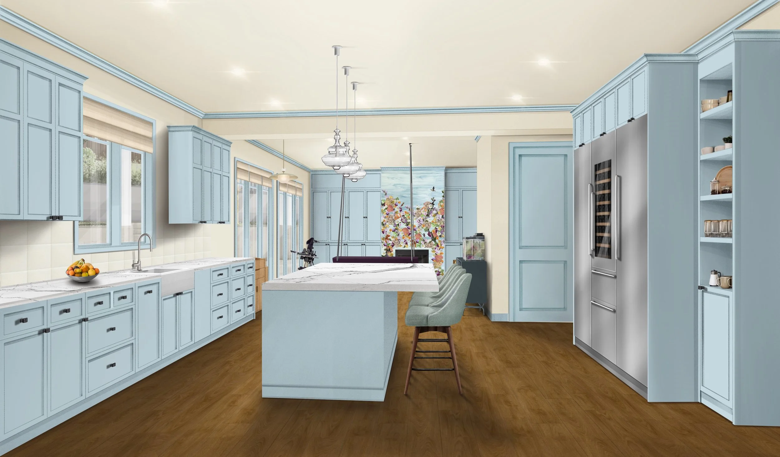
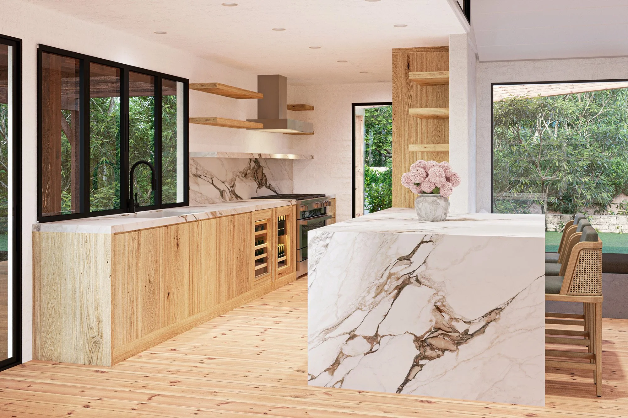
From the kitchen, the interior design maintains visual continuity by carrying the same pale sky blue palette from the family room's built-in cabinetry and trim directly onto the custom kitchen millwork. A backsplash of three-dimensionally carved marble features a subtle floral pattern that acts as a delicate texture from a distance and reveals deep artisan detail up close. Sturdy counter stools are wrapped in a resilient indoor-outdoor textile that remains remarkably soft to the touch. This perspective highlights the project's open-concept layout, featuring flush flooring and expansive pathways that keep the kitchen workstations fluidly connected to the family space, with the wildlife mural visible just beyond the counter.
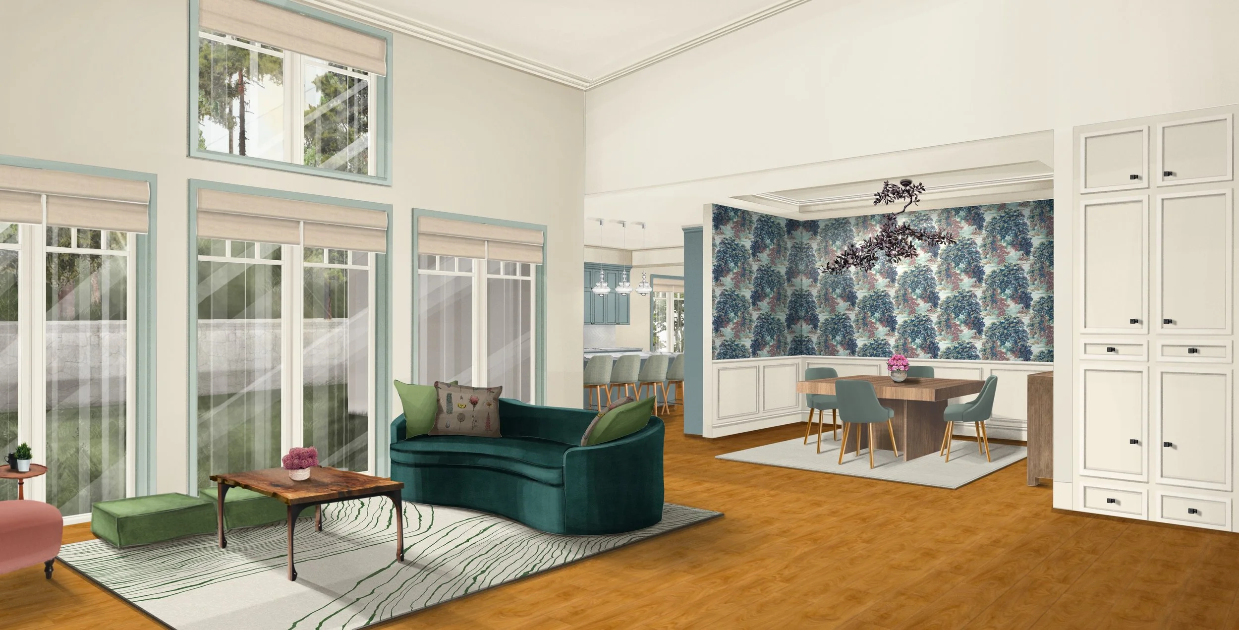
From the living room, the open floor plan provides a visual connection to the home's formal entertaining spaces, offering a clear view into the adjacent dining room, with the sky-blue kitchen visible in the distance. In the foreground, biophilic elegance shines through custom sofa toss pillows delicately embroidered with botanical motifs. Beyond the living area, the dining room features an elegant forest-patterned wallpaper in shades of teal, slate blue, and dusty rose, beautifully paired with a custom-fabricated oak-leaf chandelier. At the center sits a unique walnut dining table engineered with an internal self-storing leaf mechanism, accompanied by the family's original chairs thoughtfully reupholstered in a high-performance, healthcare-grade silicone faux leather. Grounding both spaces, a continuous flat floor surface and low-profile rugs help family members using mobility devices navigate seamlessly between rooms.
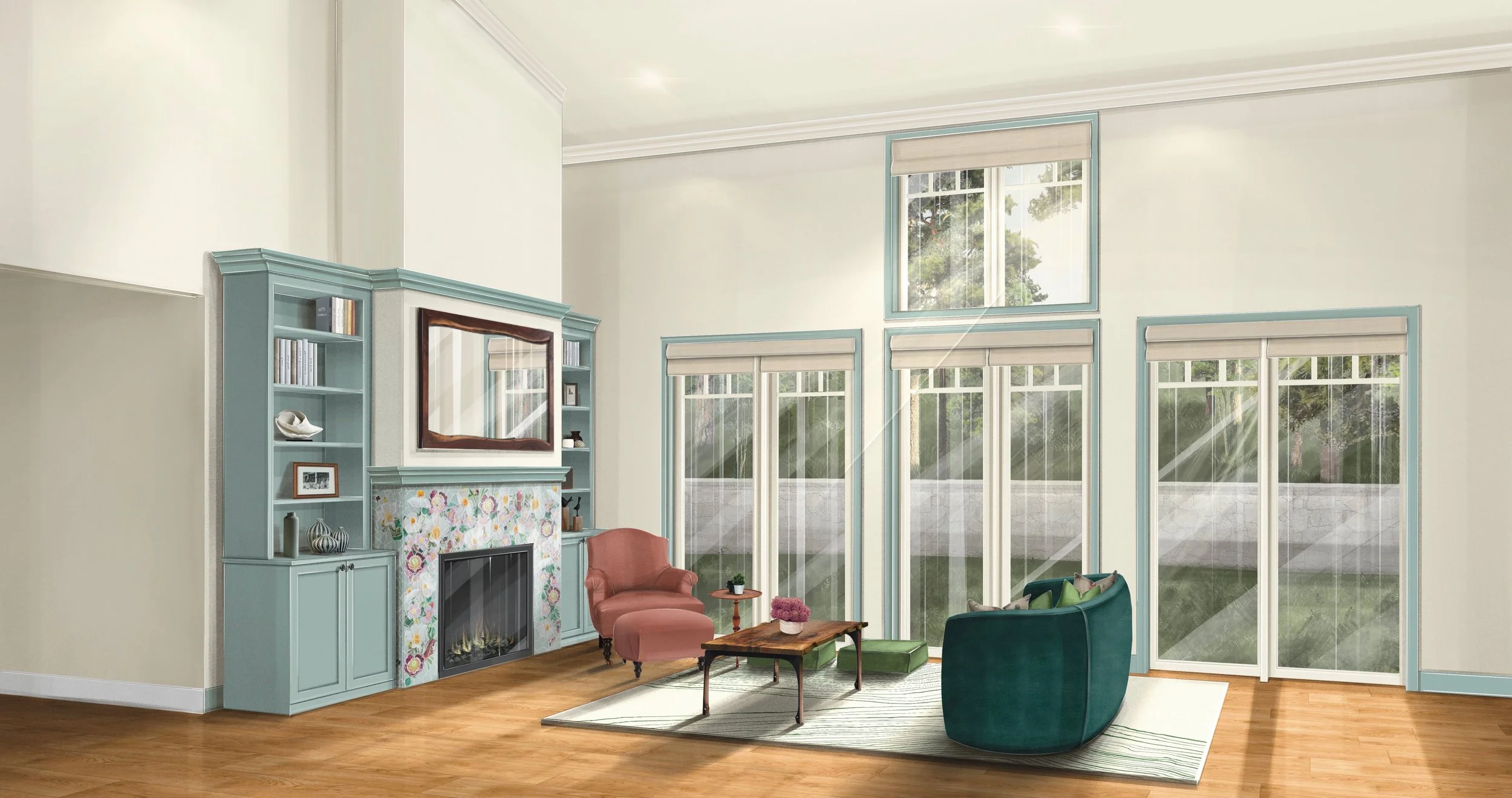
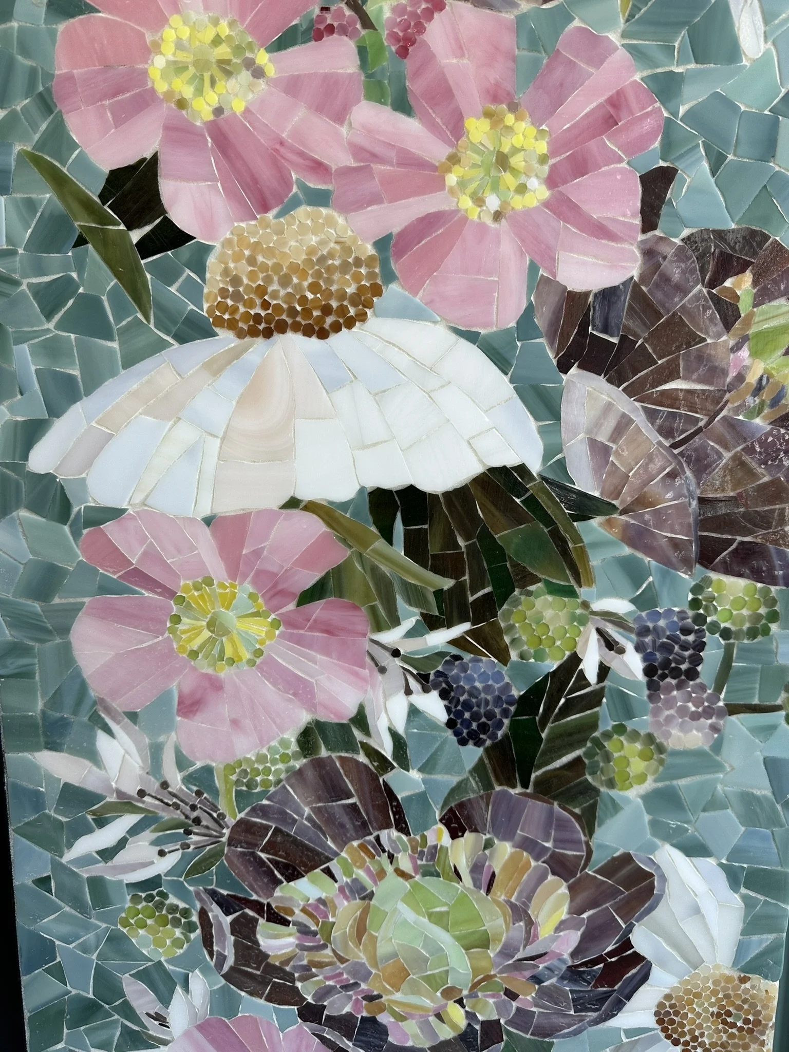
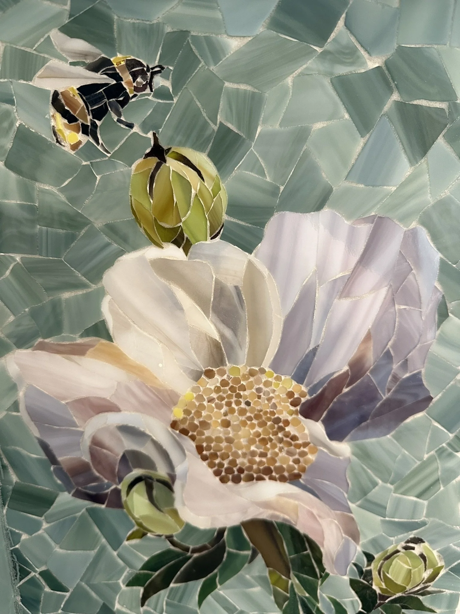
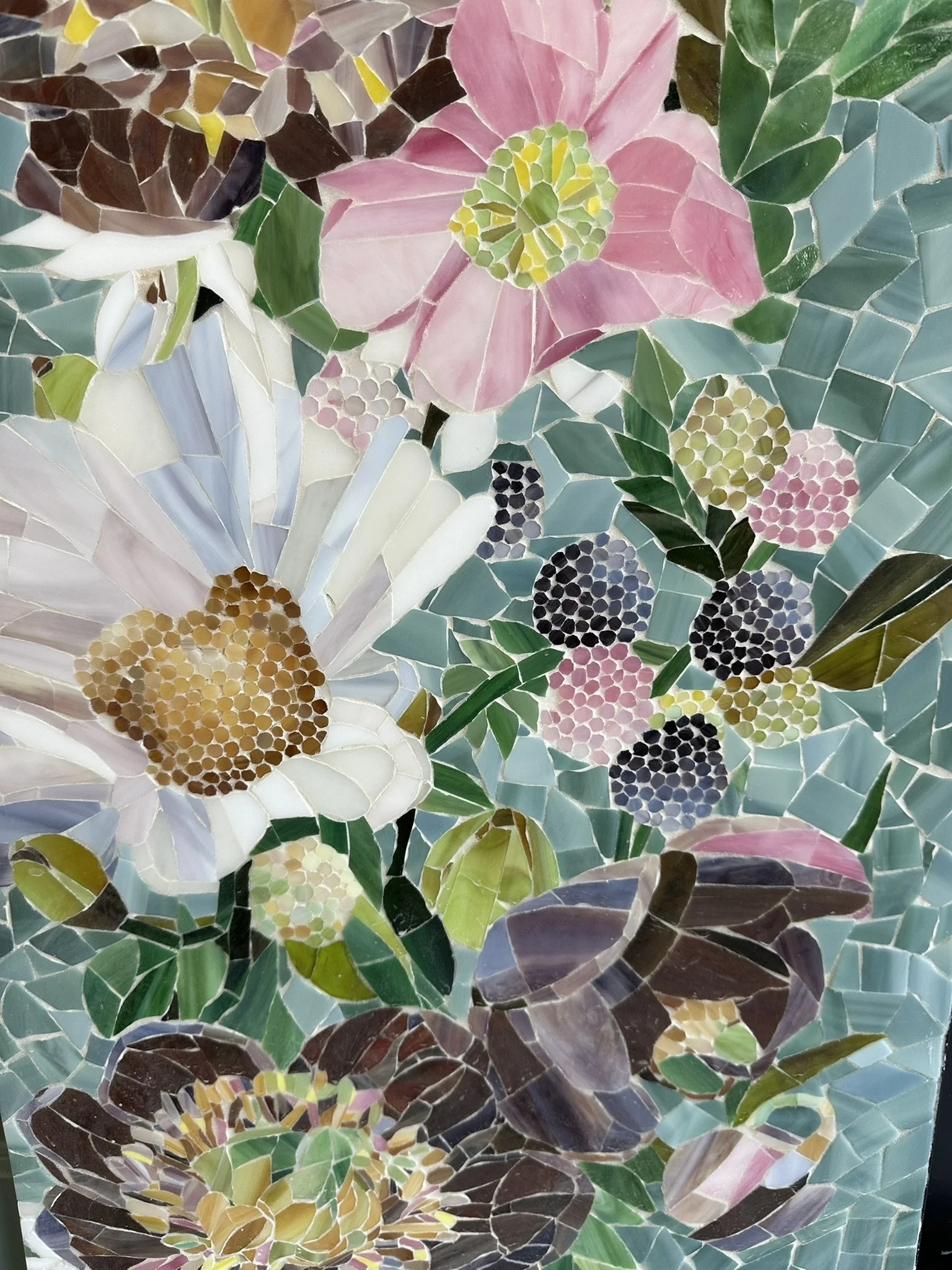
The formal living room centers on a custom mosaic fireplace surround that celebrates regional biodiversity and serves as the primary visual anchor of the space. The intricate artisan tile work brings the local landscape indoors by accurately depicting California native Peonies, Matilija Poppies, California Wild Roses, California Blackberries, and the Bombus californicus bumblebee. This vibrant floral motif bridges architectural details and fine art practice. Flanking the detailed hearth, custom cabinetry and clean architectural moldings provide a structured, traditional frame that balances the organic movement of the custom mosaic. To support inclusive wellness, the seating area maintains a wide turning radius and a low-profile, washable area rug.
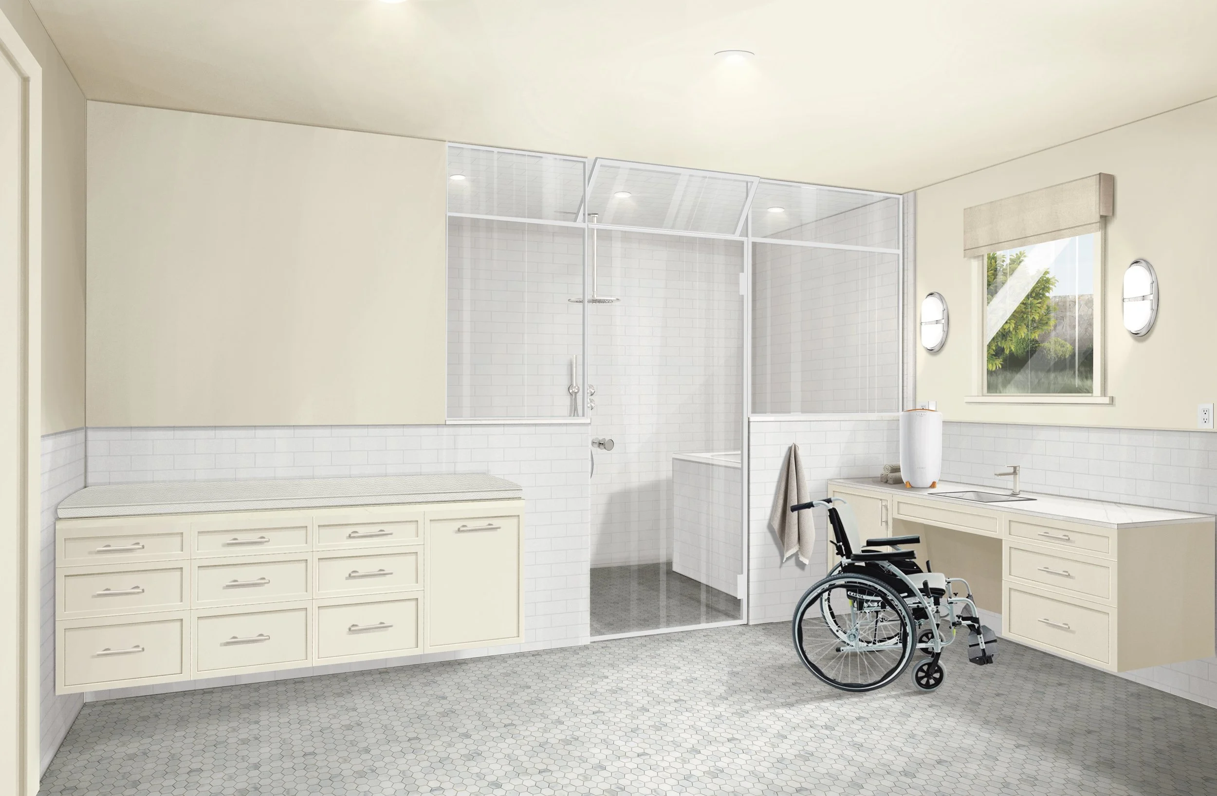
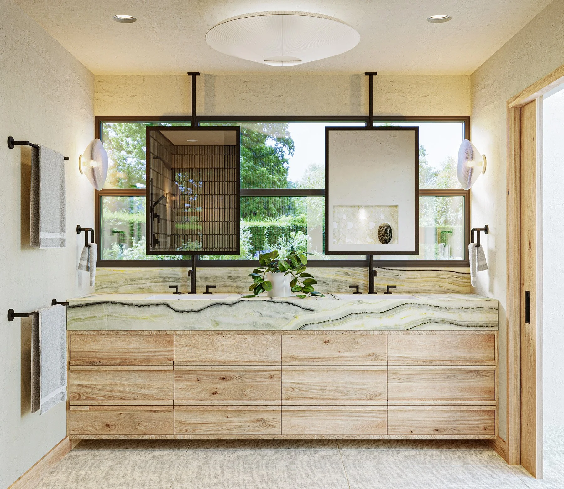
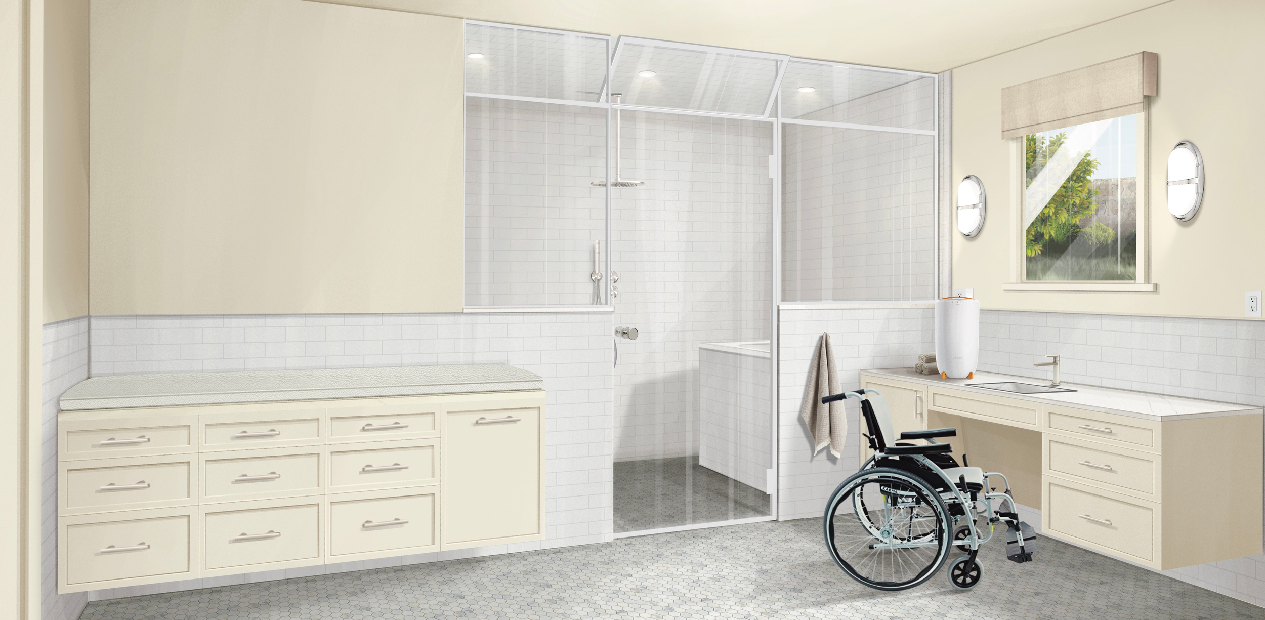
Tailored specifically for a family member with a vision impairment who uses a wheelchair, this inclusive bathroom combines traditional styling and premium materials with universal design principles. The vanity is engineered for a seated user, featuring an angled protective panel at the knee space alongside a 9-inch clear toe space below all surrounding wall-mounted cabinetry. In place of a mirror, a window features a motorized window treatment for easy, hands-free operation. The countertop hosts a freestanding towel warmer, adjacent to specialized cabinetry configured to hold a Diaper Genie and a silicone-leather changing-table cushion designed to accommodate the family member as they grow.
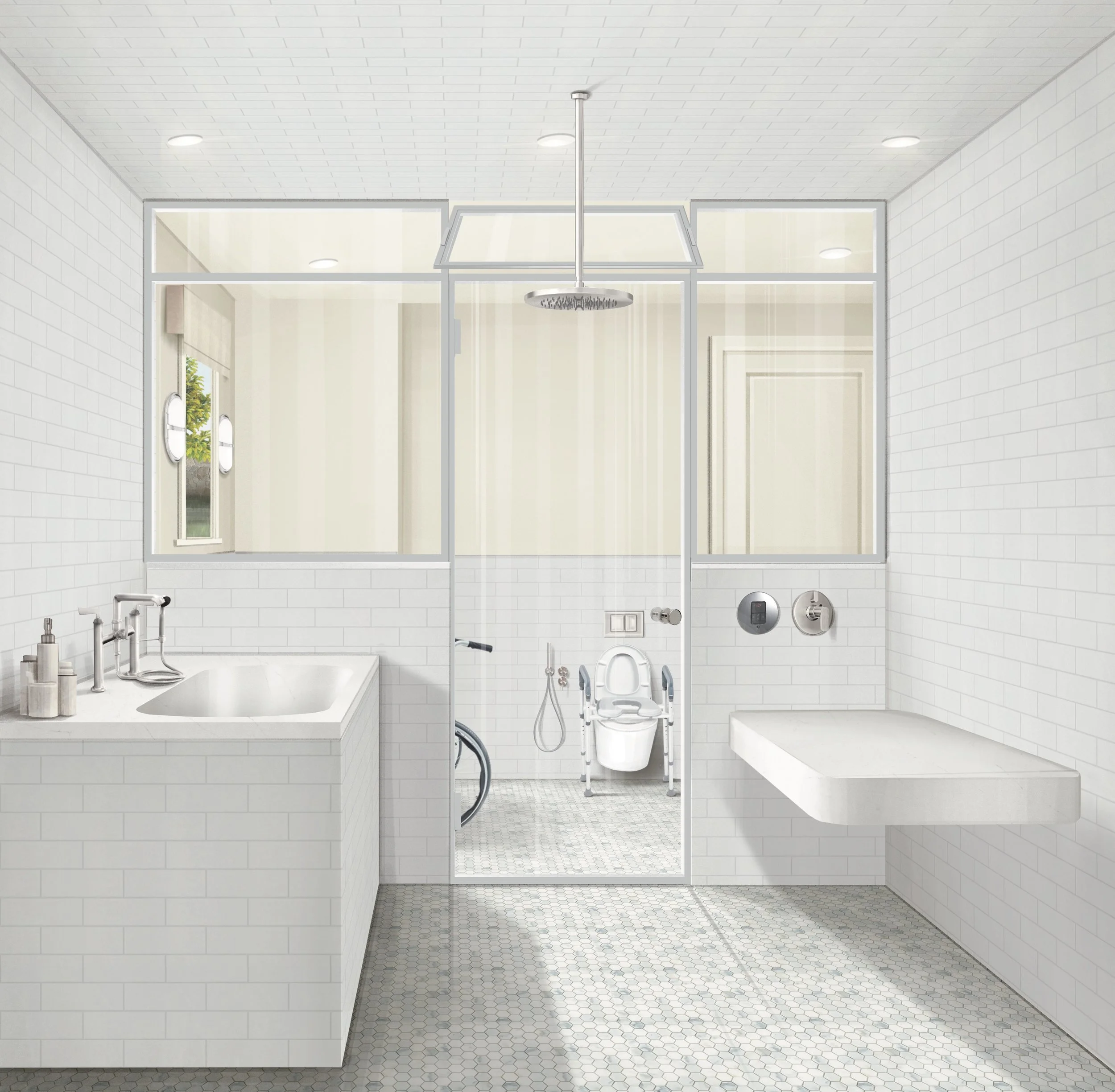
This view from inside the steam enclosure showcases a barrier-free wet room area designed with a curbless transition to comfortably accommodate a user and two caregivers simultaneously. Designed with an ample, open scale, the space highlights a raised bathtub outfitted with a therapeutic jet system, a wall-mounted shower table, an overhead rain shower experience, and a flexible hand shower. The custom glass enclosure features an operable vent in the upper portion to facilitate using the space with or without a steam experience. Functional design is woven discreetly throughout, including a vanity cabinet configured for pass-through access to the bathtub motor and a utility closet providing a dedicated service access point for the steam system.
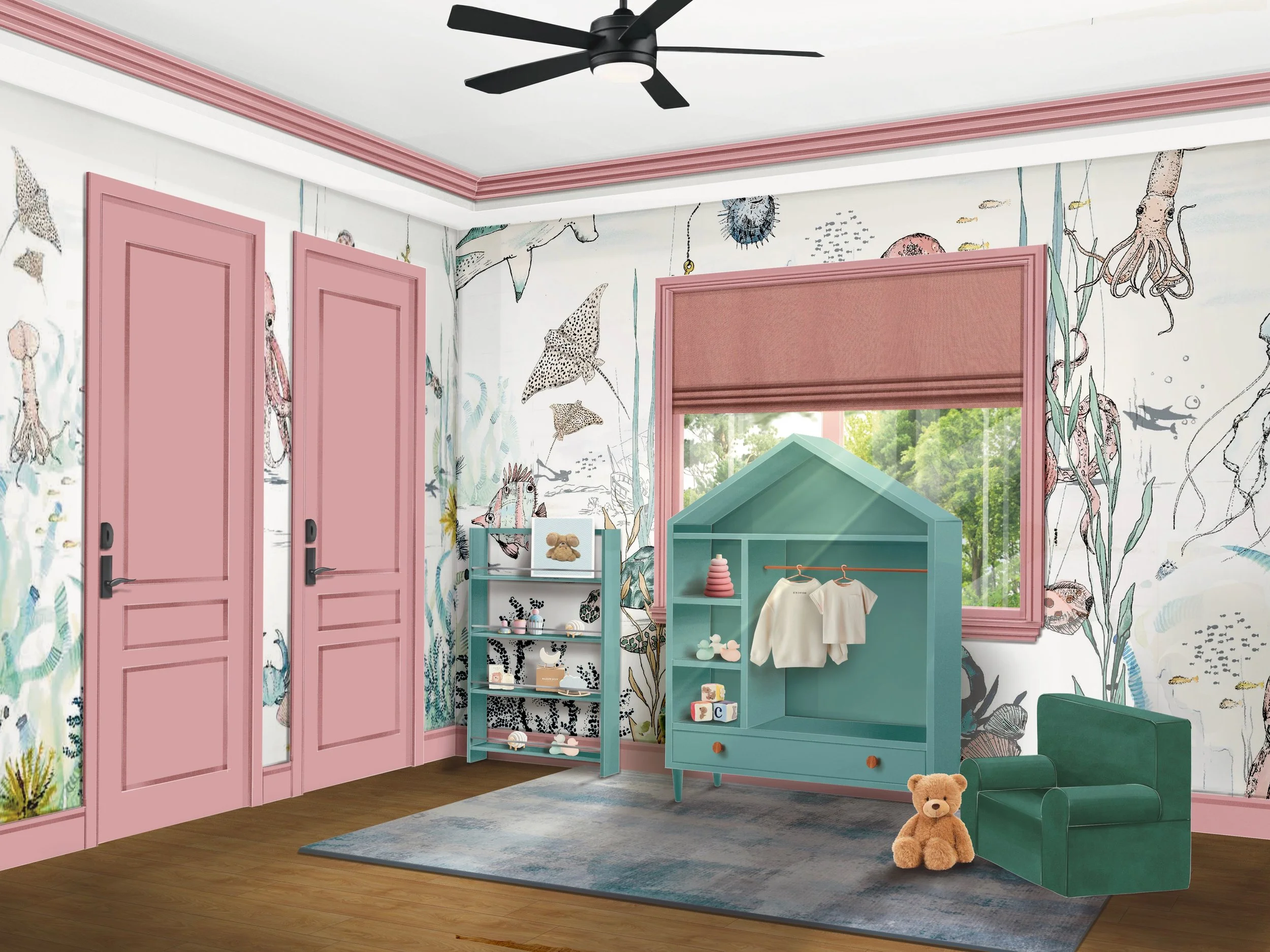
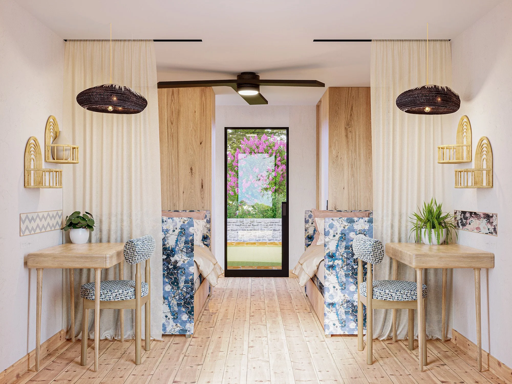
The child's bedroom interior design introduces a whimsical underwater-themed wallpaper rendered in soft pinks and varying shades of teal, creating an imaginative environment. Custom, child-height storage solutions and open shelving are meticulously designed to promote independent movement, keeping toys and belongings easily reachable. A child-sized upholstered armchair in deep teal provides a comfortable, supportive reading spot tailored perfectly to the scale of the room. The custom closets feature a forward-thinking design, making them fully accessible to the child now and easily adaptable to their needs as they grow. Grounded by a flat, washable rug and motorized window treatments for hands-free operation, the layout beautifully ensures a safe, navigable, and healthy space for play and rest.
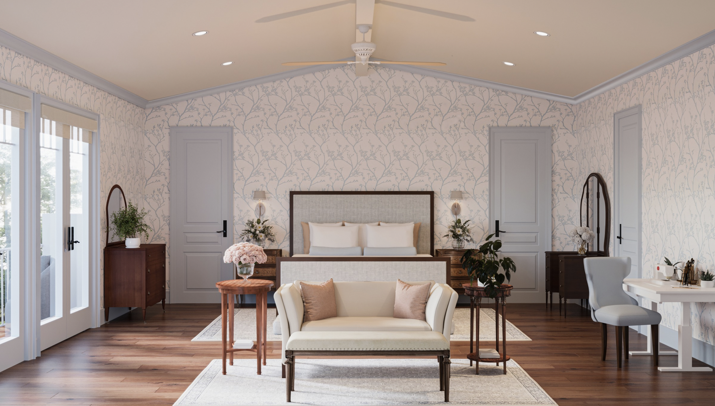
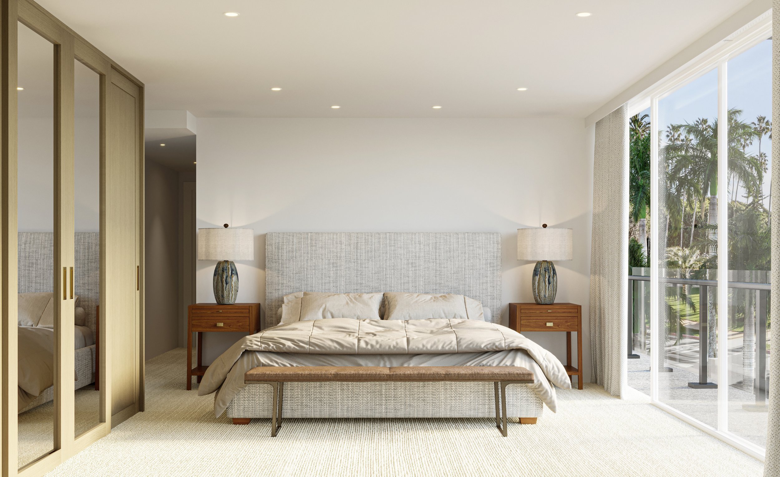
The primary bedroom transitions the residential narrative into a calm, restorative retreat, utilizing a soothing icy-blue palette and delicate floral wallpaper. Keeping holistic family health at the forefront, the custom-made bed is crafted with natural materials and dressed in certified organic linens. This view highlights how the client's treasured original antique dressers are balanced on opposing walls. Universal design principles extend into the room's functional corners, featuring a sewing table tailored to comfortably accommodate different physical needs and postures.
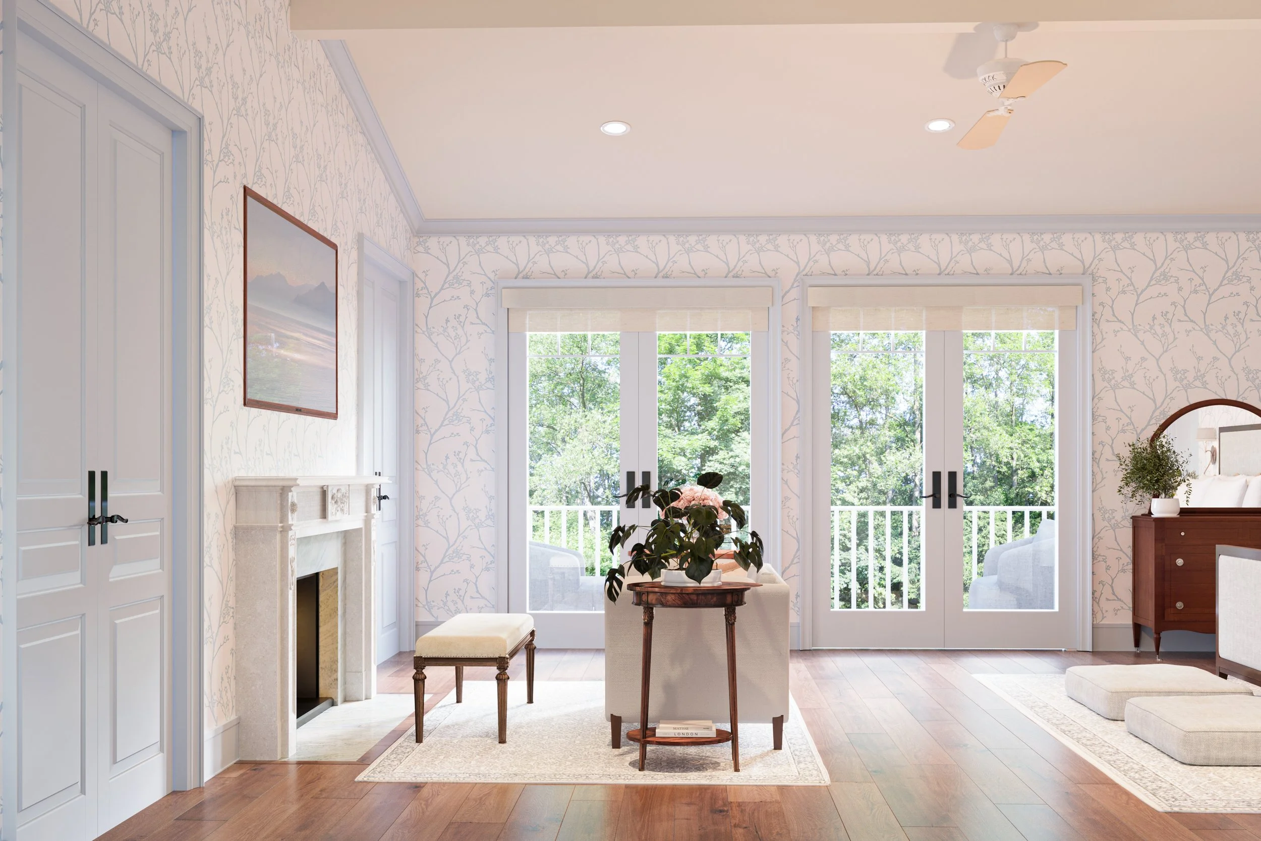
This perspective of the primary bedroom centers on a bright seating area framed by expansive double glass doors, showcasing the project's blend of historic charm and layout accessibility. The arrangement displays a curated reproduction bench and an authentic antique side table that ground the sitting space. Neatly integrated into the floor plan, custom pet beds upholstered in a high-performance, coordinating textile ensure the family's companion animals are warmly accommodated.
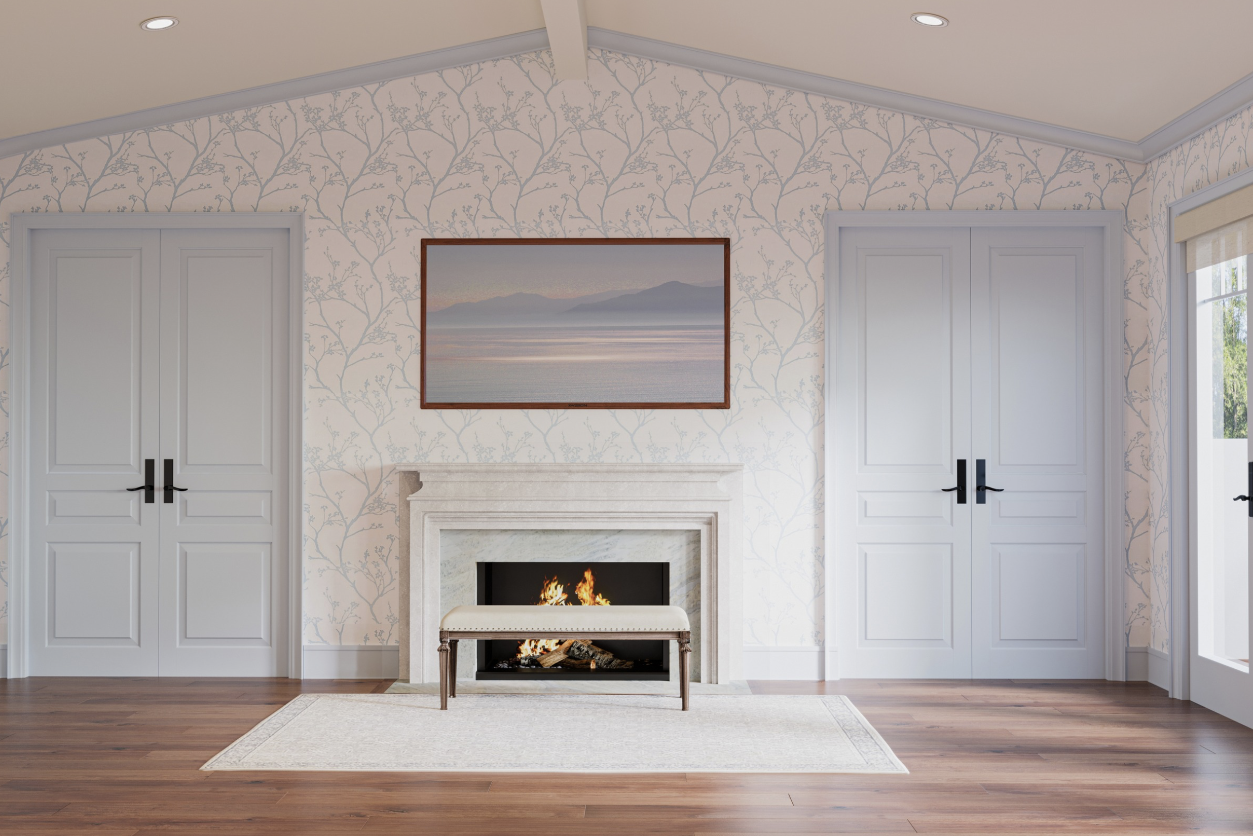
This final view showcases the primary bedroom's architectural symmetry, centering on a custom limestone fireplace with a natural stone slip and a flush hearth seamlessly integrated into the hardwood flooring. Above the mantle, a fine art photograph of the Salton Sea elegantly conceals a hidden television. The room’s delicate floral wallpaper wraps the walls in a soft pattern, framing the double doors and creating a balanced, classic layout. Grounded by a low-profile, flat area rug and a soothing color palette, this space highlights the project's thoughtful neuro-inclusive interior design principles, emphasizing a classic aesthetic and sensory calm.
Sarah Barnard is a WELL and LEED accredited interior designer and creator of environments that support mental, physical, and emotional wellbeing. She creates highly personalized, restorative spaces that are deeply connected to art and the preservation of the environment. A certified California Naturalist, Sarah believes in celebrating nature through responsible design that works symbiotically with the local environment.
An advocate for consciousness, inclusivity, and compassion in the creative process, Sarah has appeared in Architectural Digest, Elle Décor, Vogue, HGTV, and many other publications. Sarah was recognized as a "Ones to Watch" Scholar by the American Society of Interior Designers (ASID) and has been awarded "Best of Houzz Design" for seven consecutive years. Sarah's MFA in visual arts from Claremont Graduate University informs her practice and innovative approach toward interior design as creating a living work of art.

California State of Mind: A Harmonious Lifestyle

Defining the California Aesthetic
The California aesthetic is characterized by a generous sense of space, abundant natural light, and a deep appreciation for materiality. This interior design style prioritizes a fluid transition between indoor and outdoor environments, celebrating the state's golden light and diverse landscapes. Beyond a singular look, it is a restorative practice that utilizes quality-crafted, sustainable materials to support emotional and physical wellbeing.
A Celebration of the Local Environment
At its core, California home style mirrors the beauty of the coastline and high desert through a palette of soft greens, deep blues, and warm earth tones. This design principle invites the outdoors in, fostering tranquility and connection. This regional approach is rooted in the early 20th-century Arts and Crafts movement, which emphasized a direct response to the natural landscape and the use of materials to anchor a building to its site.
Sarah Barnard, LEED + WELL A.P., notes, “Intentionally designing a sanctuary can cultivate a space that supports a deeper connection with our internal experience.” This focus on quality is central to creating a California connection within a residence.

Honor in Craftsmanship and Narrative
The interior design aesthetic is rooted in traditions that value personal, handmade, and quality-crafted details. By focusing on artisan furniture and architectural elements that showcase raw materials like wood and stone, a home becomes a collection of stories. This approach often includes design strategies for an unpredictable climate, where beauty and functionality balance to support longevity.
This narrative includes regional styles like the Spanish Colonial Revival, which blossomed in the 1920s to become a dominant Southern California style, using stucco, tile, and lush courtyards to create a romantic, site-sensitive identity.
Caliterranean: A blend of Italian, Spanish, and Mission influences characterized by soft stucco and intricate tilework.
Scandifornian: Coastal California elements paired with Scandinavian simplicity.
Francofornia: French sensibilities combined with California comfort.
Material Integrity and Environmental Health
Modern California design style prioritizes material health, selecting sustainable options that support a fresh indoor environment. This includes reclaimed woods, natural textiles, and raw minerals that provide a grounded presence. A humanistic modernism emerged in the state that fully embraced comfort and leisure, responding directly to the environment. Many homeowners also explore vegan home design to create a compassionate style that reflects a love of animals and wildlife.
Intentional Minimalism
The California look is curated and intentional, promoting calm and order. By utilizing vertical space and layered lighting, rooms feel expansive and airy. Functional elements are often integrated into specialized cabinetry or built-ins, allowing the eye to rest on art and natural woodgrains. This refined approach, sometimes called Caliminimalism, emphasizes organized spaces and functional neutral palettes.
Strategies for Achieving a California Lifestyle
Achieving this interior design style is as much about cultivating a state of mind as it is about visual design. By making intentional choices, the home becomes a tool for a life focused on mindfulness and connection to the land.
Cultivate a Nature-Inspired Palette
Selecting colors rooted in local minerals and flora brings the landscape indoors.
Coastal and Earth Tones: Soft greens, deep blues, and warm neutrals reflect the West Coast.
Grounding Minerals: Natural stones like California slate or river rock offer a sense of stability.
Golden Tones: Salvaged sycamore or reclaimed redwood emulate the warmth of West Coast sunshine.
Select Materials for Integrity and Longevity
The history of materials plays a significant role in supporting the local ecosystem and health.
Certified Timbers: FSC-certified woods like reclaimed elm or ash support environmental preservation.
Textile Health: Natural linens or textiles support indoor air quality.
Low-Impact Finishes: No-VOC materials for wood surfaces support a healthy living environment.
Emphasize Artisanal Craftsmanship
Focusing on pieces that showcase human effort and natural beauty adds depth to an interior.
Bespoke Furniture: Custom pieces celebrate the organic form of the wood.
Restored Heirlooms: Integrating family pieces or salvaged historical materials honors design traditions.
Tactile Surfaces: Chiseled wood, textured art, or rough-hewn stone add physical interest.
Sarah Barnard, LEED + WELL A.P., is a leading interior designer of personalized, sustainable spaces that support mental, physical, and emotional wellbeing. She creates restorative environments deeply connected to art and the preservation of the natural world. Sarah has been recognized as a “Ones to Watch” Scholar by the American Society of Interior Designers (ASID).
Bibliography
Stovall, Sarah. “California Design, 1930–1965: Living in a Modern Way.” LACMA, 2011. https://www.lacma.org/sites/default/files/California%20Design%20didactic%20FINAL.pdf
Van Wormer, Catherine. “Architecture and Engineering Theme: Arts and Crafts Movement, 1895-1930.” City of Los Angeles Department of City Planning, 2016. https://planning.lacity.gov/odocument/18037253-197d-483a-8b13-c85fcd553fe8/ArtsandCraftsMovement_1895-1930.pdf
Sloan, Carolyne. “Spanish Colonial Revival Architecture in Santa Monica.” Santa Monica Conservancy, 2024. https://smconservancy.org/property/parkhurst-building/

Canyon Calm: Design Strategies for an Unpredictable Climate
Resilience as Coastal Stewardship
The mid-afternoon sun in Topanga Canyon often creates a sensory intensity where the air feels static and the landscape particularly fragile. During Climate Week in Los Angeles, this environmental reality serves as a catalyst for estate owners to move beyond passive design trends toward a more active and intentional form of stewardship. In high-fire-severity zones, protecting a coastal property requires navigating the complex intersection of high-end aesthetic integrity and technical necessity. It is a fundamental shift in perspective that views the home not merely as a site of leisure, but as a responsive biological ally. Navigating these requirements demands an authoritative oversight grounded in specialized credentials to ensure a residence remains a restorative retreat.
Thermal Batteries and the Diurnal Cycle
In luxury residential environments, significant functional value is found in materials that offer more than a prestigious pedigree. Dense stones, such as honed basalt and limestone, possess the thermal mass required to manage the demanding diurnal heat cycle. High-mass stone may act as a silent thermal battery by wicking away the peak intensity of a mid-day sun, potentially supporting a sense of internal calm and preventing heat-related physiological stress. When a room manages its temperature effectively, it aims to provide the stable internal environment needed to facilitate high-level cognitive performance and physical recovery. The stone holds the cool long after the sun has shifted.
The Technical Defense of the Building Envelope
Strategic resilience begins with the technical precision of the building envelope. Utilizing layered protective materials, such as dual-paned tempered glass and non-combustible finishes, aims to defend the structural integrity of a property against environmental shifts. A critical component of this defensive strategy is the ember audit, which addresses the high-stakes reality that undetected gaps in vents or eaves may serve as entry points for wind-blown fire. This specialized approach to home hardening aims to mitigate vulnerabilities before they are tested by a local weather event. The house stands as a quiet, fortified retreat against the elements.
Sarah Barnard, LEED + WELL A.P., said, "By selecting enduring materials that buffer and protect, a home may better accommodate the physiological needs of its inhabitants while providing a meaningful layer of protection against environmental shifts."
Naturalism as a Strategic Shield
A property’s security extends beyond its walls to the immediate landscape. A symbiotic relationship with the local environment informs the selection of responsible landscaping that works in harmony with the unique constraints of the California coast. Rather than relying on thirsty, high-maintenance flora, a native-focused design may provide natural shading and moisture retention. This naturalist approach serves as a functional tool for environmental preparedness, potentially reducing a property’s reliance on mechanical climate control while aiming to preserve the restorative nature of the estate. It is an act of foresight that honors both the inhabitant and the local ecosystem.

The Enduring Sanctuary
A resilient home is intended to be a responsive ally engineered to support a sense of well-being even during periods of environmental fluctuation. These technical choices represent proactive, intelligent investments in a well-lived life where safety and restoration are woven into the home itself. A temperature-stable, hardened environment aims to provide the quiet and stability that may help support the deep stages of sleep and long-term vitality. By prioritizing enduring materials and ecological intelligence, an estate can remain a supportive sanctuary that stands the test of time.
Sarah Barnard, LEED + WELL A.P., is a leading designer of personalized, sustainable spaces that support mental, physical, and emotional wellbeing. She creates highly personalized, restorative spaces that are deeply connected to art and the preservation of the environment. An advocate for consciousness, inclusivity, and compassion in the creative process, Sarah has appeared in Architectural Digest, Elle Décor, Vogue, HGTV, and many other publications. Sarah was honored as a "Ones to Watch" Scholar by the American Society of Interior Designers (ASID).
Bibliography
Association of Collegiate Schools of Architecture (ACSA). (2026). Thermal Mass and Natural Ventilation: Performance Divergence in Hot Climates. acsa-arch.org/
Insurance Institute for Business & Home Safety (IBHS). (2025). Construction Costs for Wildfire-Resistant Homes: Los Angeles Regional Analysis. ibhs.org/wildfireready/
International WELL Building Institute (IWBI). (2023). WELL v2 Standard: Thermal Comfort and Physiological Recovery. v2.wellcertified.com/en/v2/thermal-comfort
National Center for Biotechnology Information (NCBI). (2024). Surviving Indoor Heat Stress: Impact of Overheating on Residential Thermal Comfort and Health. ncbi.nlm.nih.gov/pmc/
United States Green Building Council - Los Angeles (USGBC-LA). (2022). Wildfire Defense Landscaper Certificate Program. usgbc-la.org/programs/wildfire-defense-landscaper/
The Verdant Center: Cultivating Restorative Balance

The concept of the home has evolved into something far more profound than a collection of curated objects. It has become a site of resonance, a space where the physical environment and the internal emotional state seek a point of equilibrium. At the center of this dialogue is the Sanskrit principle of Anahata, the heart chakra. Translating literally as unstruck, Anahata represents a state of pure resonance, a frequency that remains undisturbed by external friction. As the fourth energy center, it serves as the essential bridge between the grounding, physical needs of the lower body and the higher intellectual and spiritual aspirations of the upper mind. In the context of interior design, creating an Anahata atmosphere means cultivating a sanctuary of balance, where the visual and tactile elements support a sense of emotional wholeness and psychological safety.
The primary hue associated with this energy center is green, a choice that mirrors the visible light spectrum. Positioned at the exact center of the spectrum, green provides a natural point of equilibrium, offering the human eye a state of visual rest that neither requires the energy of warmer tones nor the recession of cooler ones. By anchoring a room in the green heart, design may help support a profound sense of steadiness, making the environment an active participant in the restoration of the inhabitant. When a space is tuned to this specific frequency, it encourages a deeper connection to the self and the natural world, fostering a restorative experience that reaches beyond simple aesthetics.
Interior designer Sarah Barnard, LEED + WELL A.P., said, "Designing from a place of equilibrium allows for the home to act as a restorative anchor, where every material and color choice serves the long-term emotional well-being of the inhabitants."
The Science of the Middle Ground
The preference for verdant environments is not merely an aesthetic inclination but is rooted in the biological reality of the human nervous system. The biophilia hypothesis suggests that people possess an innate tendency to seek connections with nature, a trait developed through evolutionary history where green environments signified survival and abundance. Modern neurobiological research has begun to quantify this connection, demonstrating that exposure to nature-inspired design may significantly reduce concentrations of oxy-Hb in the prefrontal cortex. This reduction reflects relief from the cognitive and emotional overload typical of contemporary life, allowing for enhanced neural stabilization and mental clarity. By decreasing the metabolic load on the brain's executive centers, green-centered spaces provide the cognitive quiet necessary for reflection and emotional regulation.
Environmental psychology further supports this through Stress Recovery Theory, which suggests that natural environments facilitate the recovery of psychological resources. Studies examining restorative outcomes have found that biophilic design elements, such as unobstructed nature views and the presence of indoor greenery, are associated with significant positive impacts on mental clarity and physical relaxation. These elements function as micro-restorative breaks, allowing the mind to disengage from task-oriented focus and enter a state of effortless attention. Even when a direct view of the outdoors is not accessible, the strategic use of green décor and art has been shown to produce measurable restorative benefits. Specifically, green-themed interiors have been linked to a positive influence on the ability of inhabitants to clear the mind of stressful thoughts, fostering higher levels of restoration than other color themes. The psychological impact is immediate, as the nervous system recognizes the spectral cues of safety and vitality inherent in the color green.
The Legacy of the Pigment
The history of green in the interior is a story of pursuit and permanence. While the color is abundant in the natural world, it was historically one of the most difficult hues for artists and pigment makers to stabilize. In antiquity, vibrant greens were often derived from malachite, a semi-precious gemstone that provided a rich, royal depth but was notoriously difficult to layer. During the Renaissance, artists relied on verdigris, a copper-based pigment known for its transparent, jewel-like brilliance. Verdigris was often reactive and unpredictable, having a tendency to darken to an olive-brown over centuries, turning once-vibrant landscapes into moody, earthen studies. This ephemerality created a longing for a green that could capture the eternal vitality of the forest without succumbing to the decay of time.
The cultural evolution of the color has seen it move from a symbol of rebirth and immortality in ancient Egypt to a modern emblem of environmental stewardship and longevity. One significant milestone in this history was the development of Hooker’s Green, created by botanical illustrator William Hooker. By mixing Prussian blue with gamboge, a yellow resin from Asian evergreen trees, Hooker achieved a lightfast, cool green that could accurately capture the waxy needles of a pine or the soft silver of sage. This transition from the fugitive, fleeting greens of the past to the permanent tones used today has allowed designers to anchor rooms in colors that endure. This sense of permanence is vital for creating a home that feels like a lasting legacy, where the environment remains an enduring foundation for a family’s growth. The color green thus represents a bridge across time, connecting ancient spiritual associations with the modern requirement for sustainable, long-lasting beauty.

Tactile Vitality and Botanical Materiality
A restorative interior design must move beyond the purely visual, engaging the senses through a philosophy of haptic design. Luxury, in this context, is defined by how a room feels under the hand and by how the materials support the occupant's emotional state. This shift toward sensory-first environments acknowledges that luxury and well-being are experienced through all five senses. Texture becomes a defining design language, moving away from sterile surfaces toward matte and honed finishes, textured stone, and hand-woven textiles. Natural fibers play a critical role in this sensory engagement, offering a tactile richness that synthetic materials cannot replicate. These organic surfaces invite touch, grounding the inhabitant in the present moment and reinforcing the home’s role as a protective sanctuary.
Using high-end materials like 100% Belgian linen connects to the raw beauty of nature. This mid-weight fabric is highly versatile, offering a lovely handle that drapes beautifully for upholstery or drapery. Textiles in deep botanical tones, such as the mossy, grey-green of rosemary or the dusty, bluish-green of thyme, add a layer of organic texture to the space. These colors, drawn from the medicinal and culinary herbs of the Mediterranean, evoke a sense of heritage and nourishment. When paired with interior jewelry in the form of malachite slabs or semi-precious stone accents, the room gains a symbolic depth. Malachite, historically known as a stone of transformation, brings a vibrant energy that encourages emotional renewal and prosperity. The interplay between the soft, yielding texture of linen and the cool, unyielding weight of stone creates a multisensory dialogue that reflects the complexity of the natural world.

Designing with Compassion and Intention
Designing for the green heart requires a commitment to inclusive design strategies that prioritize the specific, nuanced needs of every inhabitant. For neurodivergent individuals or those with sensory sensitivities, the home must function as a sensory retreat. This involves creating varied paths of movement and balancing open, light-filled spaces with smaller, comforting nooks that feel like a protective envelope. These inclusive spaces are designed not for a generic user but for the specific biological needs of a human being, fostering a sense of psychological safety. The goal is to reduce sudden sensory arousal while providing an environment that is actively healing and restorative, allowing the inhabitant to navigate their world with autonomy and grace.
The integration of restorative infrastructure allows the home to mimic natural systems, supporting the body's internal rhythms. Circadian rhythm lighting, which shifts in temperature to mirror the natural progression of the sun, is essential for regulating sleep cycles and mood. Similarly, the implementation of quiet tech ensures that the home remains a mindful sanctuary. By hiding technology within the architecture, through invisible audio systems or seamless automation, the heartbeat of the home is maintained without disrupting the aesthetic harmony or creating sensory clutter. This approach allows the architecture to shine while technology operates effortlessly in the background to enhance the restorative experience. Every technical integration is chosen for its ability to simplify life, reducing the friction between the inhabitant and their environment.

The Reunion of Nature and Interior Space
The reunion of the natural world with the human-made interior marks a shift toward a more compassionate, human-centric maturity in design. When a home is designed from the heart, it becomes a narrative of renewal, where every material choice and layout decision supports the well-being of the inhabitants. The Anahata atmosphere is an invitation to let nature inside, not merely as a decorative accent, but as a biological necessity. This reunion acknowledges that our place-based relationships with the land do not end at the threshold of the home. Instead, the interior serves as an extension of the garden, a space where the biological needs of the human body are met with the same care as the mind’s aesthetic desires.
In the quiet resonance of a green room, the mind finds space to settle, and the body finds the support it needs to thrive. By aligning ancient principles of harmony with modern, evidence-based wellness standards, designers create environments that do more than just look beautiful; they nurture both body and soul. The verdant center supports a home that remains a protective, restorative sanctuary, where every inhabitant is allowed to be truly whole. The legacy of the green heart is one of steadiness and growth, offering a timeless foundation for a life lived in balance.
Sarah Barnard is a WELL- and LEED-accredited interior designer and creator of environments that support mental, physical, and emotional well-being. She creates highly personalized, restorative spaces that are deeply connected to art and to environmental preservation. A certified California Naturalist, Sarah believes in celebrating nature through responsible design that works symbiotically with the local environment.
Bibliography
Astell-Burt, Thomas, and Xiaoqi Feng. "Visible Green Nature and Restoration Outcomes." National Center for Biotechnology Information (NCBI). pmc.ncbi.nlm.nih.gov/articles/PMC12340148/
Fang, Karen. "Hooker’s Green: The History of Immortality." The Engines of Our Ingenuity, University of Houston. engines.egr.uh.edu/episode/3241
National Gallery London. "A History of the Colour Green in Art." National Gallery. www.nationalgallery.org.uk/podcast/colour-stories-green
Sugarman, Anna. "Heart Chakra: Love, Compassion and Generosity." Yoga Jala. yogajala.com/heart-chakra/
Taylor & Francis Online. "Systematic Review of Biophilic Design in Workplaces." Journal of Architectural Engineering. tandfonline.com/doi/full/10.1080/17508975.2024.2306273
Ulrich, Roger S. "Stress Recovery Theory and the Natural Environment." Journal of Environmental Psychology. pmc.ncbi.nlm.nih.gov/articles/PMC11878902/
Wilson, Edward O. Biophilia. Harvard University Press, 1984.
World Journal of Pharmaceutical and Medical Research. "Literature on Anahata Chakra." Vol. 5, Issue 2, 2019. www.wjpmr.com/download/article/43012019/1548850018.pdf
Yin, J., et al. "Biophilic Spatial Design and Neuropsychological Restoration." MDPI: International Journal of Environmental Research and Public Health. www.mdpi.com/1660-4601/22/10/1571
Zhong, S., et al. "Biophilic Design Elements and Physiological Stress." Frontiers in Virtual Reality. frontiersin.org/journals/virtual-reality/articles/10.3389/frvir.2025.1411425/full

Beyond Order: Restorative Storage in Modern Design

A common philosophy of storage and organization starts with a period of purging, usually involving a rigid keep, donate, or trash approach. However, this process does not always acknowledge the emotional value of our possessions or fully consider how someone wants to live and feel in their home from a psychological standpoint.
“A common approach to organization often prioritizes elimination, yet it frequently fails to acknowledge the profound emotional resonance of the objects we choose to surround ourselves with,” says Sarah Barnard, WELL and LEED accredited interior designer. “Restorative design is not about what we can discard, but about how we can curate an environment that supports our emotional well-being and reflects our true intentions for how we wish to inhabit a space.”
Many homeowners need a more nuanced strategy that allows for emotion, uncertainty, and changing capacities. The traditional sorting pile is a helpful visual tool, but the criteria for what remains should be personal and reflect one's own history. It is essential to recognize how objects hold meaning, serving as cherished mementos, touchstones, or evolving pieces of a larger collection. If the home is a safe space for free expression, much-loved items play a vital role in self-expression and daily joy.

The Psychology of Curation
Organizing still benefits from a structured process, but the mindset should be rooted in the positive. “Sorting should be approached as an act of self-care rather than a chore of elimination,” Barnard notes. “Instead of asking what we can live without, we should ask how we want our home to support our mood and the daily rituals that bring us comfort.”
By using a feelings-first guide, homeowners can look beyond strict utility. While function is a common starting point, the emotional goal of a room is just as significant. An object might be functional and valued for its usability, or valued simply because it is beautiful. In high-end design, beauty is often a primary function, contributing to calm and visual delight. For many, collecting and curating is the source of joy itself. In these cases, the process is about honoring the collection rather than reducing it.
Managing Sentimental Thresholds
Sentimental items often need a different timeline. A memory box preserves items linked to a person, place, or thing without requiring an immediate decision on their permanent place. This gives time to assess the sentimental reasons for keeping or sorting objects. Items that offer tactile comfort, such as favorite textiles or calming-colored objects, should be seen and kept as sensory anchors at home.
For objects that trigger uncertainty, a holding strategy can help. It can be hard to make quick decisions about inherited pieces or items with complex histories. Placing these in a designated area for review gives time and control. The key is to set a plan to revisit the collection. This ensures the holding area is a temporary pause, not a source of hidden stress.

Architectural Systems for Restorative Living
Once curation is complete, focus shifts to systems to encourage a seamless daily experience. A sophisticated home needs a balance of open and closed storage. Open shelving or rails provide access to frequently used items and serve as display platforms. To prevent visual overload, pair these with closed cabinetry or integrated millwork.
In a home office, this might manifest as an elegant display shelf for books and art, paired with concealed filing or cabinetry for administrative essentials. In the kitchen, high-touch tools may remain on a beautiful tray on the counter, while secondary appliances are tucked into specialized drawers. For items that carry deep meaning but lack a functional place in the current layout, digital preservation is a thoughtful alternative. Scanning precious items like children’s art or archival correspondence keeps the memories accessible while reclaiming physical space for new experiences.
Intentional Visibility and Ease
Achieving a balance of visibility without overload is personal. While concealing belongings may lead to their eventual neglect, maintaining total visibility can inadvertently lead to sensory overload. Subtle storage tools can help strike this balance. Shallow trays, baskets, or pull-out shelves in larger cabinets prevent items from becoming buried. Clear or semi-clear bins in closed closets maintain order and allow for quick identification.
Functionality means different things for everyone, and the goal of a sophisticated organizational system is to enhance the user's experience by creating an environment that feels intentional, paced, and restorative. By moving beyond the pressure of order for order’s sake, the modern home transcends simple organization to become a landscape deeply aligned with the lives lived within its walls.
Sarah Barnard is a WELL and LEED accredited interior designer and creator of environments that support mental, physical, and emotional wellbeing. She creates highly personalized, restorative spaces that are deeply connected to art and the preservation of the environment. A certified California Naturalist, Sarah believes in celebrating nature through responsible design that works symbiotically with the local environment.
An advocate for consciousness, inclusivity, and compassion in the creative process, Sarah has appeared in Architectural Digest, Elle Décor, Vogue, HGTV, and many other publications. Sarah was recognized as a "Ones to Watch" Scholar by the American Society of Interior Designers (ASID) and has been awarded "Best of Houzz Design" for seven consecutive years. Sarah's MFA in visual arts from Claremont Graduate University informs her practice and innovative approach toward interior design as creating a living work of art.
The Architecture of Autonomy: Elevating Wellness through Individual Sleeping Sanctuaries
In high-end residential design, luxury is often defined by the removal of friction. We create environments that anticipate needs, soothe the senses, and provide a seamless backdrop for a life well-lived. While traditional floor plans have prioritized the shared primary suite as the pinnacle of domestic harmony, a more sophisticated perspective is emerging, looking to historical precedent and modern biological science to reclaim the luxury of personal space.
By prioritizing individual sleeping sanctuaries, we move beyond the limitations of shared environments and embrace the Architecture of Autonomy. This approach does not signal a departure from partnership; it honors the individual’s biological needs and identity, ultimately fostering a deeper, more intentional connection.
The Sovereign Precedent: A Legacy of Privacy
The concept of the shared bed is a relatively modern standard. Historically, the elite maintained distinct private chambers as a symbol of status and dignity. In royal courts, the separate chamber was not a sign of a distant marriage but a recognition of individual sovereignty. These suites facilitated the ceremony of one’s day, rising and retiring, allowing each person to maintain their own schedule and sensory preferences without imposition.
In contemporary design, we are returning to this regal standard. By shifting the narrative from a shared master to dual primaries, it gives homeowners the freedom to inhabit spaces that are entirely their own. This is not a compromise of intimacy but an elevation of it, transforming togetherness from a default setting into a meaningful, chosen event.
Biological Precision and Environmental Optimization
True restorative sleep is a highly individualized biological process. What one person requires for peak cognitive performance, such as a specific temperature, mattress firmness, or total darkness, may disrupt their partner.
Research demonstrates that a significant portion of an individual's sleep quality can be negatively influenced by a partner’s movements, differing sleep-wake cycles, or environmental preferences (Sleep Research Society, 2024). In a shared environment, one partner is almost always making a biological concession. Individual sanctuaries allow for the implementation of precision environmental controls tailored to the inhabitant’s specific circadian needs. One partner may opt for a suite designed with automated blackout shielding to facilitate deep, undisturbed rest, while the other prefers a space that welcomes natural morning light to stimulate a healthy awakening response (International WELL Building Institute, 2020). By removing these external disruptions, we ensure that both partners reach the deepest stages of restoration, arriving at the start of their day refreshed and emotionally resilient.
The Luxury of Unfiltered Identity
Beyond the biological benefits, separate suites offer an opportunity for aesthetic expression. In a shared bedroom, design is often a series of concessions, perhaps a neutral palette chosen to satisfy two tastes. In an autonomous sanctuary, the room becomes a pure reflection of the individual.
These separate suites honor different personal narratives and tactile preferences. One suite may be a soft, monochromatic cocoon of organic cotton, while the other is a crisp, architectural space featuring curated art. This level of personalization allows the home to function as a holistic sanctuary, where the environment aligns perfectly with the inhabitant’s internal world.
Cultivating Mystery and Intentionality
There is a profound psychological benefit to physical boundaries. Academic studies suggest that couples who maintain high levels of personal autonomy often report greater long-term relationship satisfaction (Storm, 2023).
Sharing every mundane detail of one's morning and evening routine can, over time, diminish the sense of mystery that fuels attraction. Individual dressing areas and bathrooms allow for the big reveal. When partners meet for an evening or retire to one another’s chamber, they do so with intentionality. They have had space to prepare, center themselves, and show up for their partner as their best selves. Inviting a partner into one’s private domain mirrors the romantic traditions of high society, making being together a curated experience rather than a habitual necessity.
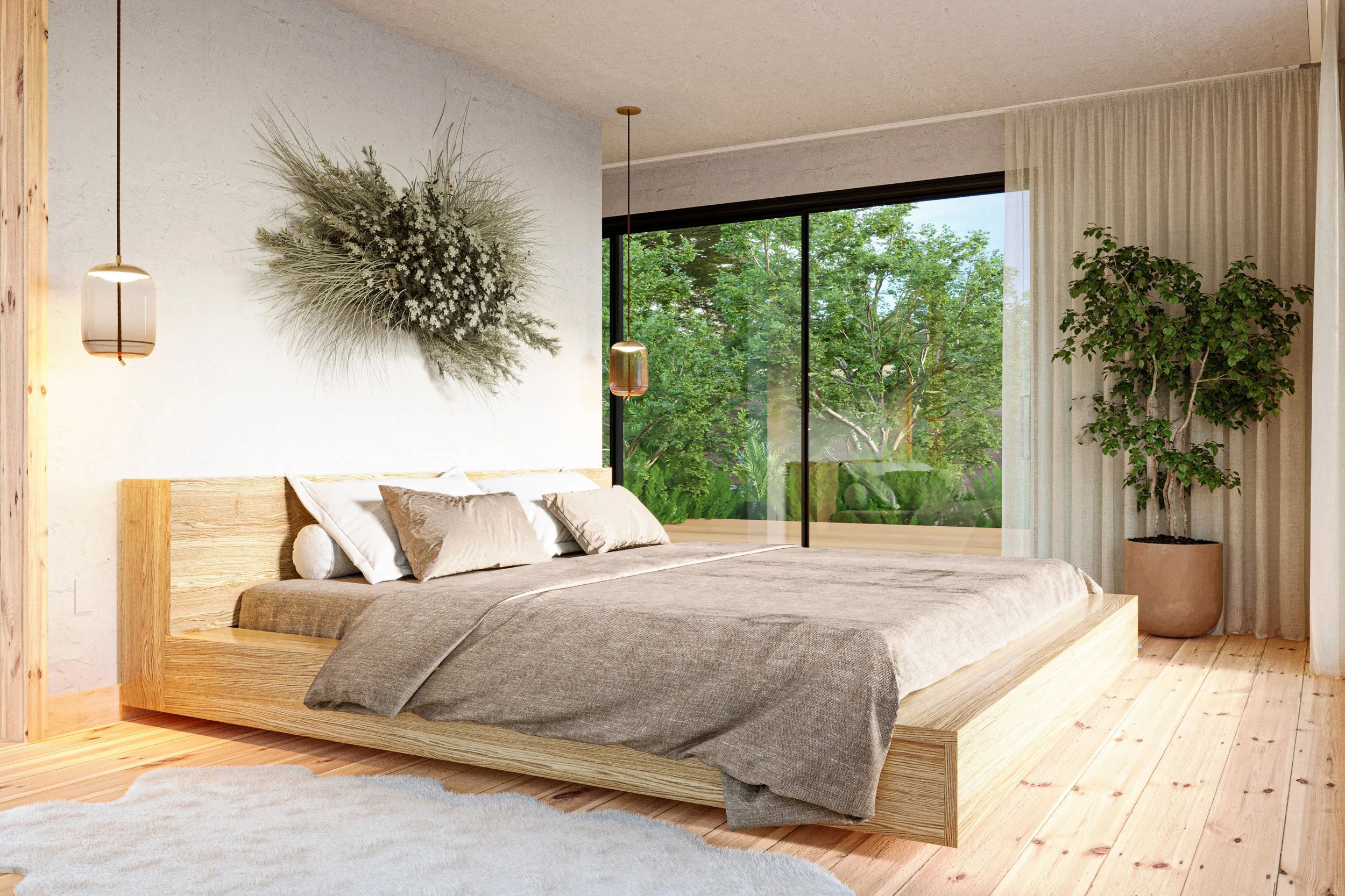
Lifespan Design: The Wellness Wing
A forward-thinking home must also account for life’s transitions. We often design one primary sanctuary on the ground level, not out of immediate need but as a proactive wellness wing.
These spaces use universal design principles, incorporating curbless showers and wider clearances without sacrificing luxury. A dedicated space for recovery or health management allows for individualized care without disrupting the partner’s well-being (Troxel, 2021). Whether for temporary recovery or a long-term shift in mobility, these suites ensure the home remains a place of comfort and dignity, not a source of stress.
Conclusion: Living Without Compromise
In the modern luxury home, the most valuable commodity is the ability to live as one chooses. The shift toward individual sleeping sanctuaries represents a maturation of residential design, moving away from societal expectations and toward a more enlightened understanding of health, identity, and partnership.
By designing for autonomy, we create homes that do more than house us; they support our biology and protect our relationships. Living like royalty is not about the size of the bed, but the quality of rest and the freedom to be oneself.

Sarah Barnard is a WELL and LEED accredited interior designer and creator of environments that support mental, physical, and emotional wellbeing. She creates highly personalized, restorative spaces that are deeply connected to art and the preservation of the environment. A certified California Naturalist, Sarah believes in celebrating nature through responsible design that works symbiotically with the local environment.
An advocate for consciousness, inclusivity, and compassion in the creative process, Sarah has appeared in Architectural Digest, Elle Décor, Vogue, HGTV, and many other publications. Sarah was recognized as a "Ones to Watch" Scholar by the American Society of Interior Designers (ASID) and has been awarded "Best of Houzz Design" for seven consecutive years. Sarah's MFA in visual arts from Claremont Graduate University informs her practice and innovative approach toward interior design as creating a living work of art.
Works Cited
International WELL Building Institute. WELL Building Standard v2. 2020.
Pulling Back the Sheets: Exploring the Impact of Sleep on Couples' Relationships. Sleep Research Society, 2024.
Storm, Nina. "The Importance of Personal Space in a Relationship." University of California, Berkeley, 2023.
Troxel, Wendy M. "Multilevel Analysis of Sleep and Relationship Quality." PubMed Central, National Institutes of Health, 2021.
The Future of Flourishing: A First Look at the Unified WELL Standard
We believe the environments we inhabit should do more than house our daily activities; they should actively support our well-being. This philosophy is why we closely follow the evolution of the WELL Building Standard, the global benchmark for health-centric design.
Recently, the International WELL Building Institute (IWBI) shared a significant milestone: the next version of the WELL Standard is now open for public comment through May 1. This "One WELL" vision is a thoughtful reimagining of how we create, measure, and sustain spaces that put people first.
A Unified Vision for Health
The most significant shift in this update is the move toward a unified, harmonized standard. Previously, different types of projects, from commercial offices to residential spaces, navigated separate frameworks. The new preview consolidates these into a single cohesive system.
This "One WELL" approach ensures that whether we design a private sanctuary or a community hub, the core principles of human health remain consistent and accessible. It’s a more intuitive way to look at the building blocks of wellness, making it easier for designers and inhabitants to understand how a space supports them.
What is Changing?
While the rigorous, evidence-based strategies that define WELL remain the foundation, the way we interact with them is becoming more streamlined. Key updates in this preview:
Integrated Ratings and Certification: In a shift that honors every effort made toward health, the new structure ensures that "every step forward counts." Points earned toward specific health, safety, or equity ratings now count toward full WELL Certification.
Thematic Groupings: Strategies are now organized into intuitive themes. This allows design teams to pinpoint goals, such as mental health support or restorative lighting, with greater precision.
Clearer, Global Language: The requirements have been rewritten to be clearer and more scannable. This shift away from dense technical jargon makes the standard more adaptable across global markets and easier for homeowners and business owners to implement with confidence.
Rewarding Progress: Preconditions, the mandatory baseline requirements, will now qualify for points across the board. This recognizes the value of these fundamental health features and rewards projects for their commitment to baseline excellence.

Designing for the Whole Person
At its heart, the evolution of the WELL Standard is about making "people-first places" the norm rather than the exception. By refining the concepts we've championed, like air, light, mind, and community, this update makes it simpler to weave wellness into the fabric of a building.
For example, the updated standard continues to prioritize:
Restorative Spaces: Creating opportunities for quiet reflection and connection to nature to mitigate daily stress.
Environmental Quality: Ensuring the invisible elements, the air we breathe and the water we drink, are held to the highest purity standards.
Inclusive Design: Expanding the community concept to ensure spaces are equitable, accessible, and welcoming to all, regardless of physical abilities or backgrounds.
Why Your Voice Matters
The IWBI is seeking feedback from the community of designers, architects, and occupants who live and work in these spaces. The public comment period is an opportunity to ensure the standard remains practical and impactful for real-world application.
By participating in this process, we contribute to a future where our buildings are tools for longevity and joy. As this new version moves from preview to final release, it promises to make the journey toward a healthier home or workplace more efficient and rewarding.
Sarah Barnard, WELL AP + LEED AP, is a leading interior designer of personalized, sustainable spaces that support mental, physical, and emotional wellbeing. She creates highly personalized, restorative spaces that are deeply connected to art and the preservation of the environment. An advocate for consciousness, inclusivity, and compassion in the creative process, Sarah has appeared in Architectural Digest, Elle Décor, Vogue, HGTV, and many other publications. Sarah was honored as a “Ones to Watch” Scholar by the American Society of Interior Designers (ASID).
References & Further Reading
For those interested in the rigorous science and evolving frameworks behind the One WELL vision, the following resources provide the foundational data and official guidelines used to develop these health-centric strategies:
Primary Sources
International WELL Building Institute (2026). The WELL Building Standard: Concept Directory. An overview of the eleven core categories of human health in the built environment.
International WELL Building Institute (2026). One WELL: A Unified Vision for the Future of Health. Official announcement regarding the harmonization of WELL programs and the public comment period.
IWBI Public Comment Portal (2026). Standard Preview and Feedback Forum. The active platform for reviewing side-by-side comparisons of v2 and the upcoming enhancements (Open through May 1, 2026).
Foundational Research
Allen, J. G., & Macomber, J. D. (2020). Healthy Buildings: How Indoor Spaces Drive Performance and Productivity. Harvard University Press. A key text often cited by IWBI regarding the economic and cognitive benefits of healthy offices.
World Health Organization (WHO). Guidelines for Indoor Air Quality. The scientific basis for many of the Air and Materials requirements found within the WELL Standard.
Global Wellness Institute. Wellness Architecture & Design Initiative. Research exploring the intersection of the built environment and holistic human health.

Celebrating Wellness by Design: Sarah Barnard Design Receives Best of Houzz Award
We’re excited to share that Sarah Barnard Design has been recognized by the global Houzz community with the Best of Houzz 2026 award for Design.
As our homes play a bigger role in our lives, this recognition feels especially meaningful. It’s more than just about looks; it affirms our belief in caring design, holistic wellbeing, and the strong link between our spaces and our health.

Designing for the Senses and the Soul
This award is especially meaningful because it comes from the homeowners in the Houzz community. Only the top 3% of over 3 million home professionals are recognized for having the most popular designs, as chosen by millions of users. When people save our photos, share ideas, and connect with our work, it shows a real desire for spaces that not only look good but also feel good.
Sarah Barnard Design is known for creating personalized, restorative spaces. By using biophilic design, sustainable materials, and understanding sensory needs, Sarah crafts homes that feel like true sanctuaries. From peaceful coastal retreats to earthy living spaces that bring nature inside, each project reflects the people who live there. This award honors our personal, wellness-focused approach that connects with so many.
A Tradition of Excellence
This 2026 award is another proud moment in our history with Houzz. We’re truly grateful for the community’s ongoing support, which has now brought us our 12th Houzz honor.
From favorites like the Ocean View Penthouse to our latest projects, your support inspires us to keep exploring what makes a home healthy and happy. This decade of recognition shows our dedication to blending environmental responsibility with great design. We’re committed to growing with our clients and to the value of thoughtful, wellness-focused design.
Nature-Inspired Color Trends
Every year, major paint brands choose a color of the year. They devote a lot of time and research to color choices, and often, the choices reflect what consumers want and need in their lives at a given point in time, rather than being predictive.
What do the color choices this year tell us about what we want from our homes? Many of the paint picks this year are grounding, represent a back-to-basics simplicity, and encourage pause to enjoy small, but significant moments.
There are a number of greens and browns on offer this year, but two of the most effective at eliciting calm, and are useful tools for rewilding, are Dunn-Edward’s Midnight Garden and Benjamin Moore’s Silhouette.
Begin Your Design Journey
Are you inspired to transform your own home into a personalized space that nurtures your well-being? We would love to hear about your vision, your needs, and what home means to you.
Sarah Barnard, WELL AP + LEED AP, is a leading interior designer of personalized, sustainable spaces that support mental, physical, and emotional wellbeing. She creates highly personalized, restorative spaces that are deeply connected to art and the preservation of the environment. An advocate for consciousness, inclusivity, and compassion in the creative process, Sarah has appeared in Architectural Digest, Elle Décor, Vogue, HGTV, and many other publications. Sarah was honored as a “Ones to Watch” Scholar by the American Society of Interior Designers (ASID).

How Nature-Inspired Colors Can Help Create Calm Through Rewilding
Even in a built environment, there is a place for nature, especially in creating spaces that support health, wellness, and mood. As we look to our homes for shelter and sanctuary, nature-driven design, such as rewilding, is becoming more important.
Rewilding is the practice of minimizing human intervention to let nature lead the way, both aesthetically and experientially, respecting and observing natural life cycles and systems. In practical terms, this might mean restoring native flora and fauna around our homes. This invites the local ecosystem to flourish, while providing us with a deeper, more authentic connection to nature.
Rewilding, as a design strategy, can also be done indoors, creating a warm and supportive space where we are consciously connected with nature. The benefit and beauty of rewilding, indoors and out, is how it subtly, but significantly, re-focuses our connection with nature.

Color Choices for Rewilding
Earth-inspired color choices are impactful as design tools in the context of rewilding, particularly greens and browns, given their place in nature and the psychological and emotional meanings they represent.
“Color can be a very powerful tool in interior design. It’s visually transformative and has a strong psychological influence. When used strategically, it can be useful in establishing an emotional connection to a home,” says Sarah Barnard, WELL and LEED-accredited interior designer. Barnard specializes in creating home designs that support mental and physical wellness. Integrating nature and connecting with the local environment are key to her design philosophy and wellness objectives.
“When using a nature-inspired color palette, especially earthy greens and browns, the effects can be calming and restorative," she says.

Research shows that often, people find green calming and nurturing. Exposure to green has been said to lower blood pressure, and some scientists say that our feel-good connection is hardwired into our brains from our hunter-gatherer days, in that green in nature equals opportunity for rest, shelter, and nourishment. Some say that green helps create focus and clarity, representing life, balance, and harmony.
Meanwhile, browns are inherently earthy and grounding. Brown is associated with strength, self-care, and warmth. In Feng Shui, brown represents the earth element and is used for stability in interior design.

Nature-Inspired Color Trends
Every year, major paint brands choose a color of the year. They devote a lot of time and research to color choices, and often, the choices reflect what consumers want and need in their lives at a given point in time, rather than being predictive.
What do the color choices this year tell us about what we want from our homes? Many of the paint picks this year are grounding, represent a back-to-basics simplicity, and encourage pause to enjoy small, but significant moments.
There are a number of greens and browns on offer this year, but two of the most effective at eliciting calm, and are useful tools for rewilding, are Dunn-Edward’s Midnight Garden and Benjamin Moore’s Silhouette.

Midnight Garden by Dunn-Edwards
Green is popular this year, but Midnight Garden is particularly well-suited for rewilding. That's because this green is grounding, literally. It’s a mossy green, inspired by moss, clover, lichen, and other ground cover. It’s a deep green, with blue undertones.
Dunn-Edwards says the color is inspired by the simple elegance of nature and is borne of a growing consumer desire for restorative spaces at home. They suggest that green, and this shade in particular, is an effective way to connect with nature through conscious design.
This color closely replicates plant matter, making the rewilding experience immersive. It’s a darker, more saturated hue that gives off forest vibes and can replicate some of the calm associated with forest bathing. Beyond natural ground cover, think of mature tree canopies, dense foliage, and twilight, all opportunities for stillness and reflection. Its plant-like coloring draws focus to regeneration, photosynthesis, and renewal.
In addition to its calming qualities, Dunn-Edwards promotes this color’s versatility as an accent or a main color.
“Midnight Garden is the green that works everywhere, from cabinetry and walls to accents and exteriors,” said Lauren Hoferkamp, color marketing manager at Dunn-Edwards, in a press release. “Its versatility makes it equally at home on interiors and exteriors, pairing effortlessly with natural textures, warm neutrals, or sleek minimalism.”
Benjamin Moore’s Silhouette
Silhouette is a rich, earthy brown, with hints of charcoal. It leans heavily into timeless design, and like Midnight Garden, it is grounding.
The color is inspired by the luxury of finding joy in simple things, which we only experience when we pause and take the time to notice.

Silhouette offers “a luxurious blend of burnt umber and delicate charcoal undertones,” said Andrea Magno, director of color marketing & design at Benjamin Moore, in a press release. “This hue has the versatility and softness to bring a space from expected to exceptional.”
It’s deep and dark, reminiscent of many of the materials we find in nature: the earth, weathered tree bark, clay, unfinished wood, and soil on the forest floor. It lends a sense of cozy connectedness, much like we experience when immersed in nature. Silhouette lends itself well to rewilding because it serves as a quiet backdrop, letting other colors and natural materials be impactful.

Using Earth-Inspired Colors at Home
“These earthy paint colors work well in spaces throughout the whole home, and can be applied with intention,” says Barnard. “Think about how rooms are used, and how applying various hues can foster a connection with nature and generate calm.”
Here are some suggestions:
For example, in a high-traffic, task-oriented space such as the kitchen, Midnight Garden can be energizing and uplifting, while earthy browns, such as Silhouette, can offer grounding.
Both are good choices for biophilic decor in bedrooms to create a serene environment geared for sleep.
Nature-inspired browns can help create a sense of cozy enclosure, a good choice for a snug reading nook or library.
In spaces where gathering is the goal, such as dining rooms and living rooms, mossy greens can encourage us to pause and absorb the joy of the moment, while rich browns can prompt us to slow down and relax.

Sources
https://www.verywellmind.com/color-psychology-green-2795817
https://www.verywellmind.com/the-color-psychology-of-brown-2795816
https://www.dunnedwards.com/colors/browser/de5657/
https://www.dunnedwards.com/press-releases/dunn-edwards-announces-midnight-garden-as-2026-color-of-the-year/
https://www.benjaminmoore.com/en-ca/press/benjamin-moore-announces-colour-of-the-year-2026
https://www.elledecor.com/design-decorate/color/a69034685/benjamin-moore-color-of-the-year-2026
Sarah Barnard, WELL AP + LEED AP, is a leading interior designer of personalized, sustainable spaces that support mental, physical, and emotional wellbeing. She creates highly personalized, restorative spaces that are deeply connected to art and the preservation of the environment. An advocate for consciousness, inclusivity, and compassion in the creative process, Sarah has appeared in Architectural Digest, Elle Décor, Vogue, HGTV, and many other publications. Sarah was honored as a “Ones to Watch” Scholar by the American Society of Interior Designers (ASID).
Mindfully Creating Supportive Spaces to Aid With Visual Impairment
While interior design generally relies on common principles, the end user and their specific needs should guide the design. Home design can play a crucial role in creating a space that fosters independence, comfort, safety, and confidence. Specific choices can facilitate navigation and, when done intentionally, blend thoughtfully into the overall design.
Why interior design choices matter with visual impairment
When affected by visual impairment, physical space and how it is structured and perceived can either create obstacles in daily living or, conversely, make life easier, including aspects such as lighting, layout, furnishings, and more.
Sarah Barnard is a WELL and LEED-accredited interior designer. Her inclusive studio’s work is guided by how clients of all abilities use their spaces daily. Using tools such as field testing and an interactive process that engages clients and incorporates their feedback, Barnard translates individual needs into design elements for clients to choose from.
When designing for individuals with visual impairment, Barnard understands the nuance of color, contrast, lighting, materiality, and layout, and how they all can combine to create comfort and usability. Having a thoughtfully designed home, with attention paid to elements that address specific visual challenges, can create a sense of safety and serenity that is frequently sought after.
While needs will vary from person to person, here are some design strategies to consider.

Layered, adaptive lighting
“Comprehensive home lighting that utilizes multiple light sources is crucial when designing for individuals with vision reduction due to aging,” says Barnard. “Combining overhead lighting, task lighting, and wall sconces creates a diverse lighting network that allows individuals to adjust illumination to suit their needs and preferences,” says Barnard.
“These preferences can be easily set and adjusted by incorporating a smart lighting system, which can be programmed to automatically adjust to lighting changes and individual preferences throughout the day. Smart lighting can be controlled through the convenience of a smartphone or voice activation, providing a convenient and accessible way to enhance visibility and comfort for individuals with vision impairment,” she says.

Prioritize natural light
While the inclusion of artificial lighting can help direct light on demand, access to natural light, and the distribution of light throughout the room are important. That’s in part because “Natural light boosts the overall brightness of a space, and more light means better visibility overall. Natural light is also typically softer and less fatiguing on the eyes than artificial light,” says Barnard.
Think of a space in terms of access to light, how light can be pulled into a room from outside, and then placement of these conduits. In design terms, this might mean large windows, skylights, and light wells. Light also needs an unfettered path to travel, so open concept floor plans work well, or in divided floor plans, transom and clerestory windows on interior walls, and French doors can help the flow of natural light.
However, glare can be problematic, so “ sheer or light-diffusing window treatments can help minimize glare within a space, improving visibility and comfort,” says Barnard.

Choosing finishes and glare reduction
Typically, finishes are chosen in a home to suit a particular aesthetic, but for individuals with vision impairment, there is a functional aspect: minimizing glare. “Glare from reflective surfaces can reduce visibility for individuals with vision impairment, making distinguishing objects from their background difficult, and can also cause discomfort,” says Barnard. Glare can also contribute to eye strain and visual fatigue.
The solution, says Barnard, can be matte over glossy or polished finishes. “Choosing matte finishes for flooring, countertops, and paint can help minimize glare from reflective surfaces within interior spaces, enhancing comfort, visibility, and safety.”
Create clear pathways for movement
“Maintaining clear paths free from obstacles is essential for safe and easy navigation throughout a space.” says Barnard. Custom-designed built-in storage units are a great way to reduce clutter. They are also designed to fit perfectly within a home's existing architecture and can be customized to suit individual preferences. Because they're integrated into the walls, built-in storage does not take up floor space, leaving paths of travel clear and open.
Embrace consistency from room to room with the layout and placement of items. Consider placing items such as furniture, lamps, switches, and wall controls in similar locations throughout the house. Predictability can aid intuitive and safer movement through a space.
Lean into contrast
With low vision, it can be difficult to see certain colors; using brighter colors and increasing contrast can help. “Incorporating a high-contrast color palette can help improve mobility and wayfinding,” says Barnard. Color perception is individual, so a personalized approach is warranted. “When considering what high-contrast color to paint these areas, conducting field tests with swatches is essential as some individuals may perceive certain colors better than others.”
To implement contrasts, she suggests:
Furniture that contrasts with the floor and wall color can help improve the visibility of these objects, creating safe pathways around them.
Painting doors, door frames, and handrails in a high-contrast accent color can help make them visually identifiable within a space.
Transitions between rooms can also be highlighted with contrasting colors or textured materials, such as a wood floor adjoining a carpeted area.
High contrast in areas such as bathrooms and kitchens, in particular, can help with safety. High-contrast counters and sinks in the kitchen can help to identify work zones, while high-contrast shower thresholds, toilet, and sink can aid safer movement.
Leverage acoustics
For individuals with visual impairment, leveraging acoustics in a built environment to navigate space can be helpful. Design with sound-proofing acoustic tiles and panes, and wall treatments to reduce echo and background noise, so that orientation in the space is easier, using sound.
Consider including sound-absorbing accents, such as soft furnishings, textiles, and window treatments, which can help to absorb vibration and echoes, making sounds crisper and clearer.

What these design strategies look like in practice
Barnard engages in a research and discovery process with clients to inform color, pattern, and other design element choices, with exploratory field testing that creates opportunities for clients to provide feedback on visual clarity and aesthetic preferences.
While each project and individual needs will vary, here are some examples.
If certain color combinations are difficult to distinguish, it can be helpful to avoid designs that place colors close together, which can create visual perception challenges. For example, with blue/yellow color deficiency, it is advisable to avoid patterns with yellow and blue close together.
In cases of severe vision impairment, high-contrast interiors can offer a simple yet effective solution. For example, walls and ceilings painted in a deep, saturated color, with trims along walls and doorways painted in a bright, contrasting color helps to indicate their location and assist with wayfinding. Field testing helps determine which contrasting colors resonate best in terms of visibility and personal aesthetic preferences.
Design is most useful and beautiful when it makes life easier and more comfortable, which is why every space should be considered in how we use that space, and what tools might help.
For example, mirrors are often used as a design tool to create a focal point or add decorative elements. However, mirrors and reflective surfaces aren’t always appropriate or desired by everyone. It’s possible to achieve some of the decorative aims of mirrors with other items. In a bathroom, where mirrors often hang, a large window can accentuate natural light, while a tiled wall could create an alternative focal point.
When design is approached intentionally and personally, there is an opportunity to shape spaces that enhance functionality and comfort for individuals with visual impairment.
Sarah Barnard Design’s website uses the Accessibe accessibility feature, which adapts the site to each user, customizing their experience. Click the blue circle with a white human figure to access customization options, including high contrast, text size adjustment, screen reader support, and more.

Sources
https://afb.org/blog/entry/independence-tips
https://www.ncoa.org/article/helping-people-with-blindness-and-vision-loss-continue-to-participate-in-everyday-activities/
https://pmc.ncbi.nlm.nih.gov/articles/PMC12082883/
Sarah Barnard, WELL AP + LEED AP, is a leading designer of personalized, sustainable spaces that support mental, physical, and emotional wellbeing. She creates highly personalized, restorative spaces that are deeply connected to art and the preservation of the environment. An advocate for consciousness, inclusivity, and compassion in the creative process, Sarah has appeared in Architectural Digest, Elle Décor, Vogue, HGTV, and many other publications. Sarah was honored as a “Ones to Watch” Scholar by the American Society of Interior Designers (ASID).

Thoughtful Intentions: Annenberg Wildlife Crossing
A quiet moment of recognition arrived this season. A national home design publication named Sarah a top interior design expert. It is an honor that reflects many years of thoughtful, careful work and the relationships that shaped it.

As the season settles in, this time of year offers a gentle pause and a chance to gather with loved ones. Our studio enjoys using this moment to reflect on the year behind us and set thoughtful intentions for the one ahead.

In the spirit of giving, we are excited to continue our tradition of making a holiday donation in honor of our friends and clients. This year, we are contributing to the Annenberg Wildlife Crossing, a significant conservation project currently under construction over the 101 Freeway near Agoura Hills. The project, which began in 2022, aims to reconnect the natural habitats of the Santa Monica Mountains and the Simi Hills, allowing mountain lions, deer, bobcats, birds, and many other species to move safely across the landscape. For decades, road expansion has divided these ecosystems, leaving wildlife isolated and vulnerable.

The crossing represents a collaborative effort involving state agencies, conservation organizations, scientists, and community supporters, all united by a vision of restoring a healthy ecological balance. Construction is currently at an exciting stage, with soil and native vegetation being installed on the bridge deck. As the planting progresses, the structure increasingly resembles the surrounding hillsides it aims to connect. The project is expected to be completed by 2026, and the first animals will likely cross the area shortly after the landscape is established.
Sustainable and compassionate practices remain at the core of what we do, and we hope our upcoming projects will continue to bring you joy and motivation.
May the spirit of the season fill your home with warmth and bring peace for the months ahead. Have a very happy and healthy holiday season!
Sarah Barnard, WELL AP + LEED AP, is a leading designer of personalized, sustainable spaces that support mental, physical, and emotional wellbeing. She creates highly personalized, restorative spaces that are deeply connected to art and the preservation of the environment. An advocate for consciousness, inclusivity, and compassion in the creative process, Sarah has appeared in Architectural Digest, Elle Décor, Vogue, HGTV, and many other publications. Sarah was honored as a “Ones to Watch” Scholar by the American Society of Interior Designers (ASID).

Creative Workspaces: Home Office Interior Design Reimagined
As a WELL and LEED-accredited interior designer specializing in spaces that support emotional and physical wellbeing, I have a particular passion for creative workspaces. Creative work can be inherently joyful and healing, and having a dedicated space, whether an entire room, a desk, or even a chair outdoors that is devoted to accessing a creative flow state, can be an excellent way to find support in the home. Even the intentionality of dedicating an area to creativity gives that work weight and importance, automatically making it a greater priority. The more care put into thinking about a creative space, or any space, the more likely it is to become a functional presence in life, which can be a great way to encourage positive and joyful habits.
One of the things I talk about with many of my clients is designing a space that is specific to their needs and preferences, and working with them to feel comfortable eschewing any expectations they may feel obligated to meet about what a room should look or be like. Many of us adapt to the environments we are in, rather than adapting our spaces to meet our needs. Increasingly, people are craving spaces and routines that feel aligned with who we are, rather than trying to match expectations that feel out of step with what actually works for us. When I’m working, I try to take to heart the idea of meeting my own environmental and emotional needs. Not only does it support my best creative work, but it also helps reinforce how important it is for the client to have this same experience, and makes me feel more connected to my goals as a designer.
I’ve come to learn that different parts of the creative and work process may be best supported by different surroundings. When I’m waking up my brain and body, I like to start the day in the garden. Nature is a huge part of my creative work, but it’s also where I find the most joy and feel most connected to the world and to myself. I love the quiet acts of caretaking as I tend to my plants, and seeing them progress and change reflects the seasonality and natural rhythms of the earth. Seeing the plant life and the birds, and collecting pine cones and seed pods, all help me ground and relax in a way that lends itself to creative thinking throughout the day. While I don’t necessarily spend the time in my garden looking for inspiration, it always finds me. Many of the colors, textures, and imagery in my client work and in the products of my home goods studio, Kale Tree, are inspired by time spent in my garden.

After feeling fully immersed in nature and ready to begin my day in the studio, I’ve found that limited sensory input gives me the most mental space and clarity for creative expansion and problem-solving. Soft, natural lighting, silence, minimal to no scents, and no distracting textures all contribute to a profound external quiet that lets my internal world take focus, and that is really when I can enter a creative flow state where I do my best work. Then, I can tap into the imagery and inspiration that guide my designs and connect with my clients' desires without the distraction of a conflicting external space.
Knowing that I need such minimal sensory input has really emphasized the importance of encouraging clients to honor their personal sensory sensibilities. Every person needs a space as individual as they are, and it’s so important to evaluate what works best for them. If there is a moment when someone really feels they are in a flow state and connecting with a positive feeling, creatively, taking a step back afterward to take stock of their environment can be a good way to reflect on what’s most supportive.

So often, expectations around design can override actual habits and preferences. A common anecdote from clients remodeling their homes is that, although they currently have a designated home office, they usually work at the kitchen table. Knowing this becomes a great opportunity to reconsider the idea of a home workspace and embrace personal sensibilities, rather than expectations about what a home office should be or look like. Is it the warmth and comfort of being around family? The openness of the space, or a more expansive view? Maybe it’s not abandoning a home office altogether, but creating a space that adapts more to a work environment that is actually pleasurable. Taking the time to evaluate what is supportive and what makes it easier for someone to access a flow state can lead to perhaps more unconventional spaces, but also more productive ones. Re-examining how we approach these concepts and environments is one of the most exciting parts of my job and one of the best ways to help my clients physically and emotionally.
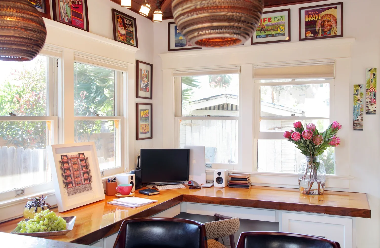
Sarah Barnard is a WELL and LEED accredited designer and creator of environments that support mental, physical, and emotional wellbeing. She creates highly personalized, restorative spaces that are deeply connected to art and the preservation of the environment. A certified California Naturalist, Sarah believes in celebrating nature through responsible design that works symbiotically with the local environment.
An advocate for consciousness, inclusivity, and compassion in the creative process, Sarah has appeared in Architectural Digest, Elle Décor, Vogue, HGTV, and many other publications. Sarah was recognized as a "Ones to Watch" Scholar by the American Society of Interior Designers (ASID) and has been awarded "Best of Houzz Design" for seven consecutive years. Sarah's MFA in visual arts from Claremont Graduate University informs her practice and innovative approach toward interior design as creating a living work of art.

Sarah Barnard's Nature Inspired Style: California Flowers, Birds, and Butterflies

Sarah Barnard, WELL + LEED AP, loves to incorporate the beauty of nature into her interior design projects. The Los Angeles-based designer believes biophilic design forms a powerful indoor-outdoor connection that can create healing, peaceful, and rejuvenating spaces within our homes.

This mood board, created while developing an original Matilija Poppy fabric print for Kale Tree (the product design studio of Sarah Barnard Design), captures the process of designing luxury home goods incorporating biophilic design. Kale Tree often works with local artisans to create textile, wallpaper, and rug designs inspired by native Californian flora, fauna, and the natural landscapes surrounding Los Angeles. Color, texture, and material all play a vital role in capturing the joyful beauty of a Matilija Poppy blooming in spring, bringing the beauty of the natural world within our home.

Much of Sarah's design philosophy is rooted in the joy and peace we encounter within nature and finding ways that biophilic design can mirror that experience within our home. Here, Sarah shares some of her favorite things that inform the core inspirations within her design practice.

1. Animals
Sarah loves all animals and is a dedicated dog owner who has adopted many pets over the years. Providing a loving home for mature rescue dogs is a rewarding and joyous experience; a great dane named Stevie (named after Stevie Nicks), a miniature pincher named Bean, and a toy poodle named Lucy, who was a beloved member of Sarah's family and the kale tree team for many years, have all held a special place in Sarah's life. In 2024, Sarah adopted a mini red poodle/labradoodle named Calliandra from California Poodle Rescue. Calliandra is named for the California native plant, the pink fairy duster.

2. Good Food
Sarah believes that good food should leave us feeling nourished in mind and body. Growing and preparing our own food is a meditative and fulfilling act that can contribute to a happier and healthier life. Our kitchens can be ergonomically designed to support this garden practice and other daily healthy habits but also facilitate and celebrate the pleasure of baked goods such as cookies, pies, and biscuits, which Sarah loves to make and share.

3. California Native Flowers.
Flowers, by their very nature, are beautiful and joyful. California is home to many unique species, such as the Matilija Poppy, Mallow, and the California Poppy, whose super blooms attract thousands of visitors each spring. Sarah loves to incorporate illustrations and color palettes inspired by some of these native wildflowers in designs by Kale Tree, such as the Matilija Poppy printed on Belgian linen in petal, putty, bluestone, and midnight colorways and the Mallow textile, printed on organic cotton in evening mauve, dusty dawn and midnight forest colorways.

4. Butterflies and Moths.
Butterflies and moths play an important role as pollinators within our local ecosystem while bringing joy and beauty into the natural landscape. The Moth textile from Kale Tree was designed to incorporate the color and texture of Belgian linen within the design, as this material is visible through the delicate moth silhouettes printed on top.

5. Birds.
Whether out on a hike or observing a birdfeeder in the privacy of our backyard, birdwatching can be a mindful and rewarding way to interact with our natural surroundings. As an avid birder, Sarah finds much joy in observing and photographing the birds that live in her garden and surrounding national parks. Sarah's favorite birds include the Hermit Thrush, California Quail, and Annas Hummingbird; each has unique characteristics that make them a joy to encounter. The Hermit Thrush sings a beautiful flute-like song.

The California Quail is a small ground-dwelling bird with a distinctive crest that curves in front of its face and is prone to sprinting along the landscape in small flocks.

Male Annas Hummingbirds initially appear dull brown or grey; however, they are revealed like magic in direct sunlight to have beautiful green and pink iridescent feathers.

6. Rock and Stone Formations.
Natural stone formations generated within the earth can be integrated into our homes as furnishings, countertops, and other awe-inspiring architectural elements. The monumentality of this material connects and grounds us within the enduring timeline of the natural world.

7. Sunset Color Palette.
Sarah's favorite color palettes are often inspired by pink, blue, and teal, which form in the sky as the sun sets in the evening. She loves integrating these colors into projects to capture dusk's stillness, tranquility, and beauty.

8. Silence.
Sarah makes time and space for silence, peace, and solitude as a mindful daily practice. This can be facilitated within design projects through furnishings that soften harsh sounds, interior layouts that prioritize private space, or a dedicated meditation or wellness room.
Sarah Barnard, WELL AP + LEED AP, is a leading designer of personalized, sustainable spaces that support mental, physical, and emotional wellbeing. She creates highly personalized, restorative spaces that are deeply connected to art and the preservation of the environment. An advocate for consciousness, inclusivity, and compassion in the creative process, Sarah has appeared in Architectural Digest, Elle Décor, Vogue, HGTV, and many other publications. Sarah was honored as a “Ones to Watch” Scholar by the American Society of Interior Designers (ASID).
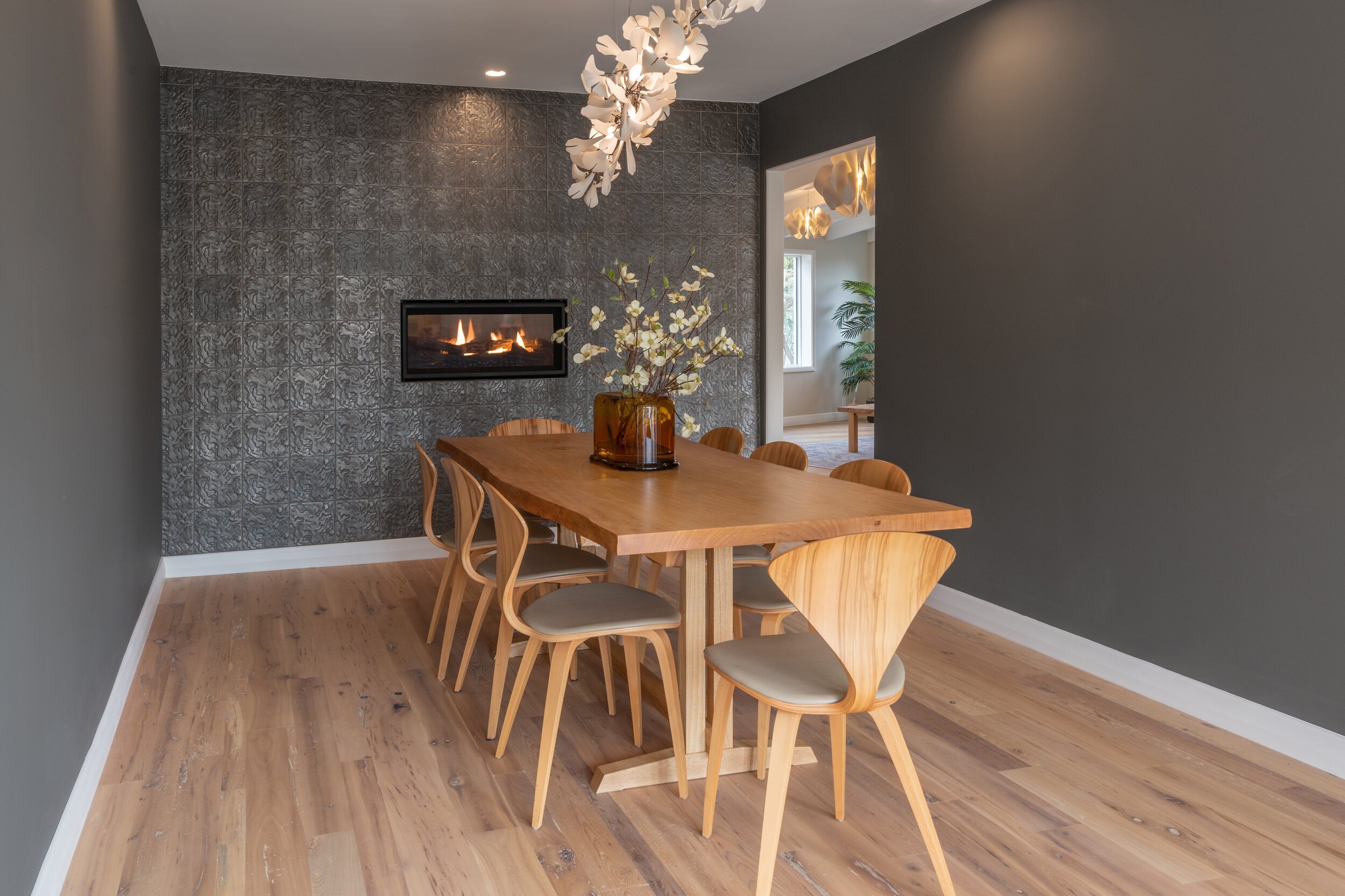
Healthy Home Basics: How Paint Impacts Our Emotional, Physical, and Environmental Health

The presence of paint in our homes is so prevalent that it often becomes overlooked as a building material. Paint can significantly impact our home spaces, with the ability to affect our mood and personal and environmental health. Color has been shown to have the ability to influence mindset and energy levels, and the thoughtful selection of paint color can help create a home space that aligns with personal goals for wellbeing. Earth tones are often considered to have a grounding, calming effect, with naturals offering a sense of peace and calm. More vibrant, saturated colors can energize a space, contributing to warm social atmospheres or promoting invigorating creative or exercise spaces. Many colors can also have symbolic connections or personal associations that can be used to create a certain mood or atmosphere. Taking the time to sample and explore colors that align with personality and design intent can help create a space that improves wellbeing and supports emotional goals.

While color is an important factor in paint selection, the use of paint in our built environments goes beyond color, with different paint types and qualities affecting aesthetics and our home's health. The ingredients of paint can vary, and researching material makeup can be important when selecting paint that aligns with goals, whether that relates to durability or an emphasis on organic and safe materials.
In the United States, the majority of buildings use acrylic latex paints for their interior and exterior spaces, and it's what most commonly comes to mind when hearing the term house paint. However, a wide range of alternative paints is available, and even within the realm of latex paints, there are many options and considerations when purchasing paint. One crucial factor is the impact and presence of volatile organic compounds or VOCs. VOCs are gases that many materials may emit, including chemical compounds that contribute to pollution and can harm health. Avoiding VOCs can be an essential step towards improving home and environmental health during the design and build process.

Fortunately, there are a variety of paint types suitable for a variety of needs and priorities.
Mineral Paint.
Mineral paints are a category of paints that use a mineral binder, typically lime or potassium silicates. Potassium silicate mineral paint can be an excellent interior paint for its natural makeup, endurance, and aesthetically pleasing attributes. When considering home health benefits, organic mineral paints typically have no VOCs and are permeable. Unlike acrylic latex paints, which can create a seal on walls once applied, the permeability of mineral paints allows air to travel, preventing moisture from being trapped in the walls and reducing the risks of mold and mildew. The mineral base of the paint also creates a beautiful quality of light, with color that responds to the lighting in the room, which can create an environment that is responsive to lighting shifts throughout the day. Because of their mineral base, these paints often respond similarly to concrete when interacting with other materials and substances, creating enduring benefits for the material and contributing to its longevity. As the paint manufacturer Keim notes, "Mineral paint systems are based upon penetration (silicification) of the binder into the substrate. A strong, permanent bond is created between the paint and the underlying substrate (e.g. render, natural stone, concrete). This potassium silicate binder is highly resistant to weathering, ensuring an extremely long-life protective finish, reducing the frequency of re-decoration cycles." 1 The material's rigidity makes it well-suited for masonry and most interior wall applications, but it may be less adequately suited for materials like wood or metal that may shift and benefit from a more flexible coating. Another consideration of the mineral base, particularly in bathroom or kitchen spaces, is that, like concrete, the color will darken when wet and resume its natural coloration once dried. When cleaning, it's best to soak and blot the paint gently to remove any marks or stains, as any aggressive scrubbing can polish the paint, leaving shiny spots on the surface.

Lime Paint.
Lime paints are very similar to silicate paints, with many overlapping qualities. The primary difference is that lime paints are often more of a wash and lack some of the more durable qualities of potassium silicate paints, requiring more maintenance over time. Limewash has a textured appearance and slight color variation, adding a lightly weathered, historied look that can contribute character to interior spaces. Like silicate mineral paints, lime wash is an excellent option for natural paint.

Milk Paint.
Milk paint is an organic option, favored for its non-toxic ingredients. As the name suggests, the paint uses casein, a milk protein, as one of its key ingredients. Milk paint is often sold as a dried pigment mixed with water shortly before use. Because of the powder base, the color of milk paint usually has less of a smooth consistency, which can be great when creating a more antiqued finish but is an essential consideration if hoping to achieve even color. Because the paint arrives in a powder, it's easy to personalize and mix colors by blending pigments, offering many opportunities for easy customization. Because of the paint's natural properties, it does not store well once mixed and should be used within a day or two after mixing. Milk paint has a matte, chalky finish, and the colors are often slightly muted, which can be great for achieving a historical aesthetic. The material is also helpful in creating a weathered look or an antique finish on furnishings. Milk paint is very safe to use and can be an excellent option for achieving specific aesthetic goals, though less durable than many mineral and latex options.

Chalk Paint.
Chalk paint is typically made with plaster of Paris or calcium carbonate and is water-based. The finish is very similar to milk paint's matte, soft appearance. However, it requires minimal preparation and applies easily to many surfaces. Unlike milk paint, chalk paint comes pre-mixed and not in a powder form and can be stored similarly to other liquid paints.

Acrylic Latex Paint.
Acrylic latex paints are the most common interior house paints. They are often selected for familiarity, durability, price point, and range of colors and finishes. While there are many benefits to using acrylic paints, they are derived from synthetic materials, significantly contributing to microplastic pollution, with many paint options impacting air quality. Parson's Healthy Materials Lab lays out some of these concerns in a blog post regarding paints, noting, "Most people know about volatile organic compounds (VOCs) in paints and know to look for no or low VOC acrylic paints. But other materials in acrylic paints like binders, pigment, and other additives are equally as toxic. For example, alkylphenol ethoxylates (APEs)—a group of chemicals combined in acrylic paint for viscosity—are suspected endocrine disruptors, leading to hormonal dysfunction in humans and animals, and the disruption of marine life." 2 Many companies are now making an effort to address these concerns, with more companies offering no or low VOC options. More companies are also manufacturing hybrid paint options with high mineral content and synthetic binders.

Vegan Considerations.
If using vegan materials is a priority, it's important to look for companies or paint lines that explicitly specify that they are vegan-friendly. While options like milk paint may be more obviously non-vegan, some paints may use animal byproducts as an ingredient in their binders or pigments. Because there is often a more limited selection of vegan paints, it may be helpful to begin by first searching for vegan paints and researching the paint material and makeup from there if specifying vegan materials is an important consideration.

When designing an interior space, paint is an essential component, with considerations beyond color. With any project, it's important to consider personal priorities, research options, and sample products to learn what materials best align with goals and aesthetic tastes. With the wide range of paint materials available, there are now more opportunities than ever to find paints for a happy, healthy home.
Sarah Barnard is a WELL and LEED accredited designer and creator of environments that support mental, physical and emotional wellbeing. She creates highly personalized, restorative spaces that are deeply connected to art and the preservation of the environment. An advocate for consciousness, inclusivity, and compassion in the creative process, Sarah has appeared in Architectural Digest, Elle Décor, Vogue, HGTV and many other publications. Sarah was recognized as a "Ones to Watch" Scholar by the American Society of Interior Designers (ASID).
1. "Benefits of Using Mineral Paints." Benefits, www.keim.com.au/benefits.html. Accessed 22 June 2023.
2. "Paint: Acrylic vs. Mineral." Healthy Materials Lab, healthymaterialslab.org/blog/paint. Accessed 22 June 2023.

California Barbie Style: Eco-Friendly Interior Design in Every Shade of Pink
Barbie is making a splash this year, with pink taking center stage in 2023. From Pantone’s vivid magenta to the classic Barbie pink, the high-frequency pinks of childhood seem to be a central component of many recent design trends. For many, “Barbie” conjures a specific time, audience, and aesthetic, defined by playrooms evoking cotton candy in color and spirit.
While there is much to celebrate about these pop-perfect, joyous spaces, there is ample room in the Barbie zeitgeist for a subtler, more sophisticated approach, with more takes on pink available than there are lines on Barbie’s resume. Peach Fuzz, Pantone’s color of the year for 2024 is a great example of tones that emulate the joy and fun of Barbie to create calm and nurturing living spaces.


Paler pinks offer a softer variant of more vibrant Barbie hues as if filtered through a cloud of nostalgia. These quieter shades provide more versatility, both in a practical design sense and in their approachability to a broader audience.
Although pink is enduring enough to incorporate into long-lasting design changes, textiles offer an opportunity to swap out shades throughout the year. Textiles can influence how we read color in a space while providing flexibility. Layering pink through throws, pillows, and window treatments can create a more significantly pink aesthetic while pairing with more neutrals and earth tones keeps it more muted.


For those that may feel tentative about a predominately pink space, opting for pink as an accent color embraces the more playful elements of the hue without overindulging in whimsy. Paired with pale, dusty shades of blues, purples, and greens, pink can still have a daydreamy effect while feeling more grounded and grown up.

Because of pinks prevalence in nature, looking toward more organic points of inspiration can create a space that feels more soothing than saccharine. Soft, floral, petal pinks and peach tones can feel ethereal and calming. When using nature-inspired patterns, these hues feel intuitively integrated into spaces that evoke natural themes or utilize organic materials.
Using pink or peach to break up a neutral-leaning space can also add warmth and a sense of comfort.


While Barbie has historically lived in a world of synthetics, the “Eco-Leadership Team” Barbie set released in 2022 reflects the prioritization and growing importance of sustainability and environmental preservation. Many of us may desire a more nature-driven space, both in terms of aesthetics and ethics.


There are many ways to incorporate pinks while utilizing natural and responsibly produced materials. Using sustainably sourced and produced products and materials can be a great way to incorporate bright and playful energy into the space while supporting eco-friendly solutions.
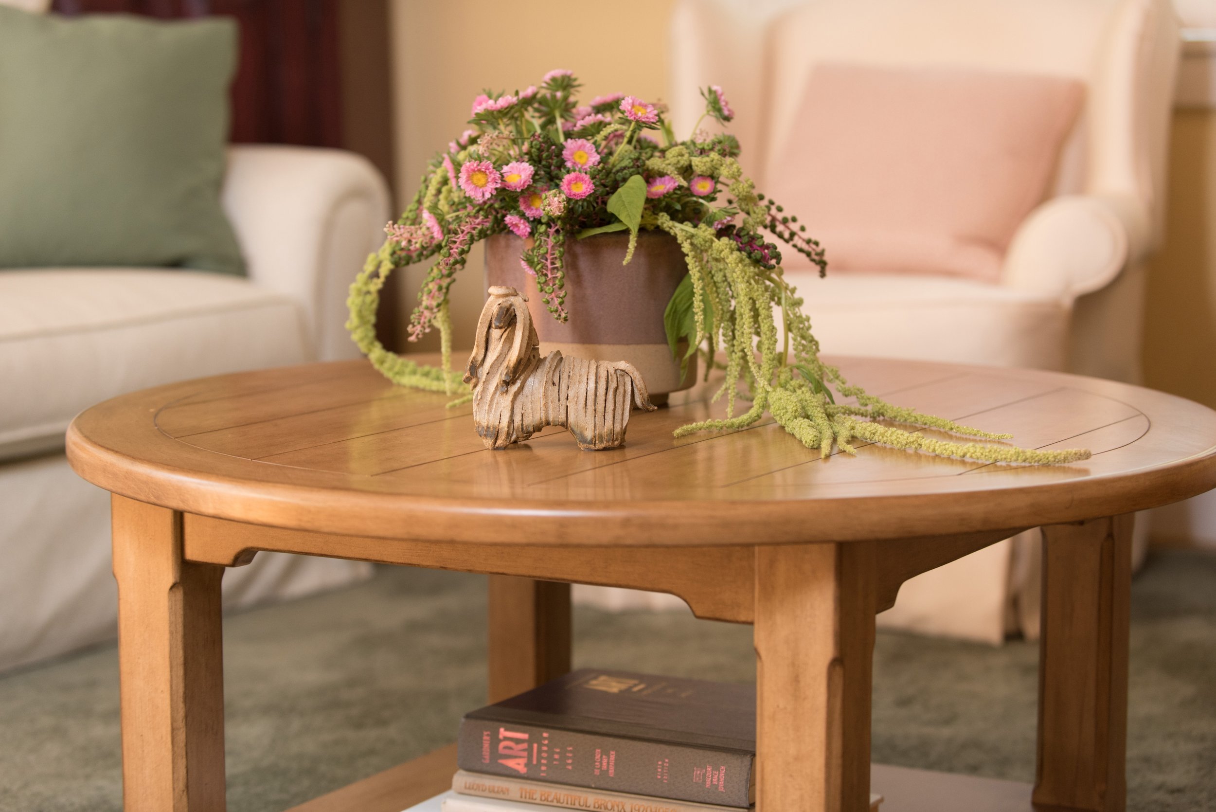


Peaches and corals also achieve some of the vibrancy of pink with a more approachable edge. These pink tones can also bring out the warmth in cream tones and woods, creating an environment that balances energy with an inherent sense of coziness.


Coral tones are also an excellent option for a fresh take on coastal spaces, straying from traditional blues and teals. Warm coral shades feel inherently beachy and offer a play on pink that’s grounded in nature.


While subtler takes on the traditional Barbie pink are often more practical in shared spaces, kid’s rooms offer the opportunity to fully embrace the vibrancy and youthfulness of pinks, with layered pink tones creating depth and texture.
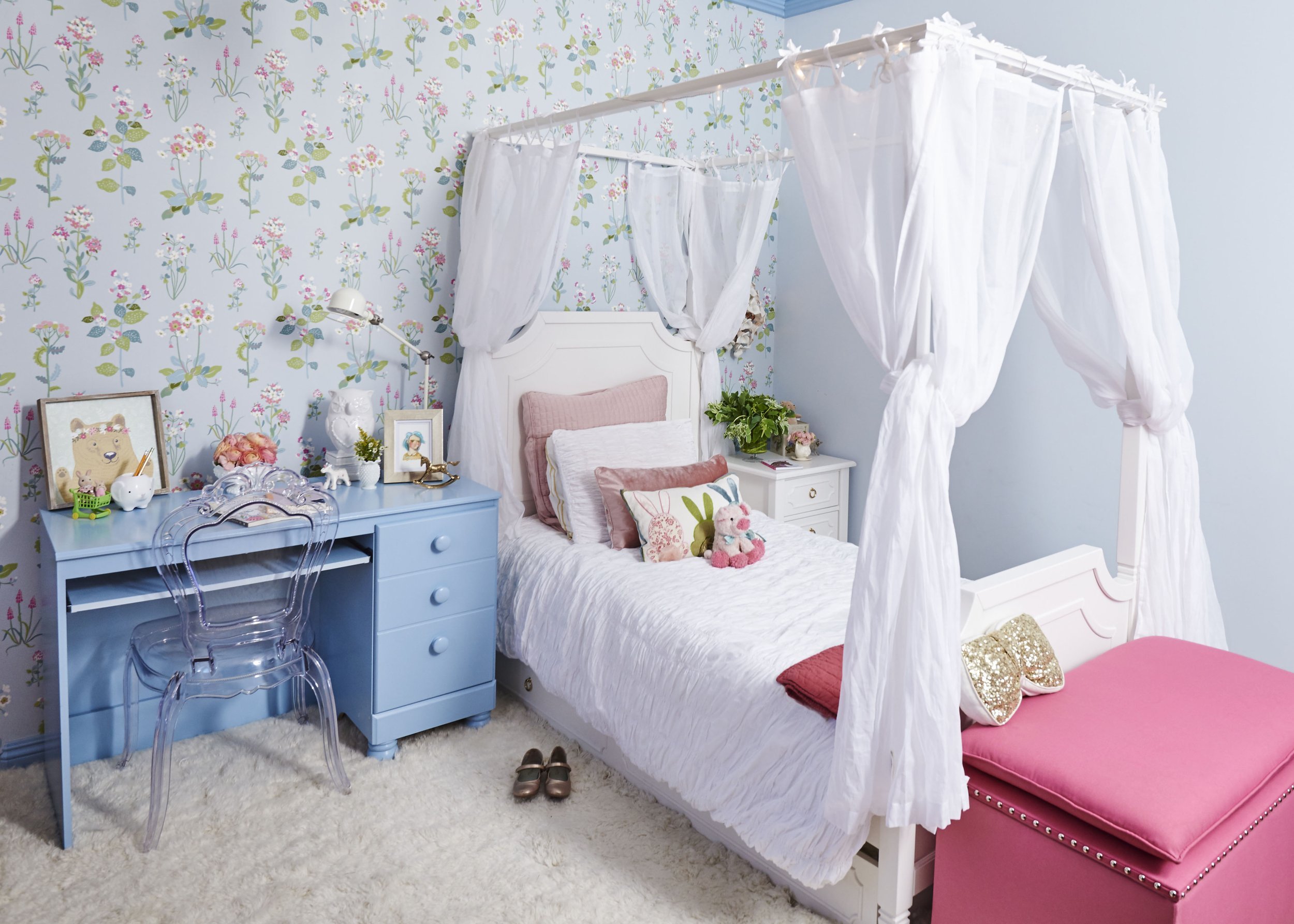


Using a more neutral pastel base on walls and furnishings can give bedrooms flexibility as kids grow older, while saturated pink accents lend a feeling of youth.


When paired with other vibrant colors, pink can contribute to a high-energy space, helping guide the eye throughout a room when displayed on a neutral backdrop.
The joy of Barbie has always come from a place of creativity and world-building. If there is anything to take away from the recent Barbiecore trends, it’s to embrace a sense of fun and creativity around our spaces, to craft homes that reflect ourselves and what brings us joy.
Sarah Barnard is a WELL and LEED accredited designer and creator of environments that support mental, physical and emotional wellbeing. She creates highly personalized, restorative spaces that are deeply connected to art and the preservation of the environment. An advocate for consciousness, inclusivity, and compassion in the creative process, Sarah has appeared in Architectural Digest, Elle Décor, Vogue, HGTV and many other publications. Sarah was recognized as a "Ones to Watch" Scholar by the American Society of Interior Designers (ASID).

The Value of a Summer Spruce: Interior design tips to refresh our homes

Summer is a beautiful time to reevaluate and refresh the home. Spring cleanings can often be a time of resetting and purging, offering a clean slate to evaluate our homes come summer and assess any updates that can help add new life and vibrancy. Seasonal changes can help create a deeper connection to natural seasonal rhythms while offering space for change without requiring significant overhauls.
Here are a few of our studio's favorite ways to spruce up our homes for summer:

1. Fresh wallpaper.
Wallpaper can be a great way to create a new aesthetic with a single change. Introducing a bolder color or pattern can help to brighten and rejuvenate the space. Look to a favorite color, texture, or decorative item in the room as a starting point for selecting colors and patterns that will work harmoniously with the current design. Pulling themes from nature can help create a peaceful home environment while adding a sense of vibrancy and color.

2. Consider the kitchen.
While we often think of bedrooms and living rooms as areas where decor and materials are seasonally swapped, we often overlook the kitchen as a space that functions differently from season to season. It can also be an excellent time to reevaluate storage solutions or aesthetic updates that have been up for consideration. A fresh coat of paint or new cabinet hardware can help dramatically change a kitchen's look and feel.

3 Curate interior greenery.
With thoughtful curation, greenery can become a central aesthetic feature of home design. Plants that create a desired visual statement, like an indoor-friendly tree in a living room, and also suit the specific conditions of the room they're in, like moisture-loving plants in bathrooms, can help to ensure plants have lasting visual benefits and lifespans. Once plants and pots are selected, indoor landscapers assemble the arrangements and can continue maintaining plants over time to help sustain greenery.

4. Update window treatments.
Window treatments, while often overlooked, often significantly impact the look and feel of a home, providing a frame for both walls and windows and helping guide the eye throughout the home. New textures, colors, or patterns can help create balance or bring more focus to exterior views. Beyond updating the aesthetics of window treatments, opting to incorporate smart home technology can help capture the benefits of natural lighting and assist with temperature regulation.

5. Opt for art.
Hanging art on the walls or installing new pieces can be an excellent way to change the visual look of a home space. A large painting or sculpture can be an eye-catching focal point that reinvents a room. Gallery walls offer more variety and can create a more playful look or feel. Beyond artwork, favorite family photos can make for wonderful wall hangings. Working with a designer to select artwork or frames and assist with layout can help amplify the impact and intention behind these displays.
When looking to update the home space, sometimes a small update is all that is needed for a whole new look and feel. Taking the time each season to reevaluate, refresh, and rejuvenate the home can keep our interiors looking new and adapting to our changing needs throughout the year.
Sarah Barnard is a WELL and LEED accredited designer and creator of environments that support mental, physical and emotional wellbeing. She creates highly personalized, restorative spaces that are deeply connected to art and the preservation of the environment. An advocate for consciousness, inclusivity, and compassion in the creative process, Sarah has appeared in Architectural Digest, Elle Décor, Vogue, HGTV and many other publications. Sarah was recognized as a "Ones to Watch" Scholar by the American Society of Interior Designers (ASID).

How Interior Design Can Facilitate Mindfulness and Reduce Stress and Burnout
Between post-pandemic issues, 24/7 work culture, and a pile-up of life stressors from the world around us, stress and burnout are at an all-time high. Mindfulness-based stress reduction has become a mainstream and accessible way to reduce stress and increase focus, energy, and overall wellness. The built environment in which we live impacts our stress levels and mental health. Interior design can play a vital role in facilitating mindfulness within our homes because interior designers are trained to understand specific design elements that encourage and cultivate mindfulness, creating a refreshing escape from the world outside. A thoughtful partnership with a professional interior designer can help facilitate a healthy, happy, and enriching home.

According to the World Health Organization, “Burnout is a syndrome conceptualized as resulting from chronic workplace stress that has not been successfully managed. It is characterized by three dimensions: feelings of energy depletion or exhaustion, increased mental distance from one’s job or feelings of negativism or cynicism related to one’s job, and reduced professional efficacy.” (1).
The effects of stress and burnout are not isolated to the workplace. Day-to-day pressures in our everyday life, such as finances, caregiving, illness, moving, etc., can also contribute to experiencing burnout. Also, consider that many of us are working from home post-pandemic. A Journal of Occupational and Environmental Medicine study states, “Blurred work-life boundaries can make it difficult to detach mentally from work which can increase stress and anxiety.” (2).

So how can interior design create spaces that cultivate mindfulness in the home? Interior designers are trained to understand how our built environment affects us. Interior design is more than how something looks or a room is arranged. Designers are educated and experienced in considering environmental factors such as noise, lighting, air quality, scent, privacy, comfort, and how a space can impact our lives.

As Interior Designer Charisse Johnston, FASID, LEED AP, notes, “Professional interior designers not only understand the visual and tactile aspects of a space, but they go beyond the surface by understanding human behavior and physiology to create highly functioning spaces that support physical and mental wellbeing and performance.” (3). Empathetic and wellness-focused interior design can create a custom-made space to support us in the ways we need to live our best life.

Some design strategies to help us manage stress within the home include, but are not limited to:

A Dedicated Space. Consider including private spaces dedicated to practicing mindfulness, such as a wellness room. Devoting a room to wellbeing and motion can help visually illustrate the importance and value of wellness. Having these located away from busy areas is recommended to help create a relaxing and soothing environment.


Personal oasis. Explore a spa-like experience through luxury details such as soaking tubs and new technology such as aromatherapy shower systems. Essential oil showers are among the emerging wellness-focused sustainable design trends.

A clutter-free home. Removing clutter and opting for plenty of storage options can help facilitate an organized home and make a space feel clean and calm. There’s no one-size-fits-all organizing method, as figuring out what works for you and your lifestyle is paramount.

Clean air.Natural and organic materials for furnishings and finishes can help contribute to better indoor air quality.

A restful sleep. Look to weighted blankets to help achieve a good night’s sleep. A wellness-minded interior designer can help create a custom weighted blanket that suits your health needs and personal style to ensure an even better night's sleep.

Including Biophilic design elements can be another valuable tool to help alleviate stress and burnout within the home.
Biophilic design stems from our innate desire to connect with nature. Incorporating this into our home can be a helpful method to connect interior spaces to the landscape outside.

Consider the following strategies to help tap into the conscious experience of spending time in nature through biophilic design:


Natural prints and images. Explore a color palette inspired by the natural world, including natural and organic materials. Some of our favorite nature-inspired goods are from Kale Tree, the Matilija Poppy Wallpaper in Petal, and Mallow Textile Evening Mauve.

Bringing the outside in. Consider incorporating plants, natural imagery, and organic forms. Studies suggest that spending time in and observing our natural surroundings can help promote mindfulness and other health benefits. For example, bird watching can help improve wellbeing and mental health.


Natural lighting. Expanding access to natural light and maximizing access to window views of the natural landscape can help alleviate stress.

The environment in which we live can profoundly affect our ability to focus, our energy levels, and our overall wellbeing. Interior design can be a great tool to integrate and encourage mindfulness at home.
Sarah Barnard is a WELL and LEED accredited designer and creator of environments that support mental, physical and emotional wellbeing. She creates highly personalized, restorative spaces that are deeply connected to art and the preservation of the environment. An advocate for consciousness, inclusivity, and compassion in the creative process, Sarah has appeared in Architectural Digest, Elle Décor, Vogue, HGTV and many other publications. Sarah was recognized as a "Ones to Watch" Scholar by the American Society of Interior Designers (ASID).
Works cited
“Burn-out An ‘Occupational Phenomenon’: International Classifcation of Diseases.” World Health Organization. May 2019. https://www.who.int/news/item/28-05-2019-burn-out-an-occupational-phenomenon-international-classification-of-diseases
Xiao, Yijing, et al. “Impacts of Working from Home during COVID-19 Pandemic on Physical and Mental Well-Being of Office Workstation Users.” Journal of Occupational and Environmental Medicine. March 2021. www.ncbi.nlm.nih.gov/pmc/articles/PMC7934324/
“It May Look Good On Instagram But You Want To Enjoy Living In It.” International Council Of Design. January 2021. https://www.theicod.org/en/resources/news-archive/it-may-look-good-instagram-you-want-enjoy-living-it

Japandi-Inspired Hideaway: Finding Calm in a Shinrin-Yoku Sanctuary
The latest iteration of Scandinavian chic that has been taking over Pinterest and social media is called Japandi design. By combining Japanese minimalism and concepts such as "Wabi Sabi" (finding beauty in imperfection) with the natural materials and functionality of Scandinavian design, Japandi design is "the perfect blend of function and form, focusing on clean lines, bright spaces, and light colors." (1). Although the term Japandi is a relatively recent trend, Japanese design has influenced interior spaces worldwide for hundreds of years, perhaps most notably through designers such as Frank Lloyd Wright and William Morris. Many nordic designers also have an affinity for Japanese design due to their shared appreciation for fine craftsmanship.
Japandi design often includes subtle color palettes, wood cladding, and large windows that incorporate biophilic elements within the home to create a tangible connection with the outdoors. These design elements perfectly align with this Californian home project, surrounded by peaceful, serene woodlands brimming with unique plants and wildlife. Living within this enriching environment inspires mindfulness and contentment through daily interactions with the natural world. The design concepts for this home project aim to maximize this experience by working with the beautiful views of the surrounding woods, mirroring this landscape within the home through natural materials, finishes, and imagery.
The kitchen features countertops, a backsplash, and a breakfast bar made from a unique brecciated marble slab, which has the appearance of being made from fragments of stone. This smooth, honed surface highlights the beauty within this natural stone formation that varies in color from cool blue-grey, warm peach, and pale mauve to deep graphite black. Ash wood features throughout this home project. Durable and lightweight, its straight grain is also visually appealing, pairing aesthetics with functionality and sustainability. Ash kitchen cabinets contain routed cabinet handles and an integrated beverage and wine fridge to create a clean profile that focuses on the natural beauty of the light honey-toned wood grain. The counter stools, made from a white oiled Ash, and upholstered with vegan leather, create a beautiful balance between sophistication and utility. The Ash has been cut and fashioned so that the grain of the wood is clearly visible, highlighting the understated beauty of this material.

The dining nook utilizes a large window that incorporates the beauty of the surrounding environment into this home project, flooding the kitchen with natural light. The floating table and benches made from blackened steel streamline with the black window frame, so they do not intrude on the picturesque view. The dining benches, upholstered in vegan leather, include dark grey toss cushions made from a cotton linen blend for extra comfort. The white ceramic bowl on the floating table has an organic shape and texture similar to a giant seed pod, bringing an element of the natural world into the space through its form. The nook is clad with Ash and features a hand-blown glass light inspired by Japanese paper lanterns, whose gentle, diffused light creates a tranquil dining space.

This alternative option for the kitchen features countertops, a backsplash, and a breakfast bar made from a stunning brecciated Italian marble slab comprised of cloudy white stone floating on top of a blush background intersected by grey-green veins. The stools, made from white oiled Ash and upholstered with pigmented vegan leather, incorporate rattan backing. This lightweight, durable, eco-friendly material works with the Ash wood finish of the kitchen cabinets to create a light and welcoming atmosphere.

In this option for the dining nook, the Ash table features a smaller ceramic bowl glazed with subtle lines that resemble tree rings or stone formations.

This option for the living room highlights the fireplace as the room's central feature. Its face has a patina of chevron-textured limestone, which connects with the custom-built hearth made from honed basalt. This durable volcanic stone has been used throughout antiquity to create sculptural works due to its smooth grain, durability, and satin finish. The hearth elongates into the corner of the room to form a window seat upholstered with a cotton linen blend textile. The tones of the fireplace carry through the grey sofa. At the same time, dark accents in the black tripod coffee table, wall-mounted console, lamp, and chandelier frame (made from wood and bronze) provide a sense of balance to the room's composition. The botanical painting in this image features a layering technique used by the artist to create the illusion of space, drawing you into this nature scene.

This view of the living room showcases where it connects with the kitchen and dining nook. In this option, the chevron-textured limestone's gray tones compliment the darker palette of the marble slab and the blackened steel floating table and benches in the dining nook. The warmth of the hand-tufted vegan silk rug harmonizes with the pine wood floor, grounding the darker elements within the room.

This option for the meditation room features large windows that create the experience of being immersed in nature. The unique glass pendant light was hand blown by a sculptor who creates functional objects inspired by natural phenomena. This light resembles the form of a cocoon, making a subtle reference to concepts of manifestation, rebirth, and regeneration within this meditation space.
Custom meditation pillows made from verdigris stone-washed linen create a gentle contrast with the soft finish of the pine wood floor through the subtle color variance in the textile.

This alternative option for the living room features a fireplace clad in matte white textured porcelain tile. The white plaster coffee table and artisanal bird table lamps made from iron and plaster carry this lightness of material throughout the room. The Oak and leather sideboard and chandelier made from natural wood and bronze create warmth which continues in the softer palette of a painting that depicts a foggy botanical scene. The light grey rug made from New Zealand wool or vegan bamboo silk incorporates an image of mangrove trees and grounds the darker grey tones of the sofa and honed limestone hearth.

In this view, we see the living room conjoining with the kitchen to reveal a wall of glass windows and doors with a beautiful view of the woodland outside. The white oiled Ash finish of the rattan-backed kitchen stools lifts the warm tones of the pine wood flooring into the room.

Here, the custom-built Ash shelving is installed on a limestone and powdered marble plaster wall, incorporating the warmth of the natural wood finish to create a lightness within the room.
The custom floor pillows for this version of the meditation room are made from a light grey linen cotton blend that harmonizes with the lighter tones of the living room.

The children's room includes custom bed-frames upholstered in a cotton linen blend, printed with a design inspired by the organic shapes of algae forming on rocks at the oceanside. There are two built-in closets in the back of the room, made from Ash, which complement the light finish of the solid oak and walnut desk and natural oak chairs at the front of the room. Two curtains made from organic linen at the end of each bed provide light filtration and the feeling of privacy. The black ceiling fan, woven wicker pendant lights, and closet hardware provide black accents that carry the highlight of the black door frame throughout the room.

View of the Ash built-in closets that provide ample storage space within the children's room.

A mudroom with a laundry cabinet features large windows that provide an abundance of natural light. The custom screens, made from Ash and natural rattan cane webbing, incorporate built-in vents to conceal the washer and dryer while in use.

Here we see the storage of the washer, dryer, and laundry behind the custom-made wooden screens. The laundry storage area features a black matte metal garment hanging rod above Ash cabinetry topped with polished terrazzo that features an array of grey and multi-tonal pinks and carries up to the back of the wall. The wall sconce features a hand-blown glass globe, cut and polished to resemble a precious stone or crystal. Suspended by a leather strap, this orb appears as if it is generating light itself, introducing a sense of alchemy or magic as it transmits light and color into the room.

Across from the laundry space is a matching cabinet containing space to store shoes and outerwear. These custom screens are made from Ash and natural rattan cane webbing to conceal storage when entering and exiting the home.

As an alternative cabinet option, this cabinet leaves one side for storage, with the other open to provide seating. The bench is upholstered in soft bouclé, perfect for removing or putting on shoes. The hand-blown wall sconce is suspended by a leather strap above this bench, illuminating the space. The bench toss pillow made from wool fabric features a digital print that looks like marble, adding comfort to the area while echoing material elements throughout the house.
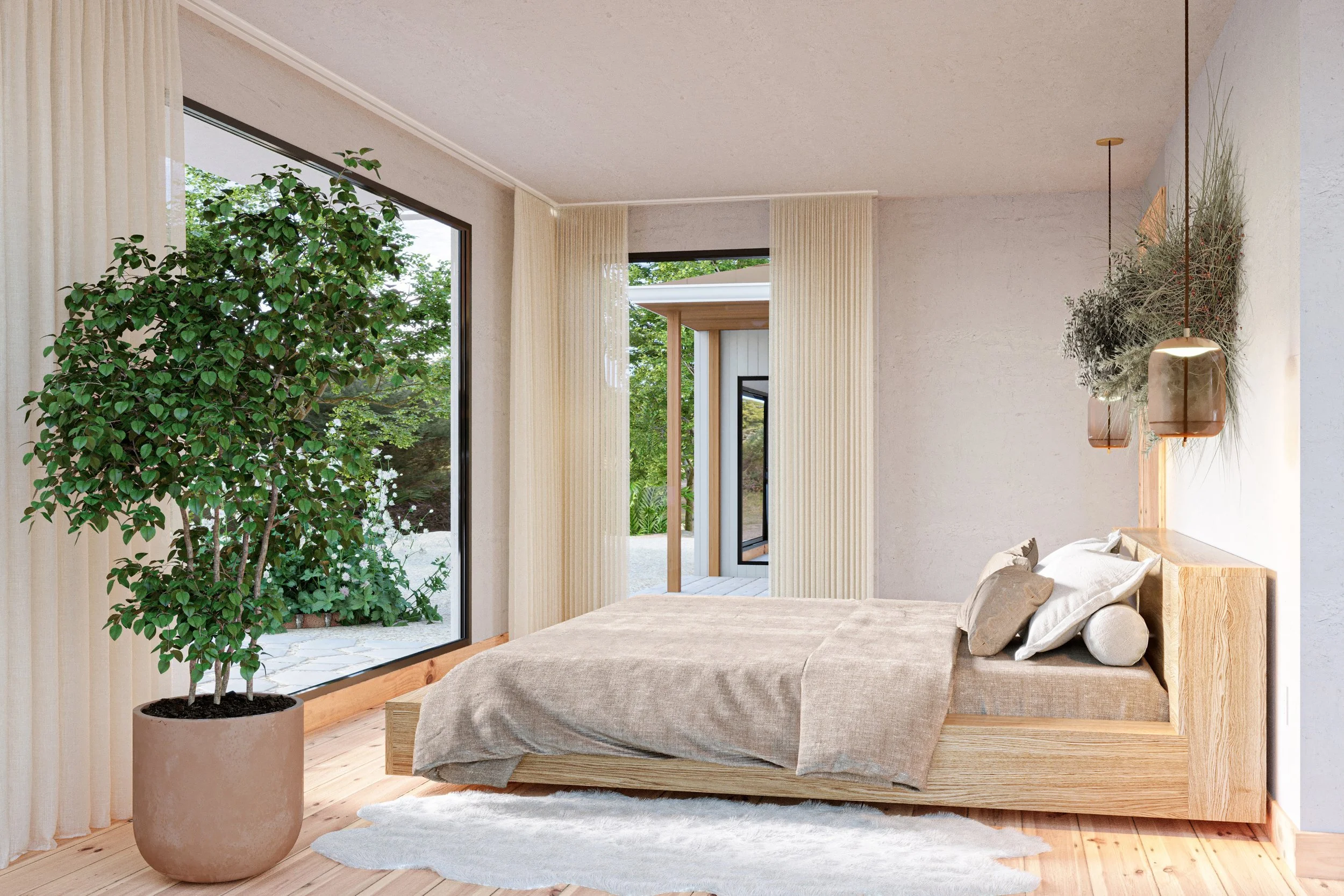
This option for the main bedroom features large enveloping windows that immerse in the natural beauty of the outside environment. The extended bed frame, crafted from sustainably harvested solid oak, mirrors the natural finish of the Ash baseboards and wood flooring throughout the house. Floor-to-ceiling sheer white linen drapery offers light filtration and the feeling of privacy while preserving the beautiful view of the woodlands outside.
In this view, a sculpture made from dried California native plants such as Santa Cruz Island Buckwheat and White Sage hangs above the bed, reinforcing the connection with the natural landscape outside. The smokey brown blown glass pendant lights on either side of the bed hang from a natural fiber cord to create a textural contrast with the smoothness of the glass and a warm glow of light within the room.

The primary bathroom of this home project incorporates a sweeping natural view from a large window as the focal point. Free-standing mirrors are installed in front of the window, utilizing the ample natural light within the space. The counter and floor made from a honed speckled grey limestone slab work harmoniously with the mirror frames' matte black finish and bathroom hardware accentuating the space. The custom cabinets, pocket doors, and baseboards made from Ash anchor the room in the warm earthy tone of its natural finish. The ceiling light is made from Japanese washi paper and tarlatan fabric encased by a brushed stainless steel canopy. The sconces on either side of the room are hand-crafted through a specialized process in which liquid glass is blown into a folded and highly heat-resistant ceramic fabric vessel. This physical and conceptual reference to fabric brings a gentle, soft texture to the lighting within the room.

The grey limestone slab continues into the shower and bath, tiling the walls to create an immersive and relaxing space; the walls' limestone and powdered marble plaster finish contrast with the grey limestone to lighten the room. The gentle light diffused through the ceiling fixture creates the perfect calm to relax in the large white soaking tub. The wall niche is tiled with an etched marble mosaic design that resembles origami folds or falling leaves. The beautiful natural form of the teak wooden stool in the shower and the Ash baseboards bring the serenity of the woodlands into the room through their material's warmth and natural finish.

This design for the water closet features a grey-honed limestone floor. The niche under the cabinet features marble tile etched with a mosaic design that resembles origami or ginkgo leaves, echoing the touch of the natural world that is present throughout the home within forms, imagery, and materials.

Here the countertop in the main bathroom is made from a beautiful slab of polished onyx, combined with a grey marble floor tile with a subtle textured finish to create a lighter alternative for the main bathroom. The ceiling light made from hand-wrapped polyester ribbon visually references paper lanterns, echoing the light fixture in the dining nook. The translucent fabric creates a warm, diffused light that is complimented by the hand-cast wall sconces on either side of the room.

Subtle green mosaic tiles encase the shower to create a gentle contrast with the lighter tone of the textured marble floor. The color of these tiles works to lift the subtle green-grey hues within the onyx countertop. The polished stone mosaic tile in the shower niche features a decorative waterlily pattern that subtly references the meditative and restorative qualities of the natural world.
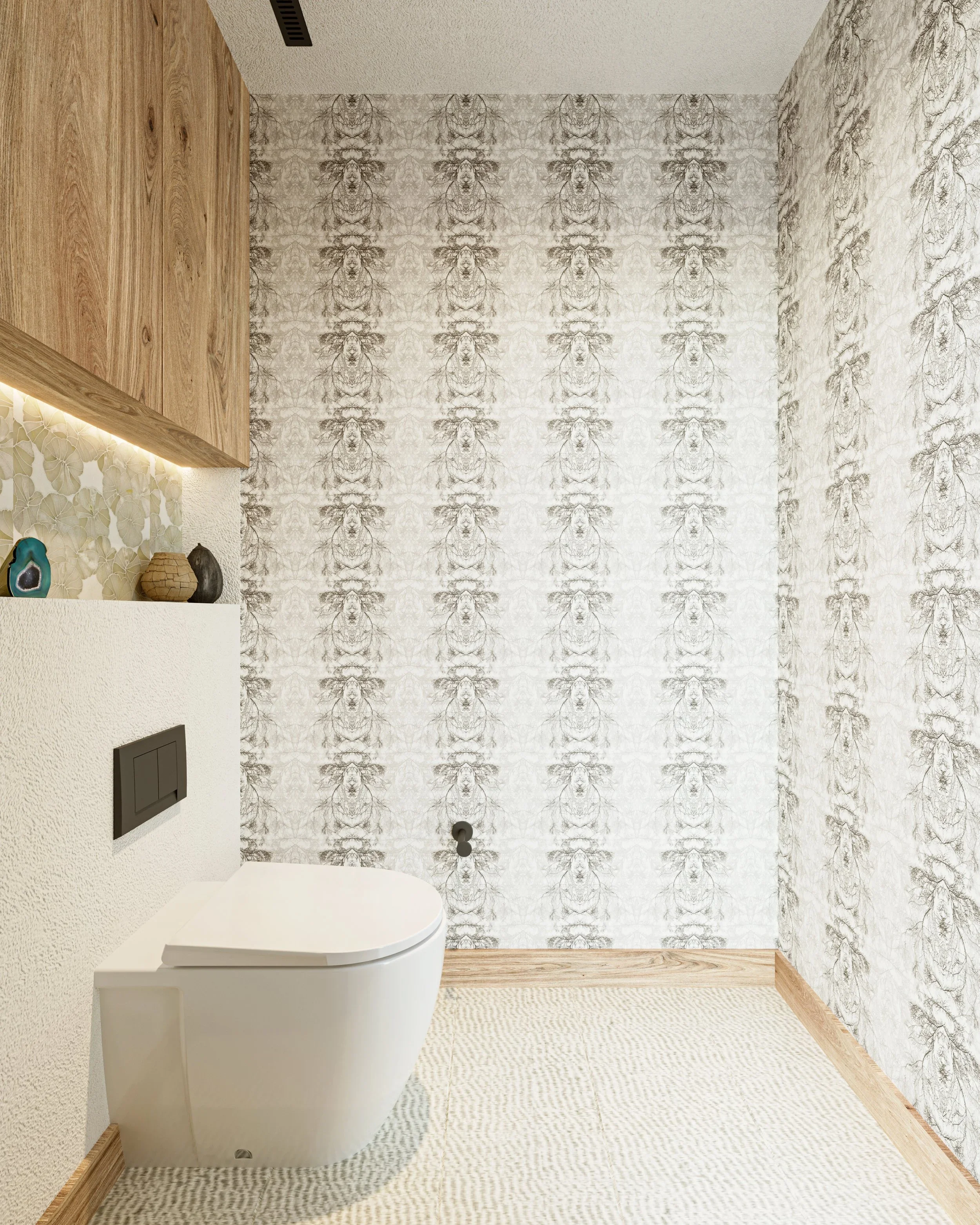
The water closet for this home project features a custom-built cabinet and baseboard made from Ash. The niche under the cabinet features a mosaic tile made from polished stone. This tile carries a tranquil lily pad pattern that subtly references nature's calming and meditative qualities. The wallpaper features an intricately drawn pattern inspired by pressed seaweed samples from the Victorian era .The design is then layered to form a subtle striping. This imagery brings a historical interlink between the natural and human-made world.
The beauty of the landscape outside our homes can manifest within interior spaces through design concepts that work with the natural form of materials, making room for them to shine. This approach, alongside mimicing scenery through biophilic design concepts, captures the emotional experience of walking through woodlands or viewing a beautiful mountain and integrates it into our day-to-day living. The result is a home space that inspires tranquility and mindfulness as it both shelters us from and connects us with the outside world.
References
Knierim, Ashley. “What Is Japandi?” The Spruce. https://www.thespruce.com/japandi-design-4782478
Sarah Barnard is a WELL and LEED accredited designer and creator of environments that support mental, physical and emotional wellbeing. She creates highly personalized, restorative spaces that are deeply connected to art and the preservation of the environment. An advocate for consciousness, inclusivity, and compassion in the creative process, Sarah has appeared in Architectural Digest, Elle Décor, Vogue, HGTV and many other publications. Sarah was recognized as a "Ones to Watch" Scholar by the American Society of Interior Designers (ASID).
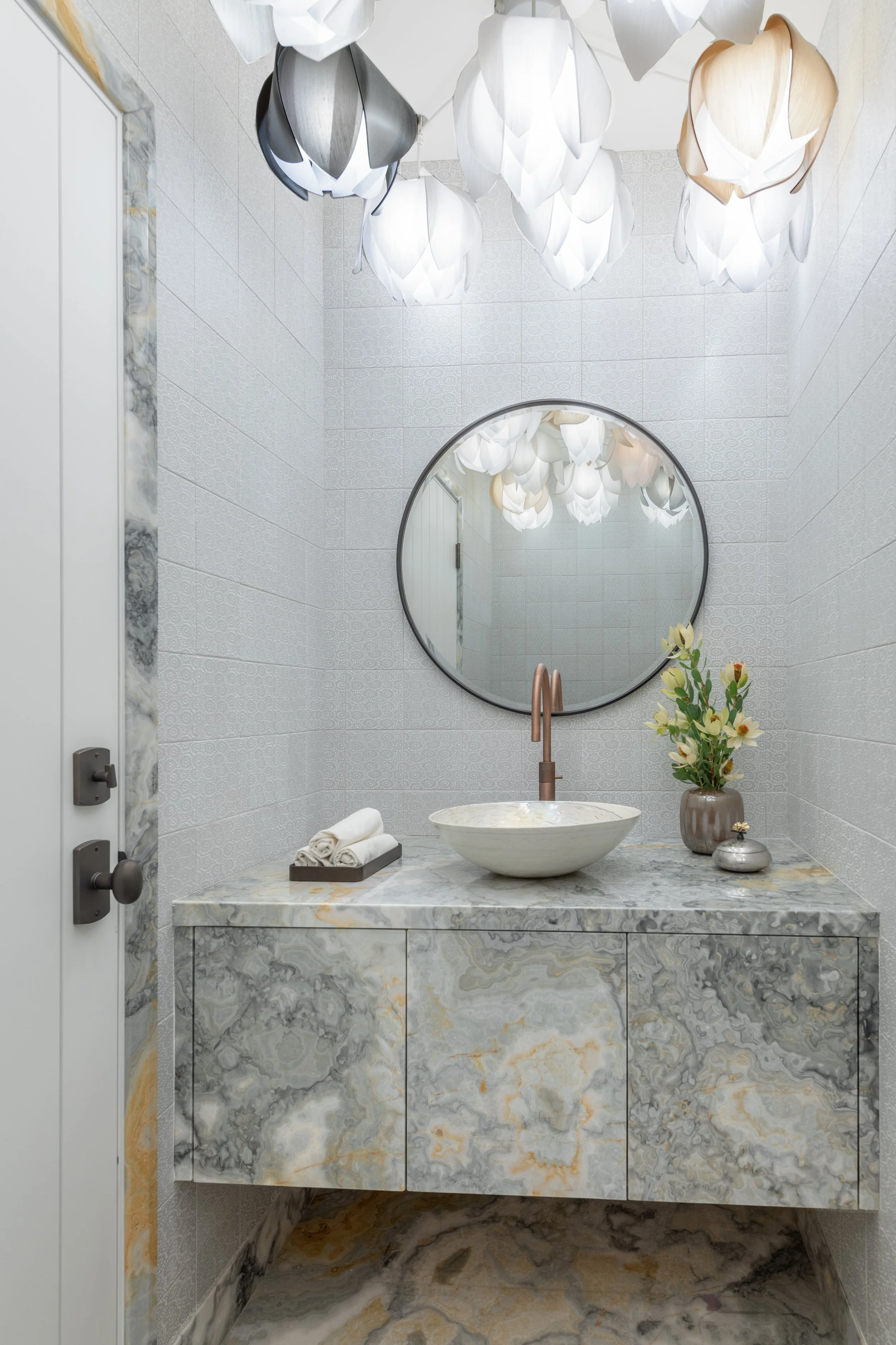
Starting Slow: The Benefits of Mindful Design
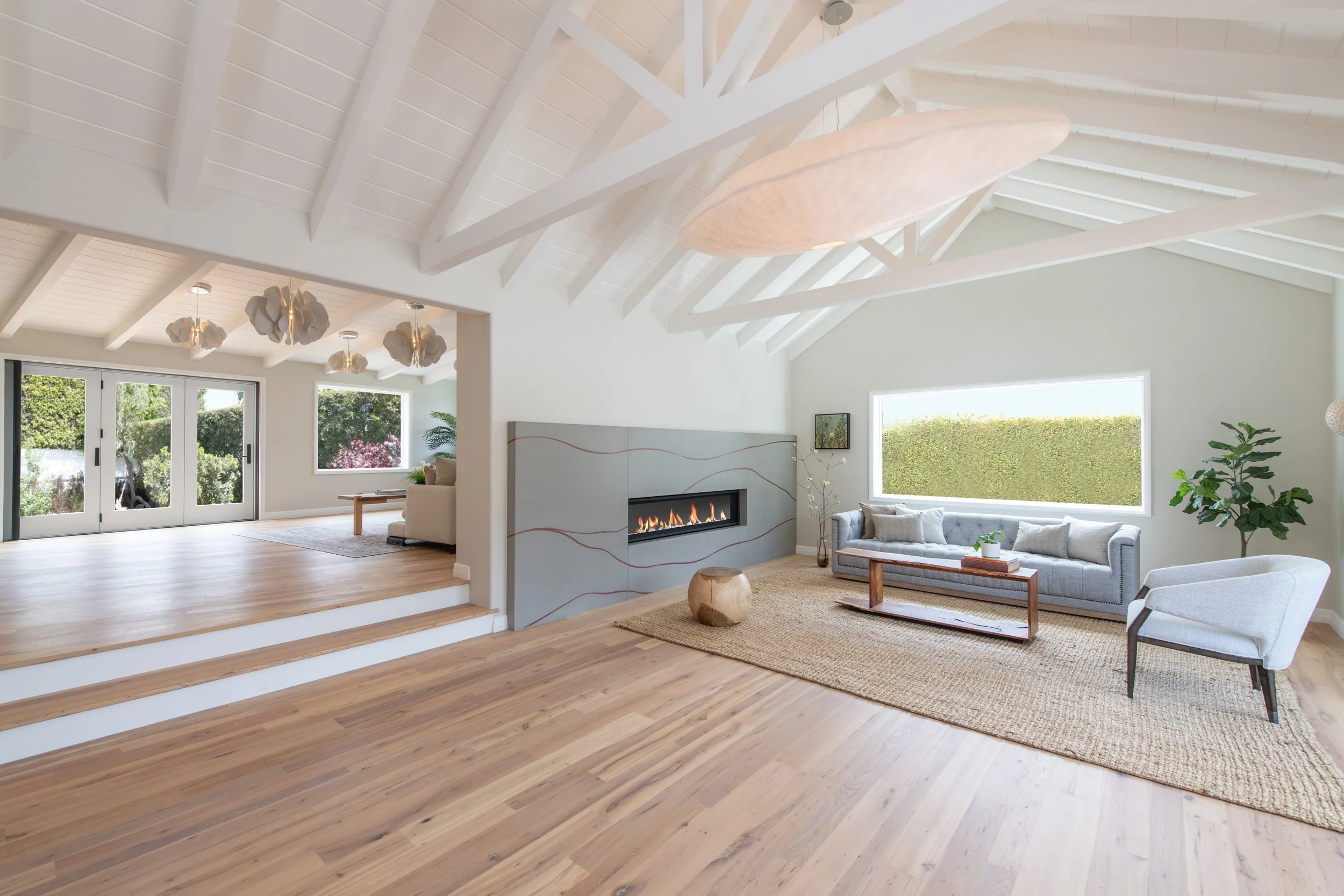
An exceptional bottle of wine, a decadent meal lovingly prepared from local organic goods, a beloved heirloom quilt, or an expertly crafted handbag can bring a sense of wonder, pleasure, and appreciation into our lives. These items feel special because of the joy and beauty they provide and the skill, expertise, and time devoted to creating an exceptional experience or product. Care and quality are often accompanied by time, which can contribute to the rarity, meaning, and preciousness of an item or experience. Artisan products generally include more thoughtful processes, from sourcing high-quality goods and materials to engaging skilled craftspeople. This considerate approach leads to finer results and often to more ethical production practices.
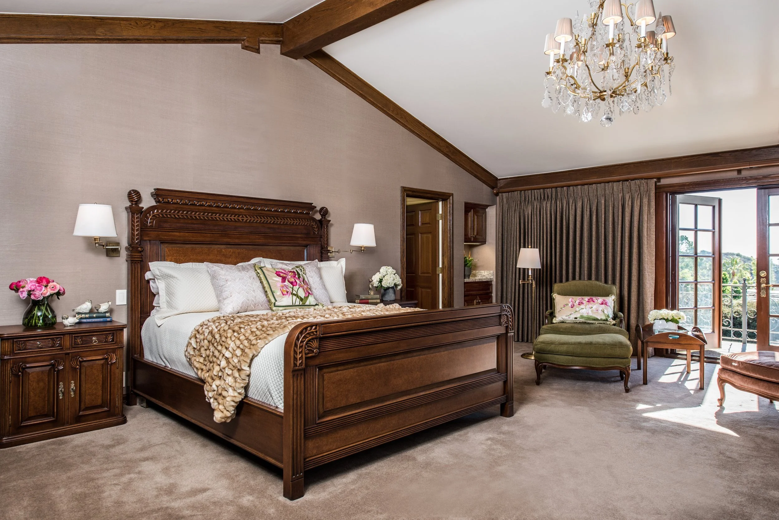
In recent years, many of us have sought responsible options in response to our concerns about environmental, labor, and production impacts, seeking products and services that align with our personal ethos. The increasing demand for more thoughtful production and consumption led to the slow movement's popularity. Best known through the slow fashion movement, the "slow" approach intends to offer an alternative to fast production through a more thoughtful, beneficial, and considered approach, prioritizing ethical creation, consumption, and cradle-to-cradle technologies. The slow approach has also been popularized through the slow food movement, where similarly, all stages of the item's life cycle are considered, from the initial production steps to its use and the impact of any material remnants. This approach is often better for the environment, using processes that consider waste reduction and long-term consequences, and contributes to healthier lifestyles for those involved.
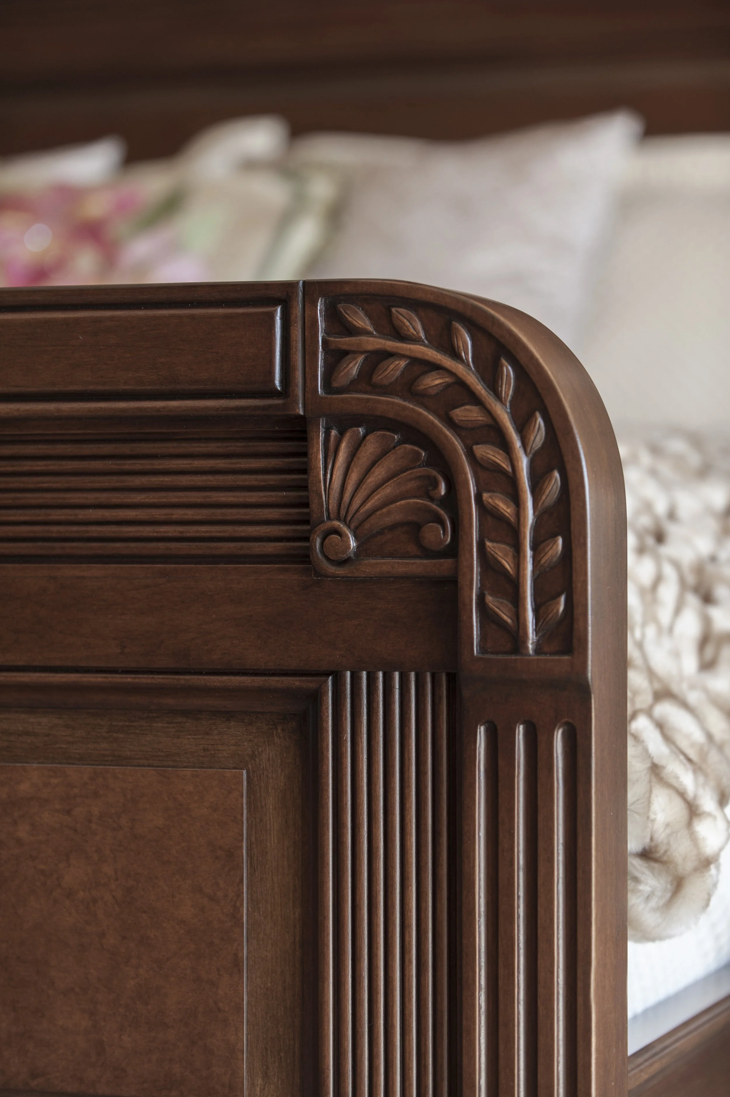
Slow interior design embraces a similar approach, applied to all stages of the design process. Sharing concerns around long-term sustainability and in an effort to make a positive impact both culturally and environmentally, slow interior design takes a more considered practice to the thoughtful planning of the home and the sourcing of materials. The immense benefits from slow design come from its holistic approach, through a slowly layered design process that focuses on long-term happiness over instant, but perhaps temporary gratification.

Recognizing the joy our home objects bring us, slow design offers the opportunity to dress our homes with cherished pieces that recognize and integrate the process of creation into the design. For something like a beloved wooden dining room table that may serve as the hearth of the home, considering the time behind the growth and care for the trees, their thoughtful harvesting, and the craftsmanship behind building the table can impart a sense of gratitude, connectivity, and beauty to the daily dining experience. Slow design encourages production that celebrates and respects the entirety of the creation process by ensuring the material's longevity in the new context, in part by creating pieces intended for a lifetime of love. Planning for long-term use may require thoughtful sourcing of natural materials, enlisting a craftsperson with the skills to craft bespoke furnishings, and the necessary time and consideration to finalize a design that will withstand shifting preferences and needs.

Slow interior design is a trusted recipe for creating an heirloom home, slowly and thoughtfully crafted with mindful intent and enduring materials. The investment in time and well-crafted and considered materials offers the benefits of increased personalization, superior quality, and the luxury of careful decision-making. Collaborating with artisans to develop one-of-a-kind pieces and allowing the home design to germinate organically can create space for the unique building of personal style, crafting a home that feels wholly individual and grows with the residents.

Many artists and craftspeople cherish their work and are knowledgeable about their wares, which can be valuable when items eventually need repairing or updating. Because of the intimacy of working with artisans, many will be willing to adapt furnishings to match changing needs, saving the items from needing replacing while still navigating shifts in preferences. Over time, working with a craftsperson may provide insights into our tastes and style, allowing them to make suggestions or develop ideas tailored to us and our homes.

Our homes can be an excellent reflection of ourselves, and treating them as works of art crafted with intentionality can be deeply personally fulfilling. An unhurried design approach expands opportunities for change and adaptation to daydream about the use of spaces or the look of an item and long-term goals for the home. Taking a thoughtful and deliberate path can build a sense of self, place, and a nurturing home environment, especially for those who may feel less decisive about their home goals. Taking time to craft our interiors also offers opportunities to envision the space and, in some cases, begin to experience them and adjust as needed.

During the design process, artists can create 3D renderings to help realize possible directions for the space and help visualize how they may feel. If mulling over multiple options, seeing the rooms in renderings may help imagine the lived possibilities more vibrantly before committing to construction. While renderings take time to develop, they will ideally lead to contentment around decisions while helping eliminate the "what if feeling" about alternative design paths.

Designing with consideration towards all past, present, and future stages of materials and home can provide a holistic method of interior design, creating spaces that radiate with care and are deliberate reflections of self. Slow design embraces home as who we are, emphasizing spaces exquisitely crafted through a thoughtful and considered process for the betterment of our loved ones, our community, and the environment.
The slow design movement offers a pragmatic, joyful, and ethical approach, reflecting a shifting sentiment toward long-term happiness and collective wellbeing.
Sarah Barnard, WELL AP + LEED AP, is a leading designer of personalized, sustainable spaces that support mental, physical, and emotional wellbeing. An advocate for consciousness, inclusivity, and compassion in the creative process, Sarah’s work has been recognized by Architectural Digest, Elle Décor, Vogue, HGTV, and many other publications. Sarah was recognized as a “Ones to Watch” Scholar by the American Society of Interior Designers (ASID).

Expanding our Senses: Designing Positive Spaces Where Neurodivergent Individuals can Thrive

Designing interiors that are sensitive to the needs of neurodivergent individuals places emphasis on the sensory experience of a space, taking a deep dive into the objects and components of a room, examining how each of them works together to create inclusive, supportive, and healing spaces that encourage better living. A wellness-based and empathetic approach integrates design concepts informed by an understanding of the characteristics of the autism spectrum and sensory processing challenges to create environments that nurture the development of independence and enrich individual lives.

Sensory Processing Challenges affect how the brain processes sensory information, making an individual more sensitive to stimuli that others are not. It can affect one or all of the senses. "Current estimates indicate that 5% to 16.5% of the general population"(1) and 1 in 20 children(2) experience Sensory Processing Challenges. Individuals within the autism spectrum can be hypo-sensitive to stimuli (sensory seekers) or hyper-sensitive (sensory avoiders). Sensory seekers are less sensitive to sensory input than neurotypical individuals and often create their own sensory stimuli. In contrast, sensory avoiders are more sensitive and usually experience sensory input more intensely than neurotypical individuals.

A recent publication, "Designing for Autism Spectrum Disorders," written by academics and educators Kristi Gaines, Angela Bourne, Michelle Pearson, and Mesha Kleibrink "draws on the latest research in the fields of environmental psychology and education to show how architecture and interior spaces can positively influence individuals with neuro diversities.”(3) Many studies and theories investigate the built environment's effect on us. Environmental Preference Theory is based on the idea that people prefer engaging and involving spaces rather than simple and boring ones. Engaging environments are essential for the self-actualization of individuals on the Autistic spectrum.

The Environment Behavior Theory states that behavior is a function of the person and their environment. This theory suggests that behavior comes from within an individual and is heavily influenced by the environment. This stresses the point that individuals on the Autistic spectrum should live in environments that are designed to support them positively. Architects and designers can help ease stress and irritation caused by incoming stimuli by creating organized, well-defined spaces that modify factors such as color, lighting, texture, sense of closure, acoustics, and ventilation, depending on the individual's needs.

In 2019, the architectural firm HKS conducted a research project where they developed a sensory well-being hub for adolescents with developmental disabilities. One of their outcomes was that "Design should support a range of sensory stimulations, from active to respite, and across modalities."(4) "Designing for Autism Spectrum Disorders"(5) explores some ways in which spaces designed for children on the autistic spectrum can foster and encourage independence. The ideal home environment for a child on the autistic spectrum considers how to accommodate sensory needs and help prepare them for challenges they may face in everyday life as they grow. Including children in the decision-making and consulting about their preferences and needs is an important part of the process that helps them self-actualize and consider incorporating particular objects/subjects they are interested in into some aspects of the design of their home. Design elements that improve an individual's ability to navigate a space can foster empowerment and independence. Some of these include: Clear sight lines for wayfinding, definable forms, and surfaces; Contrasting colors or textures to indicate the intersections of spaces; Clarifying the intent of visibility through color, contrast, and placement; Creating a sequencing of spaces.
"Designing for Autism Spectrum Disorders"(6) suggests that spaces laid out in orderly and predictable ways can create an environment that enables individuals within the autism spectrum to thrive. For sensory-seekers, creating spaces that encourage play in which they can touch, feel, taste, and smell that contain open spaces with unobstructed views for easy parental/adult supervision creates a space where they can learn what is safe while still being themselves.

The compartmentalization of spaces is also recommended because dedicated space for specific activities can help maintain daily routines. Think about dividing areas into zones, each with only one function or activity, so that individuals begin associating activity with a particular area, easing the transition between activities, protecting routine patterns, promoting predictability, and improving wayfinding. Open spaces can be organized using furniture arrangements, colors, and finishes. Consider creating a distinguishable difference between sleeping/study and play areas. For example, "inactive" spaces are bedrooms or quiet living areas where a child can sleep or do homework. "Active" spaces allow the child to explore and play freely. Also, consider making adequate storage available in every room to ease stress over environmental changes, such as when an item is moved from one place to another. Items can be stored in bins, baskets, boxes, or drawers instead of open shelves.

A child with hypo-sensitivity (sensory seekers) can frequently only see the outlines of objects, cannot visually perceive the texture or weight of objects, and often loves bright colors and sunlight.(7) Some design practices suggested in "Designing for Autism Spectrum Disorders" concerning space planning for sensory seekers include considering the use of contrasting colors to increase visibility. For example, painting walls in different colors can help the individual distinguish the room's corners. Walls can also be a different/contrasting color than the furniture, etc., to help the child to see them in space. Painting borders around a door a different color from the walls can also help distinguish doorways and improve wayfinding.
Lighting systems that incorporate different/changing colors and the quality of light selected can benefit individuals with photosensitivity. Consider the impacts of LED or fluorescent light and utilize indirect light within the space. Window coverings or window films can help to regulate light effectively and create a calming space.

Engaging in "hands-on" work is also important for sensory seekers because it provides tactile connections and positive sensory feedback, helping individuals develop a deeper connection to what is happening in the environment around them. Furniture with different textures can provide tactile sensory satisfaction, as do soft environments. Factor in furniture and finishes that are durable and easy to clean. Weighted blankets can aid in creating a calming experience and be custom designed in natural and organic materials.
It is also important to consider the acoustic qualities of a space when designing for children on the autistic spectrum. Think about using soft materials that absorb noise in an area designed for children with hypo-sensitivity. Soundproofing and avoiding hard surfaces on walls, floors, and ceilings can reduce noise and reverberation. Acoustic wall tiles could also be helpful.
It is also essential for designers to think beyond the five senses. Proprioceptive and Vestibular senses are often described as "hidden" or "inside" senses. Proprioceptive senses relate to our body awareness, where our body parts are, and how to coordinate them with actions such as holding, pushing, pulling, or lifting(8), while Vestibular senses relate to balance and bodily position, which help us move smoothly through space.(9) "Designing for Autism Spectrum Disorders"(10) suggests ways in which neurodivergent experiences of the Proprioceptive and Vestibular senses can be accommodated through design. Ensure that stairs are easy to navigate by applying different materials, textures, and senses that will help the individual connect their thoughts and feelings to where they are in space. Consider including only rounded edges within the space and making transitions between different floor levels and surfaces obvious using contrasting floor materials such as carpet, wood, contrasting finishes, and colors. Interiors made up of defined forms and shapes that profile the perimeter of a space can also help a person overcome these challenges. Floor and ceiling moldings to outline the perimeter of the space at the floor and ceiling level can provide spatial clarity. Hammocks, rocking chairs, and swings can also accommodate a hypo-sensitive individual's desire to move constantly.

Creating an environment that manages and eases stress is essential. Biophilia is our innate desire to connect with nature. Studies have shown that incorporating natural elements into the home (through color, material, imagery, etc.) makes them more appealing to us and brings some of the health benefits of spending time outdoors into the home. Natural imagery such as clouds, a bright blue sky, or bright yellow sunlight can appeal to hypo-sensitive needs. Access to nature, healing gardens (plants/garden activities on patio/balcony), and symbols of nature can contribute to reducing stress, and studies suggest that direct experiences of nature can enhance cognitive processing.(11) Creating a small garden can contribute to the child's well-being by improving a sense of self-worth, providing different tactile and visual experiences, and acting as a direct source of nature. A water fountain or bird feeder can also contribute to the child's development, providing sensory or tactile satisfaction through natural elements.(12)
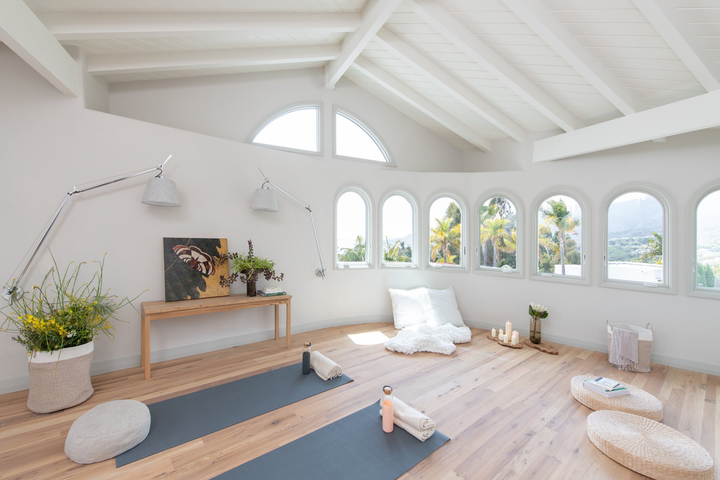
An empathic, holistic, and mindful approach to interior design encourages us to expand our sensory understanding of the world, reconsidering our experience of space, color, and material to promote authentic living, empowerment, and wellness amongst diverse individuals.
Sarah Barnard is a WELL and LEED accredited designer and creator of environments that support mental, physical and emotional wellbeing. She creates highly personalized, restorative spaces that are deeply connected to art and the preservation of the environment. An advocate for consciousness, inclusivity, and compassion in the creative process, Sarah has appeared in Architectural Digest, Elle Décor, Vogue, HGTV and many other publications. Sarah was recognized as a "Ones to Watch" Scholar by the American Society of Interior Designers (ASID).
References
Miller, Lucy Jane, et al. “Identification of Sensory Processing and Integration Symptom Clusters: A Preliminary Study.” Occupational Therapy International, U.S. National Library of Medicine, 16 Nov. 2017,https://www.ncbi.nlm.nih.gov/pmc/articles/PMC5733937/#:~:text=Current%20estimates %20indicate%20that%205,(ADHD)%20%5B4%5D.
Lumiere Children's Therapy. “Child Therapy: Understanding Sensory Processing Disorder.” Lumiere Children's Therapy, Lumiere Children's Therapy, 26 Feb. 2018, https://lumierechild.squarespace.com/lumiere-childrens-therapy/2017/02/06/child-therapy-understanding-sensory-processing-disorder.
Gaines, Kristi, et al. Designing for Autism Spectrum Disorders. Routledge, Taylor & Francis Group, 2018.
Nanda, Upali, et al. “Sensory Well-Being for Adolescents with Developmental Disabilities: Creating (and Testing) a Sensory Well-Being Hub.” HKS Architects, 26 Oct. 2022, https://www.hksinc.com/how-we-think/reports/sensory-well-being-for-adolescents-with-developmental-disabilities-creating-and-testing-a-sensory-well-being-hub/.
Gaines, Kristi, et al. Designing for Autism Spectrum Disorders. Routledge, Taylor & Francis Group, 2018.
Gaines, Kristi, et al. Designing for Autism Spectrum Disorders. Routledge, Taylor & Francis Group, 2018.
Gaines, Kristi, et al. Designing for Autism Spectrum Disorders. Routledge, Taylor & Francis Group, 2018.
SC;, Proske U;Gandevia. “The Proprioceptive Senses: Their Roles in Signaling Body Shape, Body Position and Movement, and Muscle Force.” Physiological Reviews, U.S. National Library of Medicine, https://pubmed.ncbi.nlm.nih.gov/23073629/.
The Vestibular System - Neuroscience - NCBI Bookshelf. https://www.ncbi.nlm.nih.gov/books/NBK10819/.
Gaines, Kristi, et al. Designing for Autism Spectrum Disorders. Routledge, Taylor & Francis Group, 2018.
Stenfors, Cecilia U D, et al. “Positive Effects of Nature on Cognitive Performance across Multiple Experiments: Test Order but Not Affect Modulates the Cognitive Effects.” Frontiers in Psychology, U.S. National Library of Medicine, 3 July 2019, https://www.ncbi.nlm.nih.gov/pmc/articles/PMC6616085/.
Yanez, Ruddy E., and Bronwyn S. Fees. “Preschool Children’s Biophilia and Attitudes toward Nature: The Effect of Personal Experiences.” International Journal of Early Childhood Environmental Education, vol. 5, no. 1, 2017, pp. 57–67.
Bibliography
Designing Inclusive Healthcare Spaces to Support Neurodiverse Populations. https://www.iands.design/healthcare/article/21546047/designing-inclusive-healthcare-spaces-to-support-neurodiverse-populations.
HKS HKS is a global firm of architects, et al. “How to Build a Sensory Well-Being Hub and Sensory Cocoon: An Open Source Instruction Guide.” HKS Architects, 26 Oct. 2022, https://www.hksinc.com/how-we-think/reports/how-to-build-a-sensory-wellbeing-hub-and-sensory-cocoon-an-open-source-instruction-guide/.
“American Society of Interior Designers: ASID.” Impact of Design Series, Vol. 9, https://www.asid.org/impact-of-design/hks-sensory-wellbeing-hub.