Mindfully Creating Supportive Spaces to Aid With Visual Impairment
While interior design generally relies on common principles, the end user and their specific needs should guide the design. Home design can play a crucial role in creating a space that fosters independence, comfort, safety, and confidence. Specific choices can facilitate navigation and, when done intentionally, blend thoughtfully into the overall design.
Why interior design choices matter with visual impairment
When affected by visual impairment, physical space and how it is structured and perceived can either create obstacles in daily living or, conversely, make life easier, including aspects such as lighting, layout, furnishings, and more.
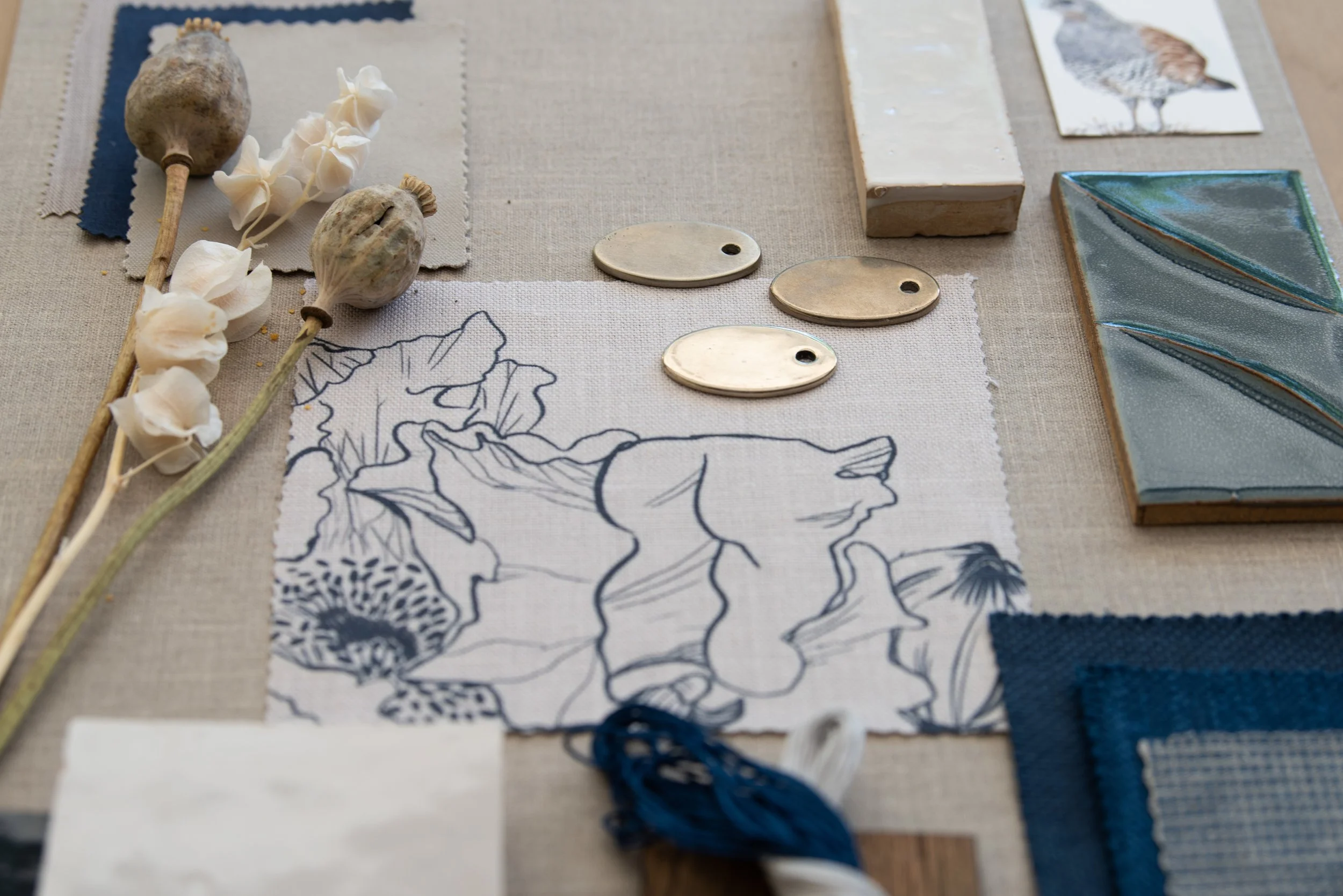
Sarah Barnard is a WELL and LEED-accredited interior designer. Her inclusive studio’s work is guided by how clients of all abilities use their spaces daily. Using tools such as field testing and an interactive process that engages clients and incorporates their feedback, Barnard translates individual needs into design elements for clients to choose from.
When designing for individuals with visual impairment, Barnard understands the nuance of color, contrast, lighting, materiality, and layout, and how they all can combine to create comfort and usability. Having a thoughtfully designed home, with attention paid to elements that address specific visual challenges, can create a sense of safety and serenity that is frequently sought after.
While needs will vary from person to person, here are some design strategies to consider.

Layered, adaptive lighting
“Comprehensive home lighting that utilizes multiple light sources is crucial when designing for individuals with vision reduction due to aging,” says Barnard. “Combining overhead lighting, task lighting, and wall sconces creates a diverse lighting network that allows individuals to adjust illumination to suit their needs and preferences,” says Barnard.
“These preferences can be easily set and adjusted by incorporating a smart lighting system, which can be programmed to automatically adjust to lighting changes and individual preferences throughout the day. Smart lighting can be controlled through the convenience of a smartphone or voice activation, providing a convenient and accessible way to enhance visibility and comfort for individuals with vision impairment,” she says.

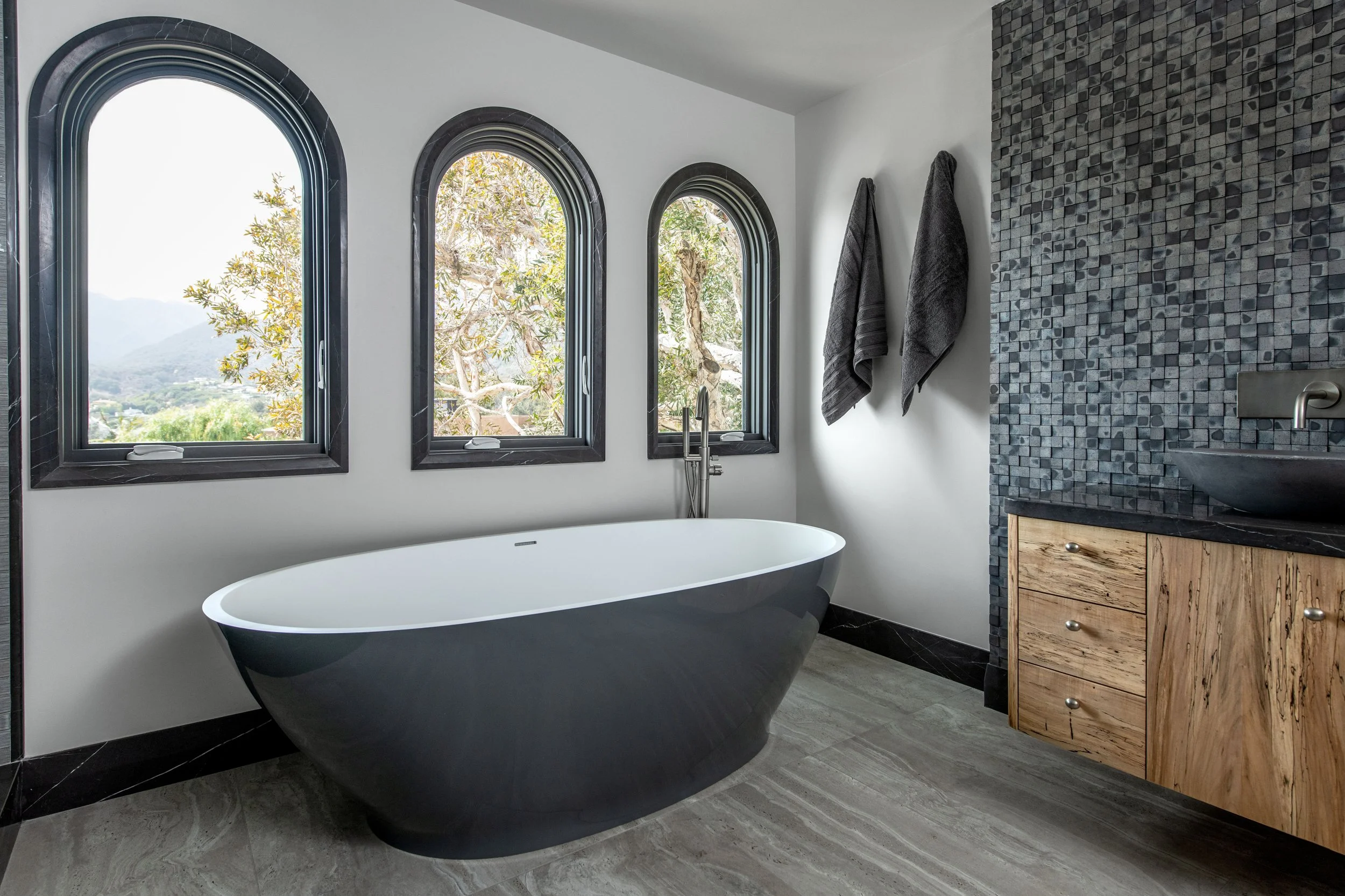
Prioritize natural light
While the inclusion of artificial lighting can help direct light on demand, access to natural light, and the distribution of light throughout the room are important. That’s in part because “Natural light boosts the overall brightness of a space, and more light means better visibility overall. Natural light is also typically softer and less fatiguing on the eyes than artificial light,” says Barnard.
Think of a space in terms of access to light, how light can be pulled into a room from outside, and then placement of these conduits. In design terms, this might mean large windows, skylights, and light wells. Light also needs an unfettered path to travel, so open concept floor plans work well, or in divided floor plans, transom and clerestory windows on interior walls, and French doors can help the flow of natural light.
However, glare can be problematic, so “ sheer or light-diffusing window treatments can help minimize glare within a space, improving visibility and comfort,” says Barnard.

Choosing finishes and glare reduction
Typically, finishes are chosen in a home to suit a particular aesthetic, but for individuals with vision impairment, there is a functional aspect: minimizing glare. “Glare from reflective surfaces can reduce visibility for individuals with vision impairment, making distinguishing objects from their background difficult, and can also cause discomfort,” says Barnard. Glare can also contribute to eye strain and visual fatigue.
The solution, says Barnard, can be matte over glossy or polished finishes. “Choosing matte finishes for flooring, countertops, and paint can help minimize glare from reflective surfaces within interior spaces, enhancing comfort, visibility, and safety.”
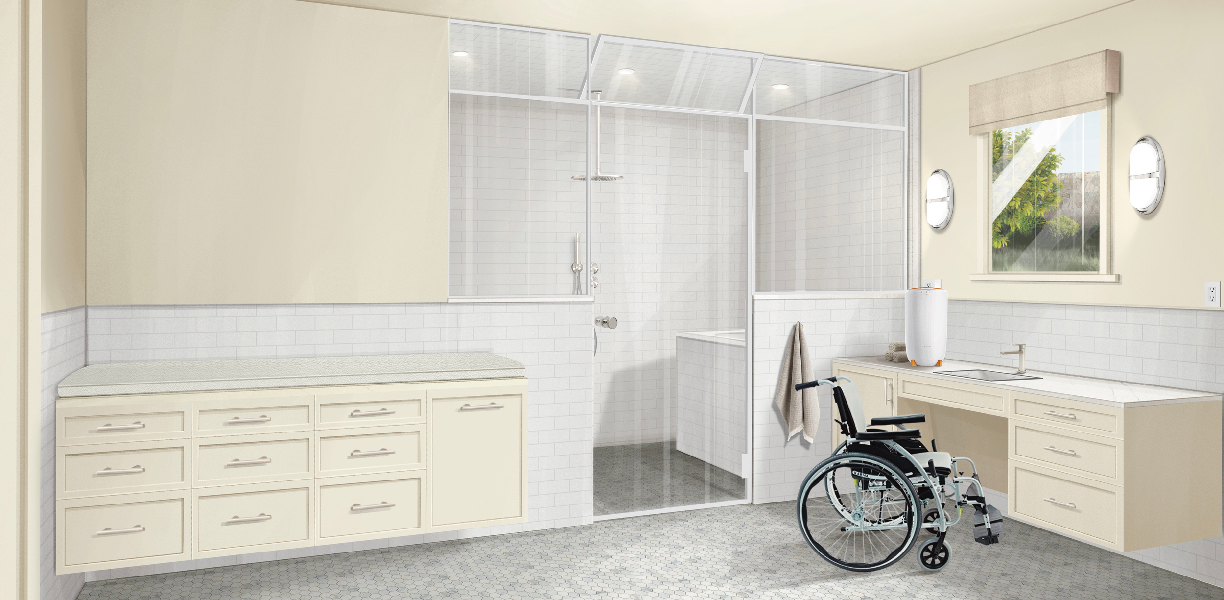
Create clear pathways for movement
“Maintaining clear paths free from obstacles is essential for safe and easy navigation throughout a space.” says Barnard. Custom-designed built-in storage units are a great way to reduce clutter. They are also designed to fit perfectly within a home's existing architecture and can be customized to suit individual preferences. Because they're integrated into the walls, built-in storage does not take up floor space, leaving paths of travel clear and open.
Embrace consistency from room to room with the layout and placement of items. Consider placing items such as furniture, lamps, switches, and wall controls in similar locations throughout the house. Predictability can aid intuitive and safer movement through a space.
Lean into contrast
With low vision, it can be difficult to see certain colors; using brighter colors and increasing contrast can help. “Incorporating a high-contrast color palette can help improve mobility and wayfinding,” says Barnard. Color perception is individual, so a personalized approach is warranted. “When considering what high-contrast color to paint these areas, conducting field tests with swatches is essential as some individuals may perceive certain colors better than others.”
To implement contrasts, she suggests:
Furniture that contrasts with the floor and wall color can help improve the visibility of these objects, creating safe pathways around them.
Painting doors, door frames, and handrails in a high-contrast accent color can help make them visually identifiable within a space.
Transitions between rooms can also be highlighted with contrasting colors or textured materials, such as a wood floor adjoining a carpeted area.
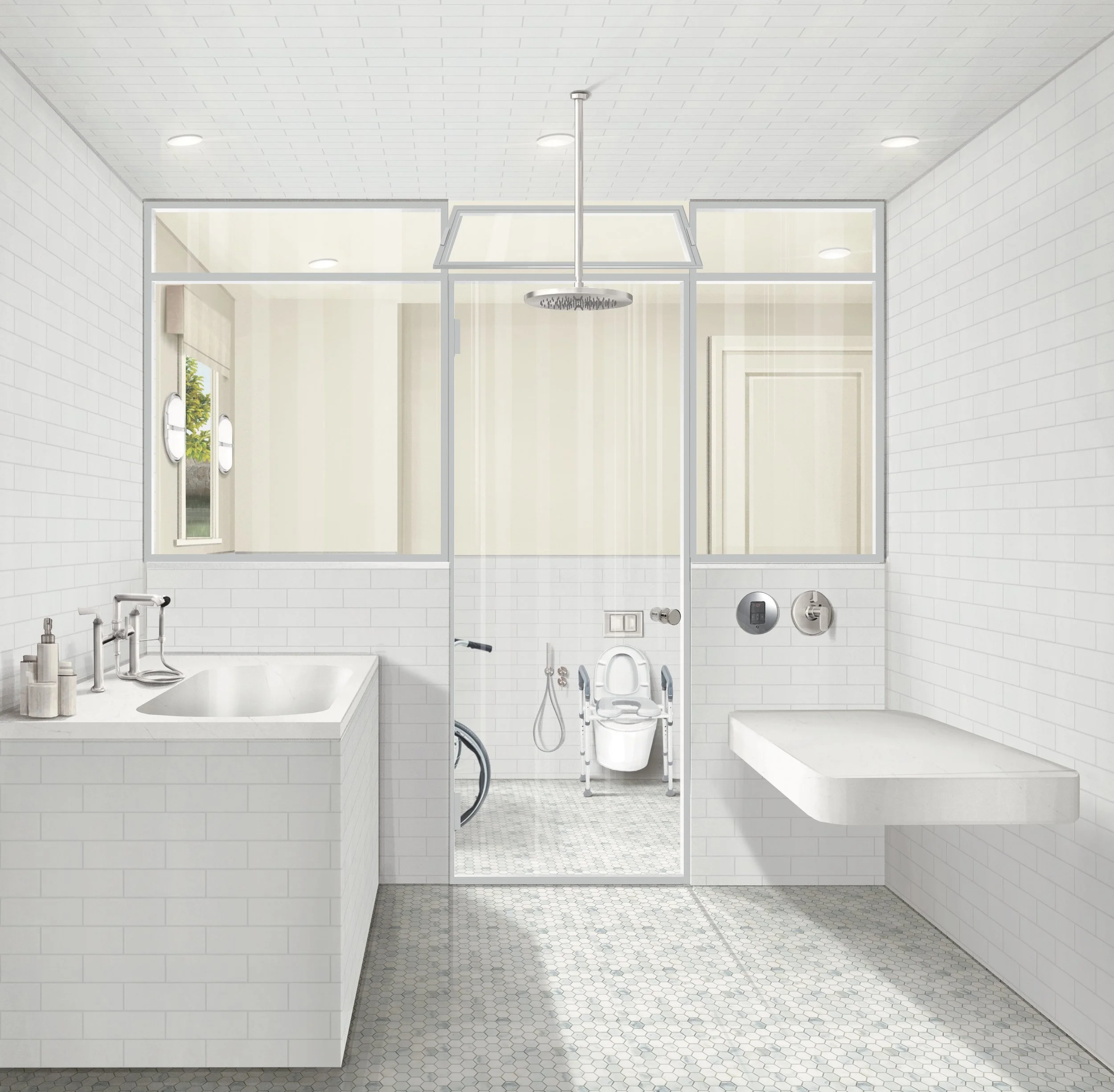
High contrast in areas such as bathrooms and kitchens, in particular, can help with safety. High-contrast counters and sinks in the kitchen can help to identify work zones, while high-contrast shower thresholds, toilet, and sink can aid safer movement.
Leverage acoustics
For individuals with visual impairment, leveraging acoustics in a built environment to navigate space can be helpful. Design with sound-proofing acoustic tiles and panes, and wall treatments to reduce echo and background noise, so that orientation in the space is easier, using sound.
Consider including sound-absorbing accents, such as soft furnishings, textiles, and window treatments, which can help to absorb vibration and echoes, making sounds crisper and clearer.

What these design strategies look like in practice
Barnard engages in a research and discovery process with clients to inform color, pattern, and other design element choices, with exploratory field testing that creates opportunities for clients to provide feedback on visual clarity and aesthetic preferences.
While each project and individual needs will vary, here are some examples.
If certain color combinations are difficult to distinguish, it can be helpful to avoid designs that place colors close together, which can create visual perception challenges. For example, with blue/yellow color deficiency, it is advisable to avoid patterns with yellow and blue close together.
In cases of severe vision impairment, high-contrast interiors can offer a simple yet effective solution. For example, walls and ceilings painted in a deep, saturated color, with trims along walls and doorways painted in a bright, contrasting color helps to indicate their location and assist with wayfinding. Field testing helps determine which contrasting colors resonate best in terms of visibility and personal aesthetic preferences.
Design is most useful and beautiful when it makes life easier and more comfortable, which is why every space should be considered in how we use that space, and what tools might help.
For example, mirrors are often used as a design tool to create a focal point or add decorative elements. However, mirrors and reflective surfaces aren’t always appropriate or desired by everyone. It’s possible to achieve some of the decorative aims of mirrors with other items. In a bathroom, where mirrors often hang, a large window can accentuate natural light, while a tiled wall could create an alternative focal point.
When design is approached intentionally and personally, there is an opportunity to shape spaces that enhance functionality and comfort for individuals with visual impairment.
Sarah Barnard Design’s website uses the Accessibe accessibility feature, which adapts the site to each user, customizing their experience. Click the blue circle with a white human figure to access customization options, including high contrast, text size adjustment, screen reader support, and more.
Sources
https://afb.org/blog/entry/independence-tips
https://www.ncoa.org/article/helping-people-with-blindness-and-vision-loss-continue-to-participate-in-everyday-activities/
https://pmc.ncbi.nlm.nih.gov/articles/PMC12082883/
Sarah Barnard, WELL AP + LEED AP, is a leading designer of personalized, sustainable spaces that support mental, physical, and emotional wellbeing. She creates highly personalized, restorative spaces that are deeply connected to art and the preservation of the environment. An advocate for consciousness, inclusivity, and compassion in the creative process, Sarah has appeared in Architectural Digest, Elle Décor, Vogue, HGTV, and many other publications. Sarah was honored as a “Ones to Watch” Scholar by the American Society of Interior Designers (ASID).