

Hummingbird Hill: The Art of Inclusive Design
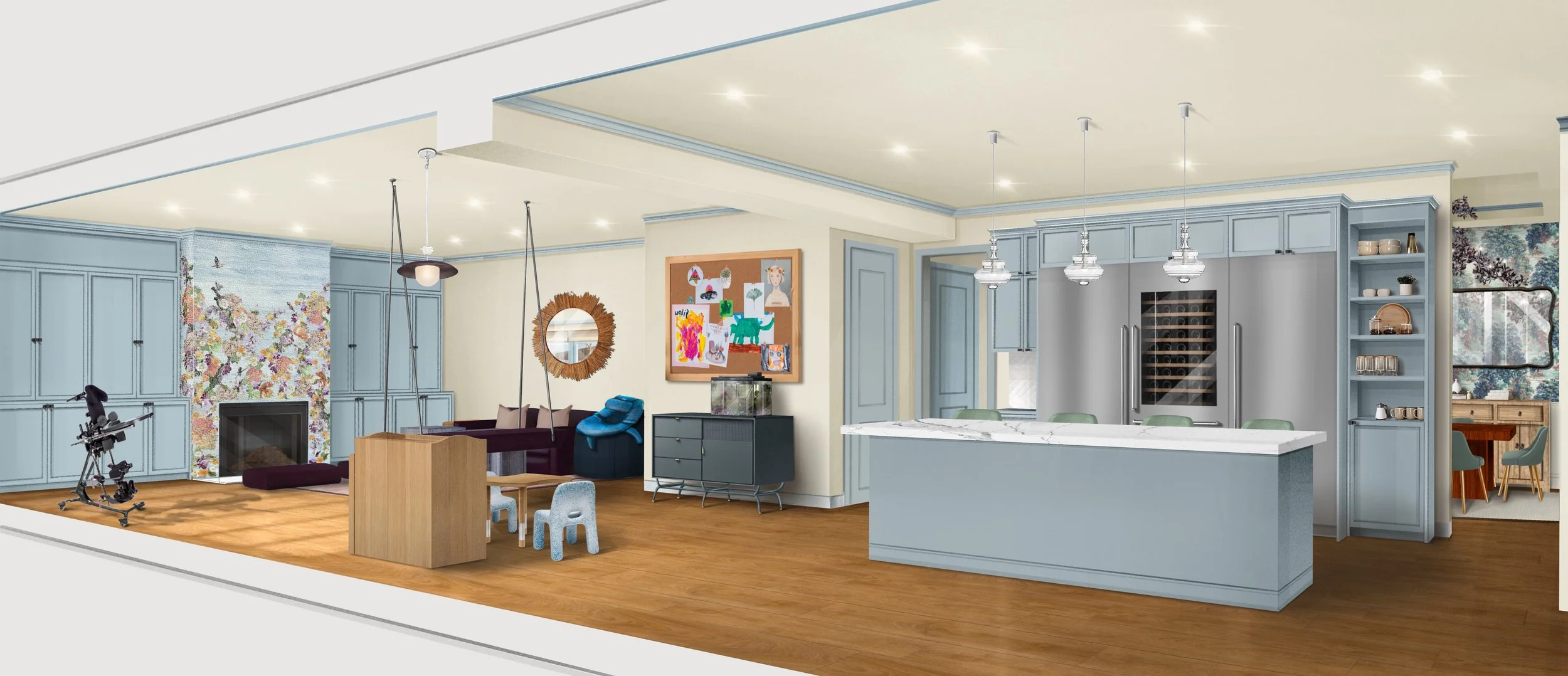
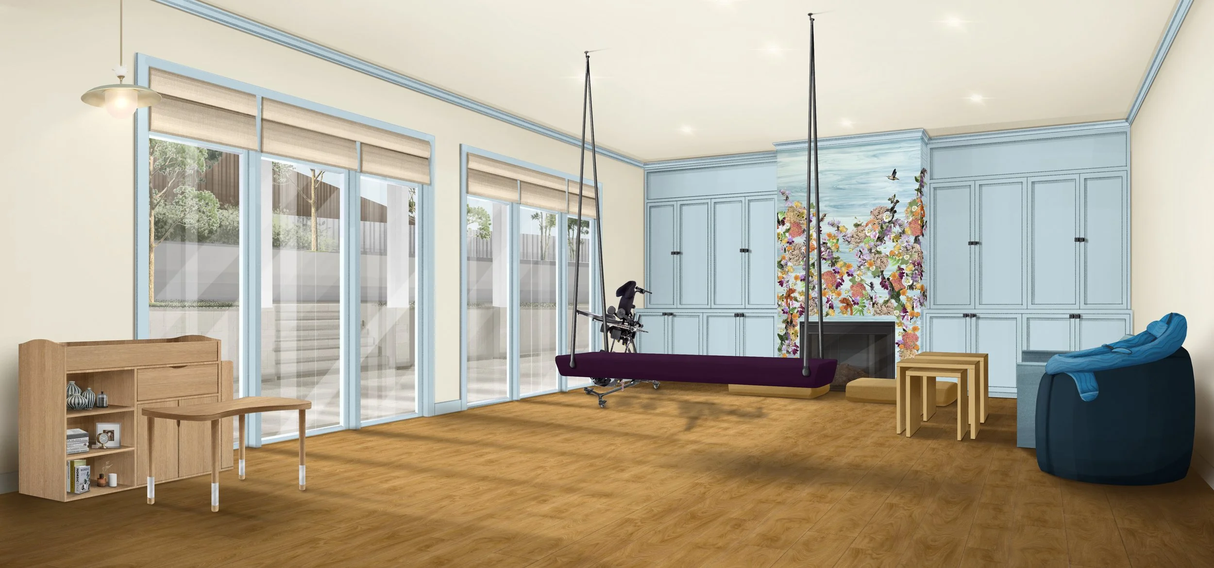
Conceived as a joyful, multi-functional sanctuary, the residential narrative begins in this vibrant family room engineered to balance creative play with therapeutic support. A plum-colored tulip pendant light illuminates a dedicated children's art table paired with eco-friendly chairs crafted from upcycled toys, sitting adjacent to a custom blue storage console and an expansive pinboard gallery. The comprehensive interior design plan natively integrates specialized pediatric mobility equipment, featuring a dedicated zone that seamlessly accommodates the user's stander within the active family environment. Overhead, a structurally reinforced ceiling securely anchors a therapeutic swing upholstered in outdoor-rated velvet. Fluid, safe travel across the room is assisted by an exceptionally flat, washable area rug.
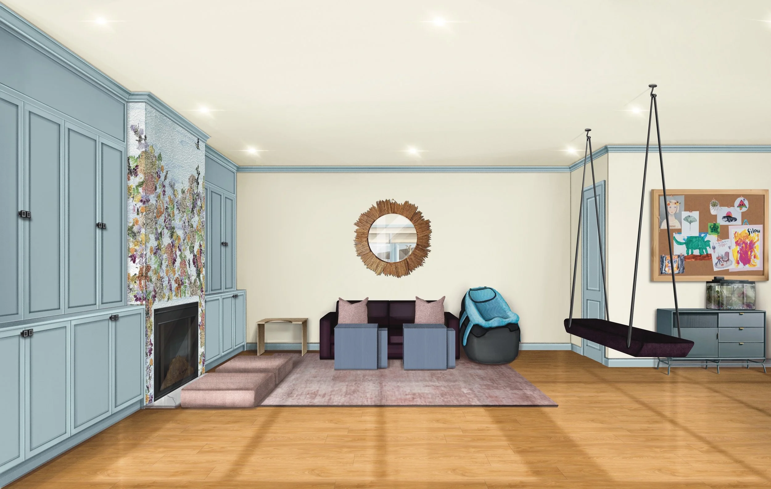
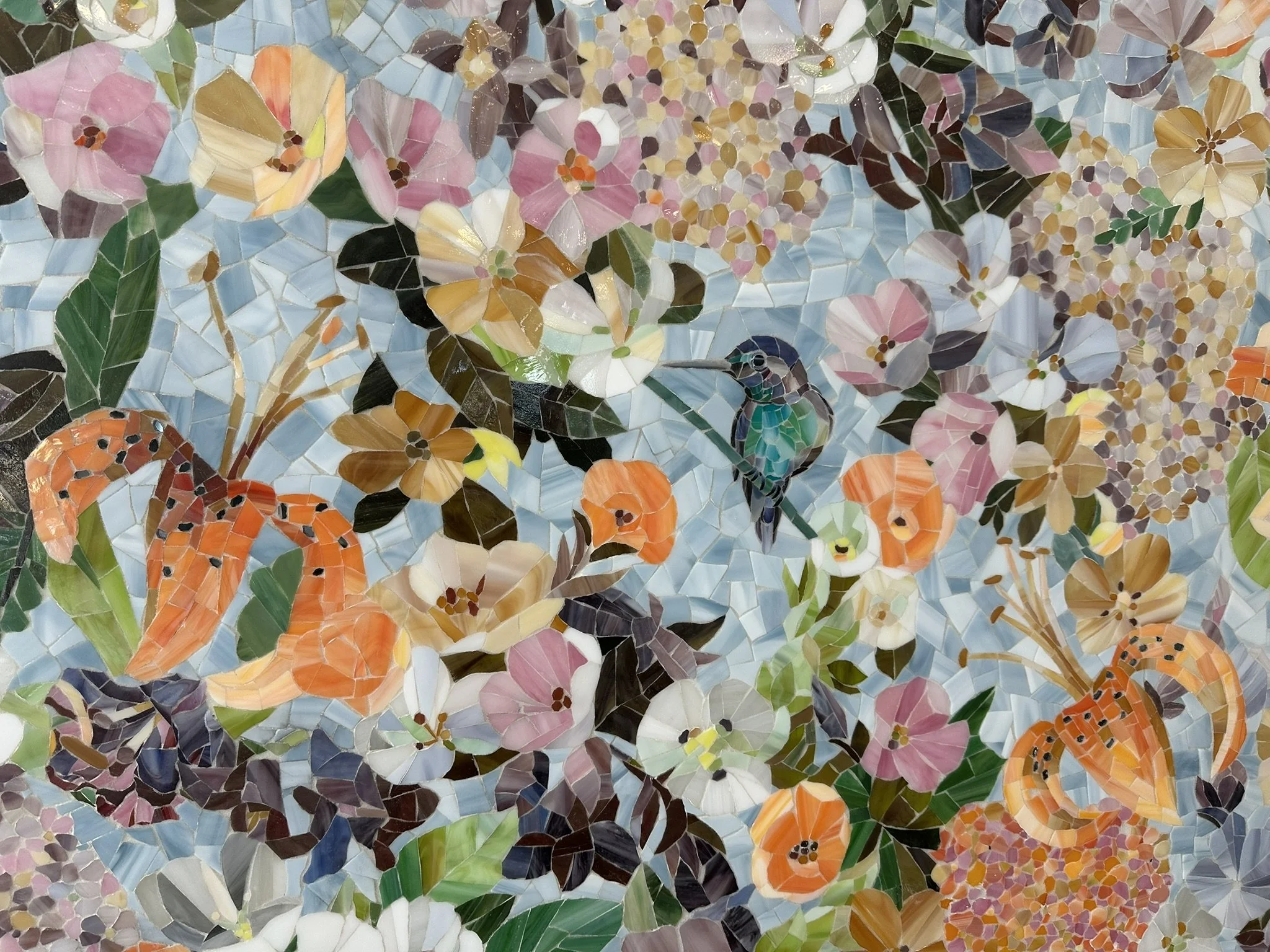
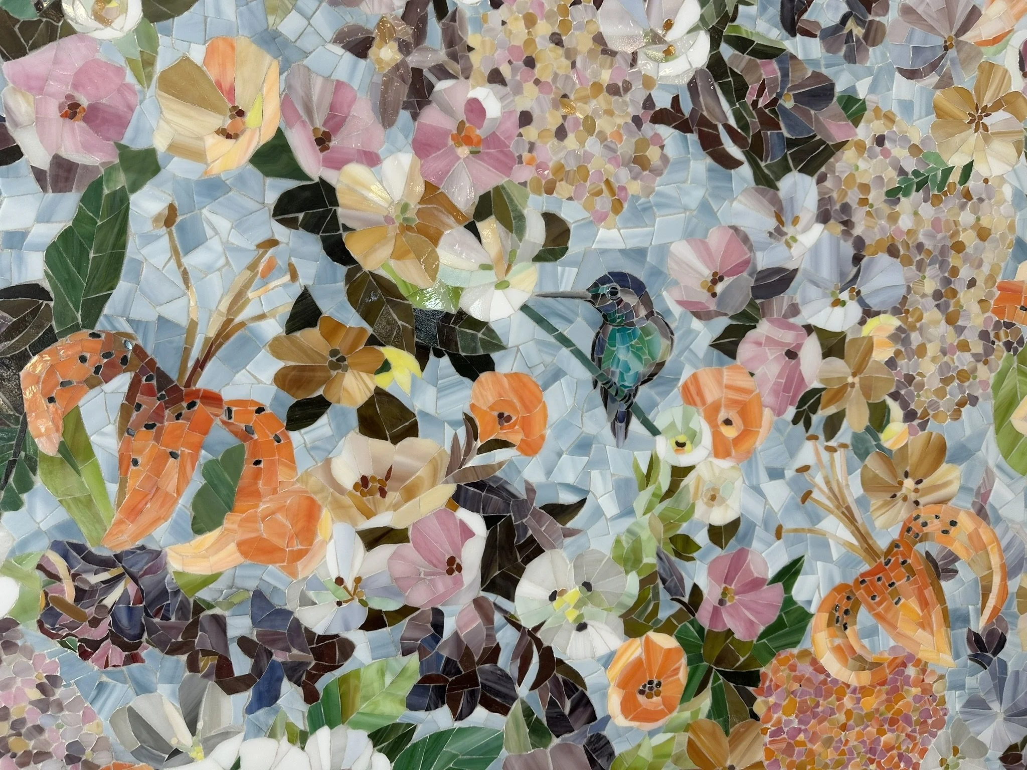
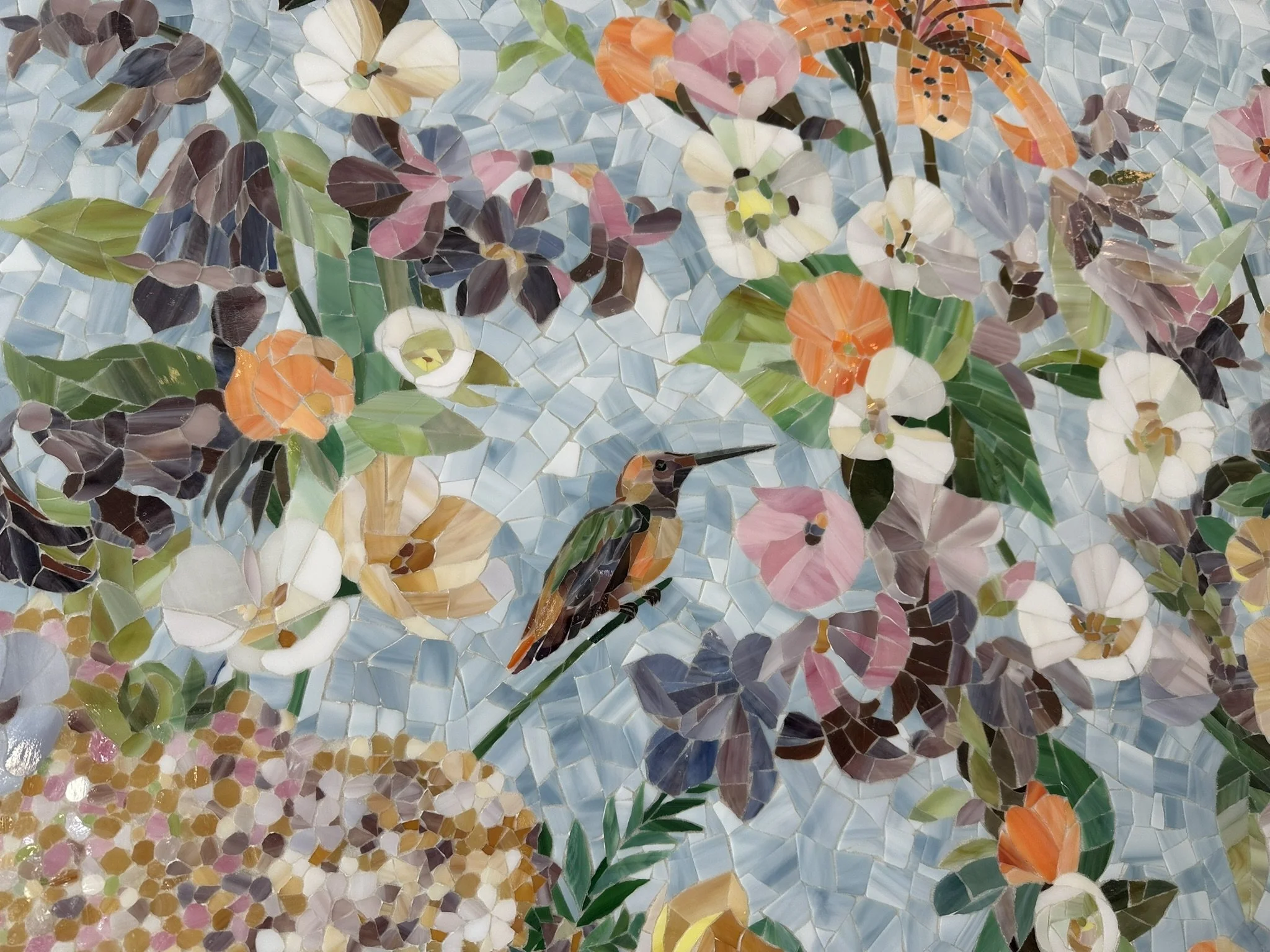
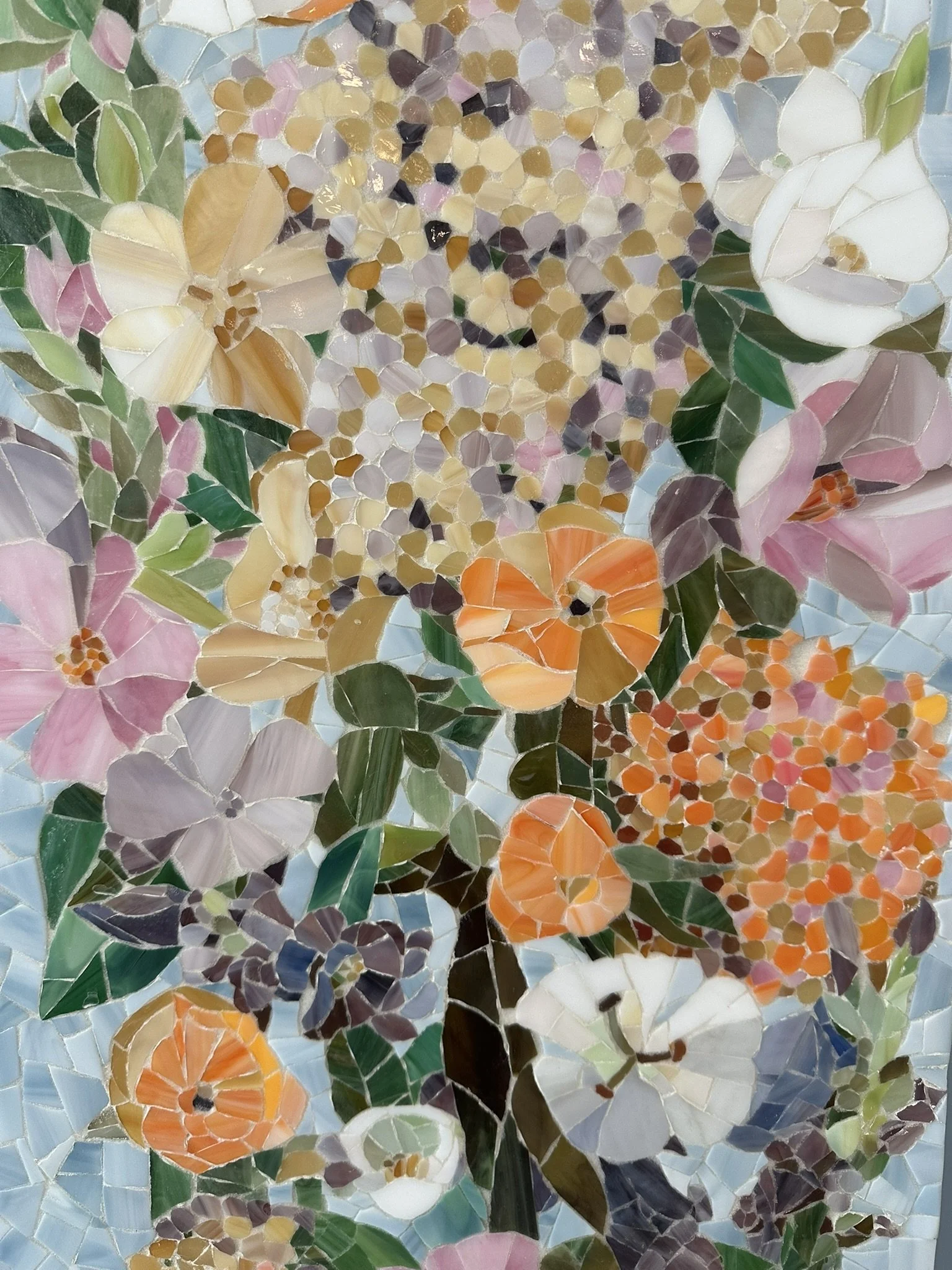
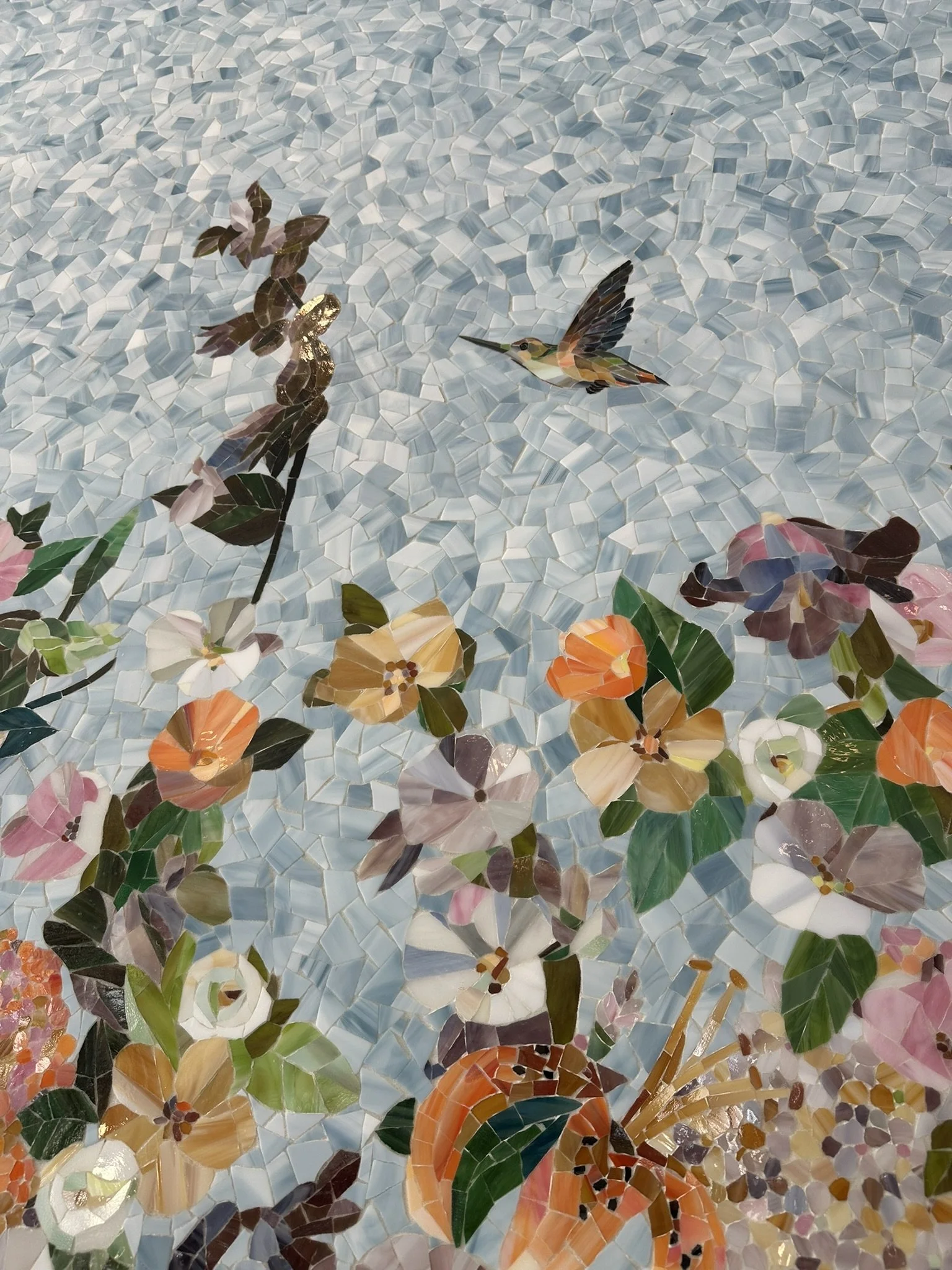
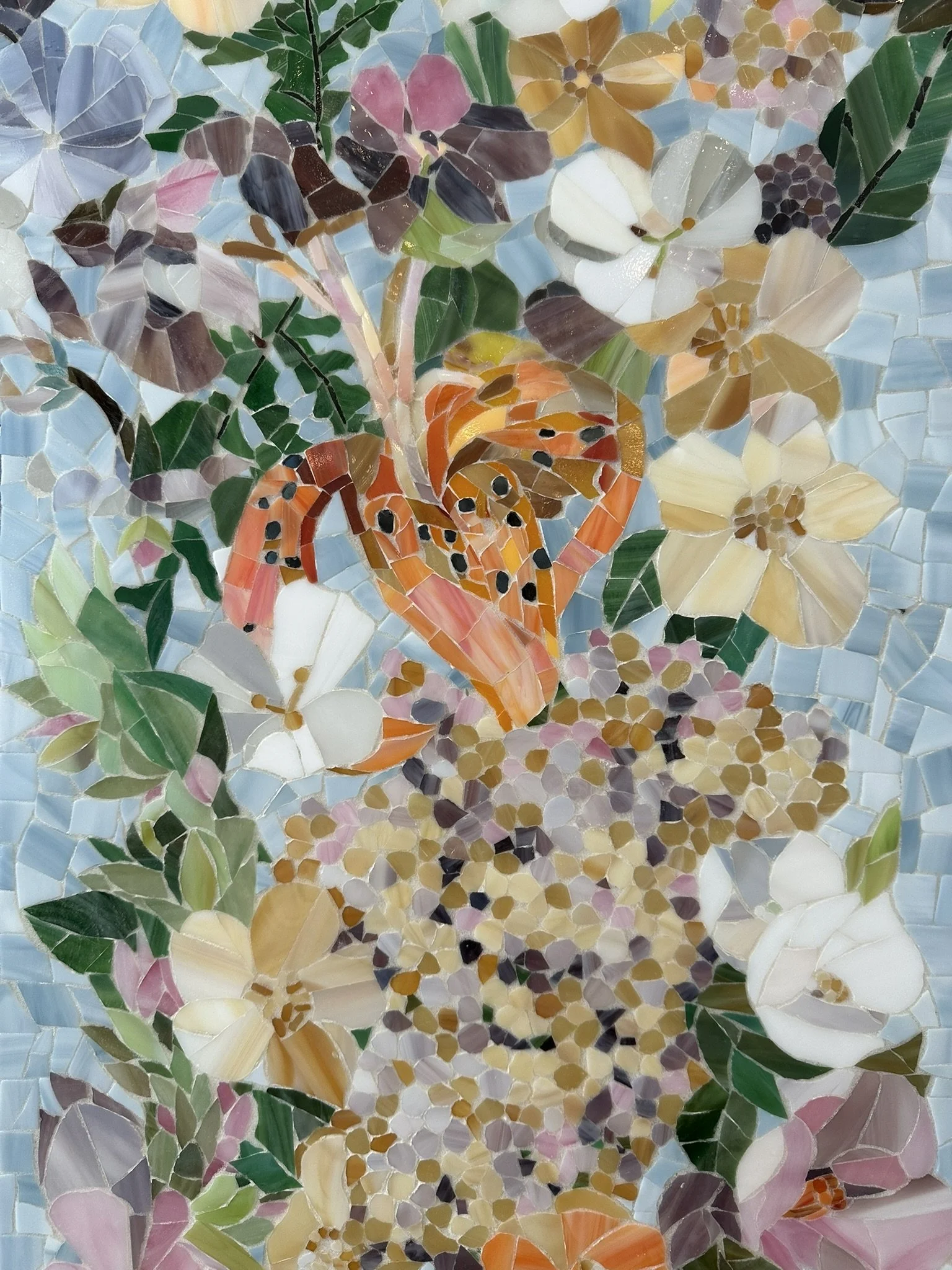
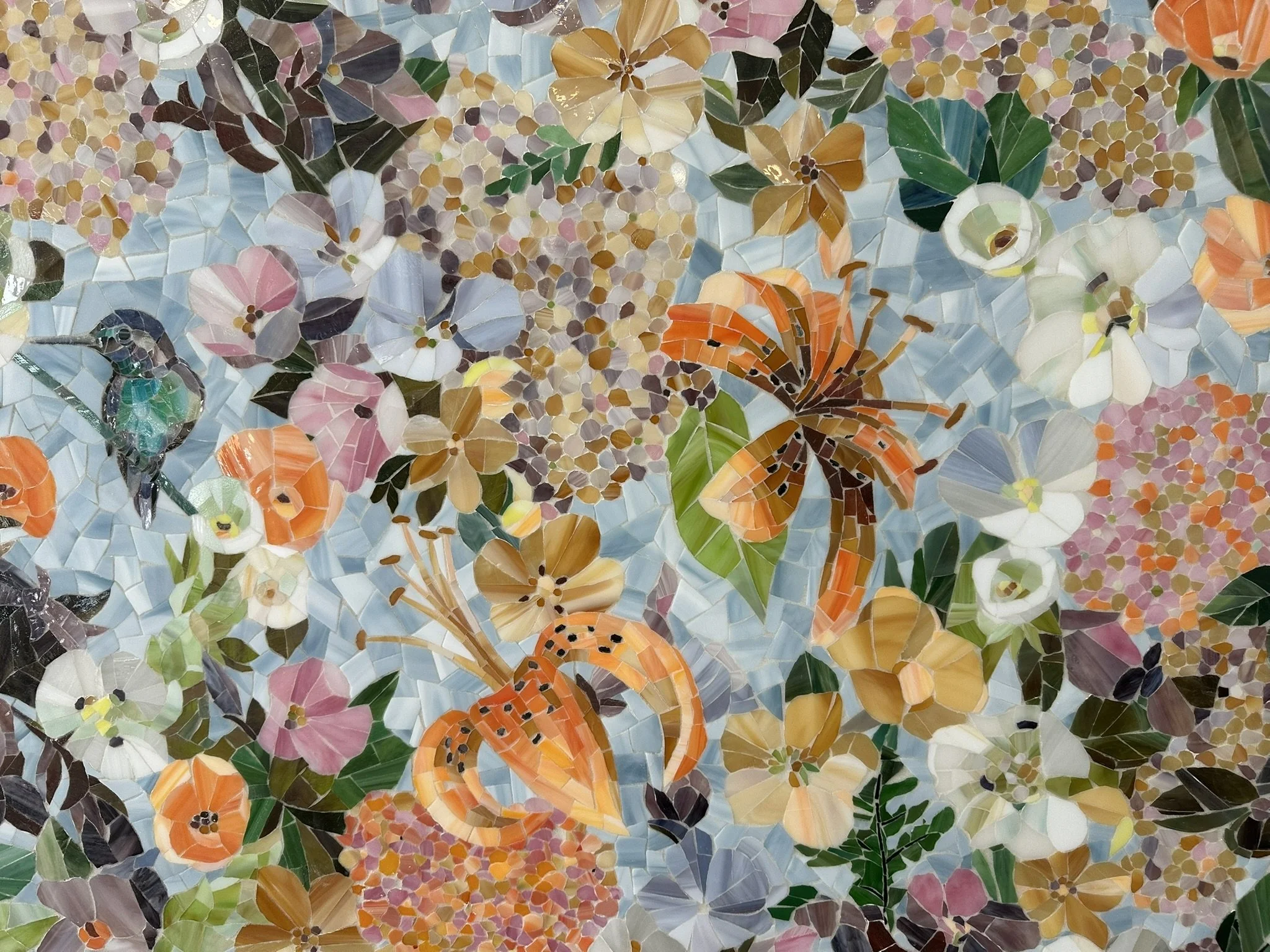
This perspective features the room’s deeper connection to the natural world, anchored by a vintage sunburst mirror hanging above a family sofa reupholstered in a high-performance, easy-to-clean textile. The true focal point is a magnificent, one-of-a-kind fine-art mosaic mural celebrating regional California wildlife, intricately depicting Curly Herissantia, Cambria Bush mallow, Salmon Beauty Yarrow, Palmer's Indian Mallow, Humboldt's Lily, Golden back Fern, and Allen's Hummingbird. A specialized postural support beanbag system rests nearby, providing a comfortable, supportive environment. Mirroring the home's pet-inclusive philosophy, custom dog beds crafted from coordinating textiles ensure companion animals are warmly welcomed in this shared oasis. The layout balances a warm, traditional aesthetic with a footprint built for long-term durability.
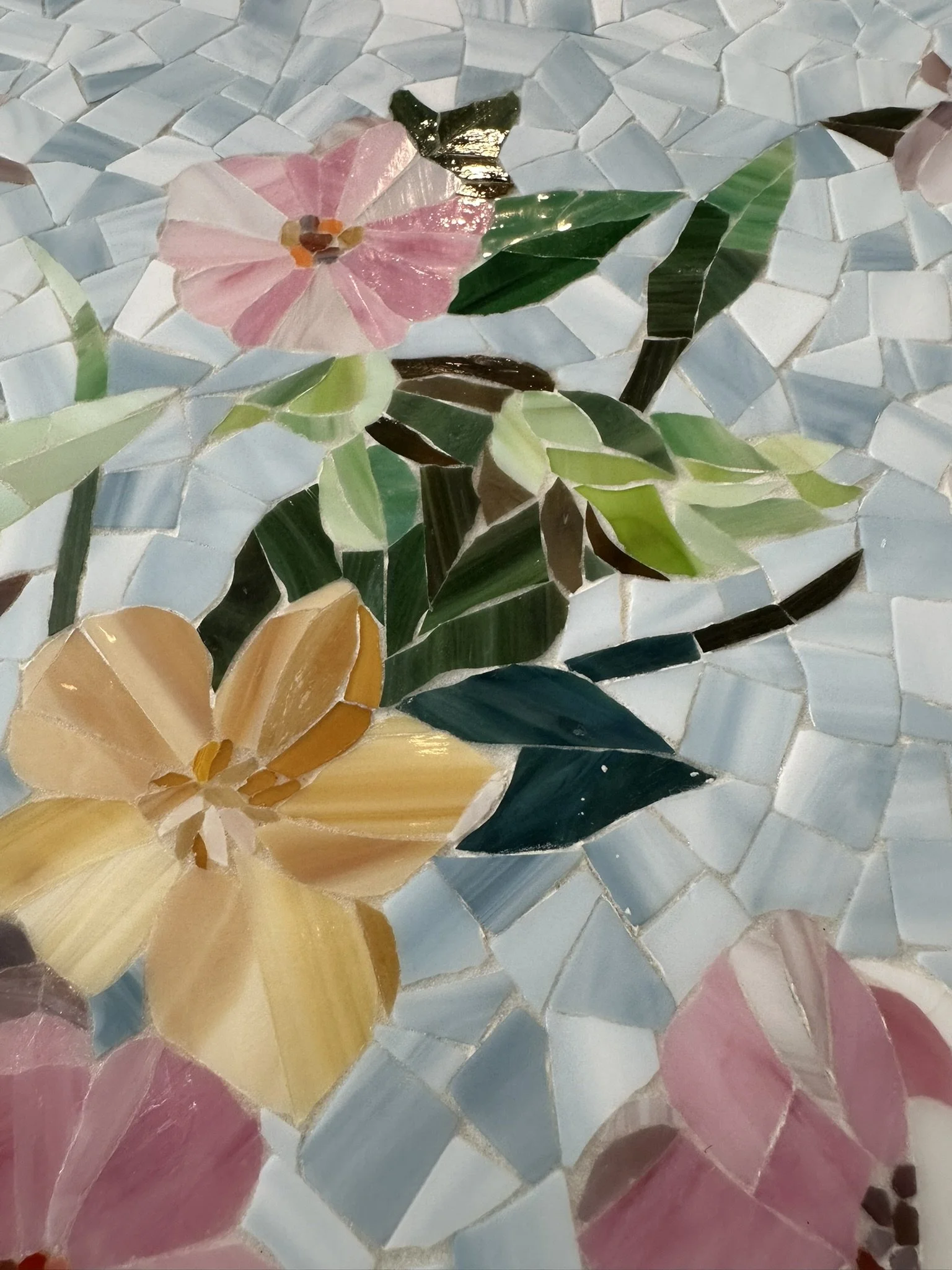
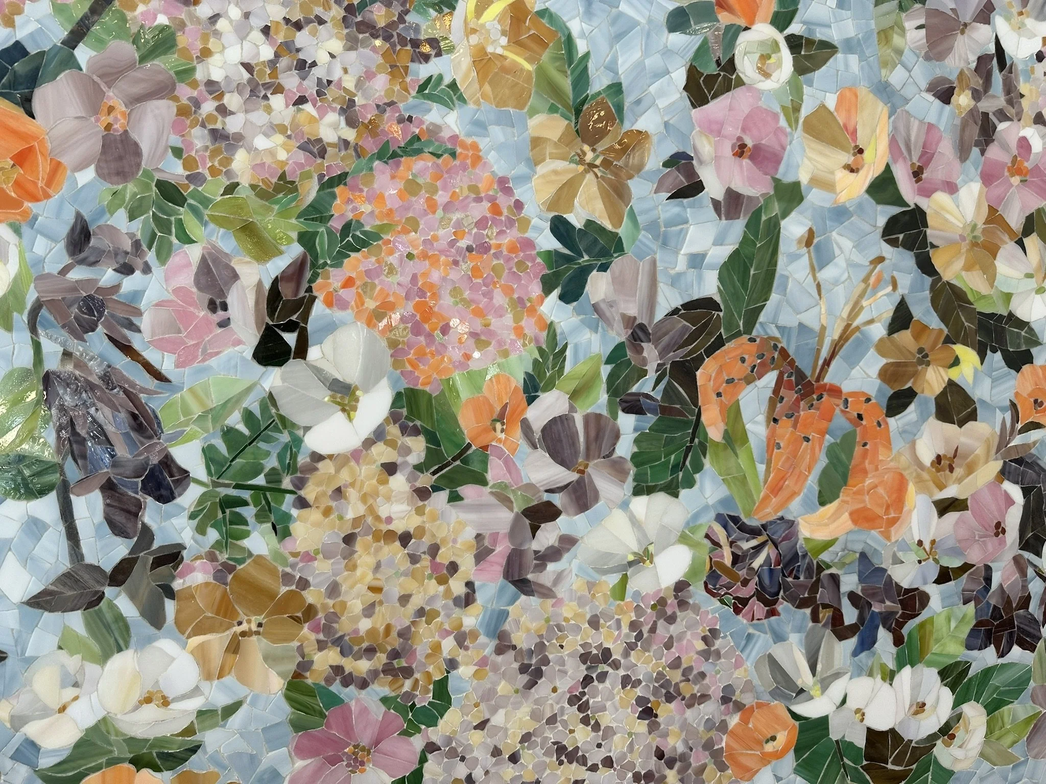
This detailed view highlights the meticulous artistry of the custom mosaic mural, bringing the vibrant ecosystem of California's flora and fauna directly into the home's interior. The design beautifully showcases the delicate textures of native species like Humboldt's Lily and Palmer's Indian Mallow, offering a highly tactile and visual experience for family members. This artwork exemplifies the project's core philosophy of naturalist glamour, connecting therapeutic, accessible spaces to fine art.
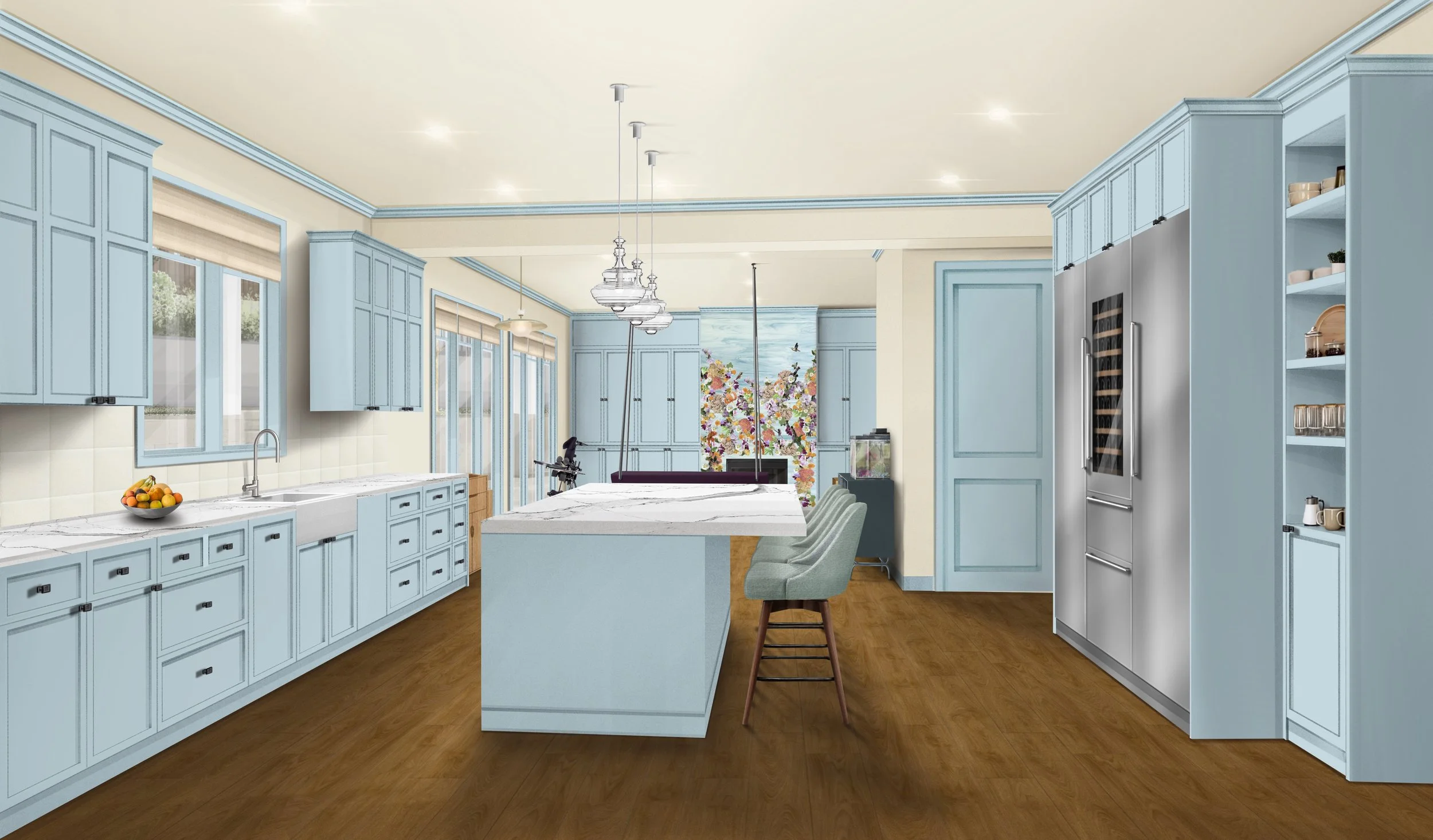
From the kitchen, the interior design maintains visual continuity by carrying the same pale sky blue palette from the family room's built-in cabinetry and trim directly onto the custom kitchen millwork. A backsplash of three-dimensionally carved marble features a subtle floral pattern that acts as a delicate texture from a distance and reveals deep artisan detail up close. Sturdy counter stools are wrapped in a resilient indoor-outdoor textile that remains remarkably soft to the touch. This perspective highlights the project's open-concept layout, featuring flush flooring and expansive pathways that keep the kitchen workstations fluidly connected to the family space, with the wildlife mural visible just beyond the counter.
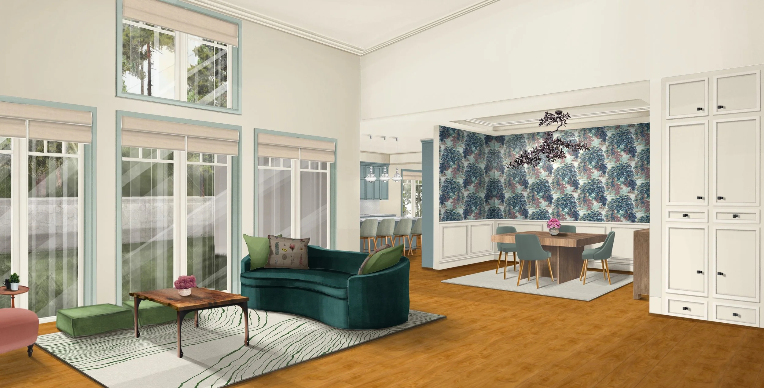
From the living room, the open floor plan provides a visual connection to the home's formal entertaining spaces, offering a clear view into the adjacent dining room, with the sky-blue kitchen visible in the distance. In the foreground, biophilic elegance shines through custom sofa toss pillows delicately embroidered with botanical motifs. Beyond the living area, the dining room features an elegant forest-patterned wallpaper in shades of teal, slate blue, and dusty rose, beautifully paired with a custom-fabricated oak-leaf chandelier. At the center sits a unique walnut dining table engineered with an internal self-storing leaf mechanism, accompanied by the family's original chairs thoughtfully reupholstered in a high-performance, healthcare-grade silicone faux leather. Grounding both spaces, a continuous flat floor surface and low-profile rugs help family members using mobility devices navigate seamlessly between rooms.
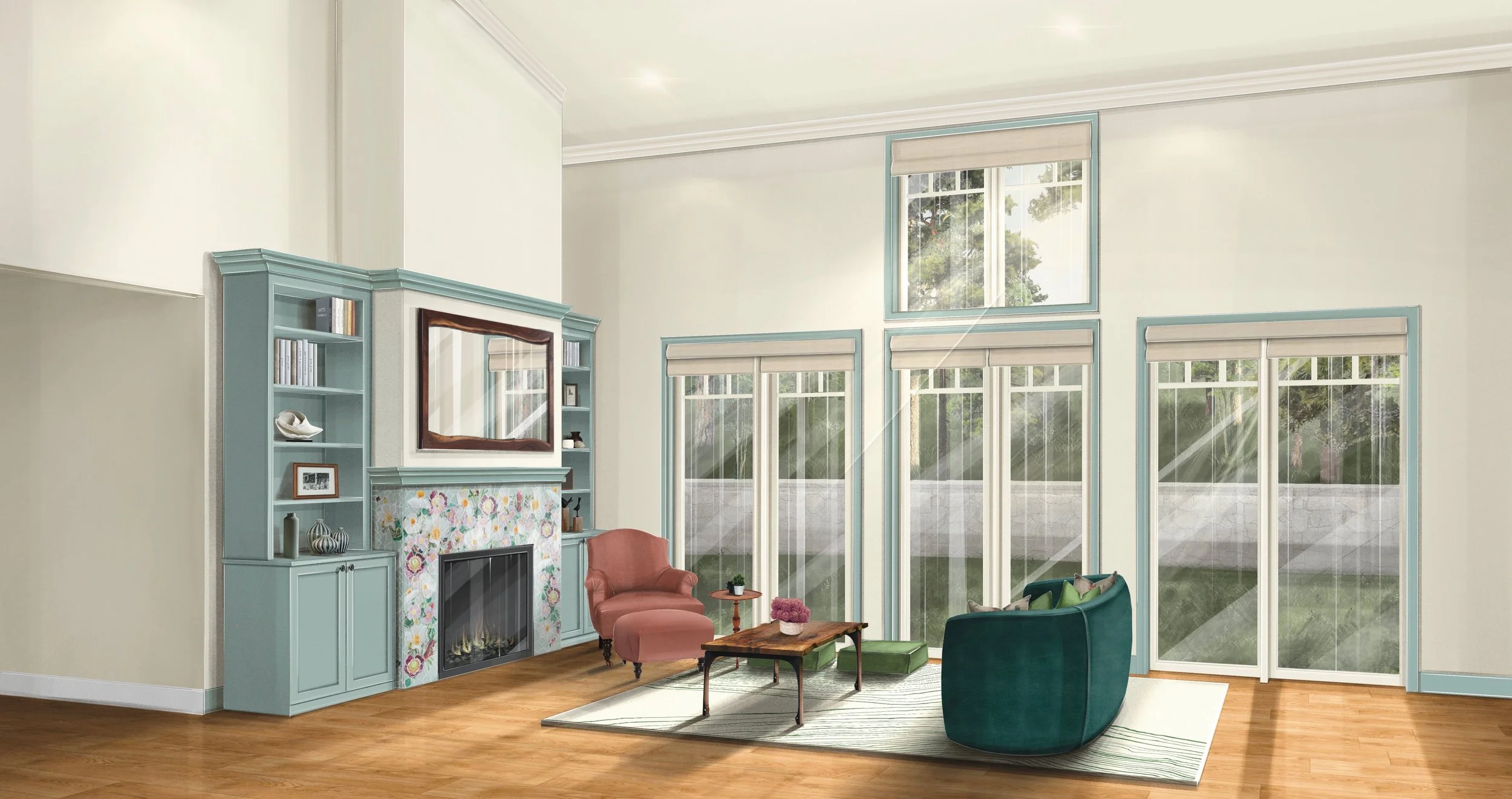
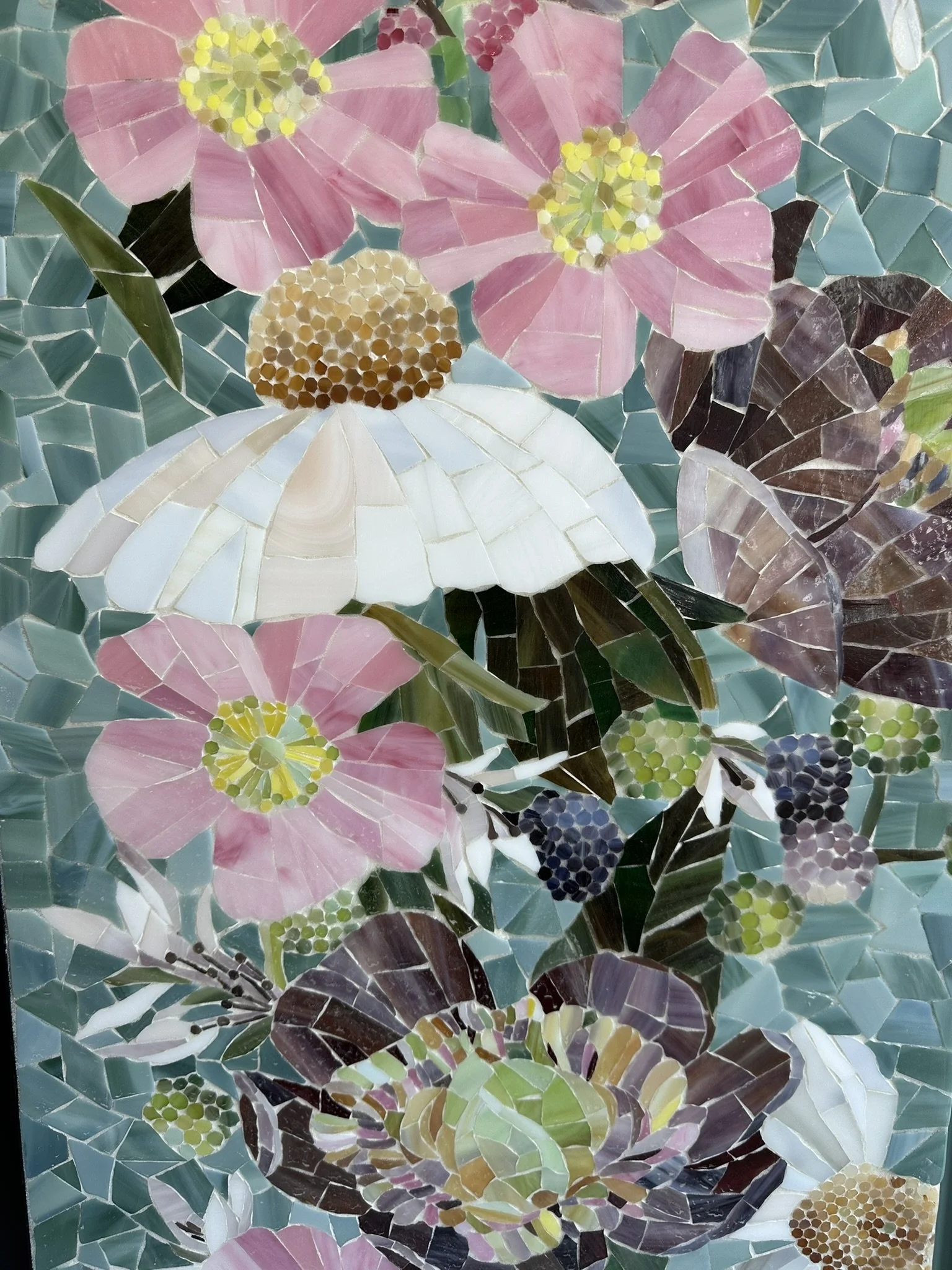
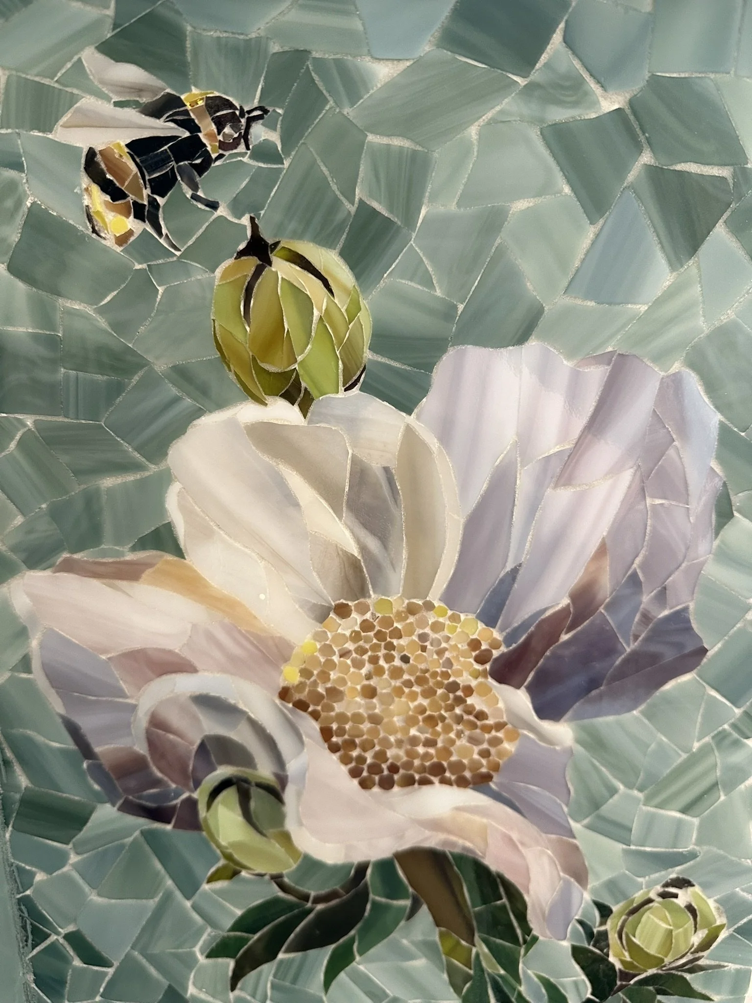
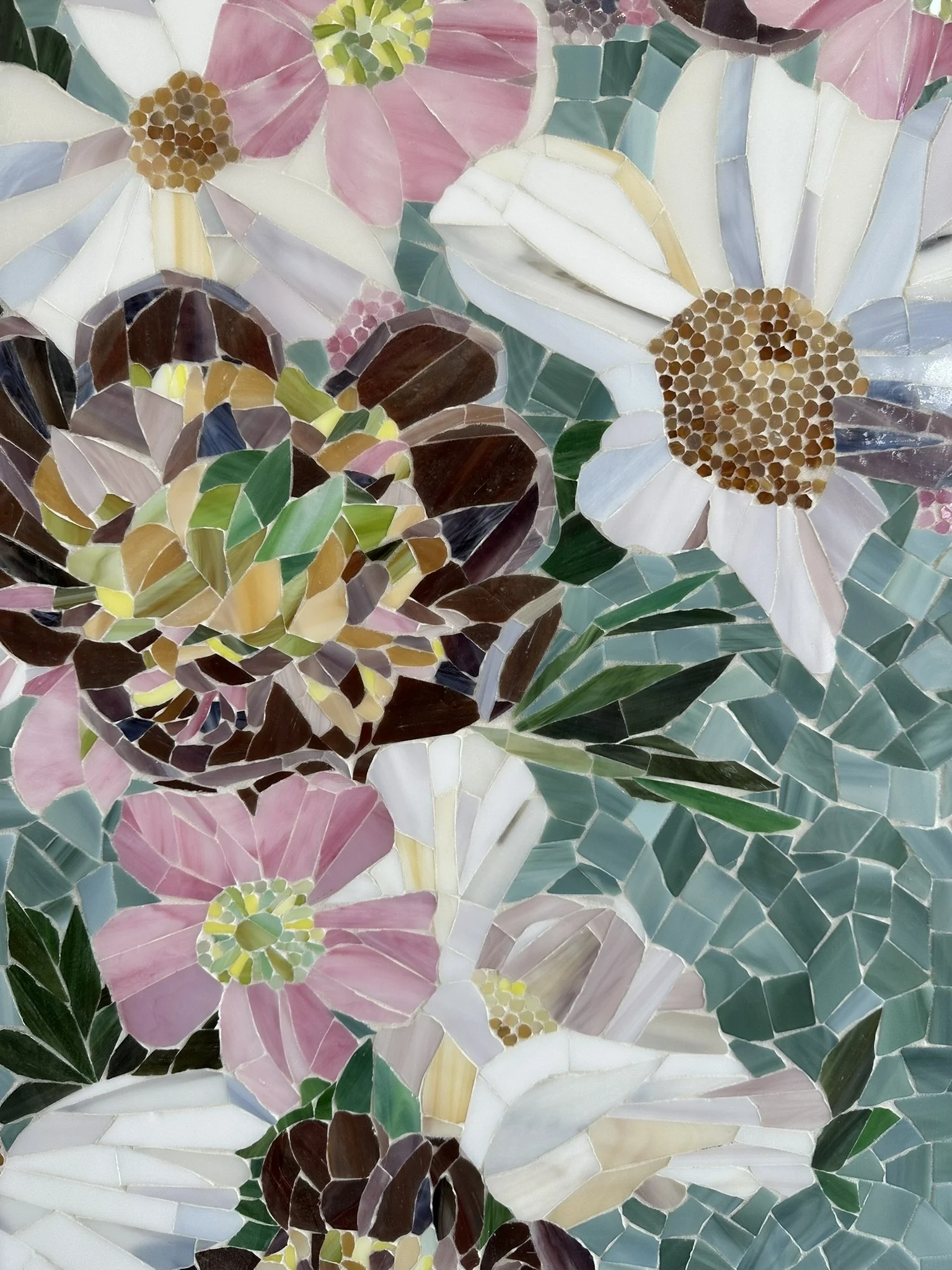
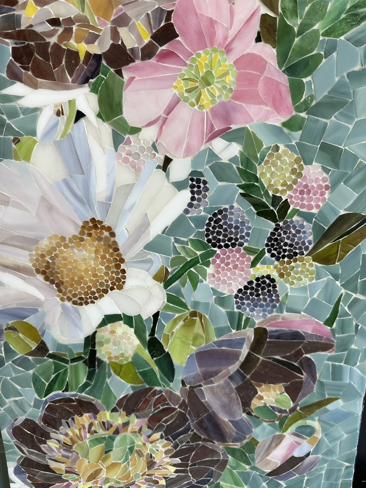
The formal living room centers on a custom mosaic fireplace surround that celebrates regional biodiversity and serves as the primary visual anchor of the space. The intricate artisan tile work brings the local landscape indoors by accurately depicting California native Peonies, Matilija Poppies, California Wild Roses, California Blackberries, and the Bombus californicus bumblebee. This vibrant floral motif bridges architectural details and fine art practice. Flanking the detailed hearth, custom cabinetry and clean architectural moldings provide a structured, traditional frame that balances the organic movement of the custom mosaic. To support inclusive wellness, the seating area maintains a wide turning radius and a low-profile, washable area rug.
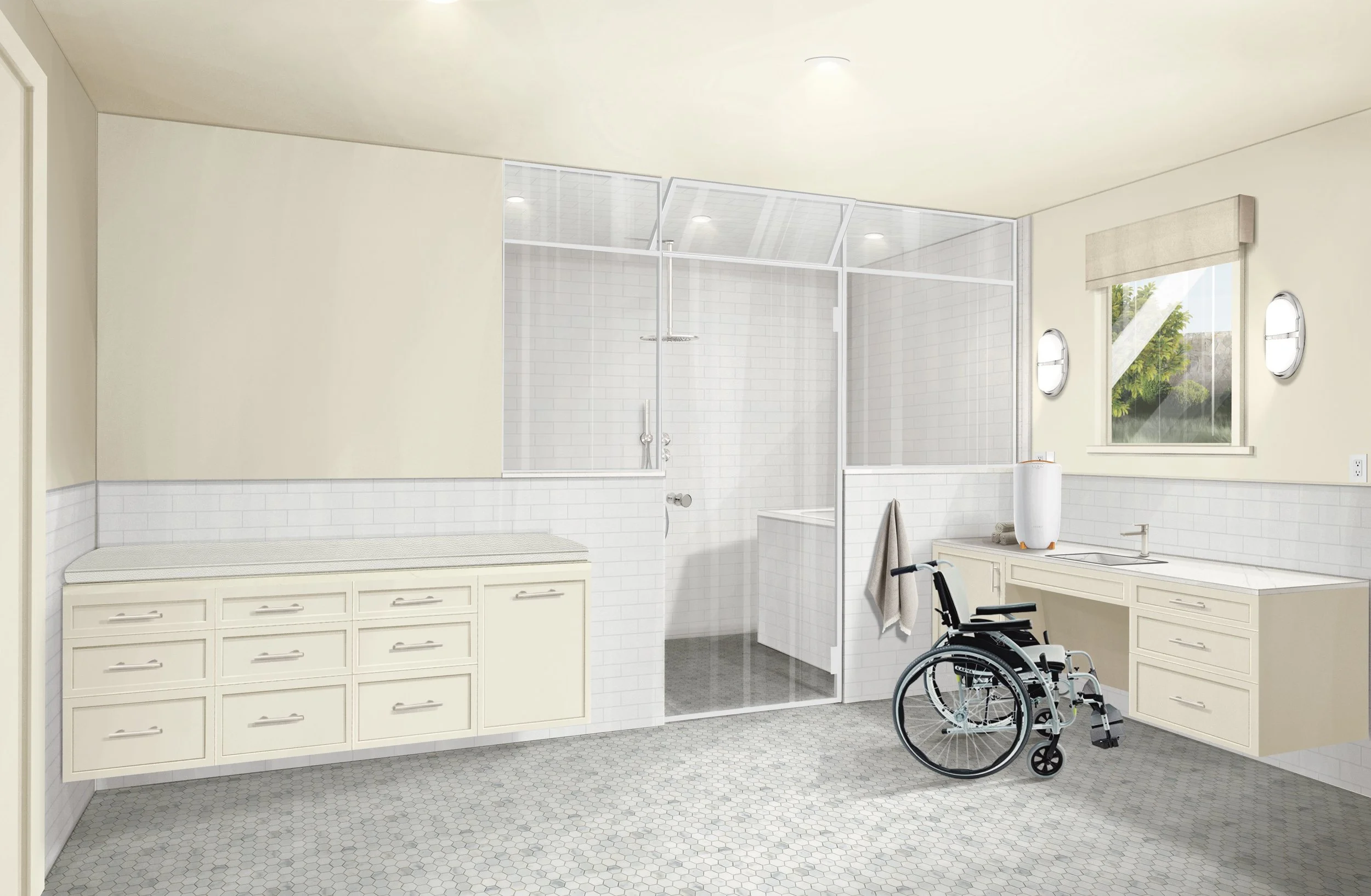
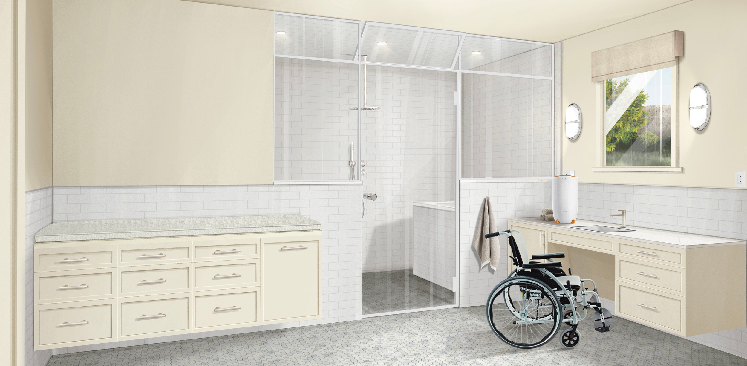
Tailored specifically for a family member with a vision impairment who uses a wheelchair, this inclusive bathroom combines traditional styling and premium materials with universal design principles. The vanity is engineered for a seated user, featuring an angled protective panel at the knee space alongside a 9-inch clear toe space below all surrounding wall-mounted cabinetry. In place of a mirror, a window features a motorized window treatment for easy, hands-free operation. The countertop hosts a freestanding towel warmer, adjacent to specialized cabinetry configured to hold a Diaper Genie and a silicone-leather changing-table cushion designed to accommodate the family member as they grow.
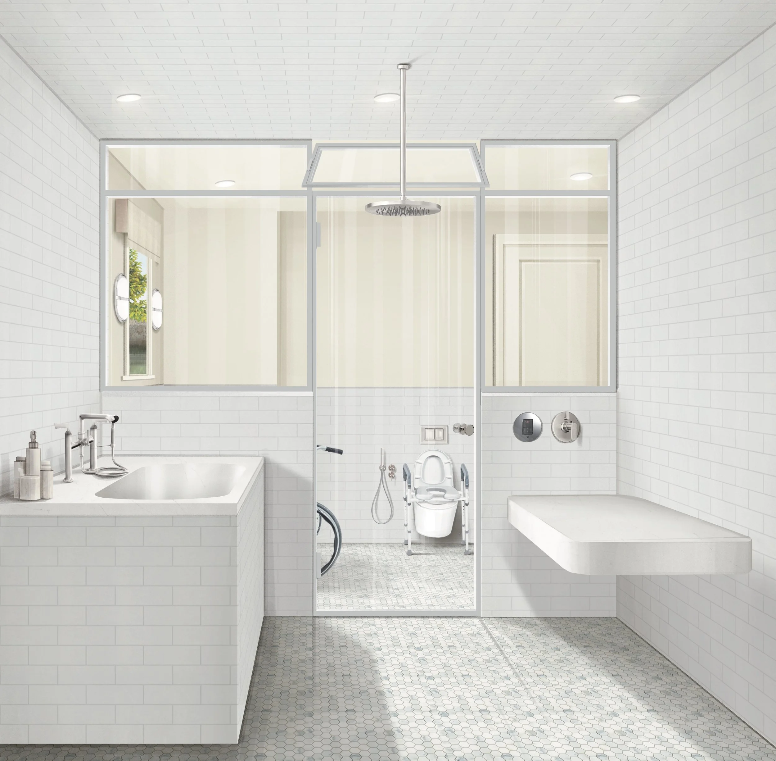
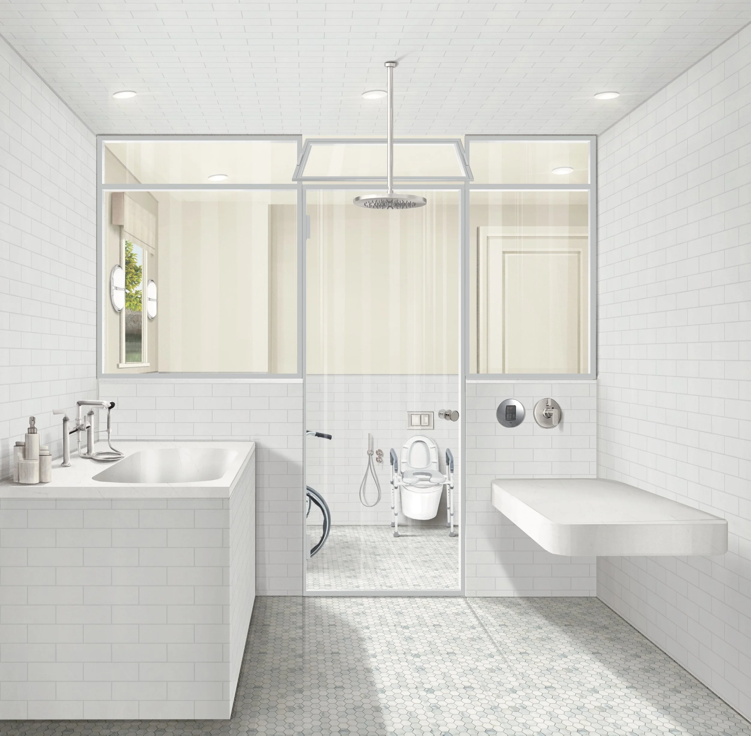
This view from inside the steam enclosure showcases a barrier-free wet room area designed with a curbless transition to comfortably accommodate a user and two caregivers simultaneously. Designed with an ample, open scale, the space highlights a raised bathtub outfitted with a therapeutic jet system, a wall-mounted shower table, an overhead rain shower experience, and a flexible hand shower. The custom glass enclosure features an operable vent in the upper portion to facilitate using the space with or without a steam experience. Functional design is woven discreetly throughout, including a vanity cabinet configured for pass-through access to the bathtub motor and a utility closet providing a dedicated service access point for the steam system.
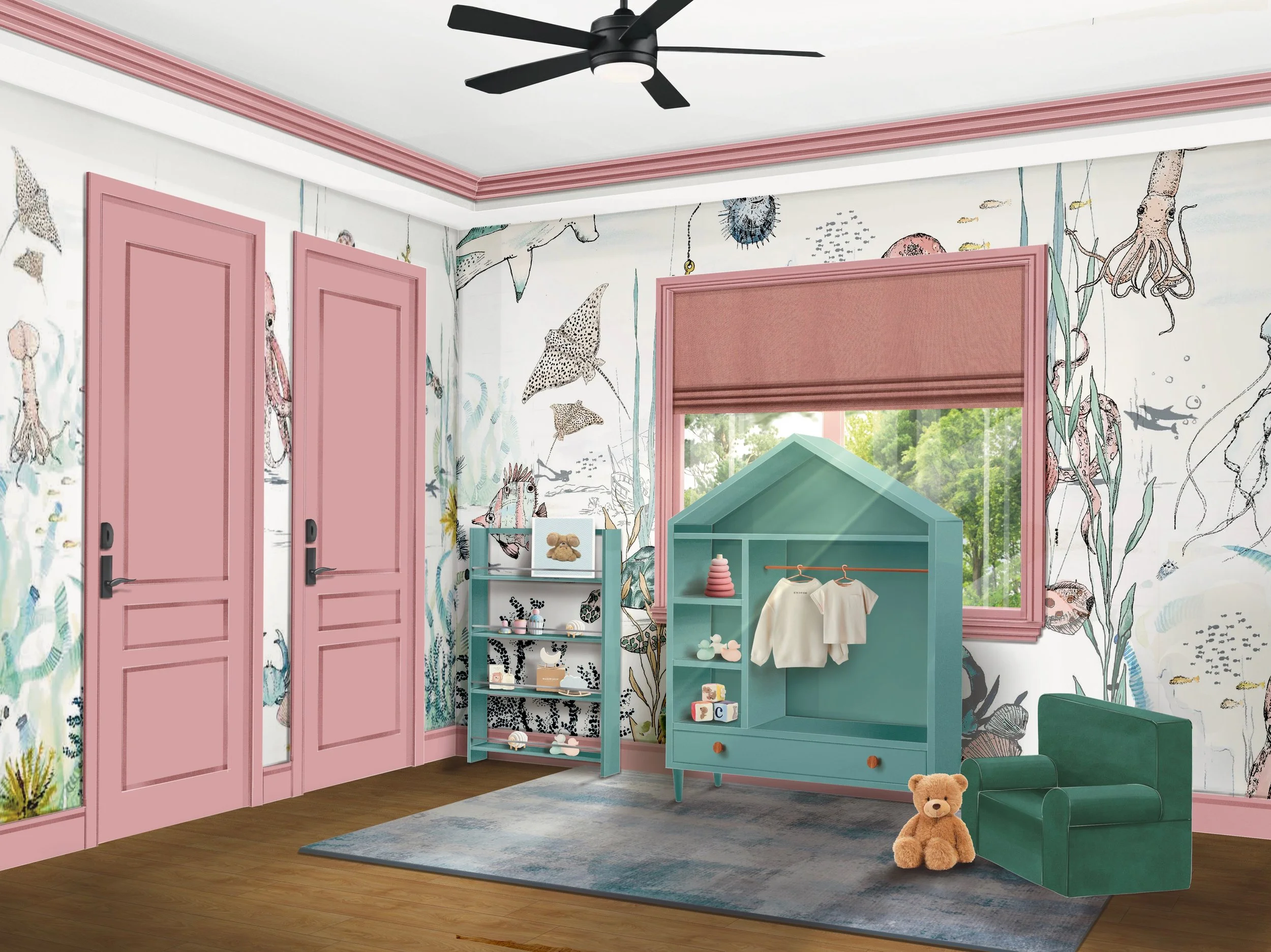
The child's bedroom interior design introduces a whimsical underwater-themed wallpaper rendered in soft pinks and varying shades of teal, creating an imaginative environment. Custom, child-height storage solutions and open shelving are meticulously designed to promote independent movement, keeping toys and belongings easily reachable. A child-sized upholstered armchair in deep teal provides a comfortable, supportive reading spot tailored perfectly to the scale of the room. The custom closets feature a forward-thinking design, making them fully accessible to the child now and easily adaptable to their needs as they grow. Grounded by a flat, washable rug and motorized window treatments for hands-free operation, the layout beautifully ensures a safe, navigable, and healthy space for play and rest.
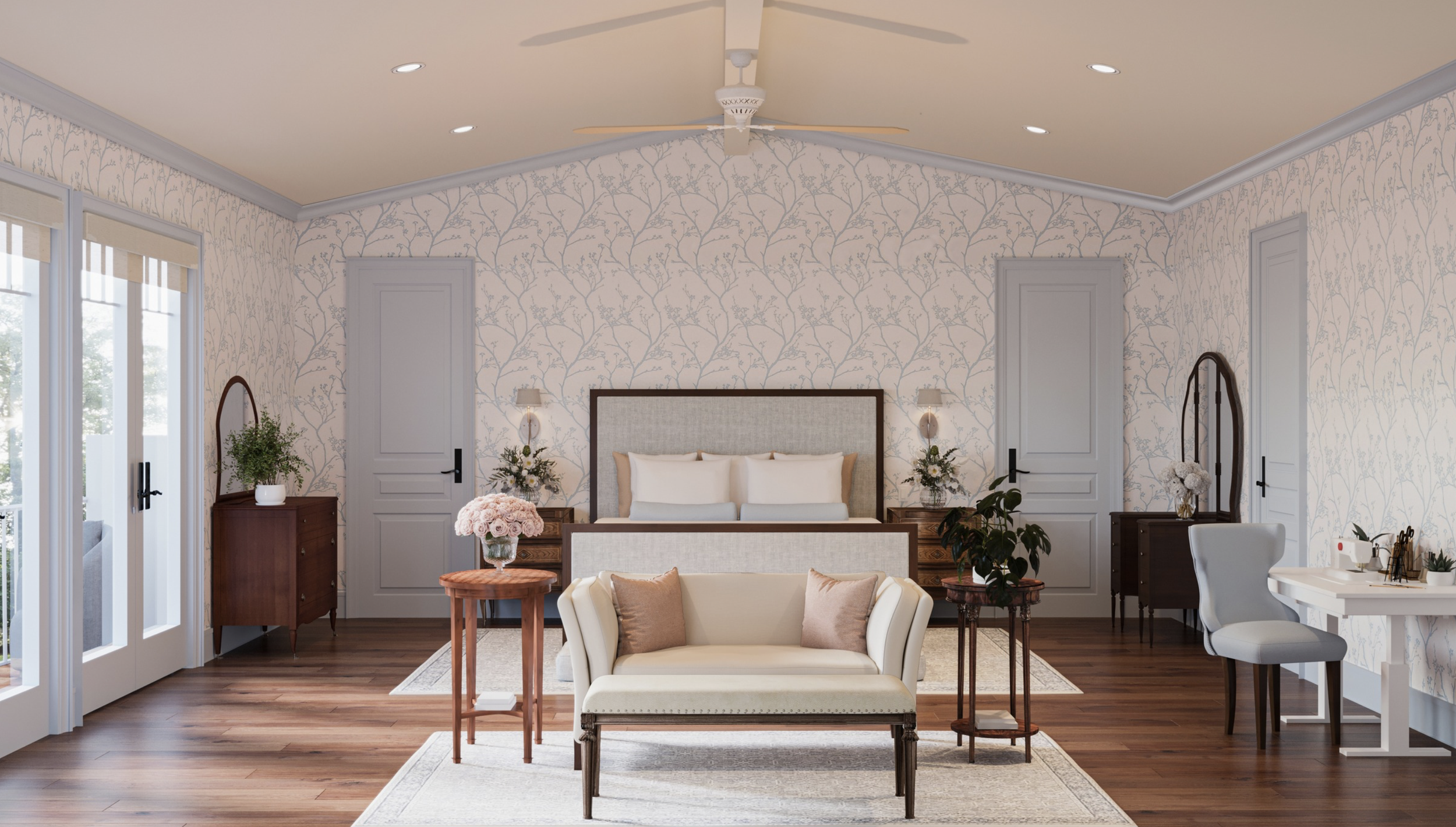
The primary bedroom transitions the residential narrative into a calm, restorative retreat, utilizing a soothing icy-blue palette and delicate floral wallpaper. Keeping holistic family health at the forefront, the custom-made bed is crafted with natural materials and dressed in certified organic linens. This view highlights how the client's treasured original antique dressers are balanced on opposing walls. Universal design principles extend into the room's functional corners, featuring a sewing table tailored to comfortably accommodate different physical needs and postures.
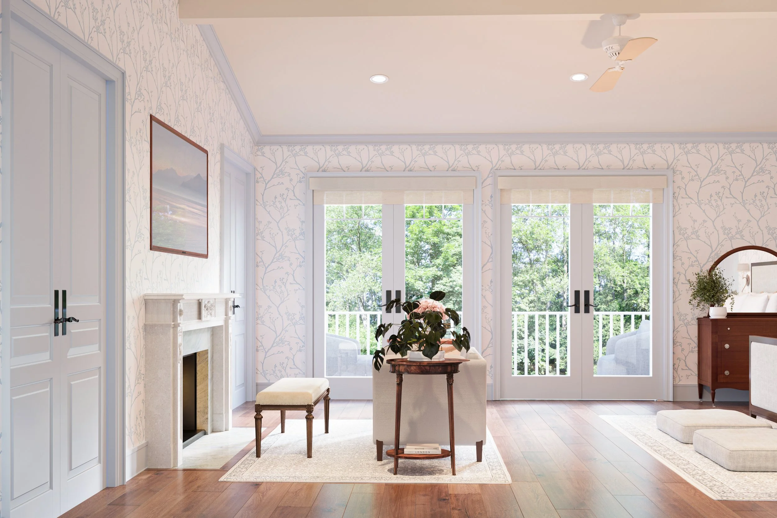
This perspective of the primary bedroom centers on a bright seating area framed by expansive double glass doors, showcasing the project's blend of historic charm and layout accessibility. The arrangement displays a curated reproduction bench and an authentic antique side table that ground the sitting space. Neatly integrated into the floor plan, custom pet beds upholstered in a high-performance, coordinating textile ensure the family's companion animals are warmly accommodated.
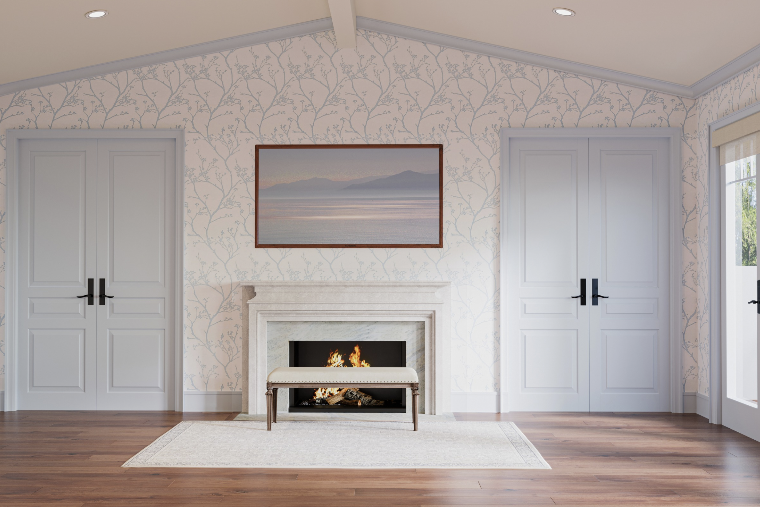
This final view showcases the primary bedroom's architectural symmetry, centering on a custom limestone fireplace with a natural stone slip and a flush hearth seamlessly integrated into the hardwood flooring. Above the mantle, a fine art photograph of the Salton Sea elegantly conceals a hidden television. The room’s delicate floral wallpaper wraps the walls in a soft pattern, framing the double doors and creating a balanced, classic layout. Grounded by a low-profile, flat area rug and a soothing color palette, this space highlights the project's thoughtful neuro-inclusive interior design principles, emphasizing a classic aesthetic and sensory calm.
Sarah Barnard is a WELL and LEED accredited interior designer and creator of environments that support mental, physical, and emotional wellbeing. She creates highly personalized, restorative spaces that are deeply connected to art and the preservation of the environment. A certified California Naturalist, Sarah believes in celebrating nature through responsible design that works symbiotically with the local environment.
An advocate for consciousness, inclusivity, and compassion in the creative process, Sarah has appeared in Architectural Digest, Elle Décor, Vogue, HGTV, and many other publications. Sarah was recognized as a "Ones to Watch" Scholar by the American Society of Interior Designers (ASID) and has been awarded "Best of Houzz Design" for seven consecutive years. Sarah's MFA in visual arts from Claremont Graduate University informs her practice and innovative approach toward interior design as creating a living work of art.
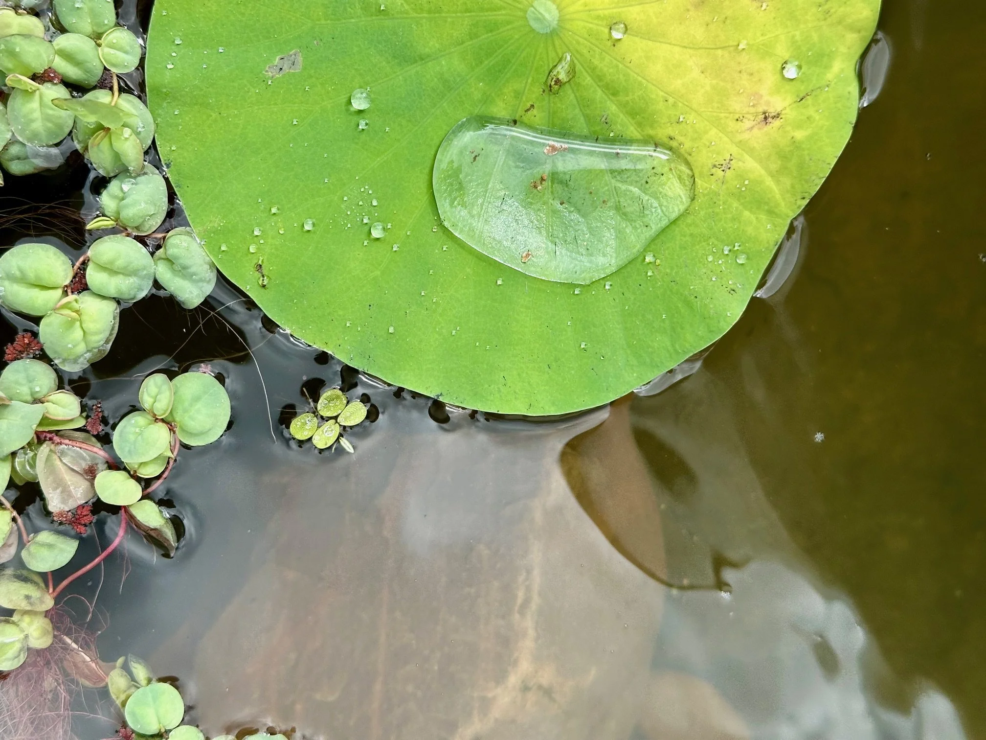
The Verdant Center: Cultivating Restorative Balance

The concept of the home has evolved into something far more profound than a collection of curated objects. It has become a site of resonance, a space where the physical environment and the internal emotional state seek a point of equilibrium. At the center of this dialogue is the Sanskrit principle of Anahata, the heart chakra. Translating literally as unstruck, Anahata represents a state of pure resonance, a frequency that remains undisturbed by external friction. As the fourth energy center, it serves as the essential bridge between the grounding, physical needs of the lower body and the higher intellectual and spiritual aspirations of the upper mind. In the context of interior design, creating an Anahata atmosphere means cultivating a sanctuary of balance, where the visual and tactile elements support a sense of emotional wholeness and psychological safety.
The primary hue associated with this energy center is green, a choice that mirrors the visible light spectrum. Positioned at the exact center of the spectrum, green provides a natural point of equilibrium, offering the human eye a state of visual rest that neither requires the energy of warmer tones nor the recession of cooler ones. By anchoring a room in the green heart, design may help support a profound sense of steadiness, making the environment an active participant in the restoration of the inhabitant. When a space is tuned to this specific frequency, it encourages a deeper connection to the self and the natural world, fostering a restorative experience that reaches beyond simple aesthetics.
Interior designer Sarah Barnard, LEED + WELL A.P., said, "Designing from a place of equilibrium allows for the home to act as a restorative anchor, where every material and color choice serves the long-term emotional well-being of the inhabitants."
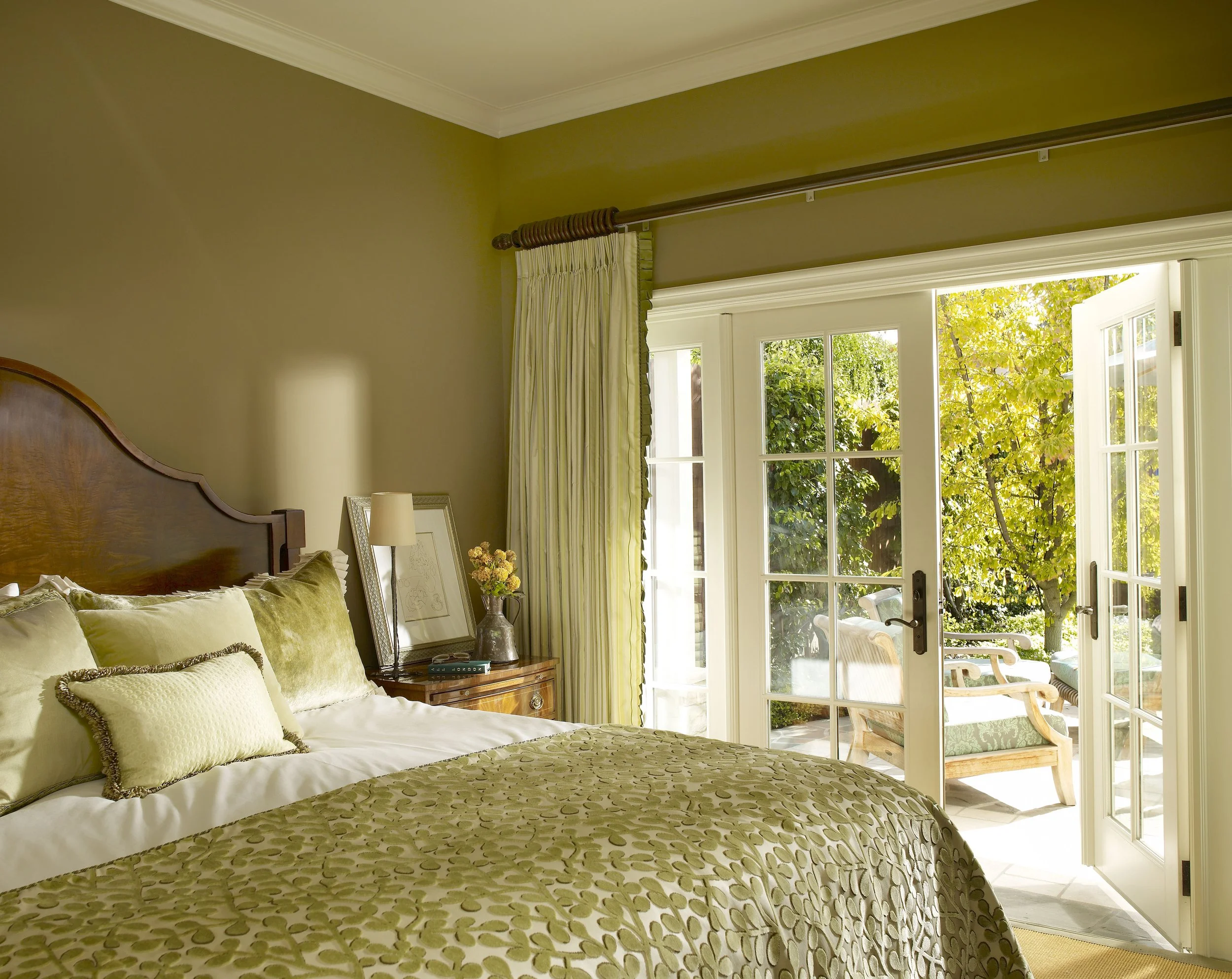
The Science of the Middle Ground
The preference for verdant environments is not merely an aesthetic inclination but is rooted in the biological reality of the human nervous system. The biophilia hypothesis suggests that people possess an innate tendency to seek connections with nature, a trait developed through evolutionary history where green environments signified survival and abundance. Modern neurobiological research has begun to quantify this connection, demonstrating that exposure to nature-inspired design may significantly reduce concentrations of oxy-Hb in the prefrontal cortex. This reduction reflects relief from the cognitive and emotional overload typical of contemporary life, allowing for enhanced neural stabilization and mental clarity. By decreasing the metabolic load on the brain's executive centers, green-centered spaces provide the cognitive quiet necessary for reflection and emotional regulation.
Environmental psychology further supports this through Stress Recovery Theory, which suggests that natural environments facilitate the recovery of psychological resources. Studies examining restorative outcomes have found that biophilic design elements, such as unobstructed nature views and the presence of indoor greenery, are associated with significant positive impacts on mental clarity and physical relaxation. These elements function as micro-restorative breaks, allowing the mind to disengage from task-oriented focus and enter a state of effortless attention. Even when a direct view of the outdoors is not accessible, the strategic use of green décor and art has been shown to produce measurable restorative benefits. Specifically, green-themed interiors have been linked to a positive influence on the ability of inhabitants to clear the mind of stressful thoughts, fostering higher levels of restoration than other color themes. The psychological impact is immediate, as the nervous system recognizes the spectral cues of safety and vitality inherent in the color green.
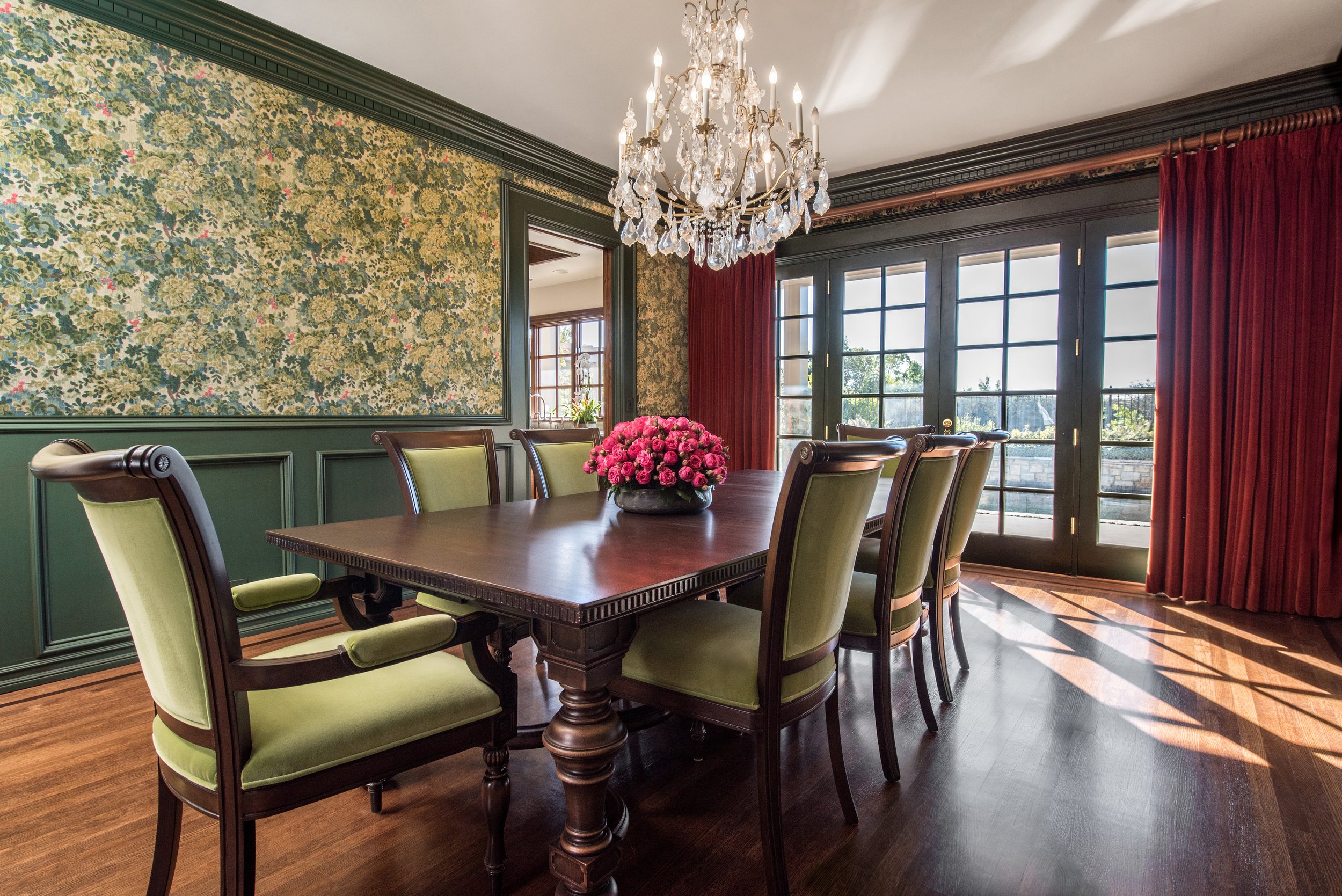
The Legacy of the Pigment
The history of green in the interior is a story of pursuit and permanence. While the color is abundant in the natural world, it was historically one of the most difficult hues for artists and pigment makers to stabilize. In antiquity, vibrant greens were often derived from malachite, a semi-precious gemstone that provided a rich, royal depth but was notoriously difficult to layer. During the Renaissance, artists relied on verdigris, a copper-based pigment known for its transparent, jewel-like brilliance. Verdigris was often reactive and unpredictable, having a tendency to darken to an olive-brown over centuries, turning once-vibrant landscapes into moody, earthen studies. This ephemerality created a longing for a green that could capture the eternal vitality of the forest without succumbing to the decay of time.
The cultural evolution of the color has seen it move from a symbol of rebirth and immortality in ancient Egypt to a modern emblem of environmental stewardship and longevity. One significant milestone in this history was the development of Hooker’s Green, created by botanical illustrator William Hooker. By mixing Prussian blue with gamboge, a yellow resin from Asian evergreen trees, Hooker achieved a lightfast, cool green that could accurately capture the waxy needles of a pine or the soft silver of sage. This transition from the fugitive, fleeting greens of the past to the permanent tones used today has allowed designers to anchor rooms in colors that endure. This sense of permanence is vital for creating a home that feels like a lasting legacy, where the environment remains an enduring foundation for a family’s growth. The color green thus represents a bridge across time, connecting ancient spiritual associations with the modern requirement for sustainable, long-lasting beauty.

Tactile Vitality and Botanical Materiality
A restorative interior design must move beyond the purely visual, engaging the senses through a philosophy of haptic design. Luxury, in this context, is defined by how a room feels under the hand and by how the materials support the occupant's emotional state. This shift toward sensory-first environments acknowledges that luxury and well-being are experienced through all five senses. Texture becomes a defining design language, moving away from sterile surfaces toward matte and honed finishes, textured stone, and hand-woven textiles. Natural fibers play a critical role in this sensory engagement, offering a tactile richness that synthetic materials cannot replicate. These organic surfaces invite touch, grounding the inhabitant in the present moment and reinforcing the home’s role as a protective sanctuary.
Using high-end materials like 100% Belgian linen connects to the raw beauty of nature. This mid-weight fabric is highly versatile, offering a lovely handle that drapes beautifully for upholstery or drapery. Textiles in deep botanical tones, such as the mossy, grey-green of rosemary or the dusty, bluish-green of thyme, add a layer of organic texture to the space. These colors, drawn from the medicinal and culinary herbs of the Mediterranean, evoke a sense of heritage and nourishment. When paired with interior jewelry in the form of malachite slabs or semi-precious stone accents, the room gains a symbolic depth. Malachite, historically known as a stone of transformation, brings a vibrant energy that encourages emotional renewal and prosperity. The interplay between the soft, yielding texture of linen and the cool, unyielding weight of stone creates a multisensory dialogue that reflects the complexity of the natural world.

Designing with Compassion and Intention
Designing for the green heart requires a commitment to inclusive design strategies that prioritize the specific, nuanced needs of every inhabitant. For neurodivergent individuals or those with sensory sensitivities, the home must function as a sensory retreat. This involves creating varied paths of movement and balancing open, light-filled spaces with smaller, comforting nooks that feel like a protective envelope. These inclusive spaces are designed not for a generic user but for the specific biological needs of a human being, fostering a sense of psychological safety. The goal is to reduce sudden sensory arousal while providing an environment that is actively healing and restorative, allowing the inhabitant to navigate their world with autonomy and grace.
The integration of restorative infrastructure allows the home to mimic natural systems, supporting the body's internal rhythms. Circadian rhythm lighting, which shifts in temperature to mirror the natural progression of the sun, is essential for regulating sleep cycles and mood. Similarly, the implementation of quiet tech ensures that the home remains a mindful sanctuary. By hiding technology within the architecture, through invisible audio systems or seamless automation, the heartbeat of the home is maintained without disrupting the aesthetic harmony or creating sensory clutter. This approach allows the architecture to shine while technology operates effortlessly in the background to enhance the restorative experience. Every technical integration is chosen for its ability to simplify life, reducing the friction between the inhabitant and their environment.

The Reunion of Nature and Interior Space
The reunion of the natural world with the human-made interior marks a shift toward a more compassionate, human-centric maturity in design. When a home is designed from the heart, it becomes a narrative of renewal, where every material choice and layout decision supports the well-being of the inhabitants. The Anahata atmosphere is an invitation to let nature inside, not merely as a decorative accent, but as a biological necessity. This reunion acknowledges that our place-based relationships with the land do not end at the threshold of the home. Instead, the interior serves as an extension of the garden, a space where the biological needs of the human body are met with the same care as the mind’s aesthetic desires.
In the quiet resonance of a green room, the mind finds space to settle, and the body finds the support it needs to thrive. By aligning ancient principles of harmony with modern, evidence-based wellness standards, designers create environments that do more than just look beautiful; they nurture both body and soul. The verdant center supports a home that remains a protective, restorative sanctuary, where every inhabitant is allowed to be truly whole. The legacy of the green heart is one of steadiness and growth, offering a timeless foundation for a life lived in balance.
Sarah Barnard is a WELL- and LEED-accredited interior designer and creator of environments that support mental, physical, and emotional well-being. She creates highly personalized, restorative spaces that are deeply connected to art and to environmental preservation. A certified California Naturalist, Sarah believes in celebrating nature through responsible design that works symbiotically with the local environment.
Bibliography
Astell-Burt, Thomas, and Xiaoqi Feng. "Visible Green Nature and Restoration Outcomes." National Center for Biotechnology Information (NCBI). pmc.ncbi.nlm.nih.gov/articles/PMC12340148/
Fang, Karen. "Hooker’s Green: The History of Immortality." The Engines of Our Ingenuity, University of Houston. engines.egr.uh.edu/episode/3241
National Gallery London. "A History of the Colour Green in Art." National Gallery. www.nationalgallery.org.uk/podcast/colour-stories-green
Sugarman, Anna. "Heart Chakra: Love, Compassion and Generosity." Yoga Jala. yogajala.com/heart-chakra/
Taylor & Francis Online. "Systematic Review of Biophilic Design in Workplaces." Journal of Architectural Engineering. tandfonline.com/doi/full/10.1080/17508975.2024.2306273
Ulrich, Roger S. "Stress Recovery Theory and the Natural Environment." Journal of Environmental Psychology. pmc.ncbi.nlm.nih.gov/articles/PMC11878902/
Wilson, Edward O. Biophilia. Harvard University Press, 1984.
World Journal of Pharmaceutical and Medical Research. "Literature on Anahata Chakra." Vol. 5, Issue 2, 2019. www.wjpmr.com/download/article/43012019/1548850018.pdf
Yin, J., et al. "Biophilic Spatial Design and Neuropsychological Restoration." MDPI: International Journal of Environmental Research and Public Health. www.mdpi.com/1660-4601/22/10/1571
Zhong, S., et al. "Biophilic Design Elements and Physiological Stress." Frontiers in Virtual Reality. frontiersin.org/journals/virtual-reality/articles/10.3389/frvir.2025.1411425/full
The Architecture of Autonomy: Elevating Wellness through Individual Sleeping Sanctuaries
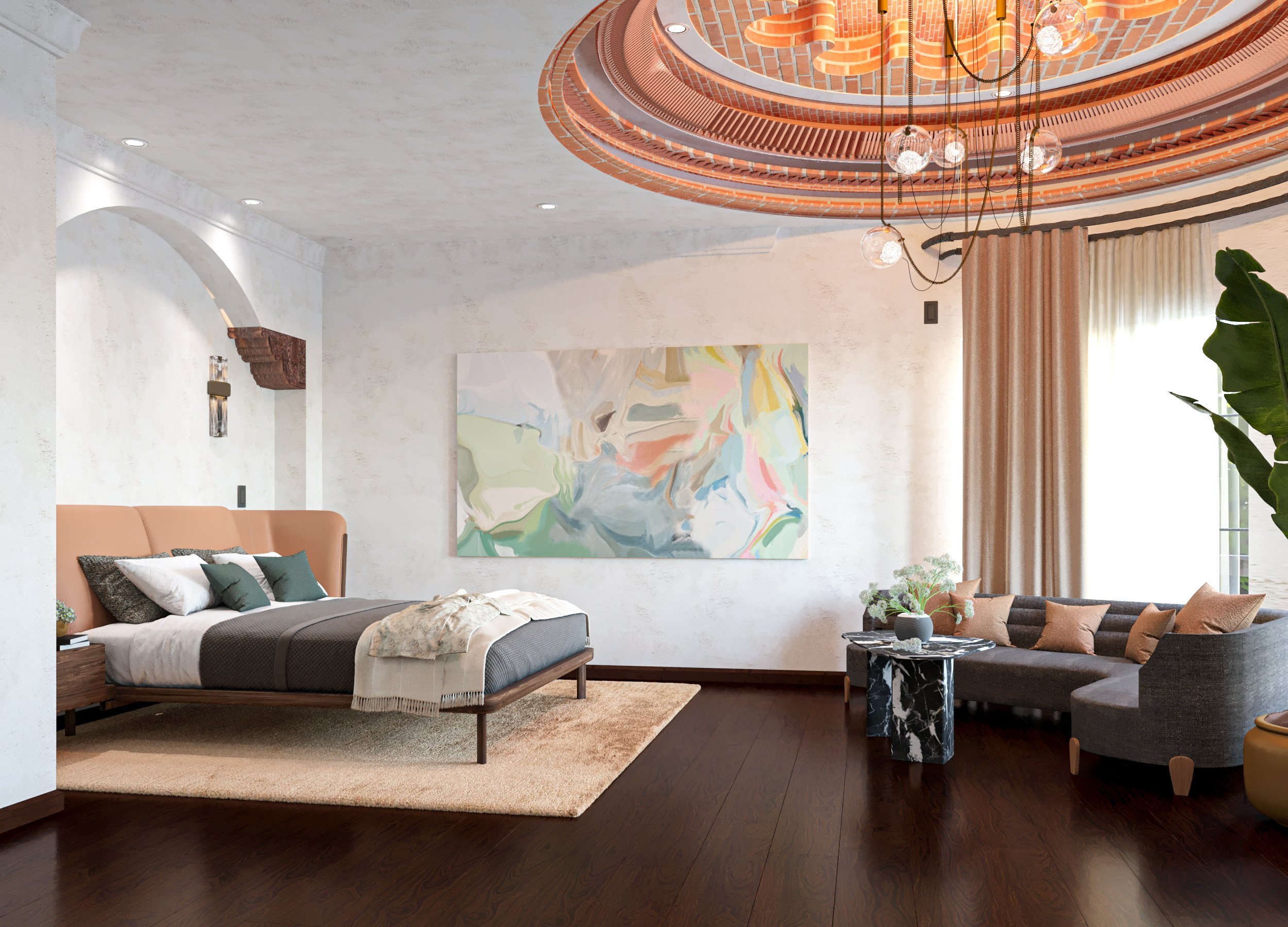
In high-end residential design, luxury is often defined by the removal of friction. We create environments that anticipate needs, soothe the senses, and provide a seamless backdrop for a life well-lived. While traditional floor plans have prioritized the shared primary suite as the pinnacle of domestic harmony, a more sophisticated perspective is emerging, looking to historical precedent and modern biological science to reclaim the luxury of personal space.
By prioritizing individual sleeping sanctuaries, we move beyond the limitations of shared environments and embrace the Architecture of Autonomy. This approach does not signal a departure from partnership; it honors the individual’s biological needs and identity, ultimately fostering a deeper, more intentional connection.
The Sovereign Precedent: A Legacy of Privacy
The concept of the shared bed is a relatively modern standard. Historically, the elite maintained distinct private chambers as a symbol of status and dignity. In royal courts, the separate chamber was not a sign of a distant marriage but a recognition of individual sovereignty. These suites facilitated the ceremony of one’s day, rising and retiring, allowing each person to maintain their own schedule and sensory preferences without imposition.
In contemporary design, we are returning to this regal standard. By shifting the narrative from a shared master to dual primaries, it gives homeowners the freedom to inhabit spaces that are entirely their own. This is not a compromise of intimacy but an elevation of it, transforming togetherness from a default setting into a meaningful, chosen event.
Biological Precision and Environmental Optimization
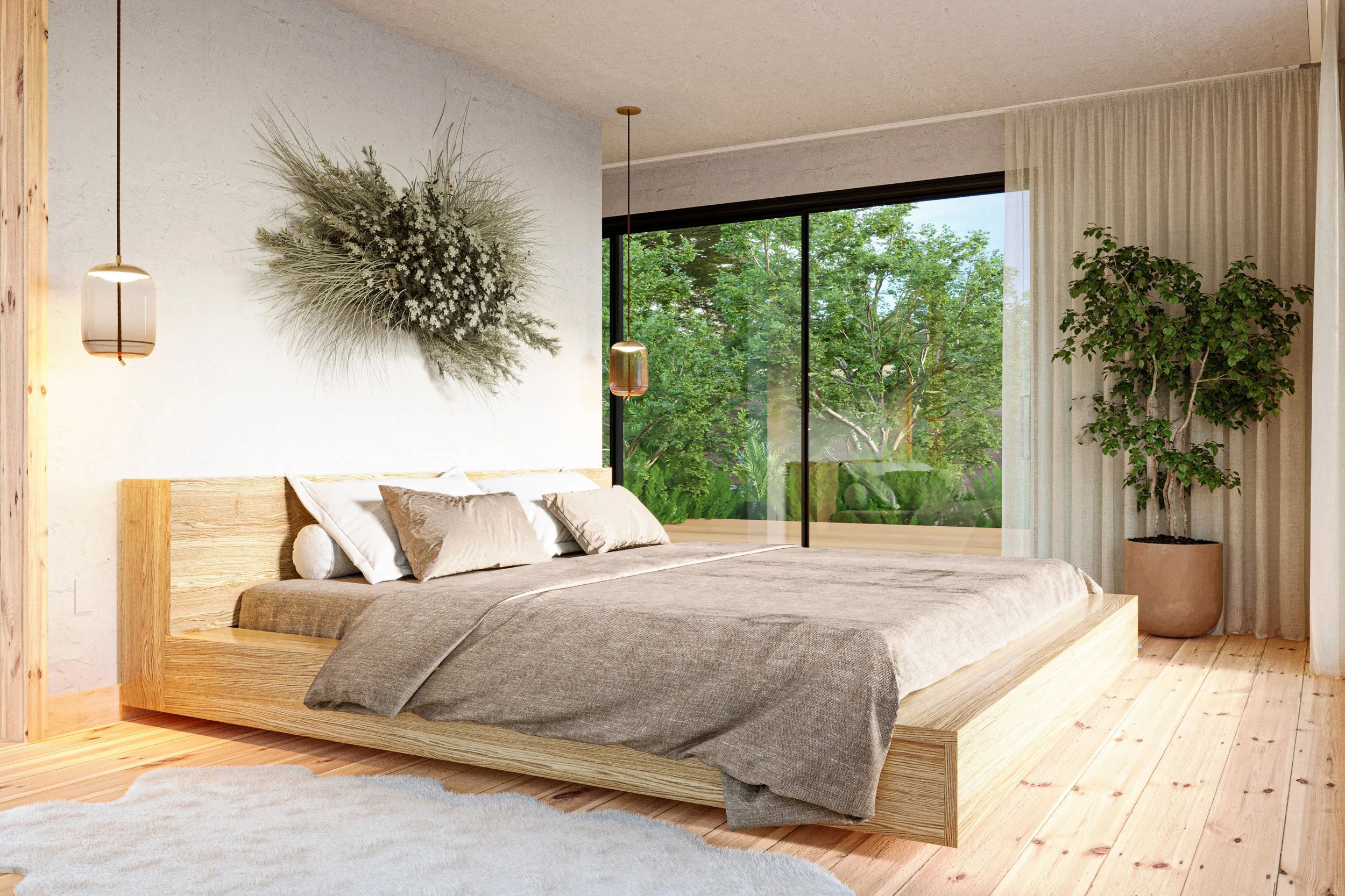
True restorative sleep is a highly individualized biological process. What one person requires for peak cognitive performance, such as a specific temperature, mattress firmness, or total darkness, may disrupt their partner.
Research demonstrates that a significant portion of an individual's sleep quality can be negatively influenced by a partner’s movements, differing sleep-wake cycles, or environmental preferences (Sleep Research Society, 2024). In a shared environment, one partner is almost always making a biological concession. Individual sanctuaries allow for the implementation of precision environmental controls tailored to the inhabitant’s specific circadian needs. One partner may opt for a suite designed with automated blackout shielding to facilitate deep, undisturbed rest, while the other prefers a space that welcomes natural morning light to stimulate a healthy awakening response (International WELL Building Institute, 2020). By removing these external disruptions, we ensure that both partners reach the deepest stages of restoration, arriving at the start of their day refreshed and emotionally resilient.
The Luxury of Unfiltered Identity
Beyond the biological benefits, separate suites offer an opportunity for aesthetic expression. In a shared bedroom, design is often a series of concessions, perhaps a neutral palette chosen to satisfy two tastes. In an autonomous sanctuary, the room becomes a pure reflection of the individual.
These separate suites honor different personal narratives and tactile preferences. One suite may be a soft, monochromatic cocoon of organic cotton, while the other is a crisp, architectural space featuring curated art. This level of personalization allows the home to function as a holistic sanctuary, where the environment aligns perfectly with the inhabitant’s internal world.
Cultivating Mystery and Intentionality
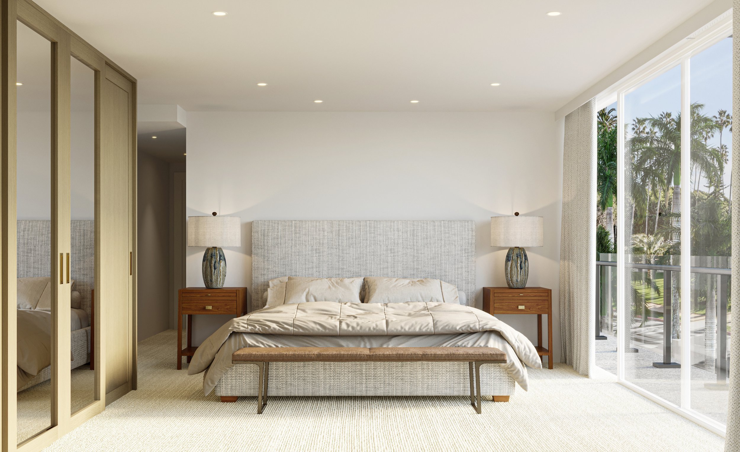
There is a profound psychological benefit to physical boundaries. Academic studies suggest that couples who maintain high levels of personal autonomy often report greater long-term relationship satisfaction (Storm, 2023).
Sharing every mundane detail of one's morning and evening routine can, over time, diminish the sense of mystery that fuels attraction. Individual dressing areas and bathrooms allow for the big reveal. When partners meet for an evening or retire to one another’s chamber, they do so with intentionality. They have had space to prepare, center themselves, and show up for their partner as their best selves. Inviting a partner into one’s private domain mirrors the romantic traditions of high society, making being together a curated experience rather than a habitual necessity.
Lifespan Design: The Wellness Wing
A forward-thinking home must also account for life’s transitions. We often design one primary sanctuary on the ground level, not out of immediate need but as a proactive wellness wing.
These spaces use universal design principles, incorporating curbless showers and wider clearances without sacrificing luxury. A dedicated space for recovery or health management allows for individualized care without disrupting the partner’s well-being (Troxel, 2021). Whether for temporary recovery or a long-term shift in mobility, these suites ensure the home remains a place of comfort and dignity, not a source of stress.
Conclusion: Living Without Compromise
In the modern luxury home, the most valuable commodity is the ability to live as one chooses. The shift toward individual sleeping sanctuaries represents a maturation of residential design, moving away from societal expectations and toward a more enlightened understanding of health, identity, and partnership.
By designing for autonomy, we create homes that do more than house us; they support our biology and protect our relationships. Living like royalty is not about the size of the bed, but the quality of rest and the freedom to be oneself.

Sarah Barnard is a WELL and LEED accredited interior designer and creator of environments that support mental, physical, and emotional wellbeing. She creates highly personalized, restorative spaces that are deeply connected to art and the preservation of the environment. A certified California Naturalist, Sarah believes in celebrating nature through responsible design that works symbiotically with the local environment.
An advocate for consciousness, inclusivity, and compassion in the creative process, Sarah has appeared in Architectural Digest, Elle Décor, Vogue, HGTV, and many other publications. Sarah was recognized as a "Ones to Watch" Scholar by the American Society of Interior Designers (ASID) and has been awarded "Best of Houzz Design" for seven consecutive years. Sarah's MFA in visual arts from Claremont Graduate University informs her practice and innovative approach toward interior design as creating a living work of art.
Works Cited
International WELL Building Institute. WELL Building Standard v2. 2020.
Pulling Back the Sheets: Exploring the Impact of Sleep on Couples' Relationships. Sleep Research Society, 2024.
Storm, Nina. "The Importance of Personal Space in a Relationship." University of California, Berkeley, 2023.
Troxel, Wendy M. "Multilevel Analysis of Sleep and Relationship Quality." PubMed Central, National Institutes of Health, 2021.

The Future of Flourishing: A First Look at the Unified WELL Standard
We believe the environments we inhabit should do more than house our daily activities; they should actively support our well-being. This philosophy is why we closely follow the evolution of the WELL Building Standard, the global benchmark for health-centric design.
Recently, the International WELL Building Institute (IWBI) shared a significant milestone: the next version of the WELL Standard is now open for public comment through May 1. This "One WELL" vision is a thoughtful reimagining of how we create, measure, and sustain spaces that put people first.
A Unified Vision for Health
The most significant shift in this update is the move toward a unified, harmonized standard. Previously, different types of projects, from commercial offices to residential spaces, navigated separate frameworks. The new preview consolidates these into a single cohesive system.
This "One WELL" approach ensures that whether we design a private sanctuary or a community hub, the core principles of human health remain consistent and accessible. It’s a more intuitive way to look at the building blocks of wellness, making it easier for designers and inhabitants to understand how a space supports them.
What is Changing?
While the rigorous, evidence-based strategies that define WELL remain the foundation, the way we interact with them is becoming more streamlined. Key updates in this preview:
Integrated Ratings and Certification: In a shift that honors every effort made toward health, the new structure ensures that "every step forward counts." Points earned toward specific health, safety, or equity ratings now count toward full WELL Certification.
Thematic Groupings: Strategies are now organized into intuitive themes. This allows design teams to pinpoint goals, such as mental health support or restorative lighting, with greater precision.
Clearer, Global Language: The requirements have been rewritten to be clearer and more scannable. This shift away from dense technical jargon makes the standard more adaptable across global markets and easier for homeowners and business owners to implement with confidence.
Rewarding Progress: Preconditions, the mandatory baseline requirements, will now qualify for points across the board. This recognizes the value of these fundamental health features and rewards projects for their commitment to baseline excellence.

Designing for the Whole Person
At its heart, the evolution of the WELL Standard is about making "people-first places" the norm rather than the exception. By refining the concepts we've championed, like air, light, mind, and community, this update makes it simpler to weave wellness into the fabric of a building.
For example, the updated standard continues to prioritize:
Restorative Spaces: Creating opportunities for quiet reflection and connection to nature to mitigate daily stress.
Environmental Quality: Ensuring the invisible elements, the air we breathe and the water we drink, are held to the highest purity standards.
Inclusive Design: Expanding the community concept to ensure spaces are equitable, accessible, and welcoming to all, regardless of physical abilities or backgrounds.
Why Your Voice Matters
The IWBI is seeking feedback from the community of designers, architects, and occupants who live and work in these spaces. The public comment period is an opportunity to ensure the standard remains practical and impactful for real-world application.
By participating in this process, we contribute to a future where our buildings are tools for longevity and joy. As this new version moves from preview to final release, it promises to make the journey toward a healthier home or workplace more efficient and rewarding.
Sarah Barnard, WELL AP + LEED AP, is a leading interior designer of personalized, sustainable spaces that support mental, physical, and emotional wellbeing. She creates highly personalized, restorative spaces that are deeply connected to art and the preservation of the environment. An advocate for consciousness, inclusivity, and compassion in the creative process, Sarah has appeared in Architectural Digest, Elle Décor, Vogue, HGTV, and many other publications. Sarah was honored as a “Ones to Watch” Scholar by the American Society of Interior Designers (ASID).
References & Further Reading
For those interested in the rigorous science and evolving frameworks behind the One WELL vision, the following resources provide the foundational data and official guidelines used to develop these health-centric strategies:
Primary Sources
International WELL Building Institute (2026). The WELL Building Standard: Concept Directory. An overview of the eleven core categories of human health in the built environment.
International WELL Building Institute (2026). One WELL: A Unified Vision for the Future of Health. Official announcement regarding the harmonization of WELL programs and the public comment period.
IWBI Public Comment Portal (2026). Standard Preview and Feedback Forum. The active platform for reviewing side-by-side comparisons of v2 and the upcoming enhancements (Open through May 1, 2026).
Foundational Research
Allen, J. G., & Macomber, J. D. (2020). Healthy Buildings: How Indoor Spaces Drive Performance and Productivity. Harvard University Press. A key text often cited by IWBI regarding the economic and cognitive benefits of healthy offices.
World Health Organization (WHO). Guidelines for Indoor Air Quality. The scientific basis for many of the Air and Materials requirements found within the WELL Standard.
Global Wellness Institute. Wellness Architecture & Design Initiative. Research exploring the intersection of the built environment and holistic human health.

Feeling = Being: Why Emotional Design is More Than a Feeling
The Interior State: Designing for the Human Experience
The traditional discourse surrounding the home often prioritizes tangible assets, focusing on square footage, stylistic labels, and market value. However, for those who see their residence as a sanctuary, the true measure of a space lies in its invisible luxury: the profound impact it has on the occupant's internal state. Modern design is evolving beyond the purely aesthetic to embrace a more vital truth: our environments are the primary authors of our daily experience.
This perspective is rooted in the idea that feeling equals being. It suggests that a home is not just a physical structure but a specialized environment for cognitive recovery and emotional sovereignty. When we acknowledge that our surroundings dictate our internal reality, the role of interior design shifts from decoration to essential stewardship over the human condition.

The Biological Reality: Interiority as Objective Data
The concept that feelings are subjective or secondary to physical reality is increasingly challenged by neurobiological research. Studies suggest that the human brain may conceive of feelings as objective reality, processing emotional states with the same physiological weight as color, shape, or size (Cornell University). If an individual feels depleted by a chaotic or poorly lit room, their body is experiencing a literal, physical state of depletion.
This biological connection is explained by the interaction between feelings, thoughts, and behavior, often described as a cascading effect where each element influences the other (Cognitive Behavioral Therapy Los Angeles). For the high-achieving individual, the home must serve as a proactive tool to manage the constant internal labor of emotional regulation. By designing interiors that mitigate stress and reduce cortisol levels, we are not just creating a pleasant atmosphere but actively reducing the biological tax on an individual's health and longevity.
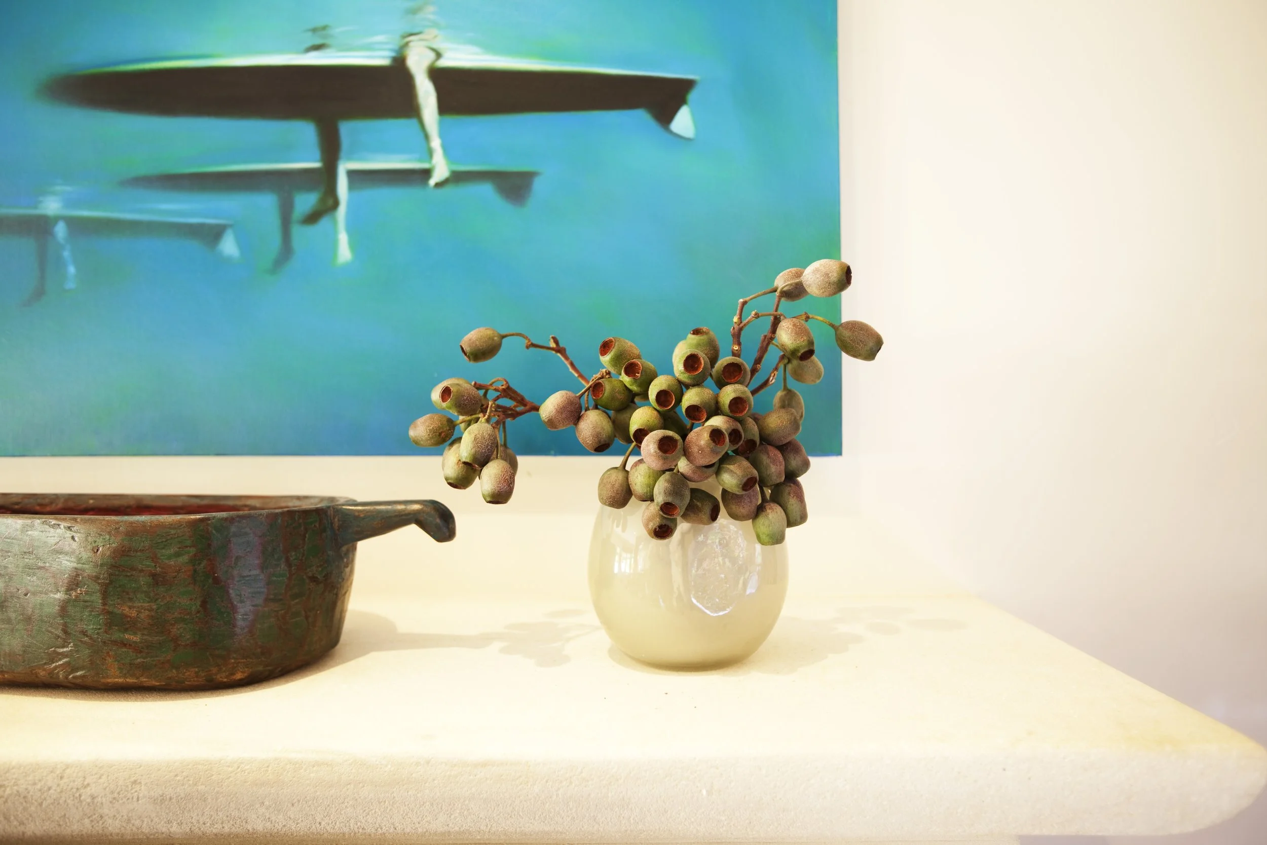
The Psychology of Space: How Interiors Map the Mind
The relationship between a person and their environment is deeply encoded in our neural pathways. Research indicates that specialized cells in the hippocampus are sensitive to the geometry and spatial arrangement of our surroundings (University of Waterloo). This means that the layout of a room is never neutral, as it is constantly being mapped by the brain to determine levels of ease or agitation.
Historically, this understanding was applied to monumental structures to evoke specific communal responses. Sacred buildings and cathedrals were designed to facilitate the lifting of the eyes, a physical action that encourages regions of the brain to become more absorbent of the environment (CNN Style). While these historic examples focused on public awe, the modern bespoke interior applies similar intentionality to private life, creating spaces that evoke states of exploration, contemplation, and profound safety.

The Restorative Toolkit: Engineering Serenity
To facilitate a supportive state of being, designers use a sophisticated toolkit rooted in wellness and biophilia. Biophilic design is not just about adding plants to a room but involves implementing specific patterns shown to reduce stress and enhance cognitive performance (Browning et al.). Patterns such as refuge, which provides a sense of enclosure and security, or mystery, which encourages gentle engagement, are essential for creating a restorative atmosphere.
Furthermore, wellness oriented design incorporates elements like curated natural light, color psychology, and sensory variability to support mental health (Marymount University). Even the geometry of furniture and fixtures plays a role, as research shows the neurological benefits of curving shapes over sharp angles (Sina et al.). These microrestorative interventions, whether an artfully placed aquarium or a quiet garden view, offer essential breaks from directed attention and help prevent the fatigue and burnout common in modern life.
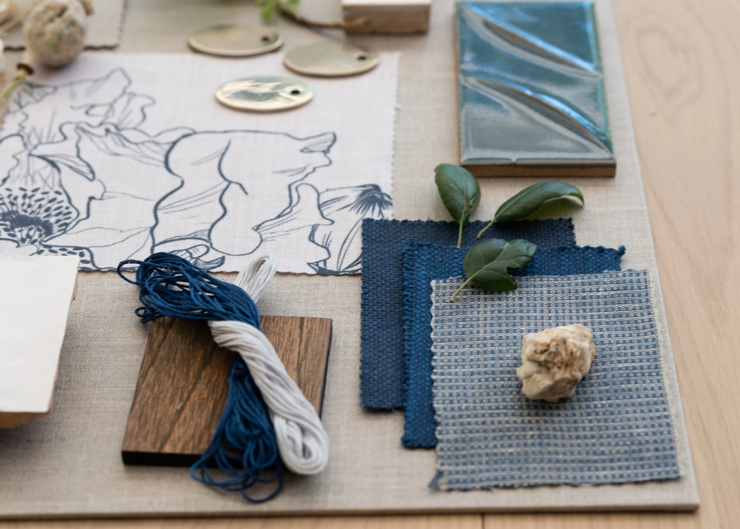
The Sarah Barnard Design Philosophy: Bespoke Emotional Sovereignty
The most critical aspect of designing for the interior state is recognizing individual perception. The interaction between sensory inputs and emotional response is highly personalized, as each person’s mind uses past experiences to inform how they perceive their current environment (Nautilus). Because there is no universal solution for well-being, true luxury must be bespoke.
The Sarah Barnard Design approach focuses on co-creating an environment that honors the client’s specific inner state. By naming the feelings we wish to cultivate, we can arrange our lives and homes to maximize time spent in positive energies. Ultimately, a well-designed interior serves as a sanctuary for the soul, providing the diversion and strength needed to navigate the world with grace. When our environment supports our feelings, it sustains our very being.
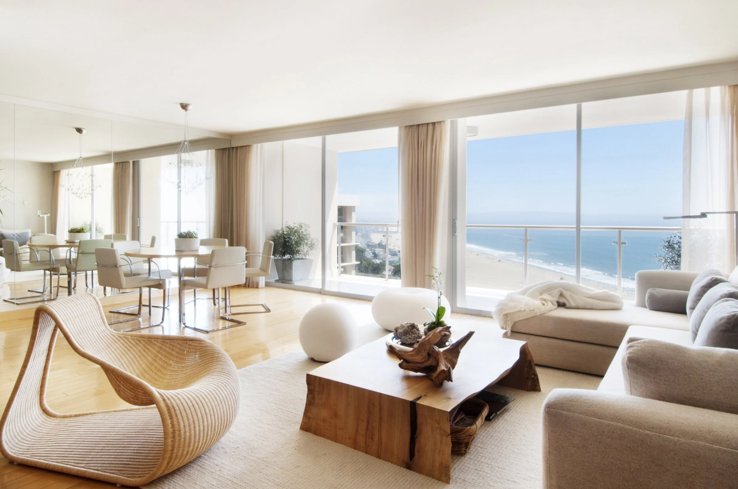
Sarah Barnard is a WELL and LEED accredited interior designer and creator of environments that support mental, physical, and emotional wellbeing. She creates highly personalized, restorative spaces that are deeply connected to art and the preservation of the environment. A certified California Naturalist, Sarah believes in celebrating nature through responsible design that works symbiotically with the local environment.
An advocate for consciousness, inclusivity, and compassion in the creative process, Sarah has appeared in Architectural Digest, Elle Décor, Vogue, HGTV, and many other publications. Sarah was recognized as a "Ones to Watch" Scholar by the American Society of Interior Designers (ASID) and has been awarded "Best of Houzz Design" for seven consecutive years. Sarah's MFA in visual arts from Claremont Graduate University informs her practice and innovative approach toward interior design as creating a living work of art.
Works Cited
Browning, William D., Catherine O. Ryan, and Joseph O. Clancy. 14 Patterns of Biophilic Design: Improving Health and Well-Being in the Built Environment. Terrapin Bright Green, 2014.
CNN Style. "How Architecture Affects Your Brain." CNN, 2024.
Cognitive Behavioral Therapy Los Angeles. "The CBT Model of Emotions." CBT-LA, 2024.
Cornell University. "Objective Feelings: New Research Suggests Our Brain Tells Us Feelings Are Reality." Cornell Human Ecology, 2024.
Marymount University. "Designing for Well-Being: The Role of Interior Architecture in Mental Health." Marymount Blog, 2024.
Nautilus. "How Emotions Connect Your Body and Brain." Nautilus, 2024.
Sina, Amanda, et al. "Impact of Curvature on Aesthetic Choices." National Library of Medicine, 2021.
University of Waterloo. "The Hidden Ways Architecture Affects How You Feel." Department of Psychology, 2024.

Celebrating Wellness by Design: Sarah Barnard Design Receives Best of Houzz Award
We’re excited to share that Sarah Barnard Design has been recognized by the global Houzz community with the Best of Houzz 2026 award for Design.
As our homes play a bigger role in our lives, this recognition feels especially meaningful. It’s more than just about looks; it affirms our belief in caring design, holistic wellbeing, and the strong link between our spaces and our health.
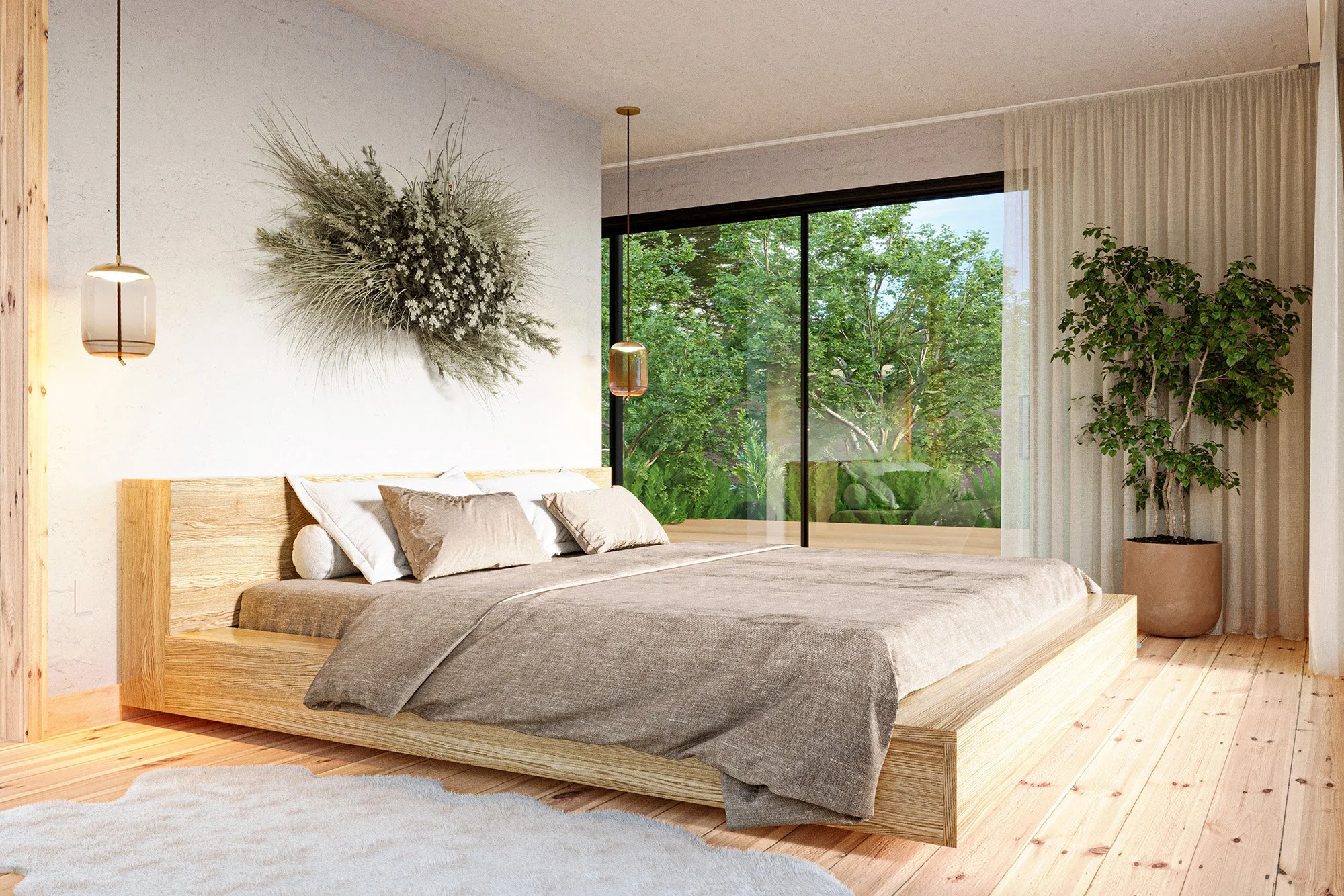
Designing for the Senses and the Soul
This award is especially meaningful because it comes from the homeowners in the Houzz community. Only the top 3% of over 3 million home professionals are recognized for having the most popular designs, as chosen by millions of users. When people save our photos, share ideas, and connect with our work, it shows a real desire for spaces that not only look good but also feel good.
Sarah Barnard Design is known for creating personalized, restorative spaces. By using biophilic design, sustainable materials, and understanding sensory needs, Sarah crafts homes that feel like true sanctuaries. From peaceful coastal retreats to earthy living spaces that bring nature inside, each project reflects the people who live there. This award honors our personal, wellness-focused approach that connects with so many.
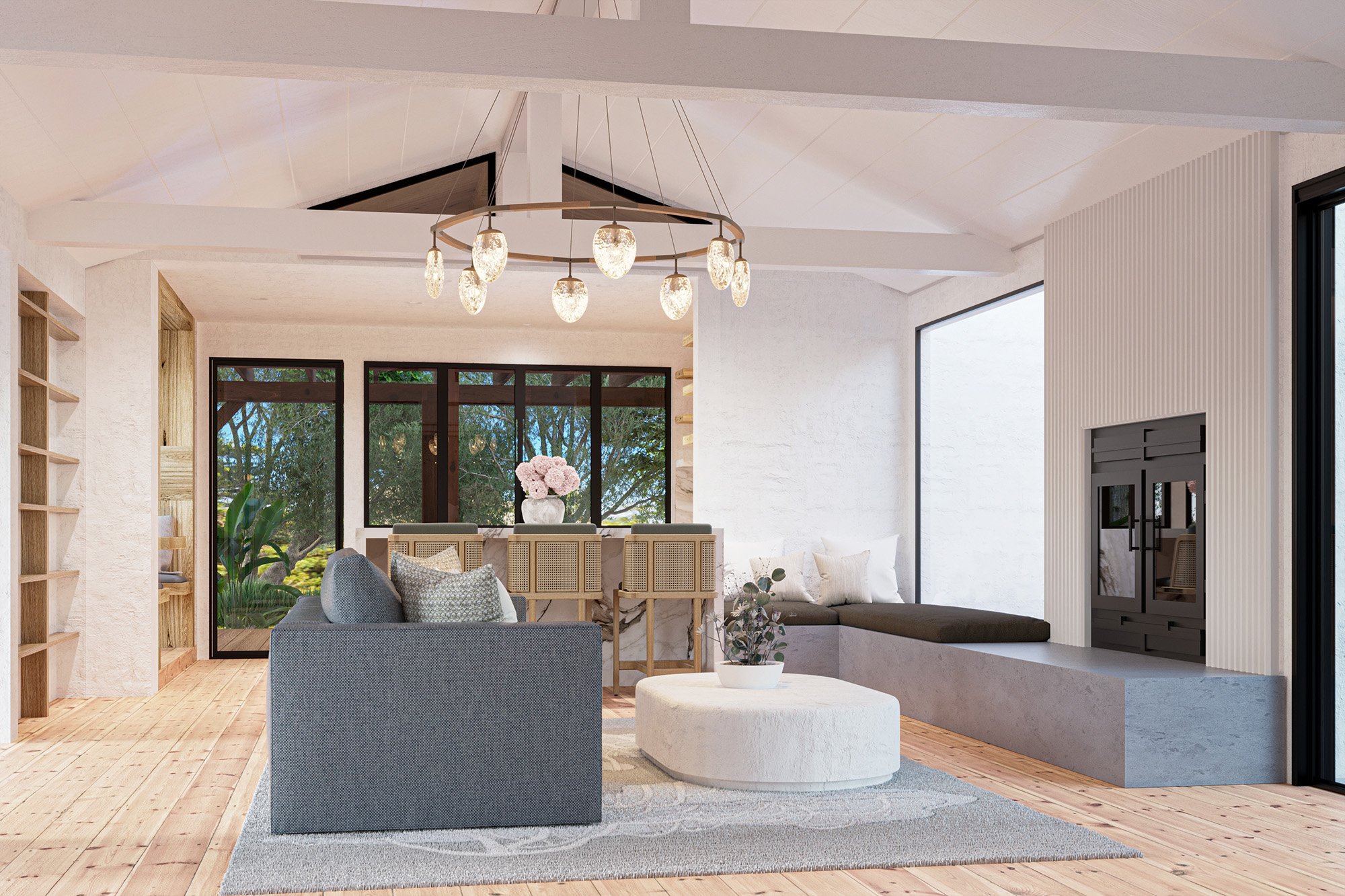
A Tradition of Excellence
This 2026 award is another proud moment in our history with Houzz. We’re truly grateful for the community’s ongoing support, which has now brought us our 12th Houzz honor.
From favorites like the Ocean View Penthouse to our latest projects, your support inspires us to keep exploring what makes a home healthy and happy. This decade of recognition shows our dedication to blending environmental responsibility with great design. We’re committed to growing with our clients and to the value of thoughtful, wellness-focused design.
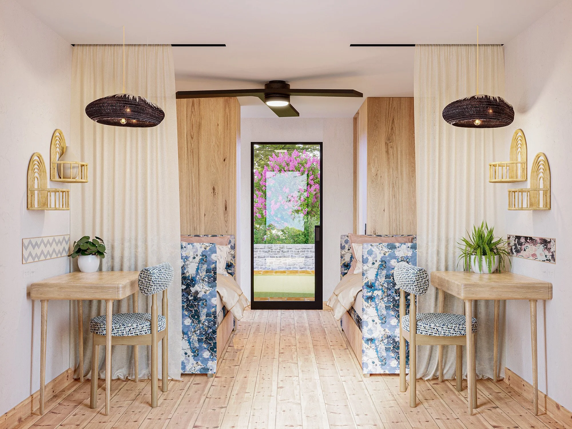
Nature-Inspired Color Trends
Every year, major paint brands choose a color of the year. They devote a lot of time and research to color choices, and often, the choices reflect what consumers want and need in their lives at a given point in time, rather than being predictive.
What do the color choices this year tell us about what we want from our homes? Many of the paint picks this year are grounding, represent a back-to-basics simplicity, and encourage pause to enjoy small, but significant moments.
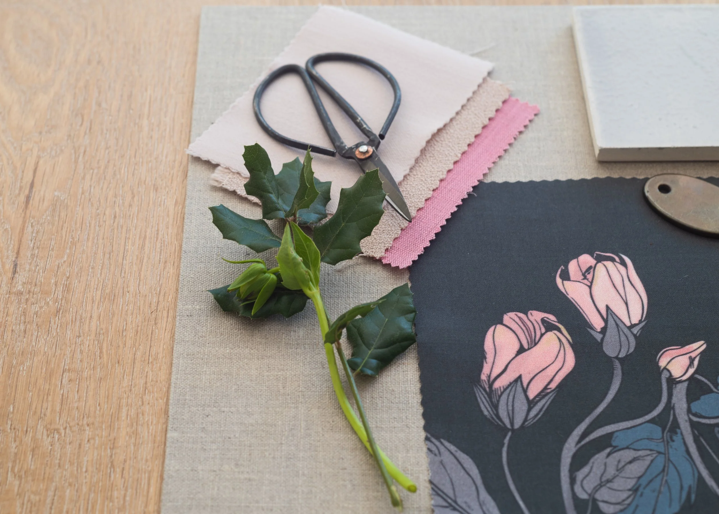
There are a number of greens and browns on offer this year, but two of the most effective at eliciting calm, and are useful tools for rewilding, are Dunn-Edward’s Midnight Garden and Benjamin Moore’s Silhouette.
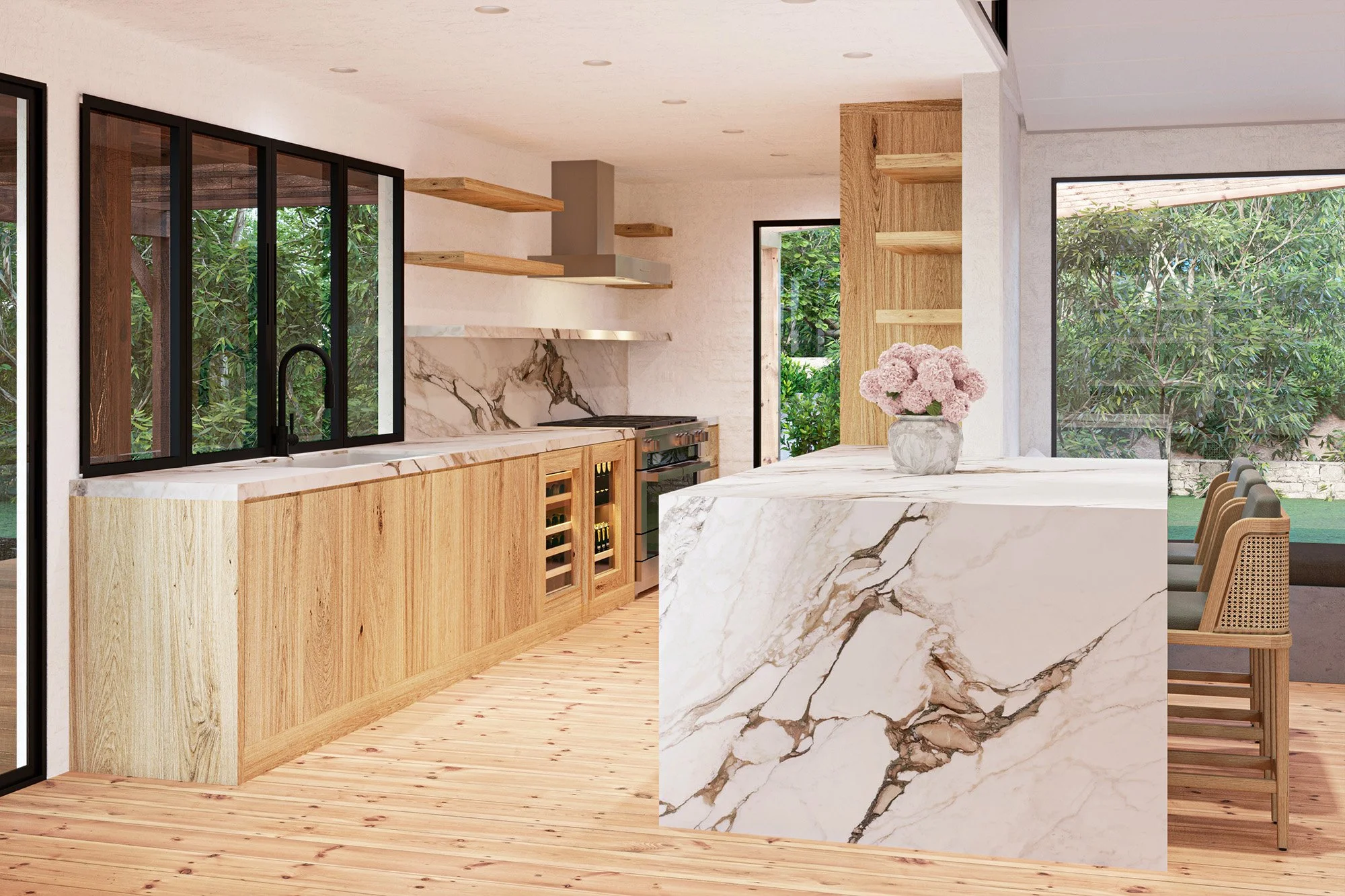
Begin Your Design Journey
Are you inspired to transform your own home into a personalized space that nurtures your well-being? We would love to hear about your vision, your needs, and what home means to you.
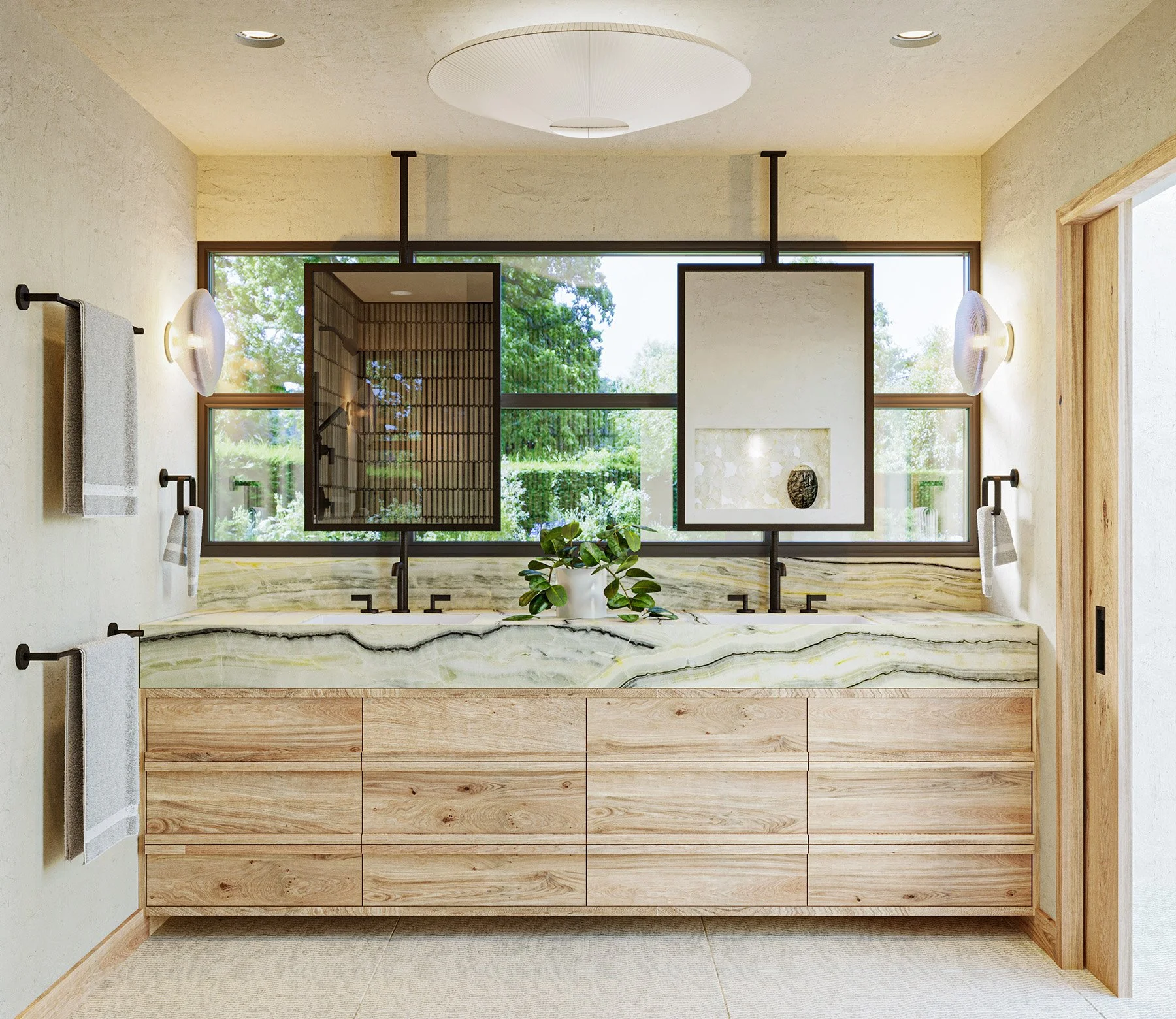
Sarah Barnard, WELL AP + LEED AP, is a leading interior designer of personalized, sustainable spaces that support mental, physical, and emotional wellbeing. She creates highly personalized, restorative spaces that are deeply connected to art and the preservation of the environment. An advocate for consciousness, inclusivity, and compassion in the creative process, Sarah has appeared in Architectural Digest, Elle Décor, Vogue, HGTV, and many other publications. Sarah was honored as a “Ones to Watch” Scholar by the American Society of Interior Designers (ASID).

How Nature-Inspired Colors Can Help Create Calm Through Rewilding
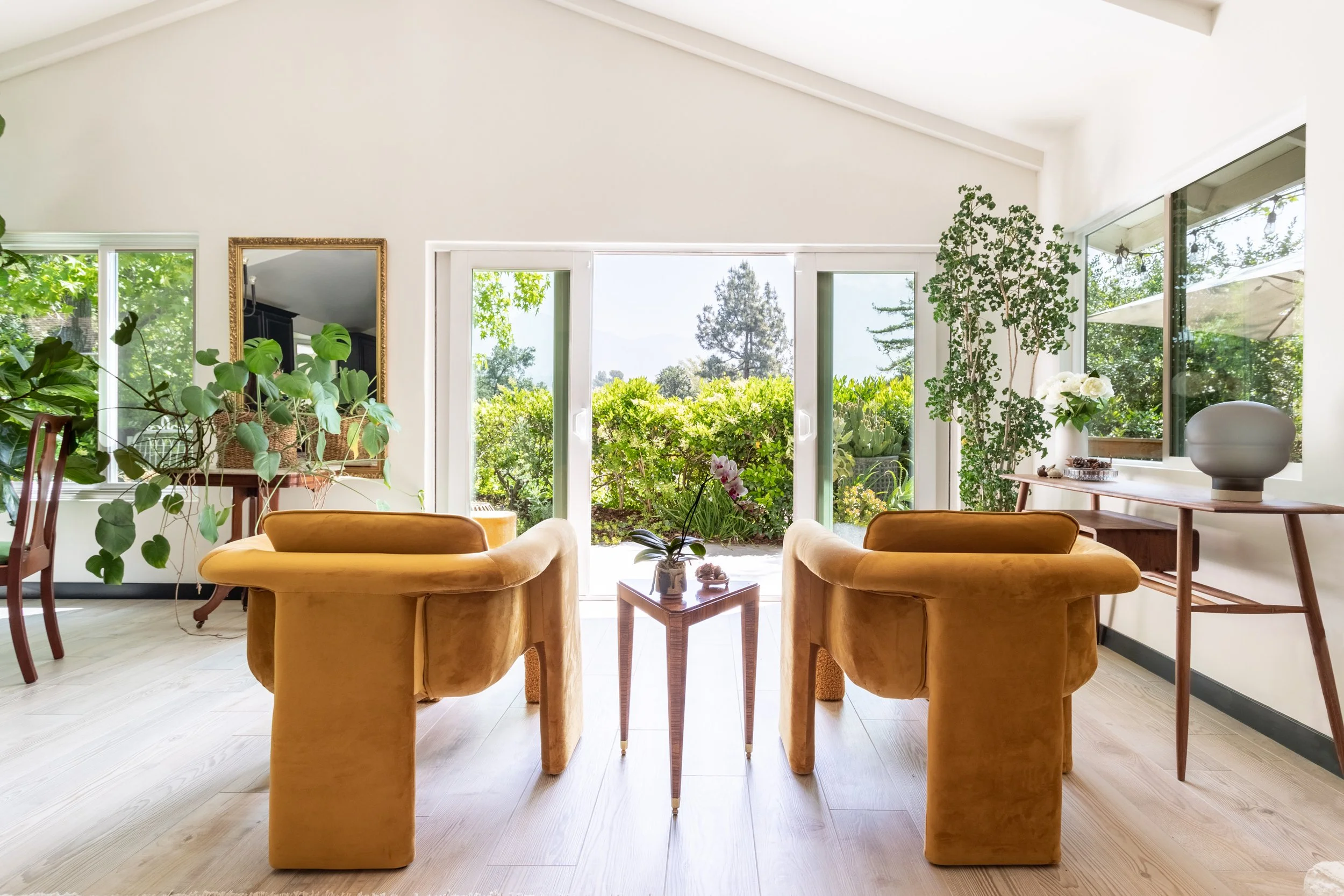
Even in a built environment, there is a place for nature, especially in creating spaces that support health, wellness, and mood. As we look to our homes for shelter and sanctuary, nature-driven design, such as rewilding, is becoming more important.
Rewilding is the practice of minimizing human intervention to let nature lead the way, both aesthetically and experientially, respecting and observing natural life cycles and systems. In practical terms, this might mean restoring native flora and fauna around our homes. This invites the local ecosystem to flourish, while providing us with a deeper, more authentic connection to nature.
Rewilding, as a design strategy, can also be done indoors, creating a warm and supportive space where we are consciously connected with nature. The benefit and beauty of rewilding, indoors and out, is how it subtly, but significantly, re-focuses our connection with nature.

Color Choices for Rewilding
Earth-inspired color choices are impactful as design tools in the context of rewilding, particularly greens and browns, given their place in nature and the psychological and emotional meanings they represent.
“Color can be a very powerful tool in interior design. It’s visually transformative and has a strong psychological influence. When used strategically, it can be useful in establishing an emotional connection to a home,” says Sarah Barnard, WELL and LEED-accredited interior designer. Barnard specializes in creating home designs that support mental and physical wellness. Integrating nature and connecting with the local environment are key to her design philosophy and wellness objectives.
“When using a nature-inspired color palette, especially earthy greens and browns, the effects can be calming and restorative," she says.

Research shows that often, people find green calming and nurturing. Exposure to green has been said to lower blood pressure, and some scientists say that our feel-good connection is hardwired into our brains from our hunter-gatherer days, in that green in nature equals opportunity for rest, shelter, and nourishment. Some say that green helps create focus and clarity, representing life, balance, and harmony.
Meanwhile, browns are inherently earthy and grounding. Brown is associated with strength, self-care, and warmth. In Feng Shui, brown represents the earth element and is used for stability in interior design.

Nature-Inspired Color Trends
Every year, major paint brands choose a color of the year. They devote a lot of time and research to color choices, and often, the choices reflect what consumers want and need in their lives at a given point in time, rather than being predictive.
What do the color choices this year tell us about what we want from our homes? Many of the paint picks this year are grounding, represent a back-to-basics simplicity, and encourage pause to enjoy small, but significant moments.
There are a number of greens and browns on offer this year, but two of the most effective at eliciting calm, and are useful tools for rewilding, are Dunn-Edward’s Midnight Garden and Benjamin Moore’s Silhouette.

Midnight Garden by Dunn-Edwards
Green is popular this year, but Midnight Garden is particularly well-suited for rewilding. That's because this green is grounding, literally. It’s a mossy green, inspired by moss, clover, lichen, and other ground cover. It’s a deep green, with blue undertones.
Dunn-Edwards says the color is inspired by the simple elegance of nature and is borne of a growing consumer desire for restorative spaces at home. They suggest that green, and this shade in particular, is an effective way to connect with nature through conscious design.
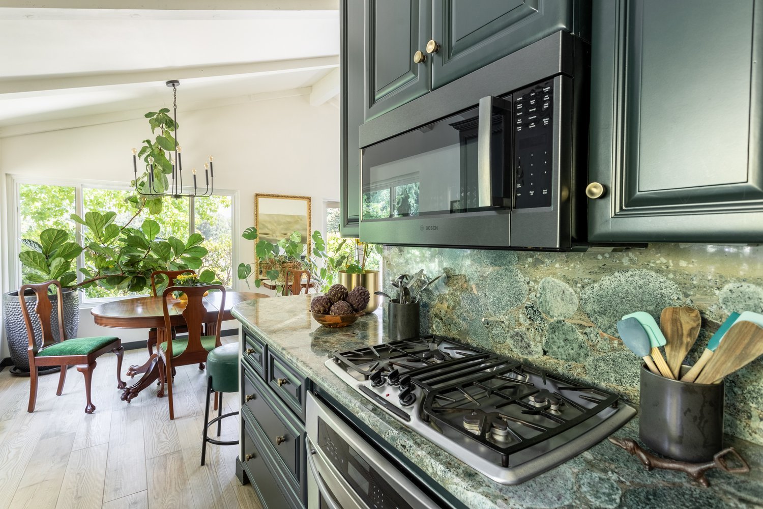
This color closely replicates plant matter, making the rewilding experience immersive. It’s a darker, more saturated hue that gives off forest vibes and can replicate some of the calm associated with forest bathing. Beyond natural ground cover, think of mature tree canopies, dense foliage, and twilight, all opportunities for stillness and reflection. Its plant-like coloring draws focus to regeneration, photosynthesis, and renewal.
In addition to its calming qualities, Dunn-Edwards promotes this color’s versatility as an accent or a main color.
“Midnight Garden is the green that works everywhere, from cabinetry and walls to accents and exteriors,” said Lauren Hoferkamp, color marketing manager at Dunn-Edwards, in a press release. “Its versatility makes it equally at home on interiors and exteriors, pairing effortlessly with natural textures, warm neutrals, or sleek minimalism.”
Benjamin Moore’s Silhouette
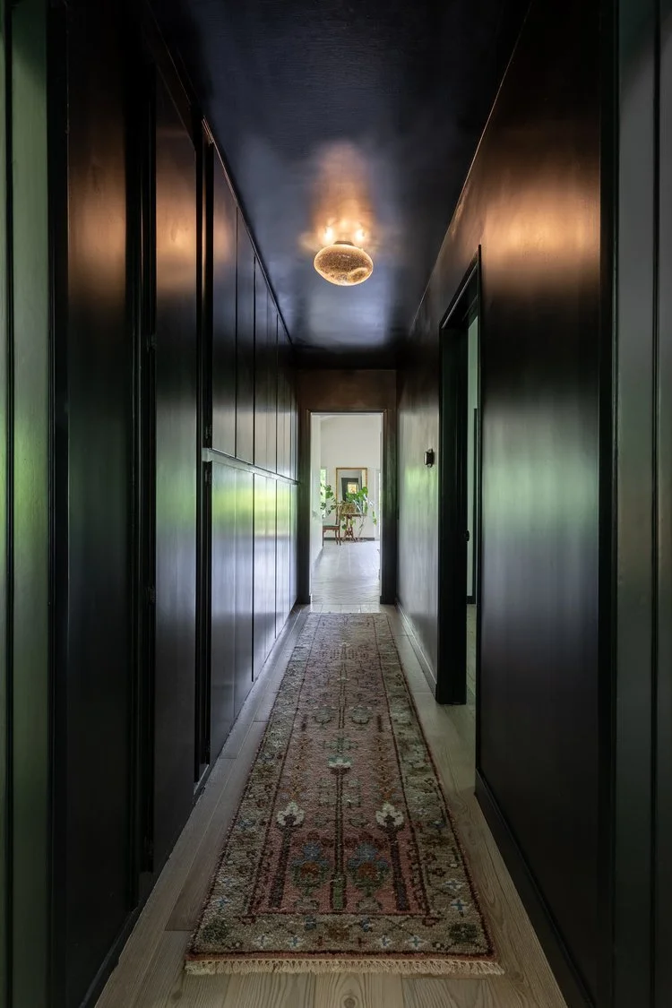
Silhouette is a rich, earthy brown, with hints of charcoal. It leans heavily into timeless design, and like Midnight Garden, it is grounding.
The color is inspired by the luxury of finding joy in simple things, which we only experience when we pause and take the time to notice.

Silhouette offers “a luxurious blend of burnt umber and delicate charcoal undertones,” said Andrea Magno, director of color marketing & design at Benjamin Moore, in a press release. “This hue has the versatility and softness to bring a space from expected to exceptional.”
It’s deep and dark, reminiscent of many of the materials we find in nature: the earth, weathered tree bark, clay, unfinished wood, and soil on the forest floor. It lends a sense of cozy connectedness, much like we experience when immersed in nature. Silhouette lends itself well to rewilding because it serves as a quiet backdrop, letting other colors and natural materials be impactful.

Using Earth-Inspired Colors at Home
“These earthy paint colors work well in spaces throughout the whole home, and can be applied with intention,” says Barnard. “Think about how rooms are used, and how applying various hues can foster a connection with nature and generate calm.”
Here are some suggestions:
For example, in a high-traffic, task-oriented space such as the kitchen, Midnight Garden can be energizing and uplifting, while earthy browns, such as Silhouette, can offer grounding.
Both are good choices for biophilic decor in bedrooms to create a serene environment geared for sleep.
Nature-inspired browns can help create a sense of cozy enclosure, a good choice for a snug reading nook or library.
In spaces where gathering is the goal, such as dining rooms and living rooms, mossy greens can encourage us to pause and absorb the joy of the moment, while rich browns can prompt us to slow down and relax.

Sources
https://www.verywellmind.com/color-psychology-green-2795817
https://www.verywellmind.com/the-color-psychology-of-brown-2795816
https://www.dunnedwards.com/colors/browser/de5657/
https://www.dunnedwards.com/press-releases/dunn-edwards-announces-midnight-garden-as-2026-color-of-the-year/
https://www.benjaminmoore.com/en-ca/press/benjamin-moore-announces-colour-of-the-year-2026
https://www.elledecor.com/design-decorate/color/a69034685/benjamin-moore-color-of-the-year-2026
Sarah Barnard, WELL AP + LEED AP, is a leading interior designer of personalized, sustainable spaces that support mental, physical, and emotional wellbeing. She creates highly personalized, restorative spaces that are deeply connected to art and the preservation of the environment. An advocate for consciousness, inclusivity, and compassion in the creative process, Sarah has appeared in Architectural Digest, Elle Décor, Vogue, HGTV, and many other publications. Sarah was honored as a “Ones to Watch” Scholar by the American Society of Interior Designers (ASID).
Mindfully Creating Supportive Spaces to Aid With Visual Impairment
While interior design generally relies on common principles, the end user and their specific needs should guide the design. Home design can play a crucial role in creating a space that fosters independence, comfort, safety, and confidence. Specific choices can facilitate navigation and, when done intentionally, blend thoughtfully into the overall design.
Why interior design choices matter with visual impairment
When affected by visual impairment, physical space and how it is structured and perceived can either create obstacles in daily living or, conversely, make life easier, including aspects such as lighting, layout, furnishings, and more.
Sarah Barnard is a WELL and LEED-accredited interior designer. Her inclusive studio’s work is guided by how clients of all abilities use their spaces daily. Using tools such as field testing and an interactive process that engages clients and incorporates their feedback, Barnard translates individual needs into design elements for clients to choose from.
When designing for individuals with visual impairment, Barnard understands the nuance of color, contrast, lighting, materiality, and layout, and how they all can combine to create comfort and usability. Having a thoughtfully designed home, with attention paid to elements that address specific visual challenges, can create a sense of safety and serenity that is frequently sought after.
While needs will vary from person to person, here are some design strategies to consider.

Layered, adaptive lighting
“Comprehensive home lighting that utilizes multiple light sources is crucial when designing for individuals with vision reduction due to aging,” says Barnard. “Combining overhead lighting, task lighting, and wall sconces creates a diverse lighting network that allows individuals to adjust illumination to suit their needs and preferences,” says Barnard.
“These preferences can be easily set and adjusted by incorporating a smart lighting system, which can be programmed to automatically adjust to lighting changes and individual preferences throughout the day. Smart lighting can be controlled through the convenience of a smartphone or voice activation, providing a convenient and accessible way to enhance visibility and comfort for individuals with vision impairment,” she says.

Prioritize natural light
While the inclusion of artificial lighting can help direct light on demand, access to natural light, and the distribution of light throughout the room are important. That’s in part because “Natural light boosts the overall brightness of a space, and more light means better visibility overall. Natural light is also typically softer and less fatiguing on the eyes than artificial light,” says Barnard.
Think of a space in terms of access to light, how light can be pulled into a room from outside, and then placement of these conduits. In design terms, this might mean large windows, skylights, and light wells. Light also needs an unfettered path to travel, so open concept floor plans work well, or in divided floor plans, transom and clerestory windows on interior walls, and French doors can help the flow of natural light.
However, glare can be problematic, so “ sheer or light-diffusing window treatments can help minimize glare within a space, improving visibility and comfort,” says Barnard.

Choosing finishes and glare reduction
Typically, finishes are chosen in a home to suit a particular aesthetic, but for individuals with vision impairment, there is a functional aspect: minimizing glare. “Glare from reflective surfaces can reduce visibility for individuals with vision impairment, making distinguishing objects from their background difficult, and can also cause discomfort,” says Barnard. Glare can also contribute to eye strain and visual fatigue.
The solution, says Barnard, can be matte over glossy or polished finishes. “Choosing matte finishes for flooring, countertops, and paint can help minimize glare from reflective surfaces within interior spaces, enhancing comfort, visibility, and safety.”
Create clear pathways for movement
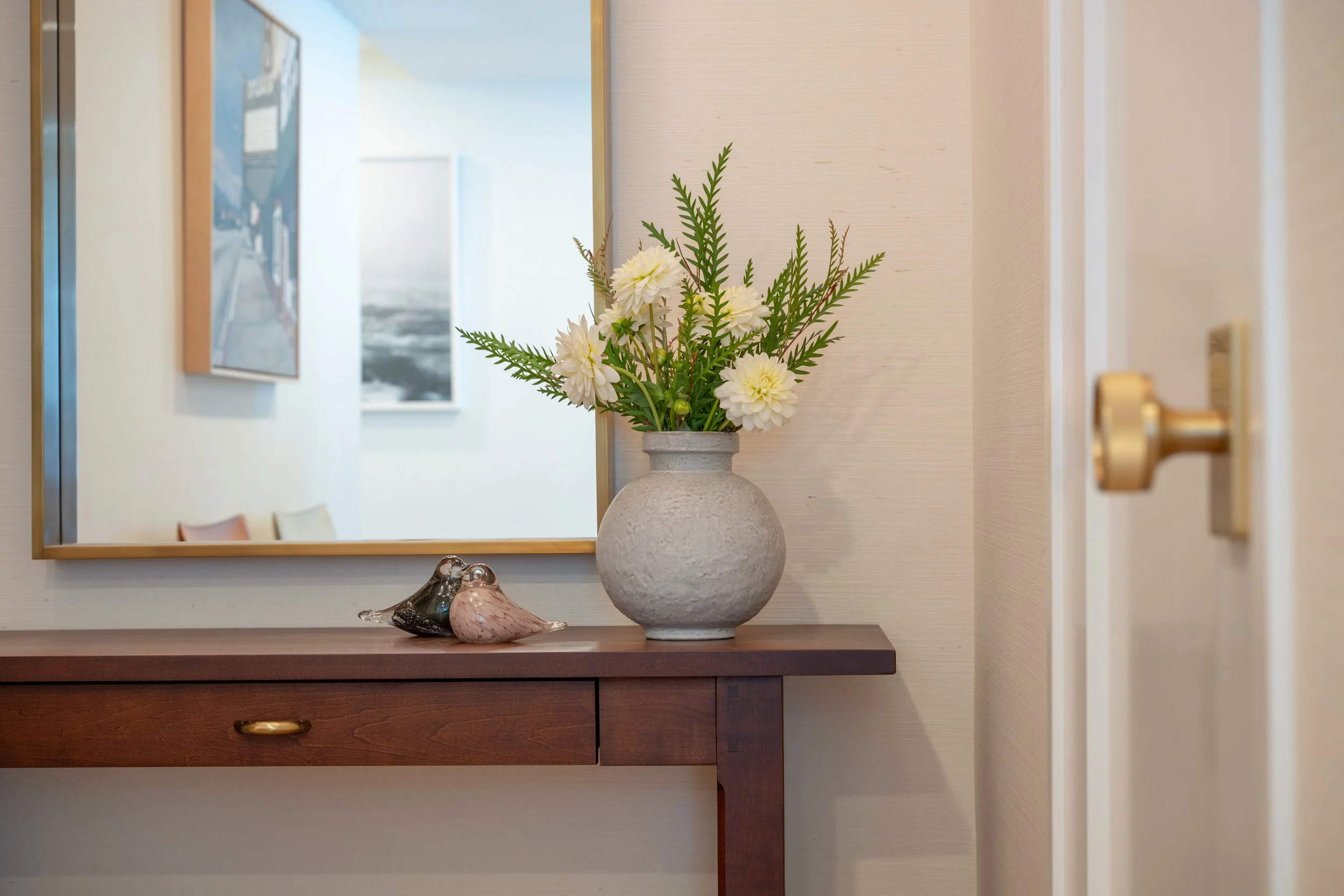
“Maintaining clear paths free from obstacles is essential for safe and easy navigation throughout a space.” says Barnard. Custom-designed built-in storage units are a great way to reduce clutter. They are also designed to fit perfectly within a home's existing architecture and can be customized to suit individual preferences. Because they're integrated into the walls, built-in storage does not take up floor space, leaving paths of travel clear and open.
Embrace consistency from room to room with the layout and placement of items. Consider placing items such as furniture, lamps, switches, and wall controls in similar locations throughout the house. Predictability can aid intuitive and safer movement through a space.
Lean into contrast
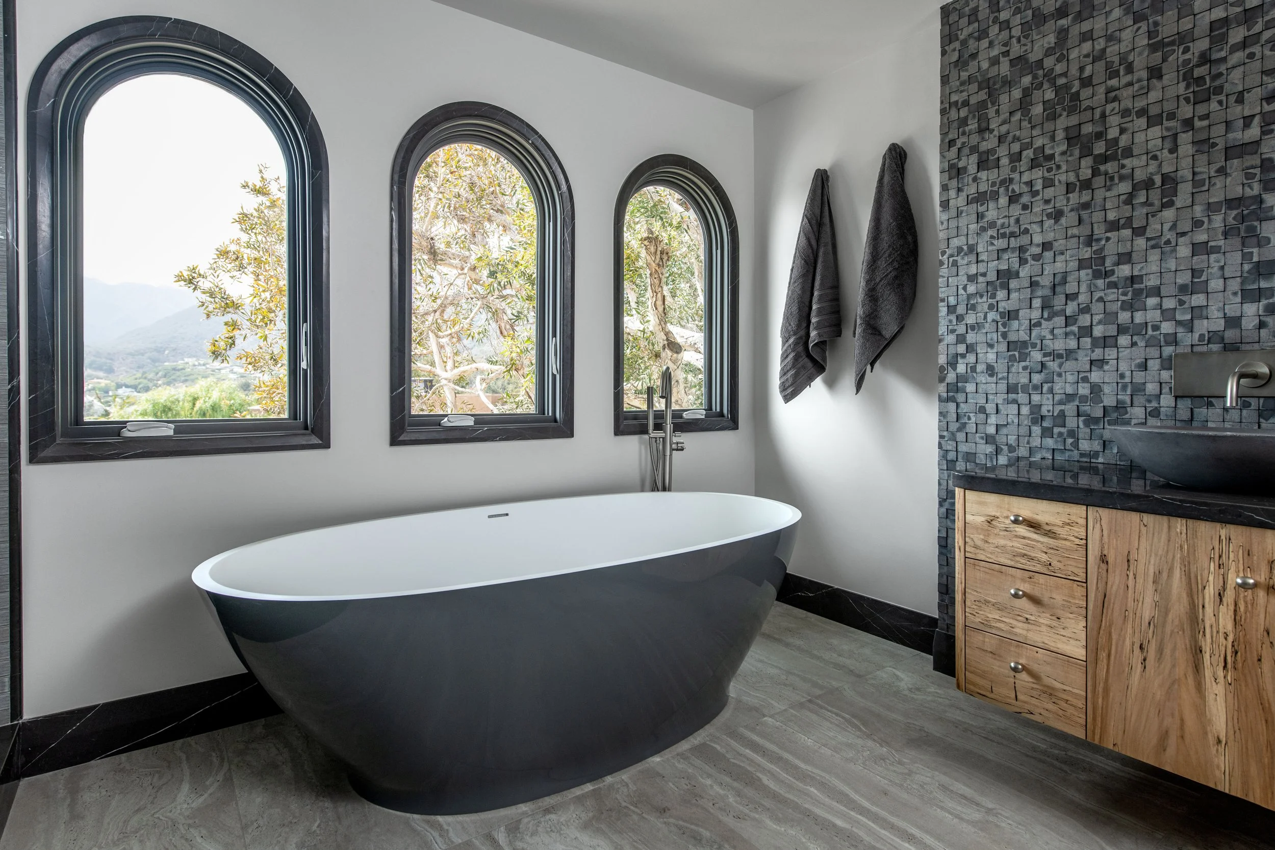
With low vision, it can be difficult to see certain colors; using brighter colors and increasing contrast can help. “Incorporating a high-contrast color palette can help improve mobility and wayfinding,” says Barnard. Color perception is individual, so a personalized approach is warranted. “When considering what high-contrast color to paint these areas, conducting field tests with swatches is essential as some individuals may perceive certain colors better than others.”
To implement contrasts, she suggests:
Furniture that contrasts with the floor and wall color can help improve the visibility of these objects, creating safe pathways around them.
Painting doors, door frames, and handrails in a high-contrast accent color can help make them visually identifiable within a space.
Transitions between rooms can also be highlighted with contrasting colors or textured materials, such as a wood floor adjoining a carpeted area.
High contrast in areas such as bathrooms and kitchens, in particular, can help with safety. High-contrast counters and sinks in the kitchen can help to identify work zones, while high-contrast shower thresholds, toilet, and sink can aid safer movement.
Leverage acoustics
For individuals with visual impairment, leveraging acoustics in a built environment to navigate space can be helpful. Design with sound-proofing acoustic tiles and panes, and wall treatments to reduce echo and background noise, so that orientation in the space is easier, using sound.
Consider including sound-absorbing accents, such as soft furnishings, textiles, and window treatments, which can help to absorb vibration and echoes, making sounds crisper and clearer.

What these design strategies look like in practice
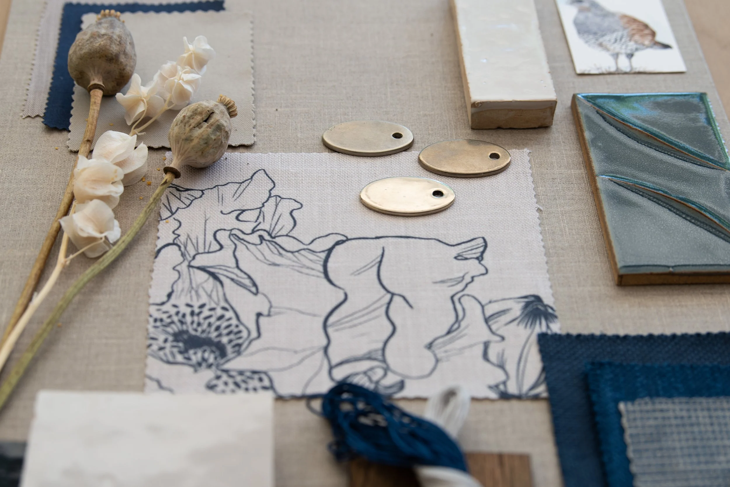
Barnard engages in a research and discovery process with clients to inform color, pattern, and other design element choices, with exploratory field testing that creates opportunities for clients to provide feedback on visual clarity and aesthetic preferences.
While each project and individual needs will vary, here are some examples.
If certain color combinations are difficult to distinguish, it can be helpful to avoid designs that place colors close together, which can create visual perception challenges. For example, with blue/yellow color deficiency, it is advisable to avoid patterns with yellow and blue close together.
In cases of severe vision impairment, high-contrast interiors can offer a simple yet effective solution. For example, walls and ceilings painted in a deep, saturated color, with trims along walls and doorways painted in a bright, contrasting color helps to indicate their location and assist with wayfinding. Field testing helps determine which contrasting colors resonate best in terms of visibility and personal aesthetic preferences.
Design is most useful and beautiful when it makes life easier and more comfortable, which is why every space should be considered in how we use that space, and what tools might help.
For example, mirrors are often used as a design tool to create a focal point or add decorative elements. However, mirrors and reflective surfaces aren’t always appropriate or desired by everyone. It’s possible to achieve some of the decorative aims of mirrors with other items. In a bathroom, where mirrors often hang, a large window can accentuate natural light, while a tiled wall could create an alternative focal point.
When design is approached intentionally and personally, there is an opportunity to shape spaces that enhance functionality and comfort for individuals with visual impairment.
Sarah Barnard Design’s website uses the Accessibe accessibility feature, which adapts the site to each user, customizing their experience. Click the blue circle with a white human figure to access customization options, including high contrast, text size adjustment, screen reader support, and more.
Sources
https://afb.org/blog/entry/independence-tips
https://www.ncoa.org/article/helping-people-with-blindness-and-vision-loss-continue-to-participate-in-everyday-activities/
https://pmc.ncbi.nlm.nih.gov/articles/PMC12082883/
Sarah Barnard, WELL AP + LEED AP, is a leading designer of personalized, sustainable spaces that support mental, physical, and emotional wellbeing. She creates highly personalized, restorative spaces that are deeply connected to art and the preservation of the environment. An advocate for consciousness, inclusivity, and compassion in the creative process, Sarah has appeared in Architectural Digest, Elle Décor, Vogue, HGTV, and many other publications. Sarah was honored as a “Ones to Watch” Scholar by the American Society of Interior Designers (ASID).

Thoughtful Intentions: Annenberg Wildlife Crossing
A quiet moment of recognition arrived this season. A national home design publication named Sarah a top interior design expert. It is an honor that reflects many years of thoughtful, careful work and the relationships that shaped it.

As the season settles in, this time of year offers a gentle pause and a chance to gather with loved ones. Our studio enjoys using this moment to reflect on the year behind us and set thoughtful intentions for the one ahead.

In the spirit of giving, we are excited to continue our tradition of making a holiday donation in honor of our friends and clients. This year, we are contributing to the Annenberg Wildlife Crossing, a significant conservation project currently under construction over the 101 Freeway near Agoura Hills. The project, which began in 2022, aims to reconnect the natural habitats of the Santa Monica Mountains and the Simi Hills, allowing mountain lions, deer, bobcats, birds, and many other species to move safely across the landscape. For decades, road expansion has divided these ecosystems, leaving wildlife isolated and vulnerable.

The crossing represents a collaborative effort involving state agencies, conservation organizations, scientists, and community supporters, all united by a vision of restoring a healthy ecological balance. Construction is currently at an exciting stage, with soil and native vegetation being installed on the bridge deck. As the planting progresses, the structure increasingly resembles the surrounding hillsides it aims to connect. The project is expected to be completed by 2026, and the first animals will likely cross the area shortly after the landscape is established.

Sustainable and compassionate practices remain at the core of what we do, and we hope our upcoming projects will continue to bring you joy and motivation.
May the spirit of the season fill your home with warmth and bring peace for the months ahead. Have a very happy and healthy holiday season!
Sarah Barnard, WELL AP + LEED AP, is a leading designer of personalized, sustainable spaces that support mental, physical, and emotional wellbeing. She creates highly personalized, restorative spaces that are deeply connected to art and the preservation of the environment. An advocate for consciousness, inclusivity, and compassion in the creative process, Sarah has appeared in Architectural Digest, Elle Décor, Vogue, HGTV, and many other publications. Sarah was honored as a “Ones to Watch” Scholar by the American Society of Interior Designers (ASID).