Ultra Personalized Color : How an interior designer can help create a home that feels like you
/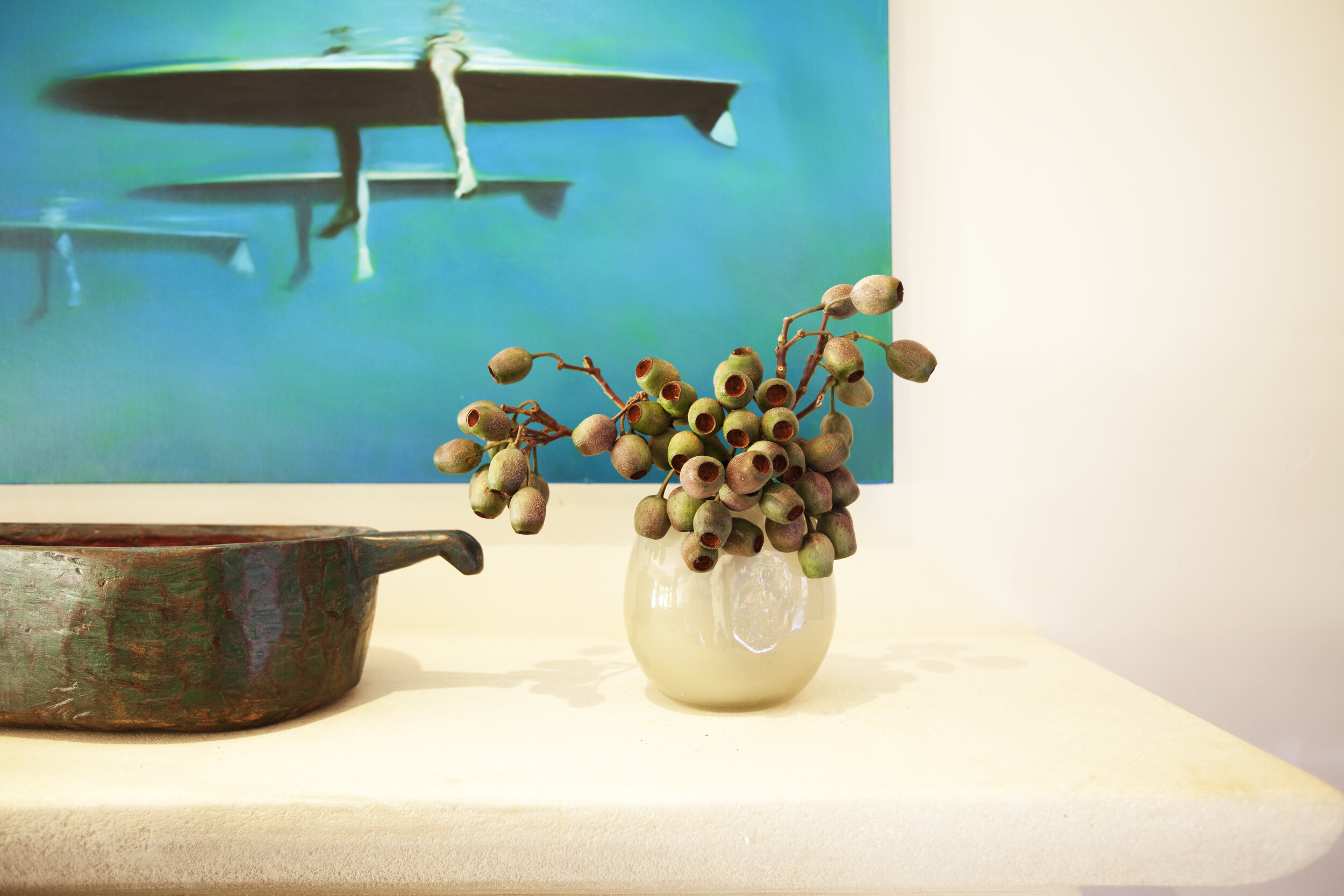
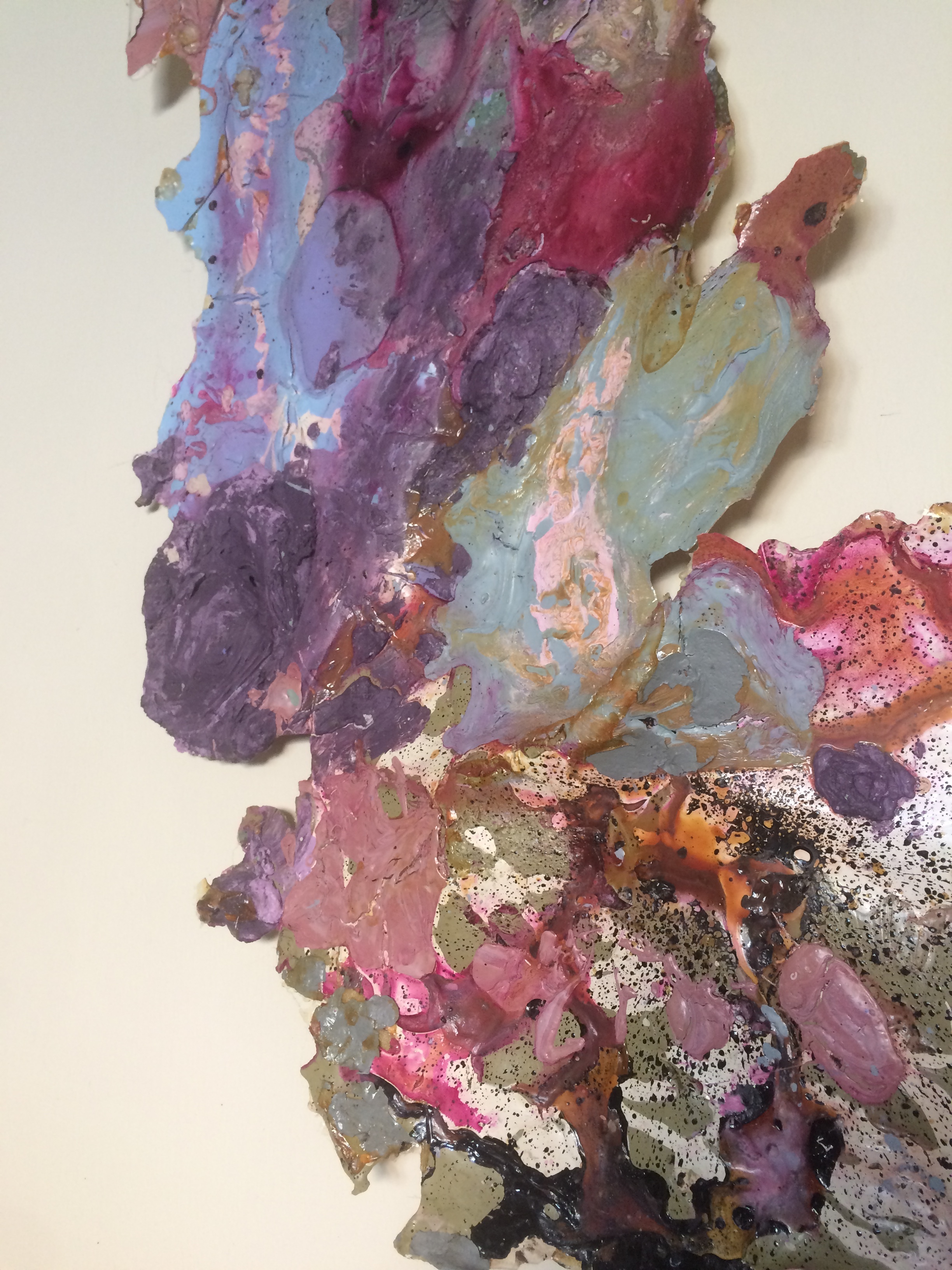
Interior Design by Sarah Barnard, Painting by Reid Winfrey.
Decorating with color is entirely subjective — we all have our likes and dislikes. And yet, in consultations with home designers, clients often struggle to come up with a suitable color scheme on their own. They might identify red as their favorite color without understanding the physical and emotional reactions it can evoke, especially when used in a restorative space like the bedroom.
Interior Design by Sarah Barnard, Artwork by Renae Barnard.
An interior designer with an understanding of color theory and color psychology can help clients define their personal color story by evaluating the hues they like to wear, studying their favorite keepsakes, or delving into their hobbies and interests for inspiration. Home designer Sarah Barnard, WELL AP + LEED AP, has guided many clients through this process, creating healthy, sustainable spaces using colors that reflect their unique personalities. She’s well-versed in the intricacies of color with a Master of Fine Arts degree and undergraduate degrees in Art and Interior Architectural Design.
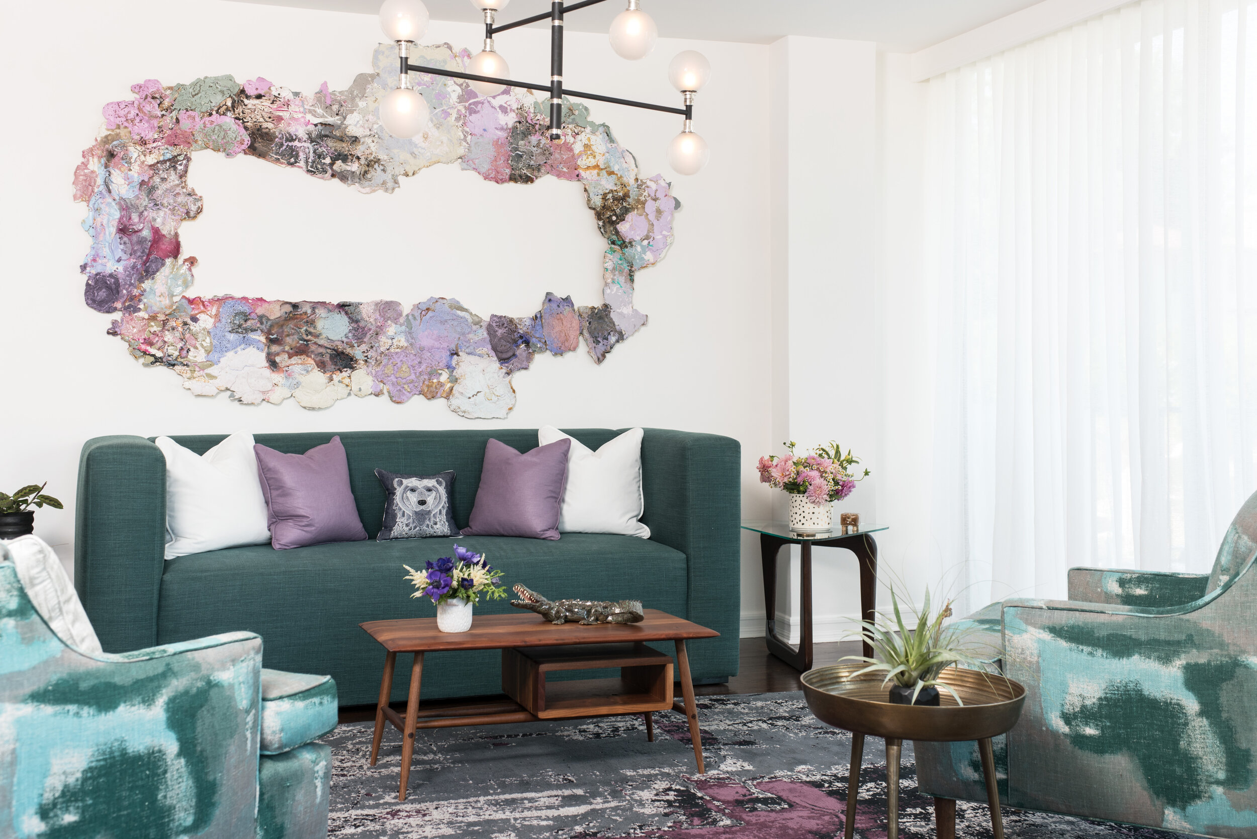
Interior design by Sarah Barnard, Artwork by Renae Barnard.
Sarah proposed a purple and teal palette reminiscent of an agate specimen for a client with an extensive book collection and a cheerful demeanor. These colors make the client’s heart sing, bringing her instant joy every time she comes through the front door. In the living room, vibrant colors pair with bold patterns and rich texture. A large wall sculpture by artist Renae Barnard hangs above a custom teal sofa with handmade toss pillows. Two armchairs with mid-century silhouettes are upholstered in a painterly textile, adding chromatic dimension.
Interior design by Sarah Barnard.
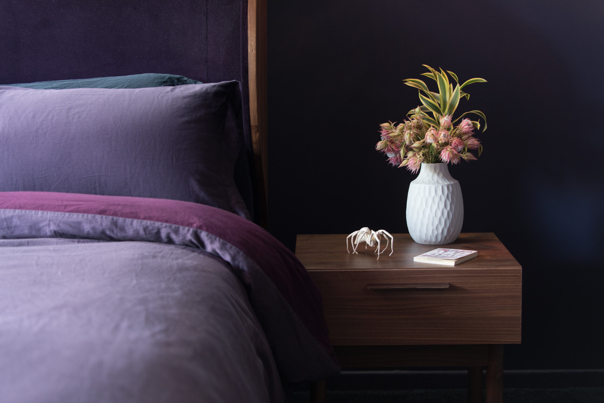
The client requested that the primary bedroom “feel like a hug,” so Sarah settled on a two-tone wall color, a marriage of plum and lavender, to envelop the space. The curved, velvet-lined headboard mimics the action of hugging and is complemented by an Egyptian cotton reversible duvet in a custom color scheme. The bedroom delivers feelings of comfort and safety, supporting the client’s well-being.
Interior design by Sarah Barnard.
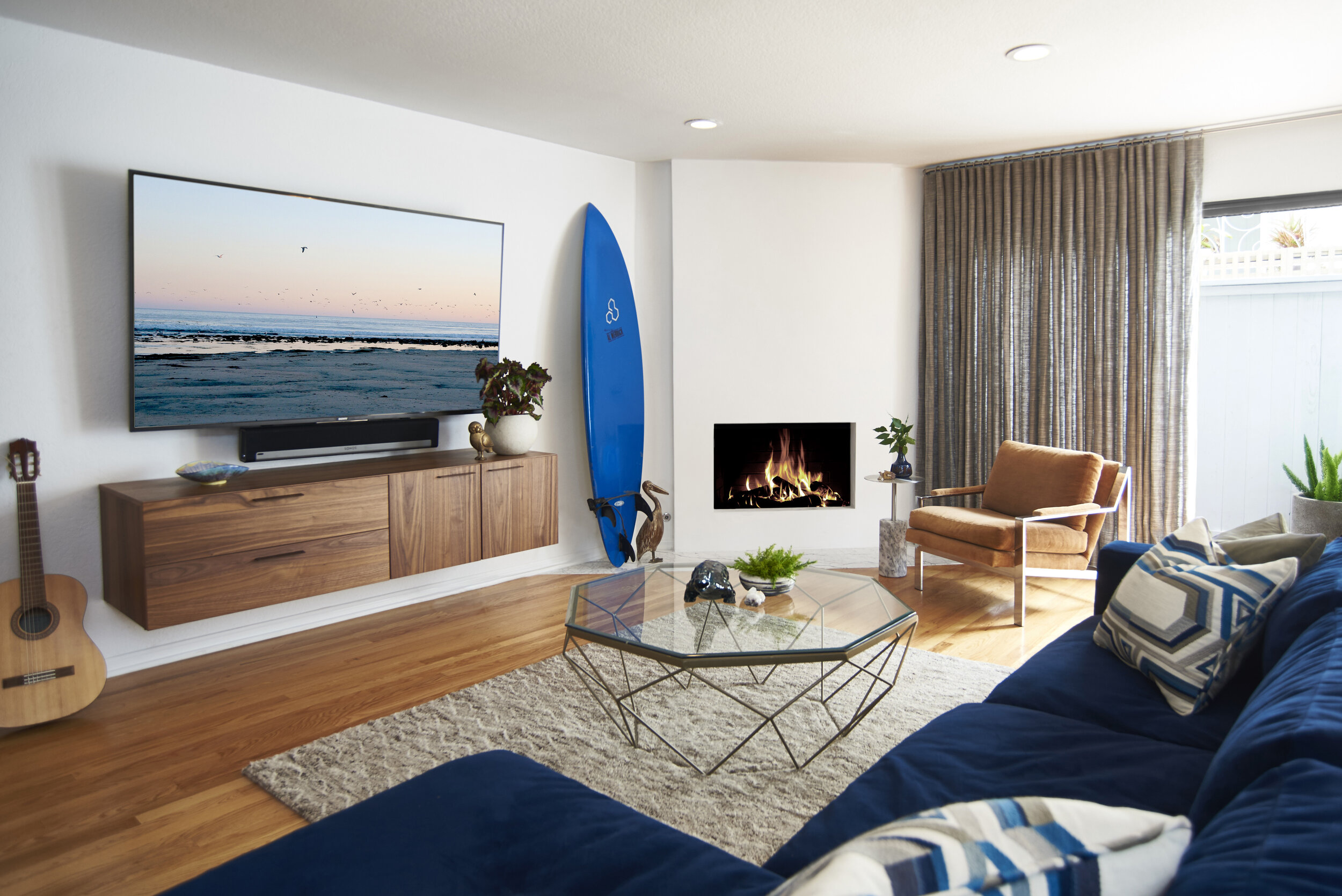
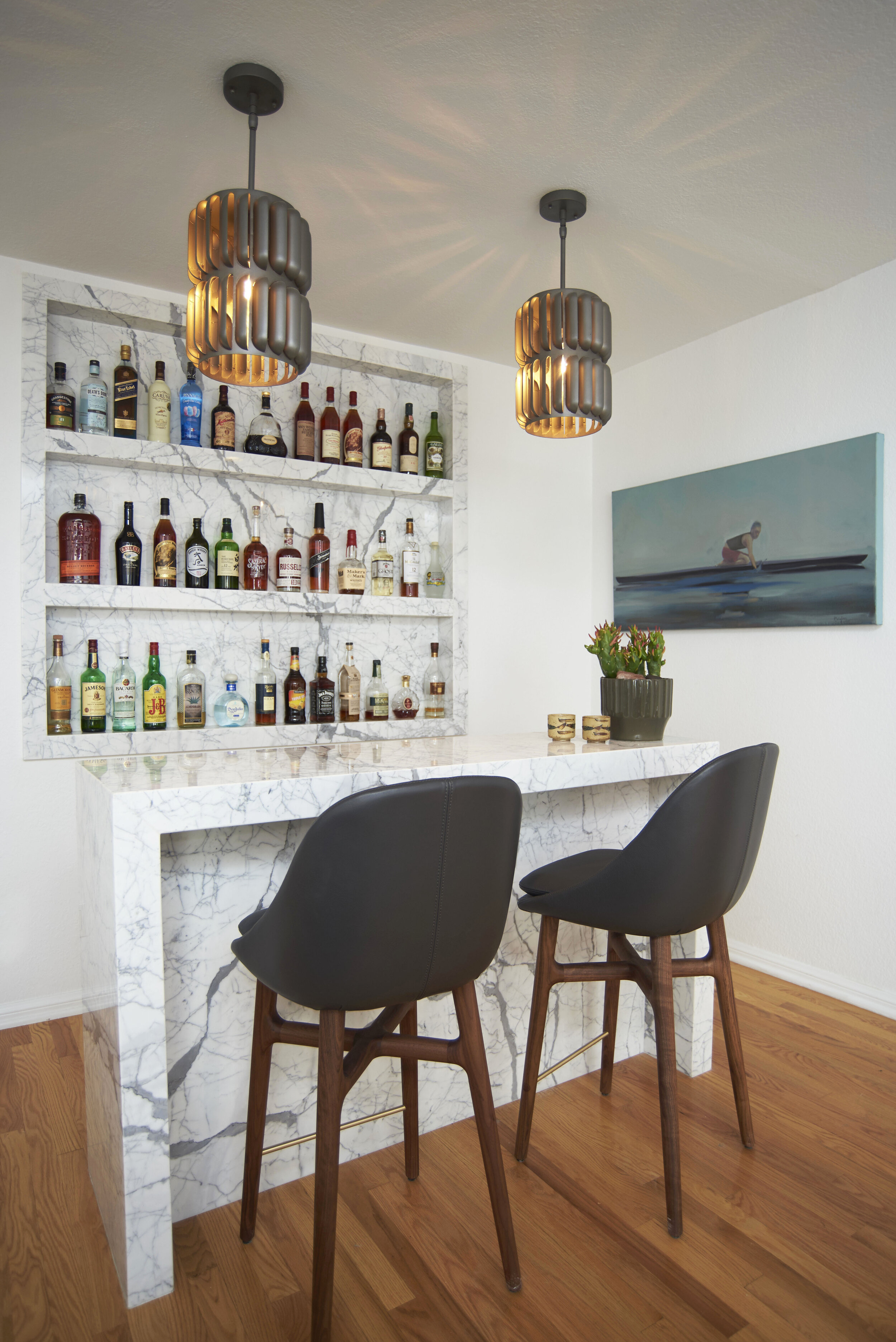
When designing a bachelor pad in a coastal locale, Sarah took inspiration from the client’s interest in surfing and his desire to feel closer to nature. The palette reminds him of the sea, sand, and sky, from the navy velvet sofa to the burnt orange armchair, and the custom Calacatta marble bar. The rich wood tones observed in the entertainment console and reclaimed side table make the space feel earthy and grounded.
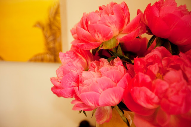
Interior design by Sarah Barnard, Painting by Reid Winfrey.
A calming environment was essential to the client as he has a high-stress job and needs to unwind at the end of a long day. The outdoor patio is awash in cool blues and weathered acacia to reflect the home’s natural surroundings.
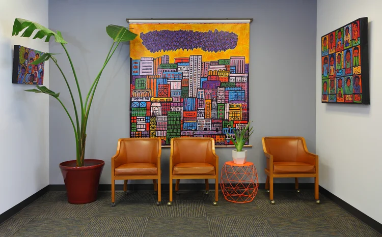
Interior design by Sarah Barnard, Painting by Kevin Moore.
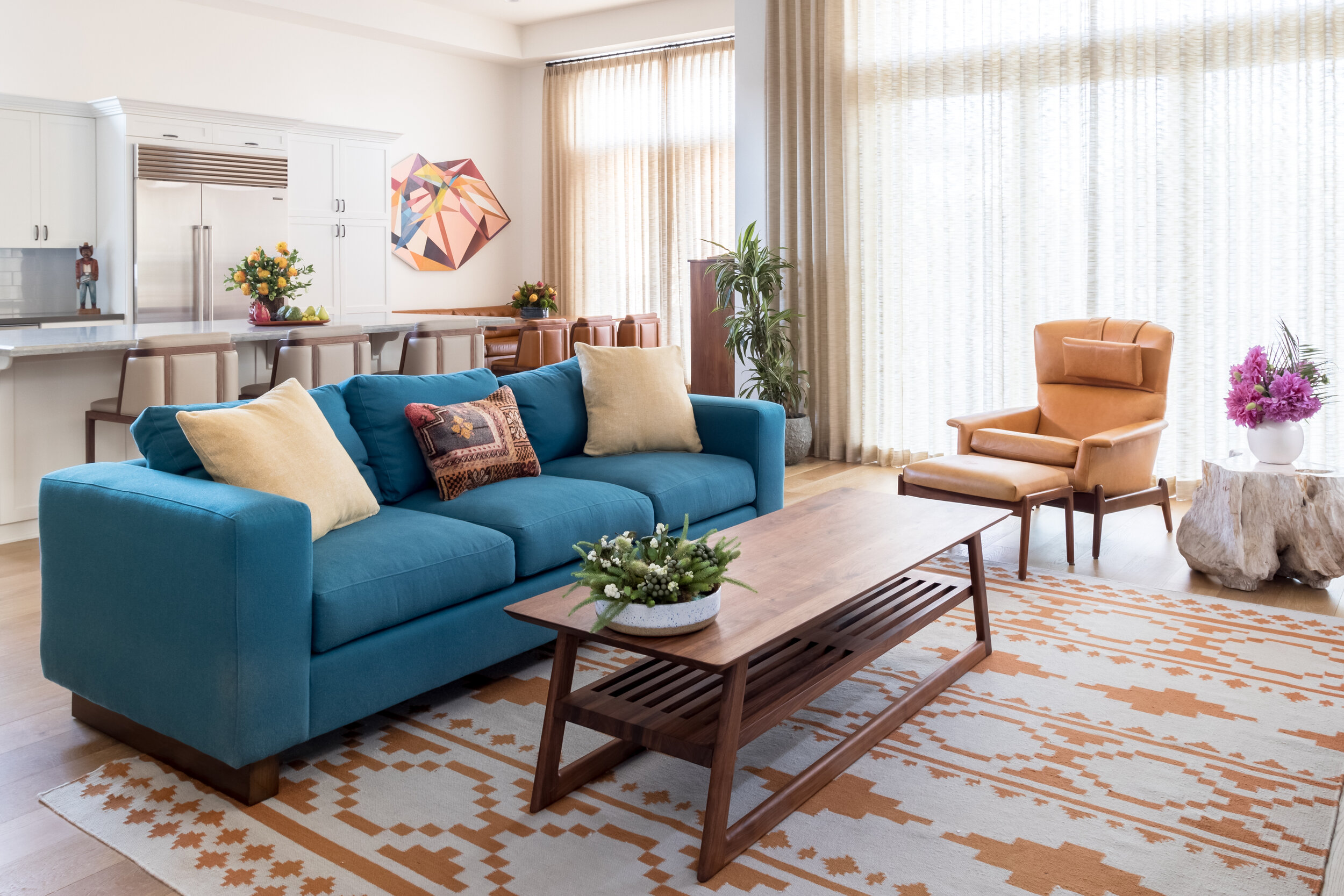
Another project in which the home’s location influenced the color scheme was this family residence that incorporates warm sunset hues and oceanic blues. The tones are representative of the coastal and desert sides of Southern California’s mountain ranges. Within the context of color theory, the chosen hues are energizing and invigorating, perfect for a busy family with young children and active dogs.
Interior design by Sarah Barnard, Painting by Karrie Ross, Sculpture by Kevin Moore.
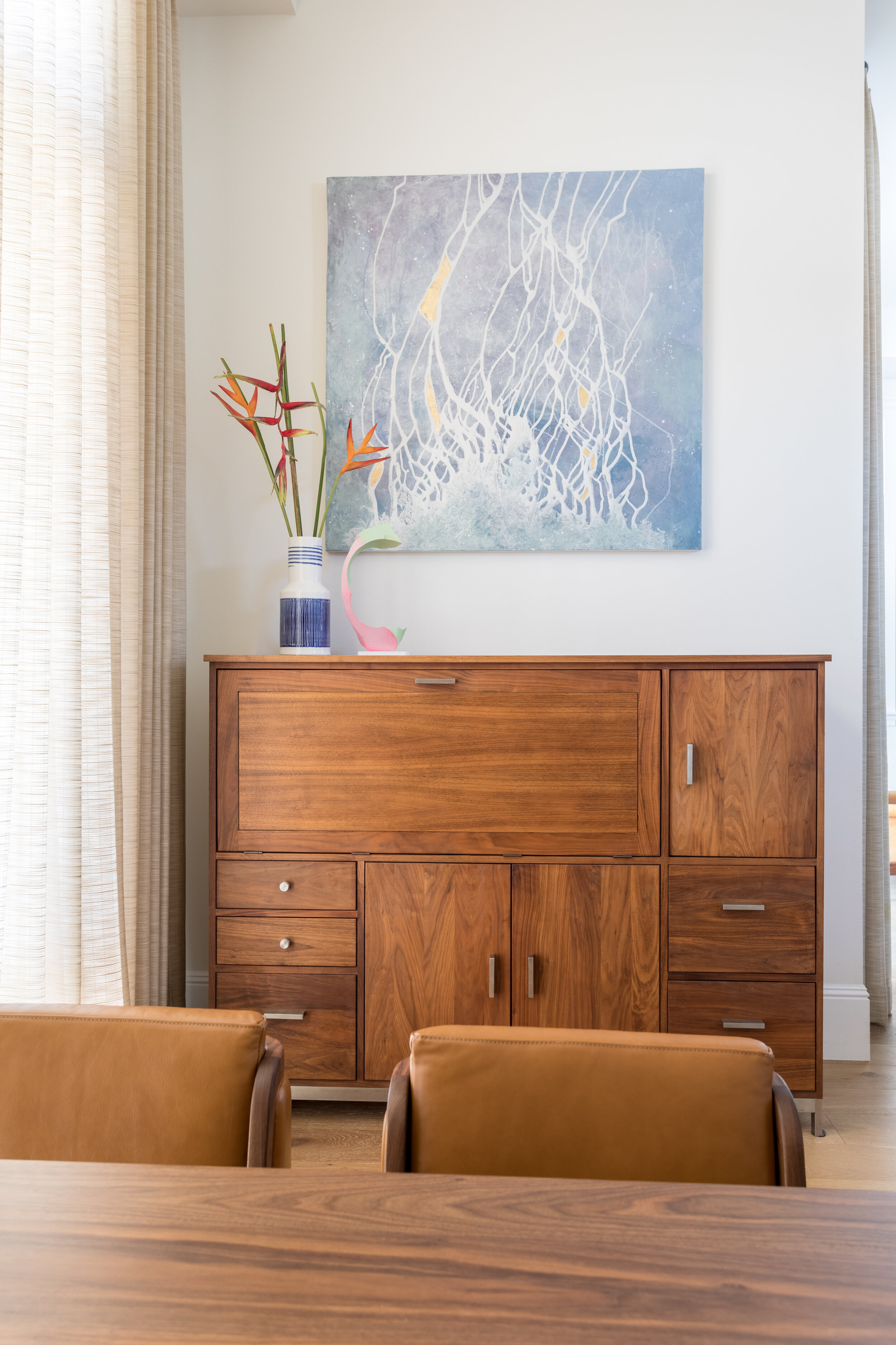
Bright white walls allow the artwork to pop and prevent any single color from overpowering the space. Each room has a different color story to tell, but it all ties together to deliver a fresh, youthful aesthetic.
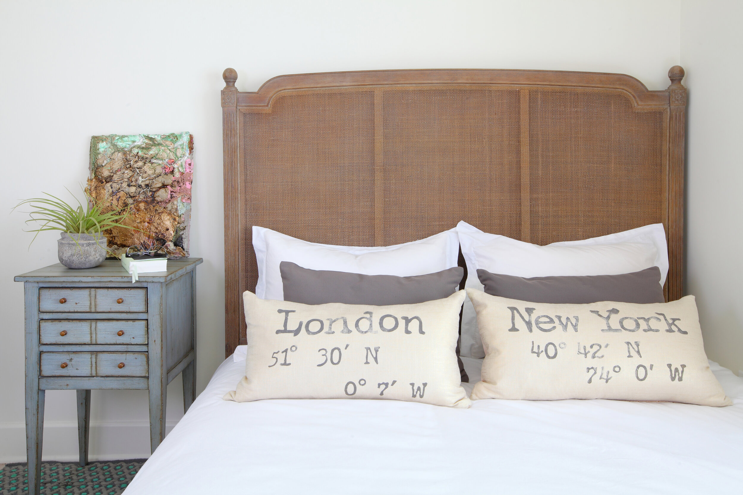
Interior design by Sarah Barnard.
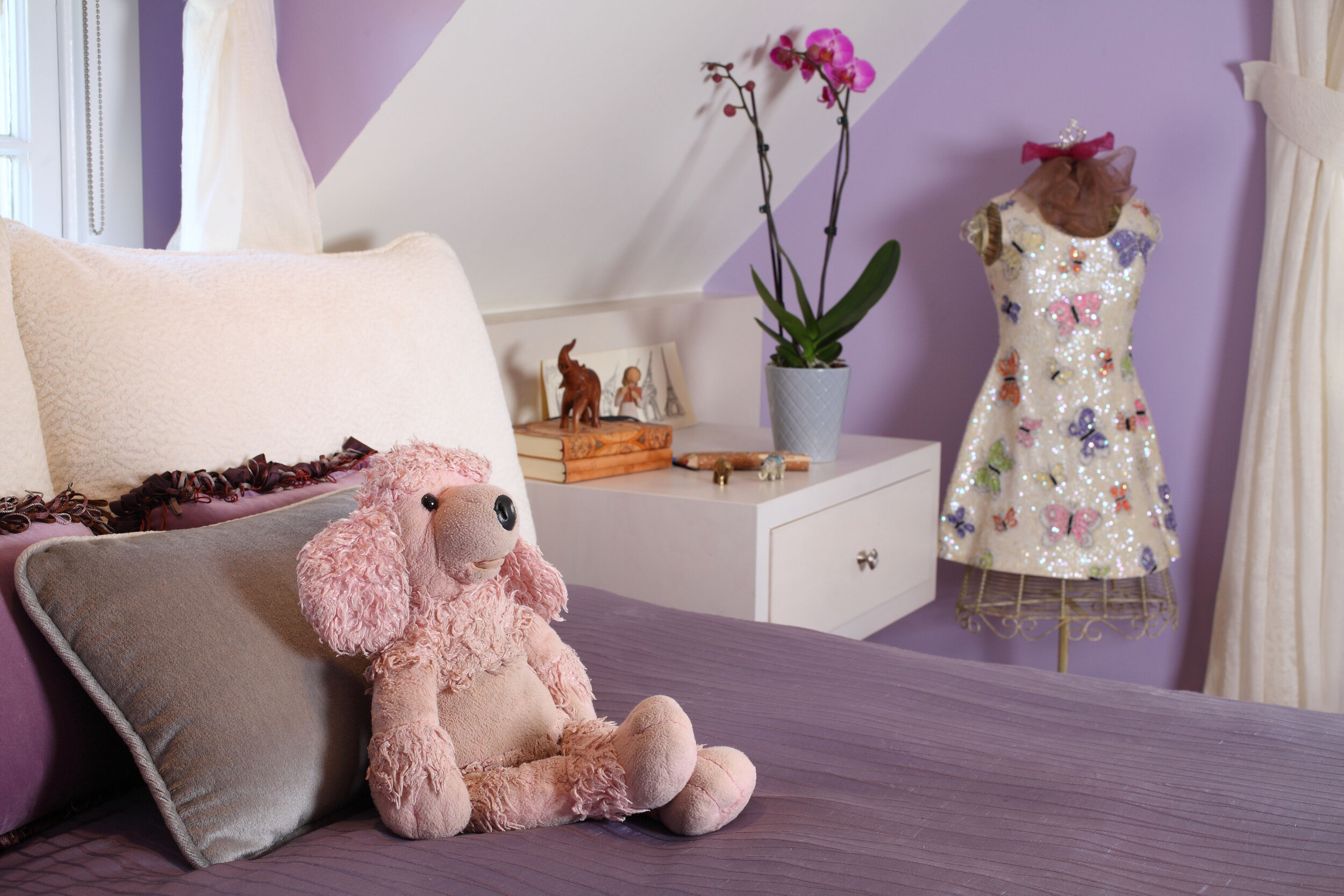
Sarah is particularly fond of designing children’s rooms and enjoys collaborating with little ones to create spaces that reflect their personalities and interests. She did just that for this family of five, bringing in their favorite colors, personal photographs, and handmade artwork. The lavender bedroom was designed for a teen girl who is passionate about travel and collects elephant figurines. Sarah worked with her clients’ daughter to curate a gallery of photographs from her most memorable trips.

Interior design by Sarah Barnard.
For a boy who loves to read, Sarah designed a custom-made, built-in bed from American Walnut that features floating nightstands with plenty of storage for books. He opted for muted shades of blue and green that are frequently found in nature and feel serene and calming.

Interior design by Sarah Barnard.
The family’s teenage son wanted his room to look like autumn in New England. Sarah painted the ceiling a deep orange, which casts a warm glow, and used pumpkin-colored draperies for a bold impact. A reclaimed wood bed frame and natural log nightstand lend an organic feel, while an armchair covered in a retro-inspired fabric serves a nod to the boy’s effervescent personality.
Interior design by Sarah Barnard.
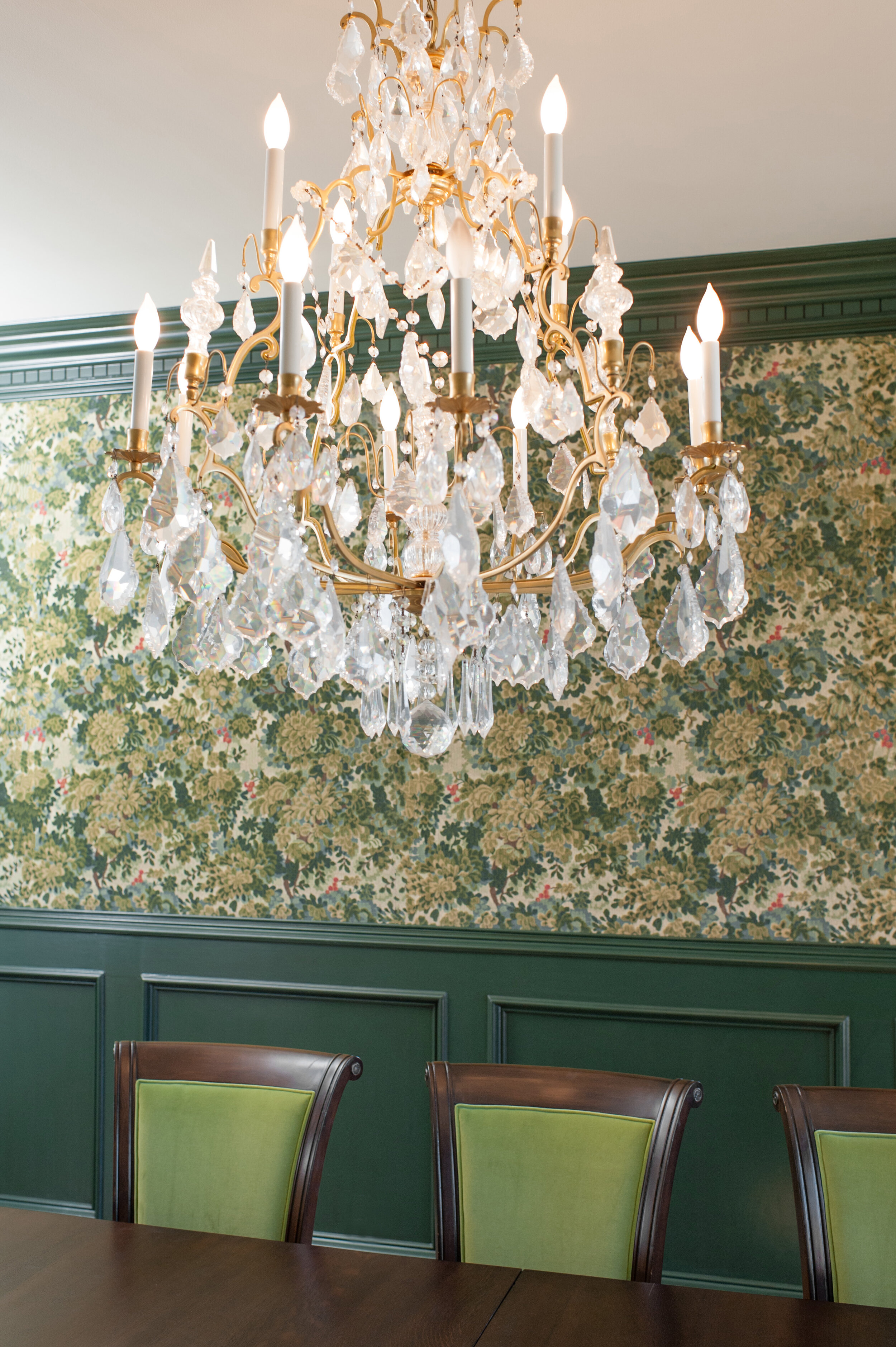
When tasked with designing a Tudor Revival-style estate, Sarah drew upon some of her clients’ favorite TV shows, specifically the BBC’s Downton Abbey and Sherlock. To achieve the Victorian-era aesthetic, Sarah chose saturated colors with historical significance. The jumping-off point for the formal dining room was the luxurious tapestry that adorns the walls. She pulled shades of forest green, chartreuse, and burgundy from its design and painted the wainscoting a custom color by Fine Paints of Europe.
Interior design by Sarah Barnard.
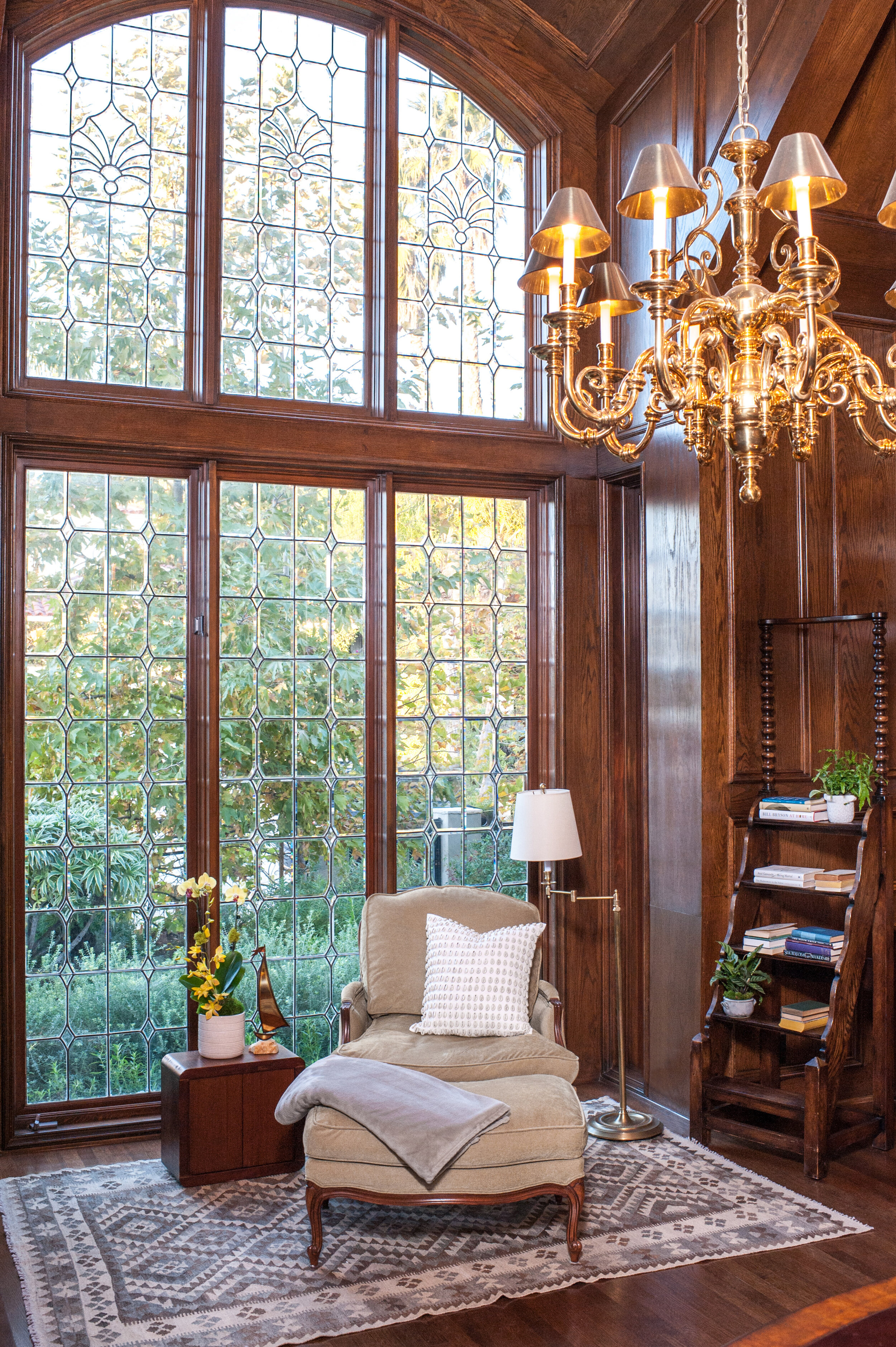
The library is a contemporary take on that of Lord Grantham’s. The American Walnut floors, oak-paneled fireplace, and coordinating bookcases add a richness to the space. Sarah updated the original fireplace with a new stone slip in a swirl of green and coral with an abstract painting by artist Kevin Moore above it. An antique kilim rug from Turkey anchors the reading area, injecting soft blues and grays into the room. The plush velvet armchair appears to change color depending on the time of day, transitioning from a buttery yellow to toasted oatmeal.
Interior design by Sarah Barnard, Painting by Sara Pae.
When conferring with clients looking to redesign their home, Sarah asks them several questions about their personal style: What are your favorite colors to wear? Are there any colors that you would never wear? She will even take a peek in their closet if that’s something they’re comfortable with to get a better sense of their color preferences. She brings a variety of samples to the meeting, including textiles and wallpapers, so the client can see and touch products they might not have otherwise considered.
Interior design by Sarah Barnard.
She observes how they react to not only colors but different sheens like matte or gloss. Curating a color palette isn’t as simple as picking out a few swatches and calling it a day. Home designers are well-trained in color theory and are aware of how color affects our behaviors and emotions. They can harness that extensive knowledge to create a color palette that matches your home to your personality — and when a space feels like ‘you,’ happiness will follow.
Interior design by Sarah Barnard.
Sarah Barnard designs healthy, happy, personalized spaces that are deeply connected to nature and art. With a contemporary approach that employs traditional vocabulary, Barnard’s range of style is innovative yet time-honored.