

Pantone’s Color of the Year: Living Coral

The family cat is the primary resident of this guest suite featuring a pink and coral color scheme.
Coral reefs are disappearing from our oceans at an alarming rate. It is imperative to the ocean’s ecosystems, and as much as a quarter of all ocean species depend upon it for food and shelter. Precious marine lifeforms are also the inspiration for Pantone’s color of the year: Living Coral.

CORAL AND LUSH GREENS CREATE A LIVELY AND INVITING ATMOSPHERE FOR AN OUTSIDE SPACE.
Sarah Barnard, a Los Angeles-based interior designer, WELL AP and LEED AP, specializes in home design that contributes to her client’s health and wellness and strives to make nature a part of each home she creates. “A happy and uplifting color reminiscent of the ocean is the perfect starting point for a happy, healthy home.”

CORAL COLORED TILES AND BEAUTIFUL GLOSSY STONE SLABS MAKE THIS COASTAL BATHROOM WARM AND BRIGHT.
Coral colored tiles and beautiful glossy stone slabs make this coastal bathroom warm and bright.
This color takes its name from the beautiful coral marine invertebrates that build extensive coral reefs, habitats for a vast diversity of life in the ocean. Sometimes referred to as the "rainforests of the sea," coral reefs are quickly dying, and are projected to reduce to 10% by 2050. Half of the world's coral has died since 2016, due to rising sea temperatures, pollution, destructive fishing, invasive species, and changing sea chemistry.
"The timely selection of this color by Pantone should be an important reminder to all of us that nature inspires beautiful interiors. If we aren't careful to preserve the natural world, we will have nothing left to take inspiration from," said Barnard.

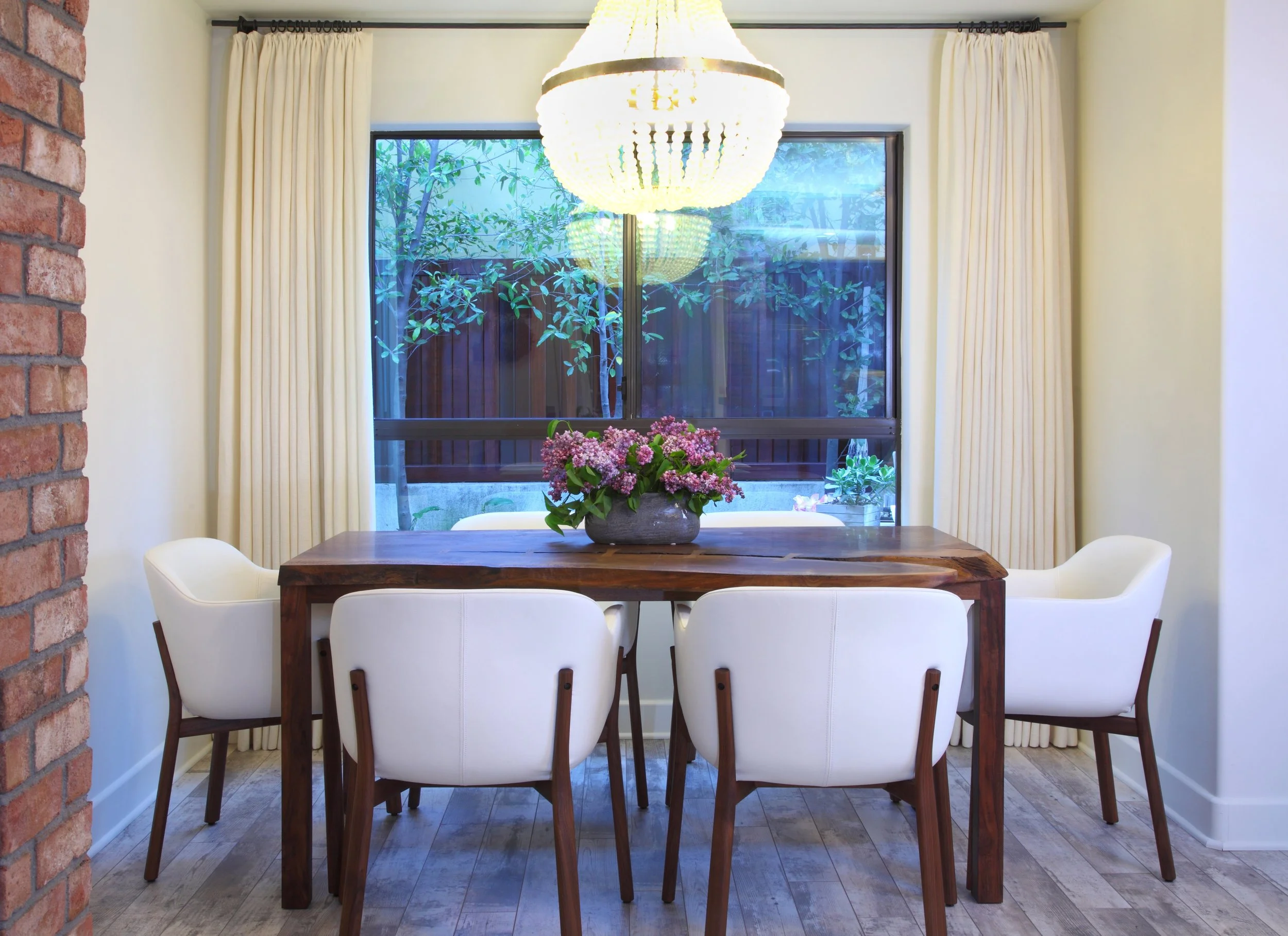
CORAL NATURALLY COMPLEMENTS WITH BLUES AND OCEAN TONES. CORAL EMBROIDERY WAS A PERFECT COMPANION (COMPLEMENT?) FOR A THROW PILLOW IN A COASTAL HOME.
Pantone is most widely known for their color swatch books. It is the company responsible for color matching paints and graphics; and now devotes the time and resources of Pantone Color Institute to research the purchasing trends of various industries. With this information, Pantone determines this year's color. The naming process regularly pulls inspiration from the natural and human-made world, naming colors such as "rose quartz" or "millennial pink." Pantone's color of the year for 2018 was ultraviolet, a beautiful, energizing shade of purple reminiscent of bright flowers and the sky at sunset. This year's choice is PANTONE 16-1546 Living Coral, a potent reminder to preserve and protect ocean life.

CORAL COLORED CERAMIC PROVIDES EARTHY CONTRAST AGAINST THE EBONIZED TABLE AND BLACK LAMP.
Coral is vibrant, cheerful, delicate and energizing, and the perfect shade to start the New Year. Living coral, described by the Pantone team as “An animating and life-affirming coral hue with a golden undertone that energizes and enlivens with a softer edge.”

THE BATH AND SHOWER FEATURE LOCALLY SOURCED HANDMADE CERAMIC TILES IN A CORAL GLOSS.
Pantone published, “Vibrant, yet mellow PANTONE 16-1546 Living Coral embraces us with warmth and nourishment to provide comfort and buoyancy in our continually shifting environment. [...] Representing the fusion of modern life, PANTONE Living Coral is a nurturing color that appears in our natural surroundings and at the same time, displays a lively presence within social media.”

CORAL AND PINK SHADES BLEND BEAUTIFULLY WITH WOOD TONES. ART IS A SUBTLE AND SEAMLESS WAY TO INTRODUCE COLORS LIKE CORAL.
While top interior designers don’t necessarily recommend painting one’s home to match the color of the year, art, accents, and of course plants are an easy and safe way to introduce vibrancy to your living or work space through home decorating.

PINKS AND CORAL CREATE AN INVITING ATMOSPHERE.
For those interested in using Living Color in their home, Sarah Barnard said, "Living Coral is a perfect complement to blue shades, and pairs well with coastal or beachy interiors. For the daring, reupholstering a treasured piece in a bright color like Living Coral can revitalize a space. For those who prefer to mix pops of color with neutrals, I recommend starting with small accents."
Pantone's Color of the Year is an excellent opportunity to add lively, earth-focused tones to your home. Make having a happy and healthy home your New Year's resolution.

CREAM AND CORAL CERAMIC JARS ARE A PERFECT STORAGE SOLUTION FOR BATHROOM NECESSITIES.
Sarah Barnard designs healthy, happy, personalized spaces that are deeply connected to nature and art.
To learn more about Sarah Barnard Design, please visit www.SarahBarnard.com.
Photos by Abby Siniscal, Chas Metivier, and Charlie Daniels

Pantone's Color of the Year is Ultraviolet... How are You Using It?

A QUICK SNAPSHOT FROM SARAH BARNARD DESIGN'S OFFICE LATE LAST YEAR.
Ultraviolet, an intense and bold shade of purple, is suggestive of the cosmos and the future, while still reminiscent of royalty, wealth, and creativity. It's also Pantone's color of the year. Pantone, the global authority on accurate color matching, is known worldwide for its standard color language which allows designers, manufacturers, retailers, and consumers to accurately produce the same colors across platforms and industries. (If you're not familiar with Pantone, you may have seen their swatch books or their line in Sephora!) They research style trends in art, fashion, and design, and predict the upcoming year's most popular trends.
This year they've selected ultraviolet as their "Color of the Year," so if you were waiting for the opportunity to make a bold change in your home design, it has arrived!

“In interiors, Ultra Violet can transform a room into one of extraordinary self-expression, or conversely its polish can tone down a room with subdued, modern pairings. Adding spice and brightness, Ultra Violet calls attention to a tufted couch, piece of art, or accent wall. As a color that can take you in so many directions, Ultra Violet makes a statement in any space, whether it’s one of tradition and elegance or unexpected boldness. In hospitality, we are seeing purples like Ultra Violet take center stage in interior spaces as large and small hotels harness color and design to entice travelers and stay relevant.”
— Pantone
Trends go in and out of fashion–unless you already love ultraviolet and had plans to use it, it may not be a good idea to paint your whole house purple. However, there are many ways you can feature violet and freshen your home or office, such as adding a bold color in through plants, linens, or art, which will allow you to animate the space in a way that won’t be out of style by the end of the year.
Let’s take a look at some of our favorite design strategies and items in ultraviolet and purple:

While some might relish the opportunity to use this news as an excuse to paint their entire house violet, most people will find ultraviolet to be an intimidating color with which to decorate. So how might you use it? Consider bringing in a small splash of violet. Flowers, for example, are a beautiful, healthy way to add a pop of bold color that will not be out of fashion in a year.

Adding art to your walls is a fantastic way to add color and interest to a space. This piece by Renae Barnard has swirling shades of violet, blue and pink. An elegant art installation like this will never go out of style.


Lavender and violet: together at last. Invigorating a traditional girl’s room palette of lilac or lavender by adding violet is a great way to keep your daughter's room from getting tired.

For the National Immigration Law Center, jewel tones were the perfect choice to convey richness and sophistication. Violet and yellow are complementary colors, meaning they are opposite each other on the color wheel. Their opposing hues and differing values are naturally striking when used together, and add energy to the area.
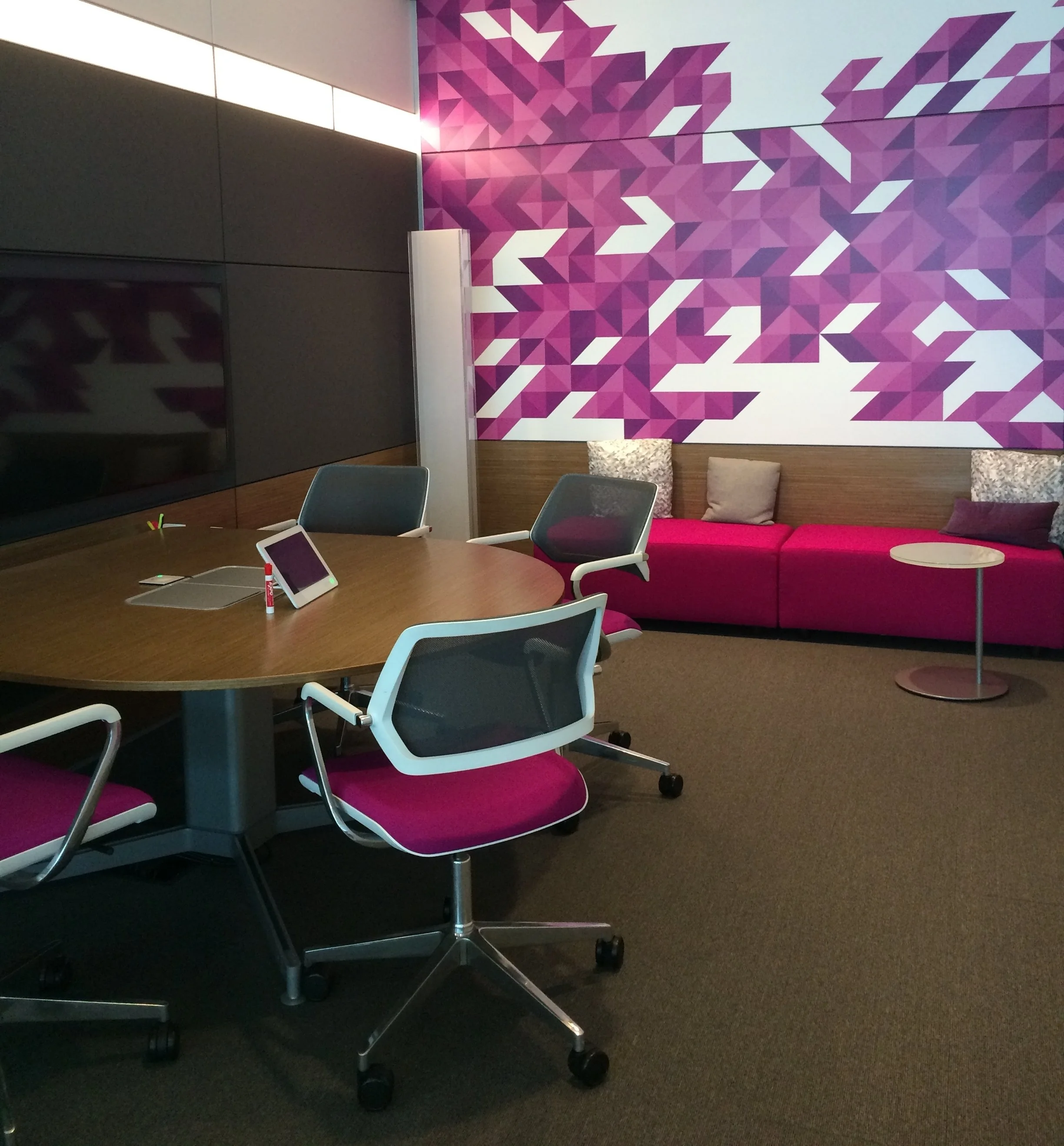
For an ultra-sleek look, Steelcase's office in Grand Rapids, MI vibrates with a mix of ultraviolet and neutrals. Mixing many colors can get too intense too quickly, so using a bold violet with white is a fresh but straightforward way to modernize an office.

Last but not least, this beautiful space sits right next to the ocean. Many people's first instinct is to add blue to a beach home to echo the sea. However the area is quite literally surrounded by blue, so adding more can quickly get tired and dull. Instead, analogous colors–bright green and purple–were used to add life to the room and complement the ocean outside.
Pantone's annual announcement is an opportunity to be creative and update your home or office. Ultraviolet is daring and sophisticated. If you are interested in adding an air of curiosity, wisdom, and richness to your home, give it a pop of Ultraviolet!
Sarah Barnard designs healthy, happy, personalized spaces that are deeply connected to nature and art.
To learn more about Sarah Barnard Design, please visit www.SarahBarnard.com.
Photos by Chas Metivier, Steven Dewall.