

Ultra Personalized Color : How an interior designer can help create a home that feels like you

INTERIOR DESIGN BY SARAH BARNARD, PAINTING BY REID WINFREY.
Decorating with color is entirely subjective — we all have our likes and dislikes. And yet, in consultations with home designers, clients often struggle to come up with a suitable color scheme on their own. They might identify red as their favorite color without understanding the physical and emotional reactions it can evoke, especially when used in a restorative space like the bedroom.

INTERIOR DESIGN BY SARAH BARNARD, ARTWORK BY RENAE BARNARD.
An interior designer with an understanding of color theory and color psychology can help clients define their personal color story by evaluating the hues they like to wear, studying their favorite keepsakes, or delving into their hobbies and interests for inspiration. Home designer Sarah Barnard, WELL AP + LEED AP, has guided many clients through this process, creating healthy, sustainable spaces using colors that reflect their unique personalities. She’s well-versed in the intricacies of color with a Master of Fine Arts degree and undergraduate degrees in Art and Interior Architectural Design.

INTERIOR DESIGN BY SARAH BARNARD, ARTWORK BY RENAE BARNARD.
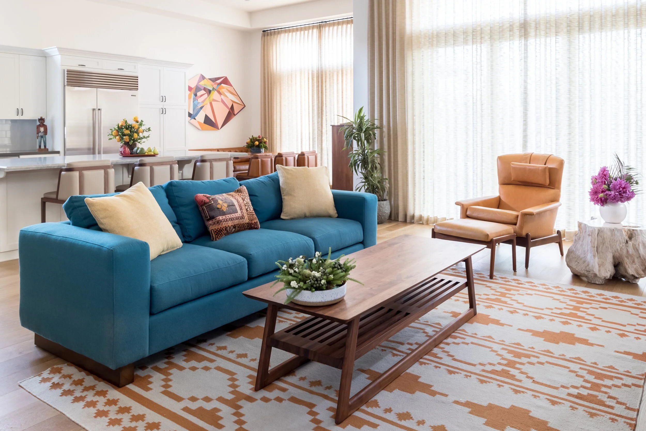
Sarah proposed a purple and teal palette reminiscent of an agate specimen for a client with an extensive book collection and a cheerful demeanor. These colors make the client’s heart sing, bringing her instant joy every time she comes through the front door. In the living room, vibrant colors pair with bold patterns and rich texture. A large wall sculpture by artist Renae Barnard hangs above a custom teal sofa with handmade toss pillows. Two armchairs with mid-century silhouettes are upholstered in a painterly textile, adding chromatic dimension.

INTERIOR DESIGN BY SARAH BARNARD.
The client requested that the primary bedroom “feel like a hug,” so Sarah settled on a two-tone wall color, a marriage of plum and lavender, to envelop the space. The curved, velvet-lined headboard mimics the action of hugging and is complemented by an Egyptian cotton reversible duvet in a custom color scheme. The bedroom delivers feelings of comfort and safety, supporting the client’s well-being.

INTERIOR DESIGN BY SARAH BARNARD.
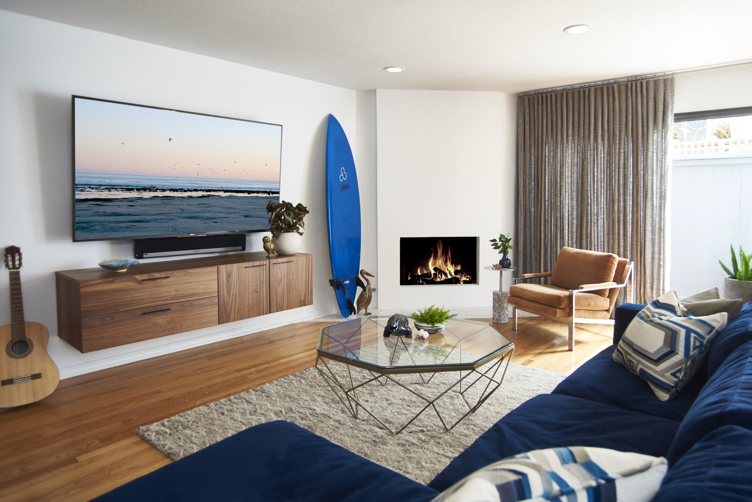
When designing a bachelor pad in a coastal locale, Sarah took inspiration from the client’s interest in surfing and his desire to feel closer to nature. The palette reminds him of the sea, sand, and sky, from the navy velvet sofa to the burnt orange armchair, and the custom Calacatta marble bar. The rich wood tones observed in the entertainment console and reclaimed side table make the space feel earthy and grounded.

INTERIOR DESIGN BY SARAH BARNARD, PAINTING BY REID WINFREY.
A calming environment was essential to the client as he has a high-stress job and needs to unwind at the end of a long day. The outdoor patio is awash in cool blues and weathered acacia to reflect the home’s natural surroundings.
INTERIOR DESIGN BY SARAH BARNARD, PAINTING BY KEVIN MOORE.
Another project in which the home’s location influenced the color scheme was this family residence that incorporates warm sunset hues and oceanic blues. The tones are representative of the coastal and desert sides of Southern California’s mountain ranges. Within the context of color theory, the chosen hues are energizing and invigorating, perfect for a busy family with young children and active dogs.

INTERIOR DESIGN BY SARAH BARNARD, PAINTING BY KARRIE ROSS, SCULPTURE BY KEVIN MOORE.
Bright white walls allow the artwork to pop and prevent any single color from overpowering the space. Each room has a different color story to tell, but it all ties together to deliver a fresh, youthful aesthetic.
INTERIOR DESIGN BY SARAH BARNARD.
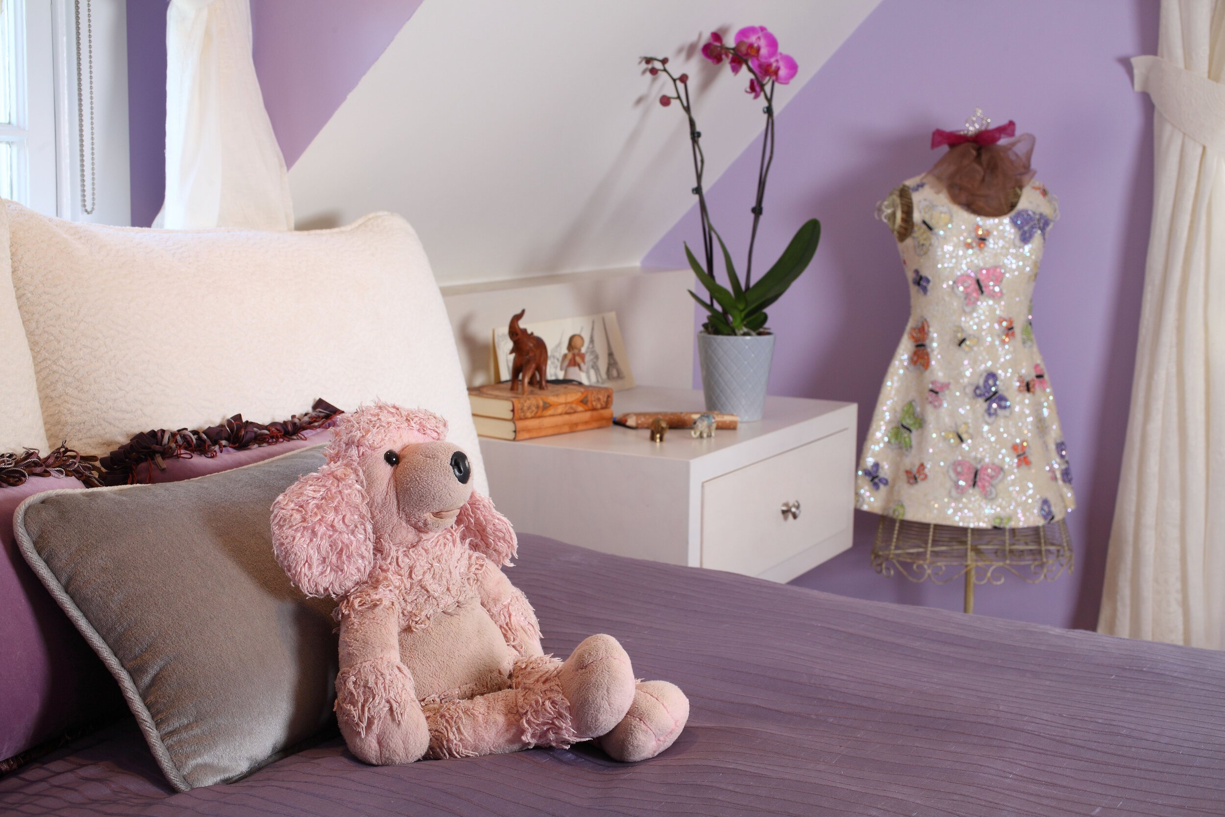
Sarah is particularly fond of designing children’s rooms and enjoys collaborating with little ones to create spaces that reflect their personalities and interests. She did just that for this family of five, bringing in their favorite colors, personal photographs, and handmade artwork. The lavender bedroom was designed for a teen girl who is passionate about travel and collects elephant figurines. Sarah worked with her clients’ daughter to curate a gallery of photographs from her most memorable trips.

INTERIOR DESIGN BY SARAH BARNARD.
For a boy who loves to read, Sarah designed a custom-made, built-in bed from American Walnut that features floating nightstands with plenty of storage for books. He opted for muted shades of blue and green that are frequently found in nature and feel serene and calming.

INTERIOR DESIGN BY SARAH BARNARD.
The family’s teenage son wanted his room to look like autumn in New England. Sarah painted the ceiling a deep orange, which casts a warm glow, and used pumpkin-colored draperies for a bold impact. A reclaimed wood bed frame and natural log nightstand lend an organic feel, while an armchair covered in a retro-inspired fabric serves a nod to the boy’s effervescent personality.
INTERIOR DESIGN BY SARAH BARNARD.
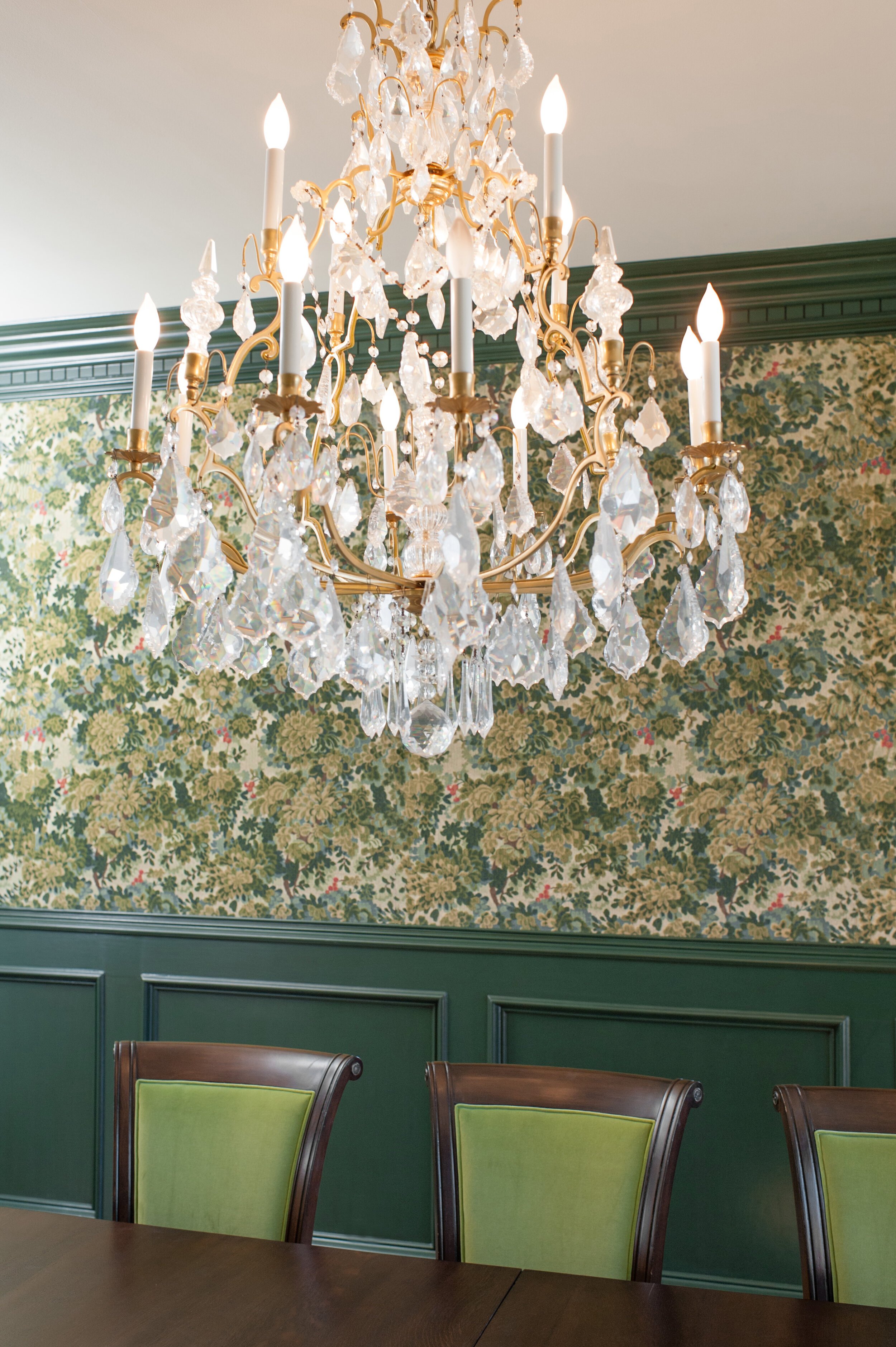
When tasked with designing a Tudor Revival-style estate, Sarah drew upon some of her clients’ favorite TV shows, specifically the BBC’s Downton Abbey and Sherlock. To achieve the Victorian-era aesthetic, Sarah chose saturated colors with historical significance. The jumping-off point for the formal dining room was the luxurious tapestry that adorns the walls. She pulled shades of forest green, chartreuse, and burgundy from its design and painted the wainscoting a custom color by Fine Paints of Europe.

INTERIOR DESIGN BY SARAH BARNARD.
The library is a contemporary take on that of Lord Grantham’s. The American Walnut floors, oak-paneled fireplace, and coordinating bookcases add a richness to the space. Sarah updated the original fireplace with a new stone slip in a swirl of green and coral with an abstract painting by artist Kevin Moore above it. An antique kilim rug from Turkey anchors the reading area, injecting soft blues and grays into the room. The plush velvet armchair appears to change color depending on the time of day, transitioning from a buttery yellow to toasted oatmeal.
INTERIOR DESIGN BY SARAH BARNARD, PAINTING BY SARA PAE.
When conferring with clients looking to redesign their home, Sarah asks them several questions about their personal style: What are your favorite colors to wear? Are there any colors that you would never wear? She will even take a peek in their closet if that’s something they’re comfortable with to get a better sense of their color preferences. She brings a variety of samples to the meeting, including textiles and wallpapers, so the client can see and touch products they might not have otherwise considered.

INTERIOR DESIGN BY SARAH BARNARD.
She observes how they react to not only colors but different sheens like matte or gloss. Curating a color palette isn’t as simple as picking out a few swatches and calling it a day. Home designers are well-trained in color theory and are aware of how color affects our behaviors and emotions. They can harness that extensive knowledge to create a color palette that matches your home to your personality — and when a space feels like ‘you,’ happiness will follow.

INTERIOR DESIGN BY SARAH BARNARD.
Sarah Barnard designs healthy, happy, personalized spaces that are deeply connected to nature and art. With a contemporary approach that employs traditional vocabulary, Barnard’s range of style is innovative yet time-honored.

How Color Impacts Feelings and Emotions

THE COLOR OF YOUR BEDROOM COULD BE IMPACTING YOUR ABILITY TO GET A GOOD NIGHT’S REST. THIS RICH INDIGO SCHEME NEUTRALIZES STRESS AND PROVIDES A SANCTIMONIOUS SPACE FOR SLEEP.
The color of your bedroom could be impacting your ability to get a good night’s rest. This rich indigo scheme neutralizes stress and provides a sanctimonious space for sleep.
Imagine your favorite color. Classic, reliable, and looks great on you. By some metaphysical magicalness, this inanimate projection of light makes you feel something. It can’t explain it- but it quiets the storm, inspires the artist, and invites introspection. Like a Netflix original series or the air we breathe, we can’t get enough of it- but why? What gives color such a powerful influence?
The answer exists somewhere between science and socialization in an area of study called color psychology.
Color is a fundamental element in life. It can alter an individual’s mood, behavior, even their appetite. Although some studies suggest that color interpretation is based on ‘pseudo-scientific assertions’ rather than scientific data, color psychology is the study of how the way we experience color has long been a valuable facet of the human experience.

TAKING INTO CONSIDERATION THE HEALTHY LIFESTYLE OF THE RESIDENTS, SARAH OPTED FOR A CONIFEROUS GREEN AS A SYMBOLIC TRIBUTE. GREEN IS A GREAT SHADE TO LIVEN UP A SPACE WITH A NATURAL LOOK.
Taking into consideration the healthy lifestyle of the residents, Sarah opted for a coniferous green as a symbolic tribute. Green is a great shade to liven up a space with a natural look.
Color psychology is the study of how color impacts mood and behavior. When studying color’s effect on mood, a color’s hue, saturation, and brightness must all be accounted for. Color perception can be affected by a series of factors, and the same color may appear different to various people.
Intro to color psychology’s kid brother: Color Theory.
While there are multiple definitions of Color Theory, there is a basic knowledge that helps define the essence of it. Color Theory is not only the series of hues known as the color wheel, but it is also a valuable structure of guidance to mixing color, and the visual emotions it invokes. The color wheel is composed of primary, secondary and tertiary colors. The primary colors are red, yellow, and blue. These three pigments remain solid on the color wheel, as they cannot be formed by the combination of any other colors. Primary colors are the true originators- hues from which all other colors are derived. Secondary colors are created when mixing primary colors; resulting with green, orange, and purple. Tertiary colors are formed by mixing a primary and a secondary color, creating yellow-orange, red-orange, red-violet, blue-violet, blue-green, and yellow-green. Colors are categorized into three hue variant descriptors; cool, warm and neutral.

IT’S EASY TO FEEL ENERGIZED IN THIS BUNGALOW BATHROOM COVERED HEAD-TO-TOE IN ORANGE TILES. THIS CHEERFUL AND VIBRANT SECONDARY COLOR COMBINES THE ENERGY OF RED AND THE HAPPINESS OF YELLOW.
It’s easy to feel energized in this Bungalow bathroom covered head-to-toe in orange tiles. This cheerful and vibrant secondary color combines the energy of red and the happiness of yellow.
By mixing colors and exploring different color combinations, one can reap the benefits of different colors’ impacts by carefully integrating them into a single space.
Interior designer Sarah Barnard (WELL AP + LEED AP) further explains, “In spaces like the minimalist coastal retreat where the dominant color scheme is a pure, dove white- the minimal use of color is emphasized by contrast. The analogous color scheme [colors adjacent to one another on the color wheel] like yellow, green, and blue, inspire a light, energetic space that feels alive and vibrant.”

PERSONAL POSSESSIONS, PLANTS, AND EVEN FOOD CAN PROVIDE ADDITIONAL COLOR. GROUPING THE DRAGON FRUIT AND STAR FRUIT TOGETHER BRINGS TWO DISTINCT POPS OF RED AND YELLOW.
In this personalized family home, each room embodies its own personality, attributed to the diverse use of color. Home to 3 children, each impassioned youth expressed themselves by participating in the selection of colors in their room. In one space; a rustic orange courts a creative, comfy atmosphere. While in the other, a softened lavender beckons a certain subtle sophistication blended with an imaginative air.
It’s not all about the striking shades. “Neutral tone-on-tone schemes create a very harmonious, feeling of cohesiveness. It’s organic and natural, evoking an earthly feeling of connectedness.” Sarah Barnard goes on, “When brighter colors are used to accent these more neutral scenes, we see more distinction in the color due to contrast. These cool, warm, and neutral tones can communicate everything from peace to activity.”
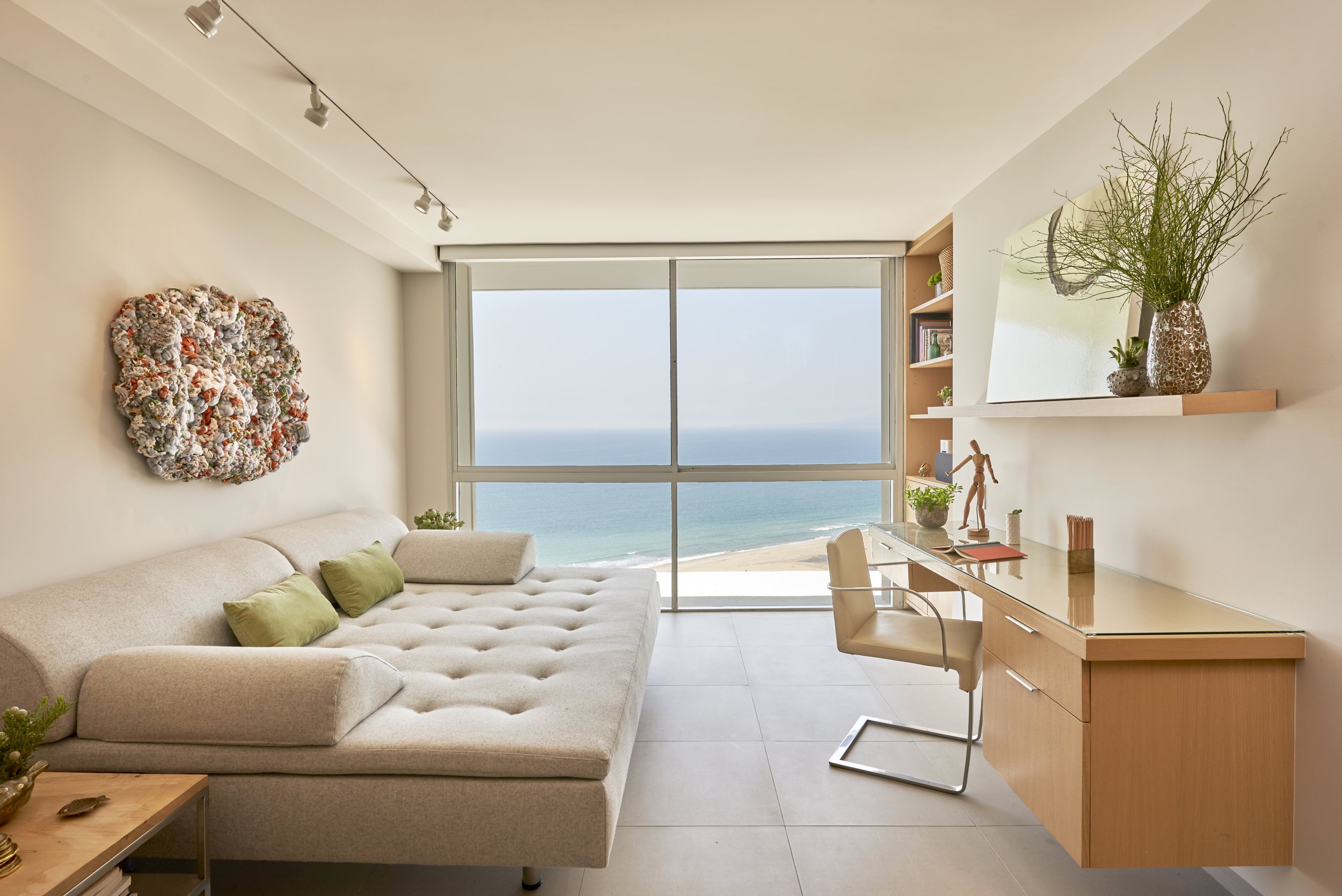
SARAH BARNARD USES THE OCEAN AS A FOCAL POINT OF THIS PENTHOUSE LIVING ROOM BY UTILIZING A BEAUTIFUL NEUTRAL COLOR SCHEME THAT PREVENTS THE EYE FROM BECOMING TOO DISTRACTED OR STRAINED.
In 1666, Sir Isaac Newton discovered that pure white light, when viewed through a prism, separates into the visible color spectrum. However, our understanding of color’s unique mood enhancement and health benefits extend far beyond this point in history. Ancient cultures around the world embraced the power of color and practiced chromotherapy. Chromotherapy, also known as ‘light therapy,’ employs colors to heal various ailments and is still currently used as a holistic or alternative method.
This treatment uses the color red to stimulate the mind and body, and increase circulation. Yellow to stimulate the nerves and detoxify the body. Orange heals the lungs and increases energy levels. Blue is believed to soothe or treat any illnesses or pain, while indigo shades are used to treat skin problems. Regardless of the scientific validity of the practice of chromotherapy, color is an indisputably important feature in our visual environment and can create a sanctuary in which we manifest healing.
There are color interpretations that have an ordinary meaning. For example; traffic lights—green means go, yellow indicates a yield, and red most recognizably signals a stop. However, most color perceptions tend to be subjective and contingent on the application.
A red room might make some feel anxious, while blue walls can induce a sense of calmness or relaxation. There are plenty of reasons why a person might react a certain way towards color, and an explanation can be the location or amount of color used even the culture someone comes from, or their personal experiences. As in all things, there exists a duality to every color archetype. While bold hues of red have given some evidence to have adverse effects in cognitive ability in children and adults, there is also evidence to show it can increase appetite, enhance athletic performance, and spark feelings of excitement and arousal. While a red bedroom may inhibit sleep, a red locker room can rally a team for competition.
Sarah Barnard illuminates the topic further, “It’s important to consider the space you’re occupying and the emotions you would like to experience there. Is this a place of rest, work, or activity? These are some of the elements I consider when introducing color to space.”
Due to this variation in interpretation, many psychologists express skepticism of the validity of color theory’s effect on an individual. In truth, this variation exemplifies the way the usage of color can be just as impactful as the color itself. Complimenting the fluidity of Color Theory, this allowance grants validity to each of our experiences that have helped inform our perception of color.
THE COLOR BLUE IS VERY VERSATILE IN THAT, WHILE IT CAN BE USED AS A CALMING ELEMENT, IT CAN ALSO SYMBOLIZE ENERGETIC FORCES LIKE THE OCEAN OR PROVIDE A MASCULINE TOUCH DEPENDING ON ITS TONES.
The color blue is very versatile in that, while it can be used as a calming element, it can also symbolize energetic forces like the ocean or provide a masculine touch depending on its tones.
By juxtaposing projects like the custom-built bedrooms of this California family residence with the masculine townhouse, we can see the breadth of emotion just one shade can bring forth. Both utilize a similar palette, a combination of vibrant blues and natural greens against natural wood and white backdrops. Despite their similarities in color, both spaces pique very different energies. A blue surfboard emanates the raw excitement of the open ocean, while blue bunk beds manifest a dreamy, youthful coziness reminiscent of pillow forts and camping in the backyard. Because of their application, the blue tones inspire very different moods, although they are similar in hue and saturation.
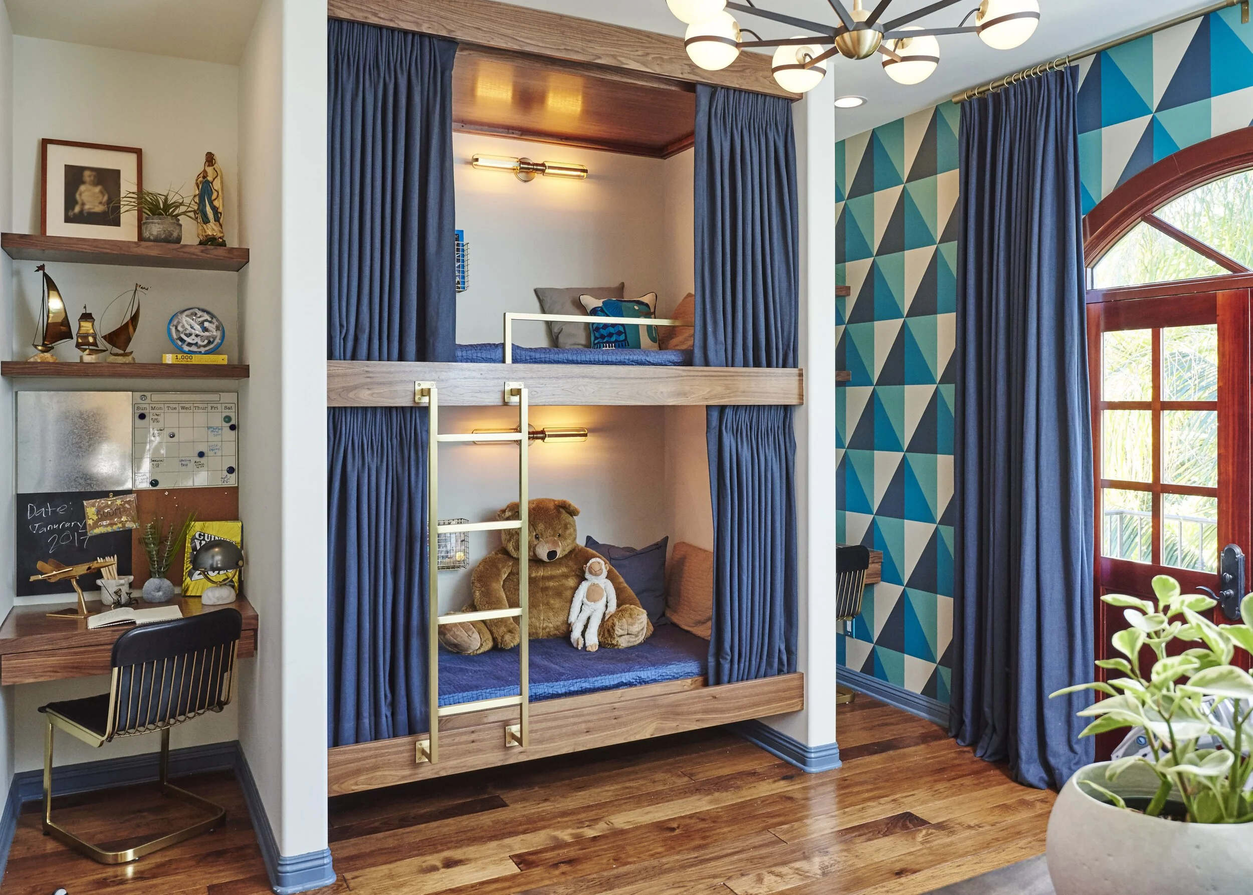
IN THIS BOY’S ROOM IN THE CALIFORNIA FAMILY RESIDENCE, SARAH UTILIZES THE DUALITY OF THE COLOR BLUE TO CREATE A SPACE THAT ENCOURAGES BOTH PLAY AND RELAXATION. SEE YOU IN DREAMLAND!
In this boy’s room in the California family residence, Sarah utilizes the duality of the color blue to create a space that encourages both play and relaxation. See you in dreamland!
Proper color selection is crucial in our everyday lives. Color can be overwhelming or healing, so it is crucial to understand how color can affect the dynamics of a room and the people in it. Interior designers deeply believe that color can drastically alter moods, feelings, and emotions. Before designing your space or switching up your color scheme, pay close attention to the way your mind and body feel when you experience different colors and consult with your designer.
”It goes beyond creating something beautiful to look at- it’s an integration of the self into the space we occupy and nourishing ourselves. The colors we see affect how we feel and how we engage with the people around us.” Sarah Barnard concludes, “It’s absolutely vital.”
Regardless of age, it is evident both adults and children are affected by color in a multitude of ways. While color interpretation can vary between cultures and people, we are unified in the power of color- the magical and visceral ways it influences us as we move through our day. It can provoke us to be more active or optimistic, or it can be the visual lullaby we need to rest peacefully at night. Positive and thoughtful applications of Color Theory have many benefits; inspiring us to play, grow, and find peace.
Sarah Barnard designs healthy, happy, personalized spaces that are deeply connected to nature and art.
To learn more about Sarah Barnard Design, please visit www.SarahBarnard.com.