2025 Color Of The Year

A contemporary bedroom featuring mocha mousse, caramelized and warm brown accents in the rug, wrap around upholstered headboard, cushions and drapery

Nature-inspired color palettes can help ground us by connecting built environments with the beauty of the outdoors. These palettes promote the mindful practice of spending time in nature, a key aspect of biophilic design. Brown is a fundamental color found within nature, such as soil, clay, wood, and stone—materials also used to construct our homes. These elements provide shelter, warmth, security, and comfort, symbolizing stability, permanence, and resilience. The 2025 Colors of the Year, 'Moca Mousse' and 'Caramelized' from Pantone and Dunn Edwards, embody these qualities to create a grounding, comforting, and sensory experience within our homes.

A traditional living room that features an antique arm chair and matching ottoman upholstered in a rich terracotta brown velvet fabric in front of french doors with heavy golden brown drapes

Brown, earthy tones have a timeless quality that makes the old feel new, making them a confident choice for various design styles, from contemporary to modern to traditional or historical.

A Tudor revival bedroom with warm earthy brown walls, carpet and drapery, and a custom Victorian-era aesthetic bed hand carved from American Walnut

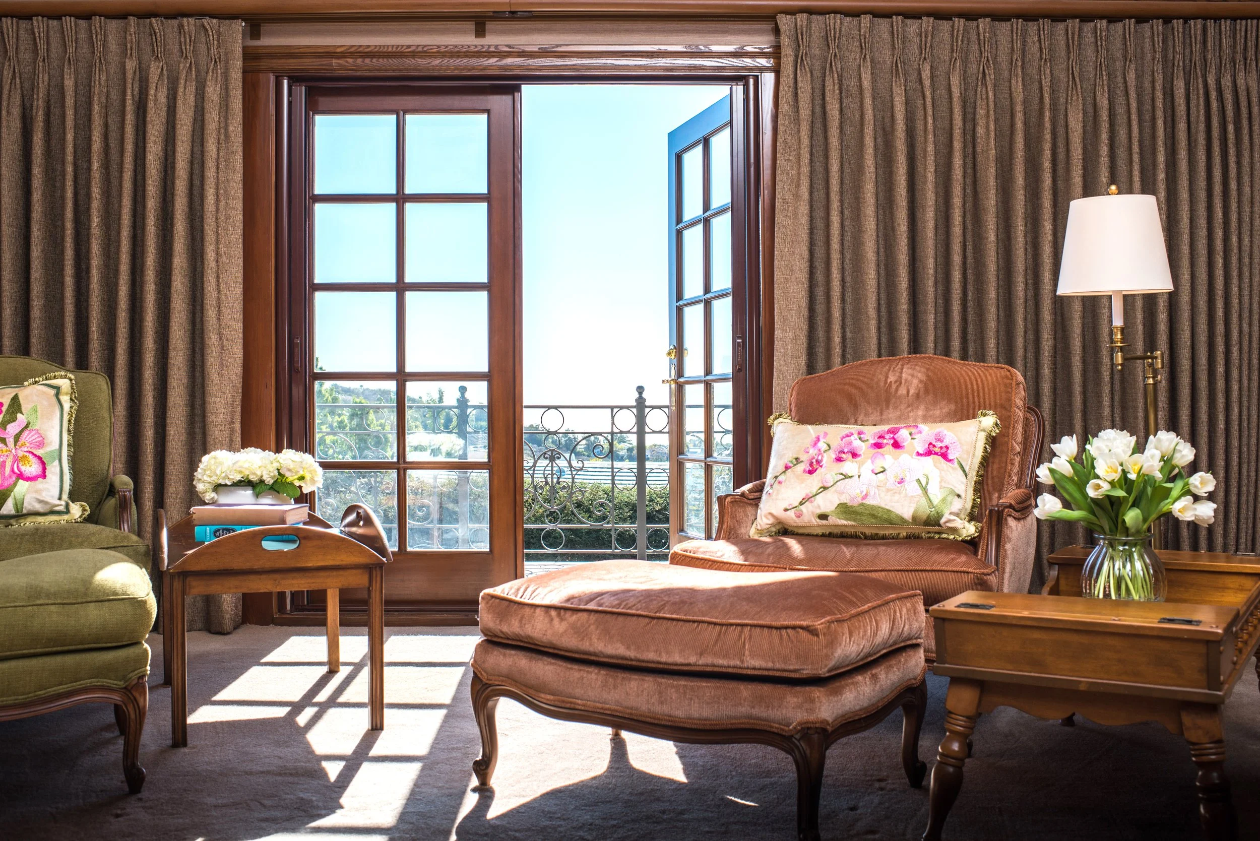
This Tudor revival bedroom features a warm, almost pinkish-brown shade in the carpet, drapery, and wall color. This tone highlights and celebrates the luxurious natural beauty of the darker wood furniture and built-in features throughout the room, such as the custom bed frame, handcrafted by an expert artisan from American Walnut, which evokes a Victorian-era aesthetic.

A contemporary living area containing a large charcoal colored L-shaped sofa with pink-brown cushions, warm terracotta brown drapery and an earthy brown tiled fireplace

Brown is also often associated with feelings of warmth and comfort. Dunn Edwards describes "Caramelized" as a "warm terracotta brown" reminiscent of "sunlight on stone," evoking the pleasing sensation of leaning against a warm brick wall or laying on a beachside slab of stone. The name itself evokes the constant warmth that produces caramelization.

A warm and cozy traditional living room, a light brown sofa and terracotta brown armchairs are arranged around a square wood coffee table in front of a decorative brick fireplace

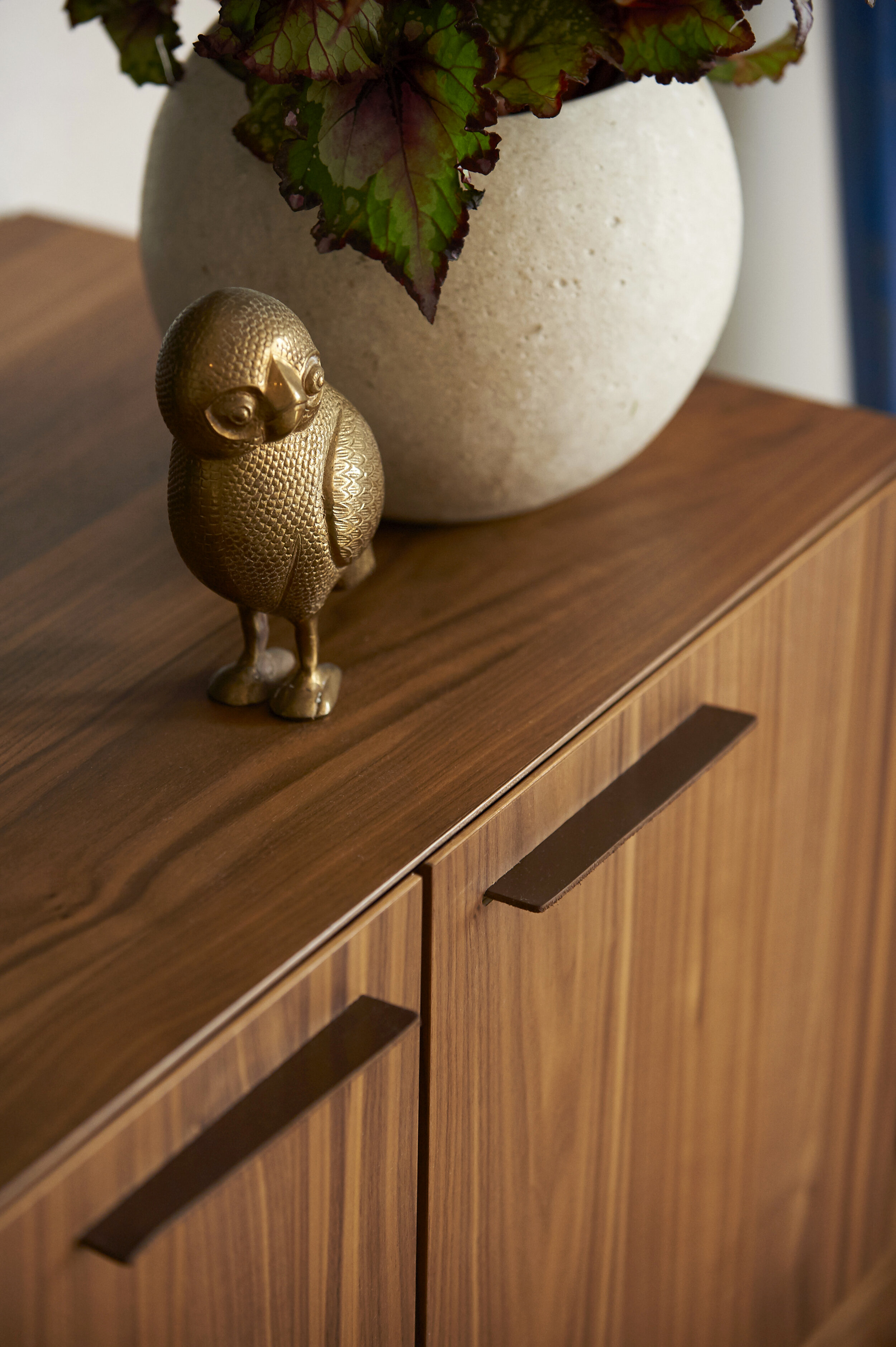
The brown furnishings and wallcoverings in this living room have warm undertones of red, orange, and yellow, which create a sense of coziness and intimacy, making the space feel inviting and welcoming.

A close up image of a bedside table in a contemporary style beachside bedroom. The earthy brown wall paint is reminiscent of clay giving the room a grounding and calming feel.

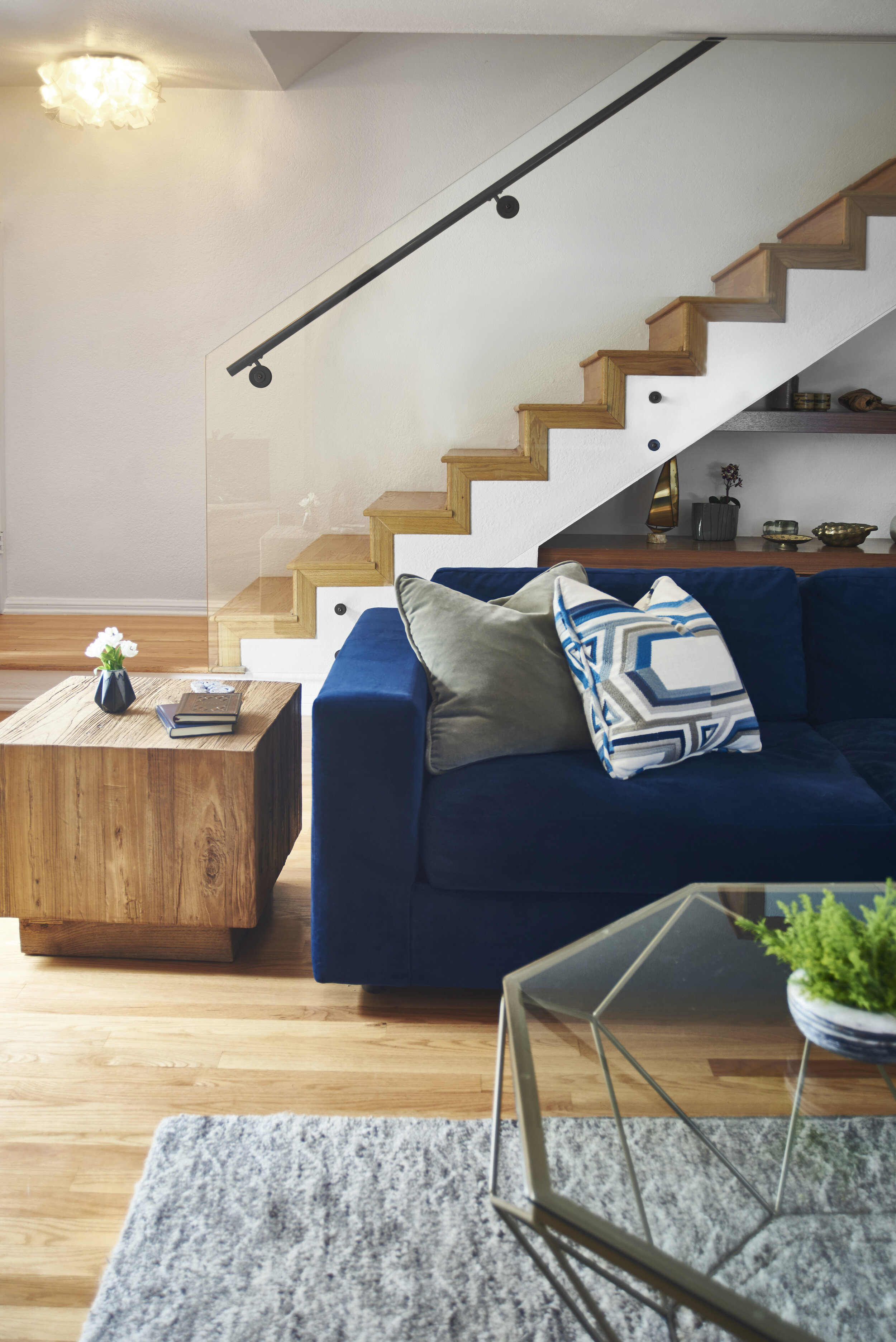
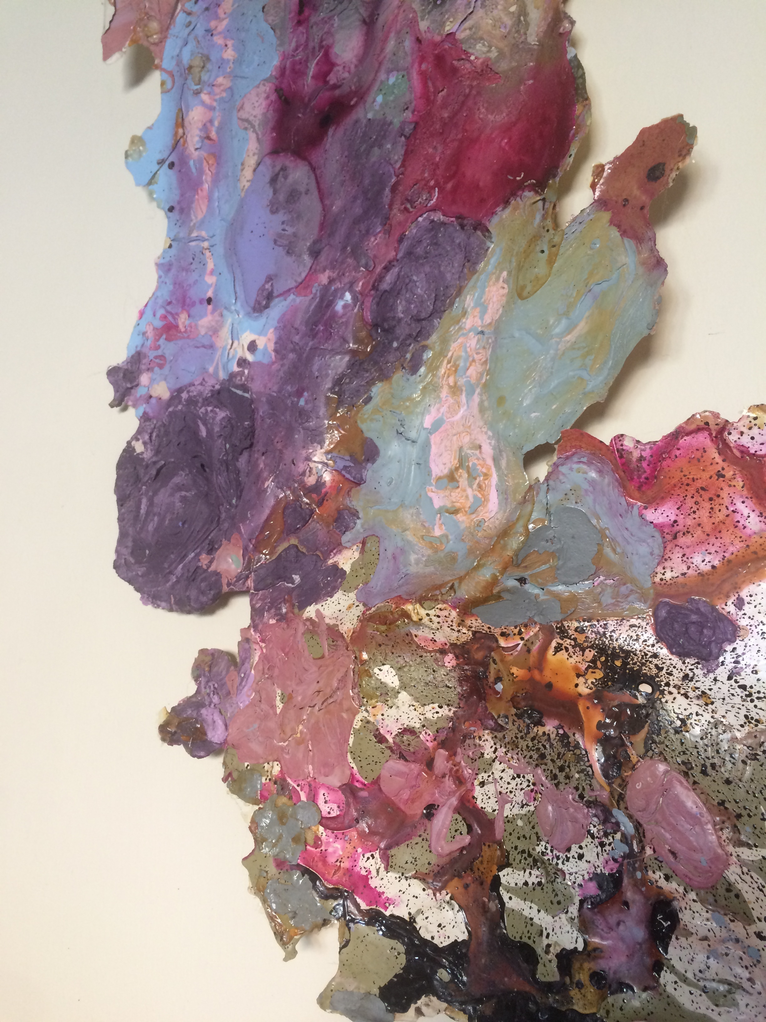
Brown also has the potential to serve as a warm and inviting neutral color that adds depth and richness to a space while effortlessly complementing a variety of styles and decor. We often think of neutrals as the backdrop to a room. White, gray, and beige are usually popular choices due to their versatility, timelessness, and ease, but they are not intended to drive the stylistic tone of a room. Warm browns like "Caramelized" and "Mocha Mousse" offer a fresh perspective on what a neutral can be, bringing warmth and an inherent sense of sophistication that classic neutrals sometimes lack. Browns have an enduring presence through their connection with the natural world, giving them a timeless quality that transcends fleeting trends.

A traditional style living room featuring warm light brown walls, a grey brown sofa. Metallic upholstered pillow on the sofa harmonize with a large black and gold painting on the wall

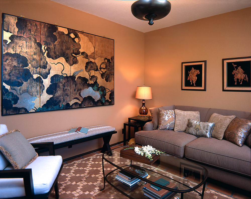
The warmth of the brown walls of this living room serves as a soothing backdrop, creating an inviting and cozy atmosphere that immediately makes anyone feel at home. These earthy tones evoke a sense of stability and grounding, providing a solid foundation for the room's overall design. The cooler grey tones of the sofa and the golden highlights of the artwork and upholstered pillows create a sense of balance, calm, and harmony through the interplay between warm and cool tones within the room. The golden highlights in the artwork and the upholstered pillows catch the light beautifully, creating a subtle glow that enriches the sensory experience within the room and introduces an element of luxury to the space.

A contemporary nature-inspired bathroom featuring custom marble honeycomb tiles in a warm brown and yellow and luxurious copper metallic tiles within the shower

Metallic browns, like bronze and copper, uniquely connect our interiors to the mineral-rich earth while infusing a touch of luxury. These earthy tones, reminiscent of copper ore and bronze artifacts, ground a space and add a sense of timelessness. The metallic brown tiles of this nature-inspired bathroom create a warm and inviting ambiance, elevating and transforming it into a sophisticated retreat that celebrates the beauty and richness of the natural world.

A bedroom featuring a warm brown ratan headboard and gray pillows featuring the bird pepper textile print by Kale Tree

Incorporating shades of brown as an accent color can add warmth, depth, and comfort to any space or design. Brown is a versatile color that pairs well with many other hues, making it a fantastic choice for accent elements like furniture, textiles, and decorative accessories.

A Victorian-style living room that featuring a nature-inspired palette of green and warm pink-brown, a carved marble fireplace, antique American walnut parlor set and Victorian marble coffee table

An earthy brown with hints of terracotta accentuates the doorways within this Victorian-style living room. This warm yet muted flush of color is in harmony with the nature-inspired palette of the room while creating a subtle and pleasing contrast that draws attention to the antique American walnut parlor set and Victorian marble coffee table.

A light and airy ocean view guest room with creamy light brown walls, a cosy fold out guest futon and bird wing sculptural artwork

Nature-inspired color palettes like "Mocha Mousse" and "Caramelized" bring the grounding comfort and stability of earth into our living spaces. These colors, which evoke the resilience and tranquility of nature, enhance our homes, transforming them into personal sanctuaries that harness the restorative power of the outdoors.

book consultation

Sarah Barnard, WELL AP + LEED AP, is a leading designer of personalized, sustainable spaces that support mental, physical, and emotional wellbeing. She creates highly personalized, restorative spaces that are deeply connected to art and the preservation of the environment. An advocate for consciousness, inclusivity, and compassion in the creative process, Sarah has appeared in Architectural Digest, Elle Décor, Vogue, HGTV, and many other publications. In 2017 Sarah was honored as a “Ones to Watch” Scholar by the American Society of Interior Designers (ASID).

Classic Blue, Pantone's Color of the Year creates calm and inspires clarity in interior spaces.

Interior Design: Sarah Barnard, Photos: Steven Dewall, Painting: Reid Winfrey

Interior Design: Sarah Barnard, Photos: Steven Dewall, Painting: Reid Winfrey

Blue brings us a sense of peace, offers us refuge, aids concentration, and brings us clarity. It is a reflective tone that fosters resilience and gives us hope, qualities we look toward during this uneasy time in the world. Pantone's Color of the Year is Classic Blue, chosen to reflect our desire for a stable future as we enter into a new decade. TIME calls the Color of the Year, "both constant and classic." It is reminiscent of a serene sea and the sky at dusk.

Pantone provides a universal language of color that is used by more than ten million designers and producers around the world to define colors accurately across different platforms and industries. Their Color Institute is dedicated to researching purchasing trends across various industries to determine each year's color. Pantone has been naming a Color of the Year since 2000 and has influenced product development and purchasing decisions in fashion, interior design, industrial design, graphic design, and advertising.

beachy bachelor (8).jpg

Classic Blue is akin to the very first Color of the Year, Cerulean. The hue represented the excitement of a new millennium, while also offering a sense of protection and serenity amidst the feared approach of Y2K. This year, we are experiencing a similar feeling of trepidation from the United States to the United Kingdom, Hong Kong, Syria, and across the globe.

beachy bachelor (14).jpg

The reigning Color of the Year offers reassurance, confidence, and connection for us in a time of uncertainty. "When we look at the world around us, we know that we're living with a lot of unrest, where some days don't feel quite as secure," said Leatrice Eiseman, Executive Director of the Pantone Color Institute, in an interview with Architectural Digest. "Blue from an emotional, psychological standpoint, has always represented a certain amount of calm and dependability. It's a color that you can rely on."

beachy bachelor (30).jpg

Classic Blue is the color of deep ocean water or a handful of ripe blueberries. It is a part of the art market, the beauty industry, automotive manufacturing, tech, and space sciences. Its associations with dependability, trustworthiness, and constancy make it a great color to incorporate into your home design.

beachy bachelor (17).jpg

My work as a LEED and WELL-accredited home designer is deeply rooted in wellness and biophilia. Biophilia is our innate desire to be close to nature, and biophilic design aims to create healthy and comfortable interiors by meaningfully incorporating natural elements into our home and work environments. Integrating Classic Blue into our spaces builds on the principle of biophilic design because of its presence in nature.

beachy bachelor (31).jpg

Art, textiles, furniture, and accents are all great ways to introduce soothing Classic Blue to your home or office. A project I recently completed features oceanic shades of blue that act almost like neutrals. I took inspiration from the home's beachy surroundings, bringing in a Classic Blue velvet sofa. I then repeated the color through vintage ceramic vases, books, and toss pillows.

When acting as a base layer, Classic Blue can be paired with a multitude of colors, including other shades of blue. For the client's bedroom, I selected a handmade upholstered bed, Belgian linen bedding, wool drapery, and an abstract painting by Jonathan Elder, all wed by various blue tones. The buttery vintage leather chair and wooden bench at the foot of the bed complete the space, providing visual warmth and balance.

Consider adding serene, calming, earth-focused tones to your home in the new year. Whether you choose Classic Blue as an all-over hue or an accent, you can't go wrong with a color that takes its cues from nature.

Sarah Barnard, WELL AP, and LEED AP specializes in creating calming restorative environments that support physical, emotional, and mental well-being. Her interior design practice centers around her client's health and wellness while incorporating natural elements into every space she designs.

Pantone's Color of the Year is Ultraviolet... How are You Using It?

A quick snapshot from Sarah Barnard Design's office late last year.

A quick snapshot from Sarah Barnard Design's office late last year.

Ultraviolet, an intense and bold shade of purple, is suggestive of the cosmos and the future, while still reminiscent of royalty, wealth, and creativity. It's also Pantone's color of the year. Pantone, the global authority on accurate color matching, is known worldwide for its standard color language which allows designers, manufacturers, retailers, and consumers to accurately produce the same colors across platforms and industries. (If you're not familiar with Pantone, you may have seen their swatch books or their line in Sephora!) They research style trends in art, fashion, and design, and predict the upcoming year's most popular trends. 

This year they've selected ultraviolet as their "Color of the Year," so if you were waiting for the opportunity to make a bold change in your home design, it has arrived!

Sarah-barnard-design-pantone-color-ultraviolet-flowers.jpg
In interiors, Ultra Violet can transform a room into one of extraordinary self-expression, or conversely its polish can tone down a room with subdued, modern pairings. Adding spice and brightness, Ultra Violet calls attention to a tufted couch, piece of art, or accent wall. As a color that can take you in so many directions, Ultra Violet makes a statement in any space, whether it’s one of tradition and elegance or unexpected boldness. In hospitality, we are seeing purples like Ultra Violet take center stage in interior spaces as large and small hotels harness color and design to entice travelers and stay relevant.
— Pantone

Trends go in and out of fashion–unless you already love ultraviolet and had plans to use it, it may not be a good idea to paint your whole house purple. However, there are many ways you can feature violet and freshen your home or office, such as adding a bold color in through plants, linens, or art, which will allow you to animate the space in a way that won’t be out of style by the end of the year.

Let’s take a look at some of our favorite design strategies and items in ultraviolet and purple:

sarah-barnard-design-park-view-ultraviolet-floral22.jpg
Sarah-barnard-design-pantone-color-ultraviolet.jpg

While some might relish the opportunity to use this news as an excuse to paint their entire house violet, most people will find ultraviolet to be an intimidating color with which to decorate. So how might you use it? Consider bringing in a small splash of violet. Flowers, for example, are a beautiful, healthy way to add a pop of bold color that will not be out of fashion in a year.

renae-barnard-pantone-color-ultraviolet.jpg

Adding art to your walls is a fantastic way to add color and interest to a space. This piece by Renae Barnard has swirling shades of violet, blue and pink. An elegant art installation like this will never go out of style.

sarah-barnard-designsecluded sanctuary-01.jpg
sarah-barnard-design-secluded-sanctuary-03.jpg

Lavender and violet: together at last. Invigorating a traditional girl’s room palette of lilac or lavender by adding violet is a great way to keep your daughter's room from getting tired.

Sarah-barnard-design-pantone-color-ultraviolet-national-immigration-law-center.jpg

For the National Immigration Law Center, jewel tones were the perfect choice to convey richness and sophistication. Violet and yellow are complementary colors, meaning they are opposite each other on the color wheel. Their opposing hues and differing values are naturally striking when used together, and add energy to the area.

Sarah-barnard-design-pantone-color-ultraviolet.jpg

For an ultra-sleek look, Steelcase's office in Grand Rapids, MI vibrates with a mix of ultraviolet and neutrals. Mixing many colors can get too intense too quickly, so using a bold violet with white is a fresh but straightforward way to modernize an office.

sarah-barnard-ocean-view-penthouse-077.jpg

Last but not least, this beautiful space sits right next to the ocean. Many people's first instinct is to add blue to a beach home to echo the sea. However the area is quite literally surrounded by blue, so adding more can quickly get tired and dull. Instead, analogous colors–bright green and purple–were used to add life to the room and complement the ocean outside.

Pantone's annual announcement is an opportunity to be creative and update your home or office. Ultraviolet is daring and sophisticated. If you are interested in adding an air of curiosity, wisdom, and richness to your home, give it a pop of Ultraviolet!

Book Consultation

Sarah Barnard designs healthy, happy, personalized spaces that are deeply connected to nature and art.

To learn more about Sarah Barnard Design, please visit www.SarahBarnard.com.

Photos by Chas Metivier, Steven Dewall.