

Pantone’s Color of the Year: Living Coral

The family cat is the primary resident of this guest suite featuring a pink and coral color scheme.
Coral reefs are disappearing from our oceans at an alarming rate. It is imperative to the ocean’s ecosystems, and as much as a quarter of all ocean species depend upon it for food and shelter. Precious marine lifeforms are also the inspiration for Pantone’s color of the year: Living Coral.

CORAL AND LUSH GREENS CREATE A LIVELY AND INVITING ATMOSPHERE FOR AN OUTSIDE SPACE.
Sarah Barnard, a Los Angeles-based interior designer, WELL AP and LEED AP, specializes in home design that contributes to her client’s health and wellness and strives to make nature a part of each home she creates. “A happy and uplifting color reminiscent of the ocean is the perfect starting point for a happy, healthy home.”

CORAL COLORED TILES AND BEAUTIFUL GLOSSY STONE SLABS MAKE THIS COASTAL BATHROOM WARM AND BRIGHT.
Coral colored tiles and beautiful glossy stone slabs make this coastal bathroom warm and bright.
This color takes its name from the beautiful coral marine invertebrates that build extensive coral reefs, habitats for a vast diversity of life in the ocean. Sometimes referred to as the "rainforests of the sea," coral reefs are quickly dying, and are projected to reduce to 10% by 2050. Half of the world's coral has died since 2016, due to rising sea temperatures, pollution, destructive fishing, invasive species, and changing sea chemistry.
"The timely selection of this color by Pantone should be an important reminder to all of us that nature inspires beautiful interiors. If we aren't careful to preserve the natural world, we will have nothing left to take inspiration from," said Barnard.

CORAL NATURALLY COMPLEMENTS WITH BLUES AND OCEAN TONES. CORAL EMBROIDERY WAS A PERFECT COMPANION (COMPLEMENT?) FOR A THROW PILLOW IN A COASTAL HOME.
Pantone is most widely known for their color swatch books. It is the company responsible for color matching paints and graphics; and now devotes the time and resources of Pantone Color Institute to research the purchasing trends of various industries. With this information, Pantone determines this year's color. The naming process regularly pulls inspiration from the natural and human-made world, naming colors such as "rose quartz" or "millennial pink." Pantone's color of the year for 2018 was ultraviolet, a beautiful, energizing shade of purple reminiscent of bright flowers and the sky at sunset. This year's choice is PANTONE 16-1546 Living Coral, a potent reminder to preserve and protect ocean life.

CORAL COLORED CERAMIC PROVIDES EARTHY CONTRAST AGAINST THE EBONIZED TABLE AND BLACK LAMP.
Coral is vibrant, cheerful, delicate and energizing, and the perfect shade to start the New Year. Living coral, described by the Pantone team as “An animating and life-affirming coral hue with a golden undertone that energizes and enlivens with a softer edge.”

THE BATH AND SHOWER FEATURE LOCALLY SOURCED HANDMADE CERAMIC TILES IN A CORAL GLOSS.
Pantone published, “Vibrant, yet mellow PANTONE 16-1546 Living Coral embraces us with warmth and nourishment to provide comfort and buoyancy in our continually shifting environment. [...] Representing the fusion of modern life, PANTONE Living Coral is a nurturing color that appears in our natural surroundings and at the same time, displays a lively presence within social media.”

CORAL AND PINK SHADES BLEND BEAUTIFULLY WITH WOOD TONES. ART IS A SUBTLE AND SEAMLESS WAY TO INTRODUCE COLORS LIKE CORAL.
While top interior designers don’t necessarily recommend painting one’s home to match the color of the year, art, accents, and of course plants are an easy and safe way to introduce vibrancy to your living or work space through home decorating.

PINKS AND CORAL CREATE AN INVITING ATMOSPHERE.
For those interested in using Living Color in their home, Sarah Barnard said, "Living Coral is a perfect complement to blue shades, and pairs well with coastal or beachy interiors. For the daring, reupholstering a treasured piece in a bright color like Living Coral can revitalize a space. For those who prefer to mix pops of color with neutrals, I recommend starting with small accents."
Pantone's Color of the Year is an excellent opportunity to add lively, earth-focused tones to your home. Make having a happy and healthy home your New Year's resolution.

CREAM AND CORAL CERAMIC JARS ARE A PERFECT STORAGE SOLUTION FOR BATHROOM NECESSITIES.
Sarah Barnard designs healthy, happy, personalized spaces that are deeply connected to nature and art.
To learn more about Sarah Barnard Design, please visit www.SarahBarnard.com.
Photos by Abby Siniscal, Chas Metivier, and Charlie Daniels

Seaside Inspiration: Custom Wall Sconces for a Coastal Home

Lighting is essential to any home design project. Sarah Barnard creates custom lighting designs for her clients' homes that consider form beyond functionality. "Lighting should do more than simply serve a purpose. It can become a focal design element that reflects a theme or a work of art in itself."
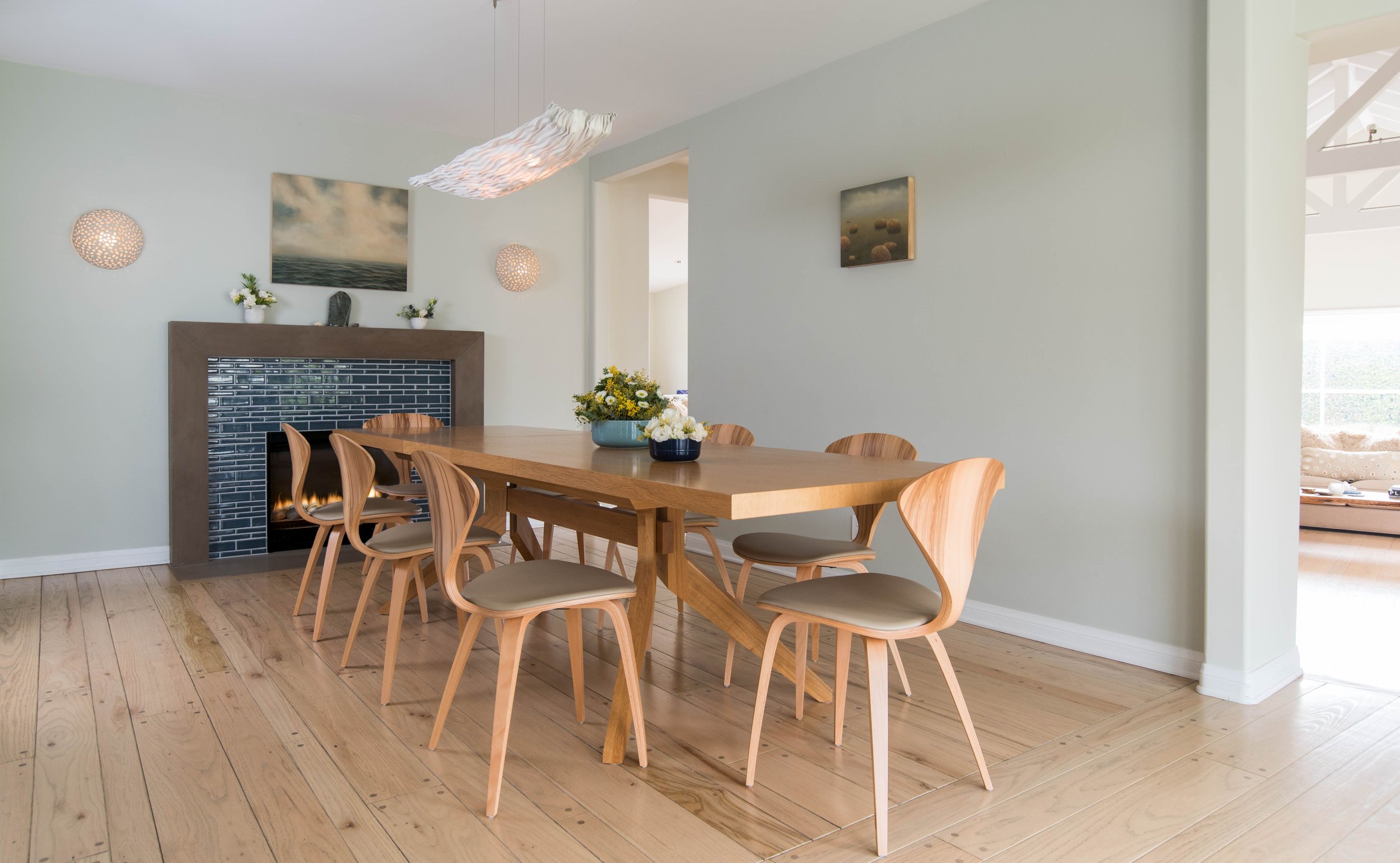
Sarah works closely with local artisans and craftspeople to realize her designs. "It all begins with an idea. I often take formal inspiration from the home's location and reinterpret that within the space." Her inspiration for this coastal home was their calming ocean view. While embracing the soft orbs in the design of her custom wall sconces, the first step was to fabricate several small ceramic prototypes for the client's review.


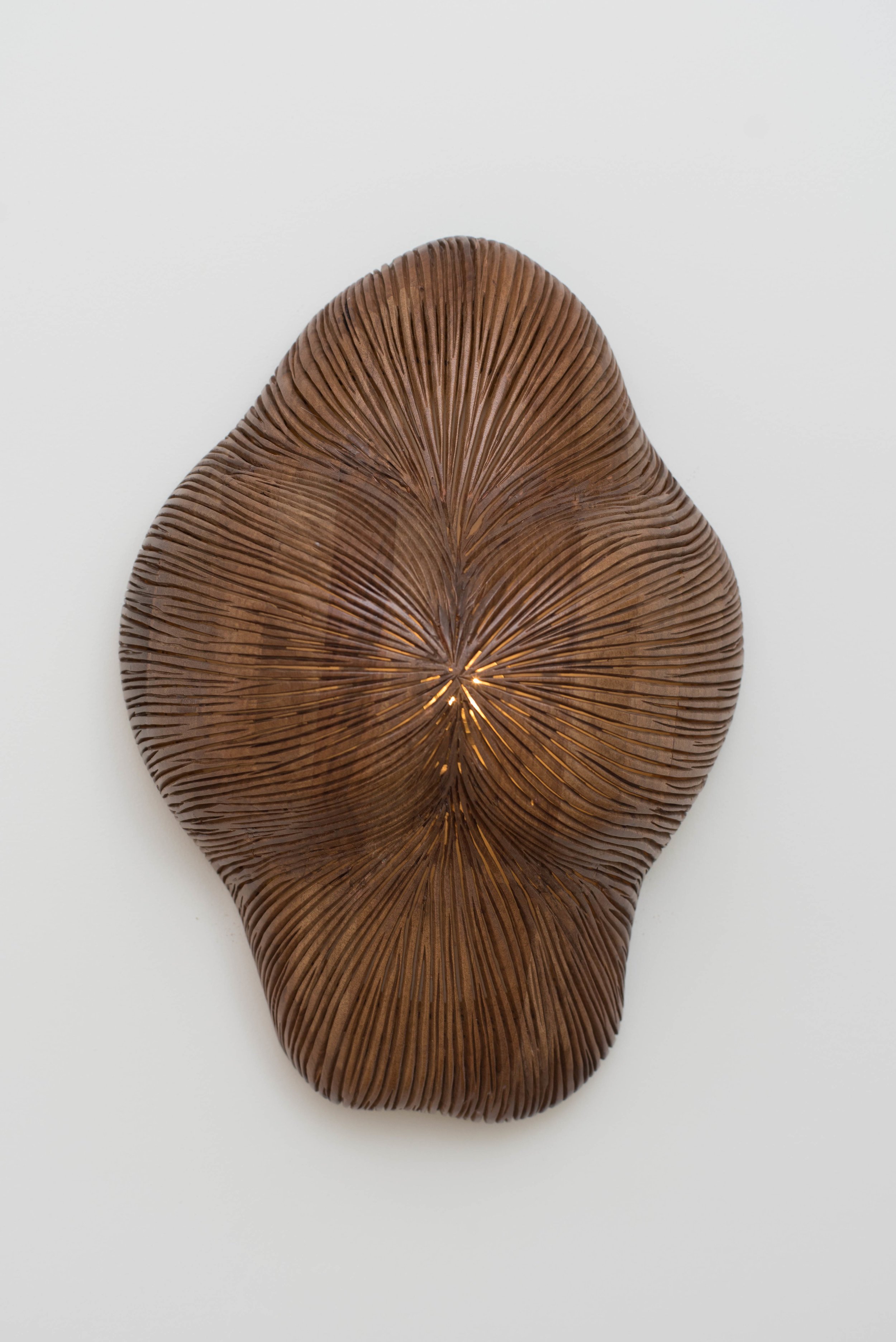
Unique handmade objects bring authenticity and personalization to your interior design project. Sarah designed this beautiful sculptural wall sconce specifically for the “Scandifornian” style living room. The elegantly contoured surface was carved by hand from American Walnut by a trusted woodworker. The organic form and natural wood finish pairs perfectly with an exotic arrangement of heliconia, bringing the outdoors into the home.
Beginning with a sketch, Sarah's designs undergo several creative working stages. The initial sketch concept is further refined through hand-made miniatures, sculptural models and sometimes 3D design applications. These materials are essential to communicating her idea and are carefully referenced during the fabrication process to ensure design continuity.


Inside the woodworking studio, the prototype is compared to the raw sconce carving. The hand-carved details accentuate the soft billowing sculptural design. With a background in Fine Arts, Sarah ensures the most exceptional craftsmanship and personalization by working closely with specialized artisans throughout the fabrication process. Her unique lighting designs integrate functionality with sculptural beauty creating one-of-a-kind fixtures which act as artwork.


Sarah Barnard designs healthy, happy, personalized spaces that are deeply connected to nature and art.
To learn more about Sarah Barnard Design, please visit www.SarahBarnard.com.
Photos by Steven Dewall and Abby Siniscal