Classic Blue, Pantone's Color of the Year creates calm and inspires clarity in interior spaces.

Interior Design: Sarah Barnard, Photos: Steven Dewall, Painting: Reid Winfrey

Interior Design: Sarah Barnard, Photos: Steven Dewall, Painting: Reid Winfrey

Blue brings us a sense of peace, offers us refuge, aids concentration, and brings us clarity. It is a reflective tone that fosters resilience and gives us hope, qualities we look toward during this uneasy time in the world. Pantone's Color of the Year is Classic Blue, chosen to reflect our desire for a stable future as we enter into a new decade. TIME calls the Color of the Year, "both constant and classic." It is reminiscent of a serene sea and the sky at dusk.

Pantone provides a universal language of color that is used by more than ten million designers and producers around the world to define colors accurately across different platforms and industries. Their Color Institute is dedicated to researching purchasing trends across various industries to determine each year's color. Pantone has been naming a Color of the Year since 2000 and has influenced product development and purchasing decisions in fashion, interior design, industrial design, graphic design, and advertising.

beachy bachelor (8).jpg

Classic Blue is akin to the very first Color of the Year, Cerulean. The hue represented the excitement of a new millennium, while also offering a sense of protection and serenity amidst the feared approach of Y2K. This year, we are experiencing a similar feeling of trepidation from the United States to the United Kingdom, Hong Kong, Syria, and across the globe.

beachy bachelor (14).jpg

The reigning Color of the Year offers reassurance, confidence, and connection for us in a time of uncertainty. "When we look at the world around us, we know that we're living with a lot of unrest, where some days don't feel quite as secure," said Leatrice Eiseman, Executive Director of the Pantone Color Institute, in an interview with Architectural Digest. "Blue from an emotional, psychological standpoint, has always represented a certain amount of calm and dependability. It's a color that you can rely on."

beachy bachelor (30).jpg

Classic Blue is the color of deep ocean water or a handful of ripe blueberries. It is a part of the art market, the beauty industry, automotive manufacturing, tech, and space sciences. Its associations with dependability, trustworthiness, and constancy make it a great color to incorporate into your home design.

beachy bachelor (17).jpg

My work as a LEED and WELL-accredited home designer is deeply rooted in wellness and biophilia. Biophilia is our innate desire to be close to nature, and biophilic design aims to create healthy and comfortable interiors by meaningfully incorporating natural elements into our home and work environments. Integrating Classic Blue into our spaces builds on the principle of biophilic design because of its presence in nature.

beachy bachelor (31).jpg

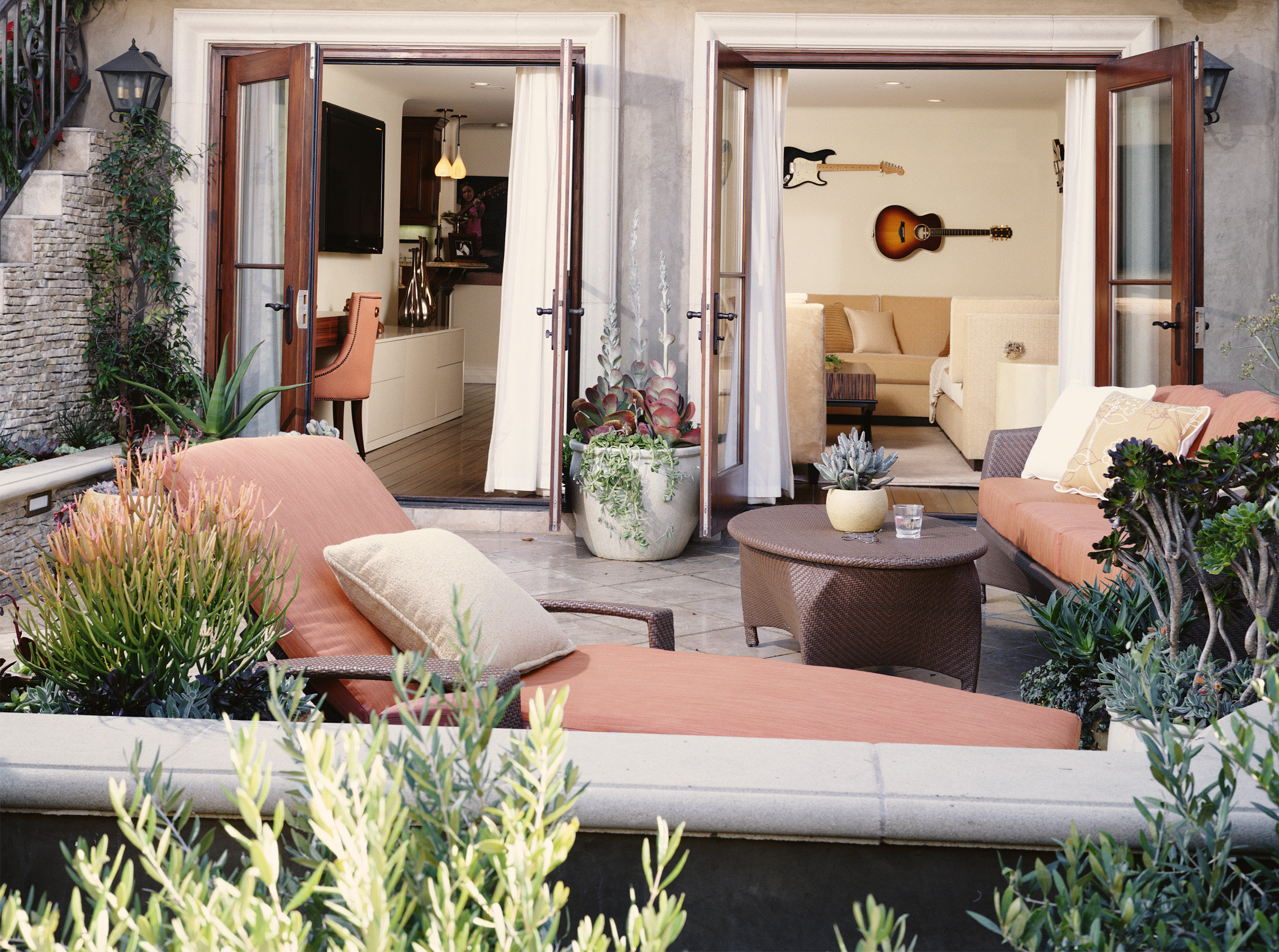
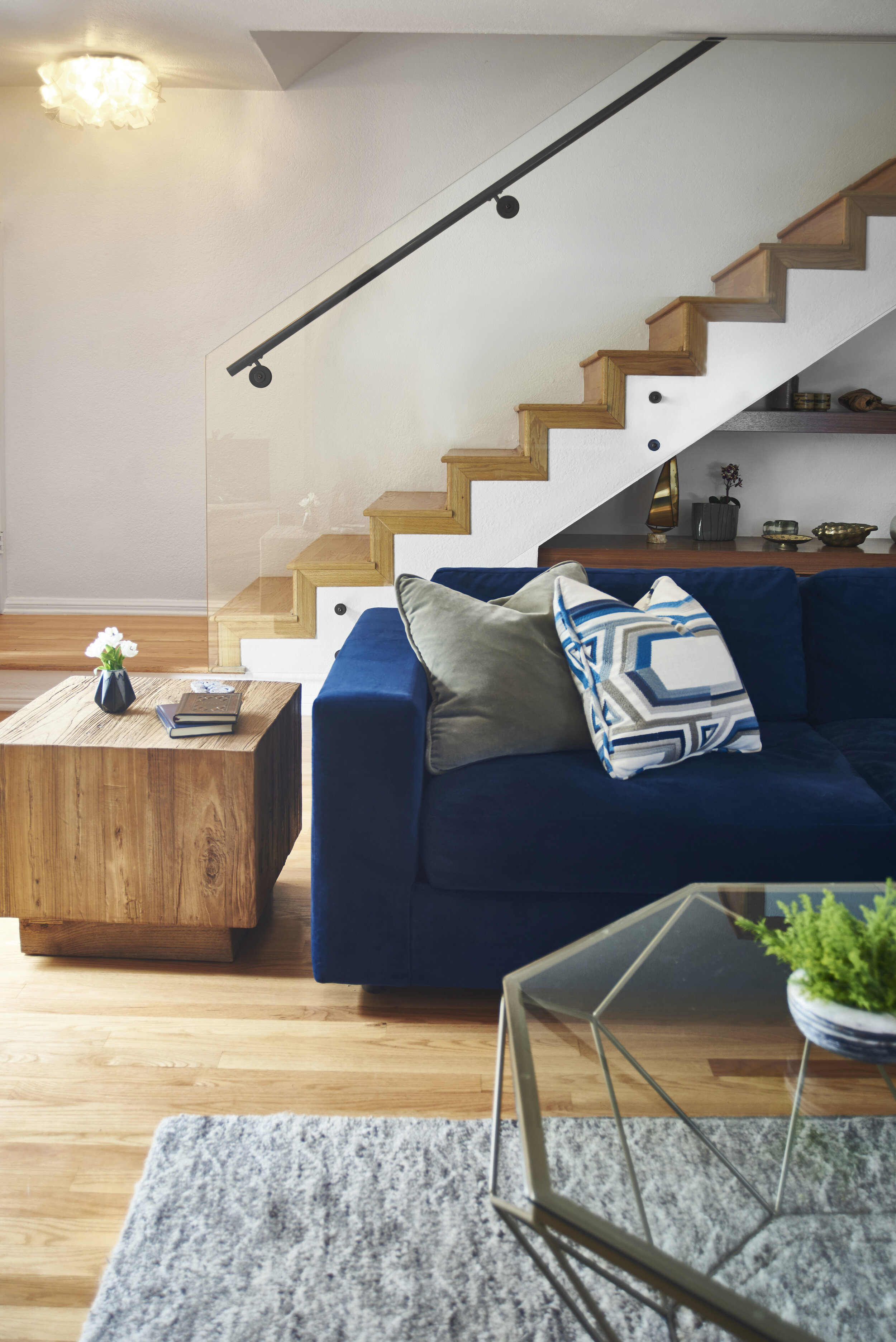
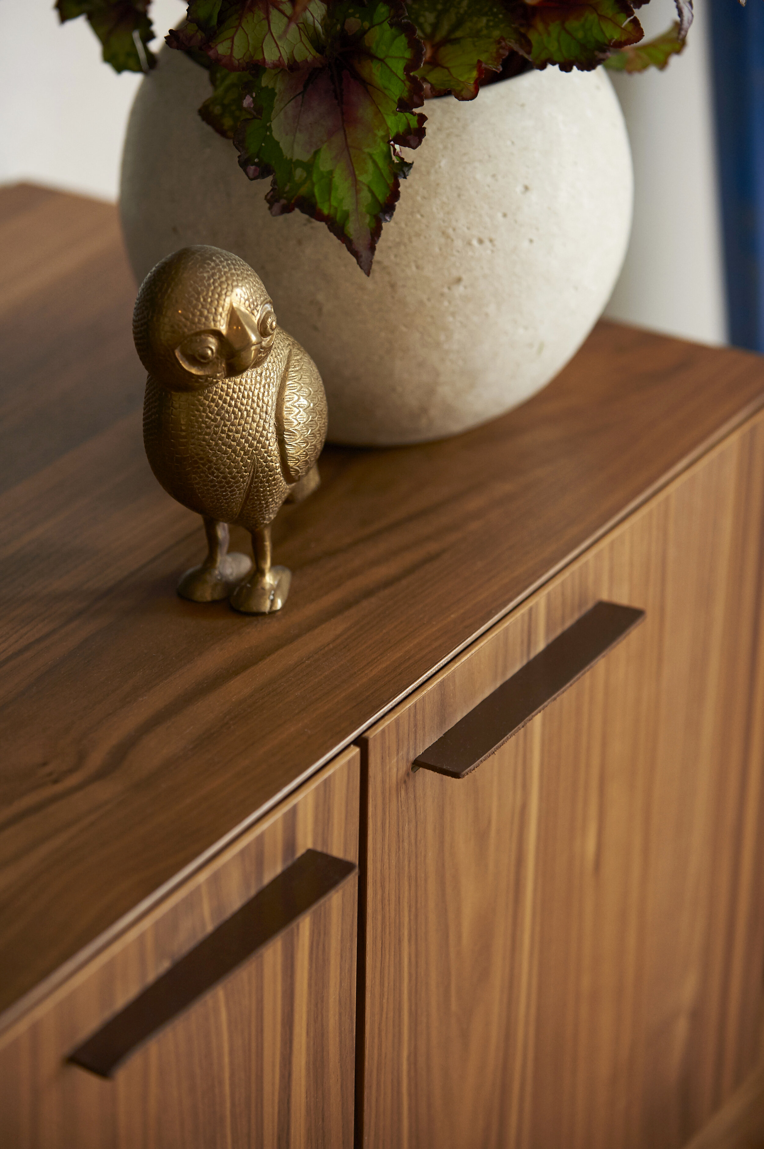
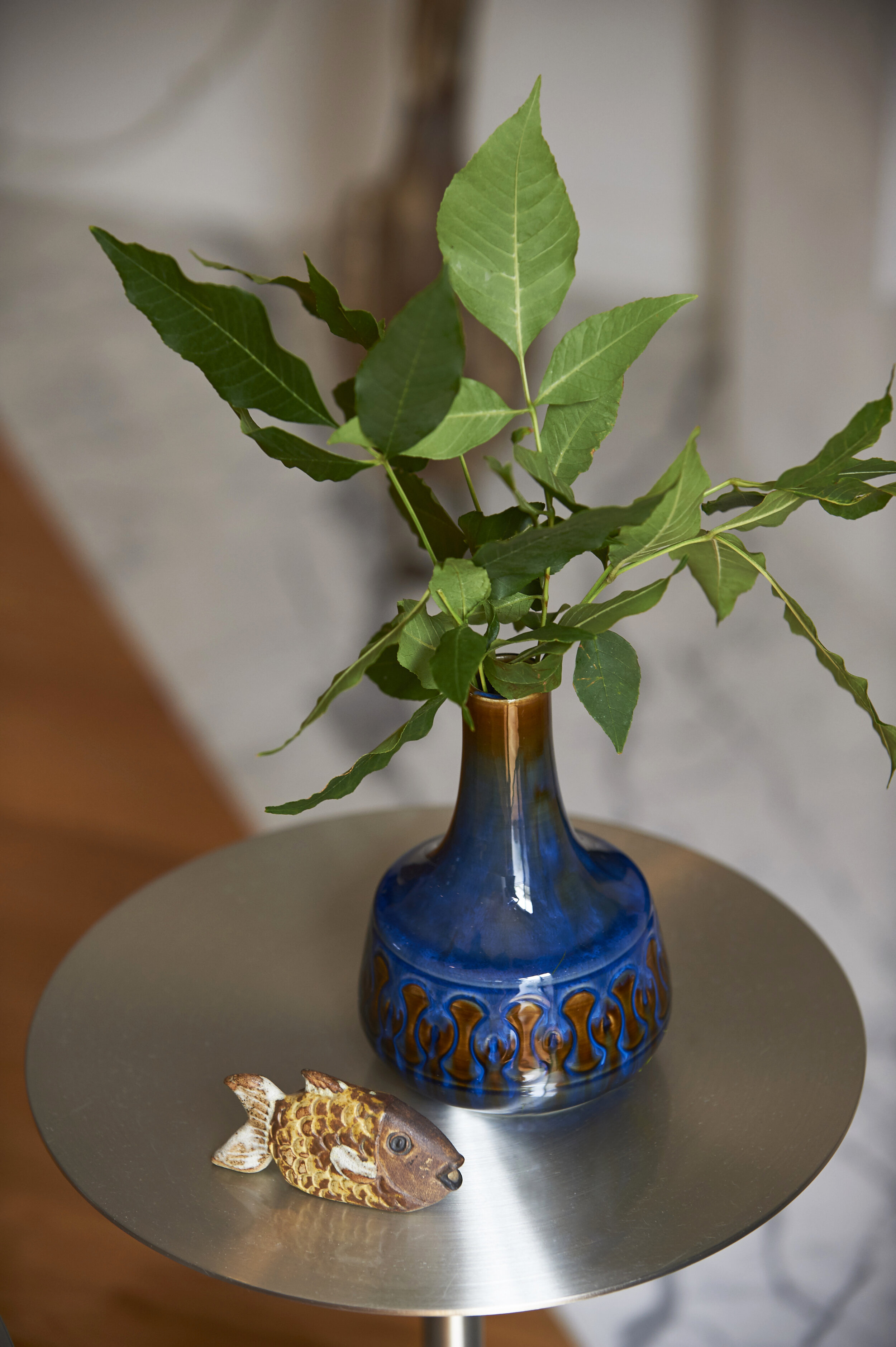
Art, textiles, furniture, and accents are all great ways to introduce soothing Classic Blue to your home or office. A project I recently completed features oceanic shades of blue that act almost like neutrals. I took inspiration from the home's beachy surroundings, bringing in a Classic Blue velvet sofa. I then repeated the color through vintage ceramic vases, books, and toss pillows.

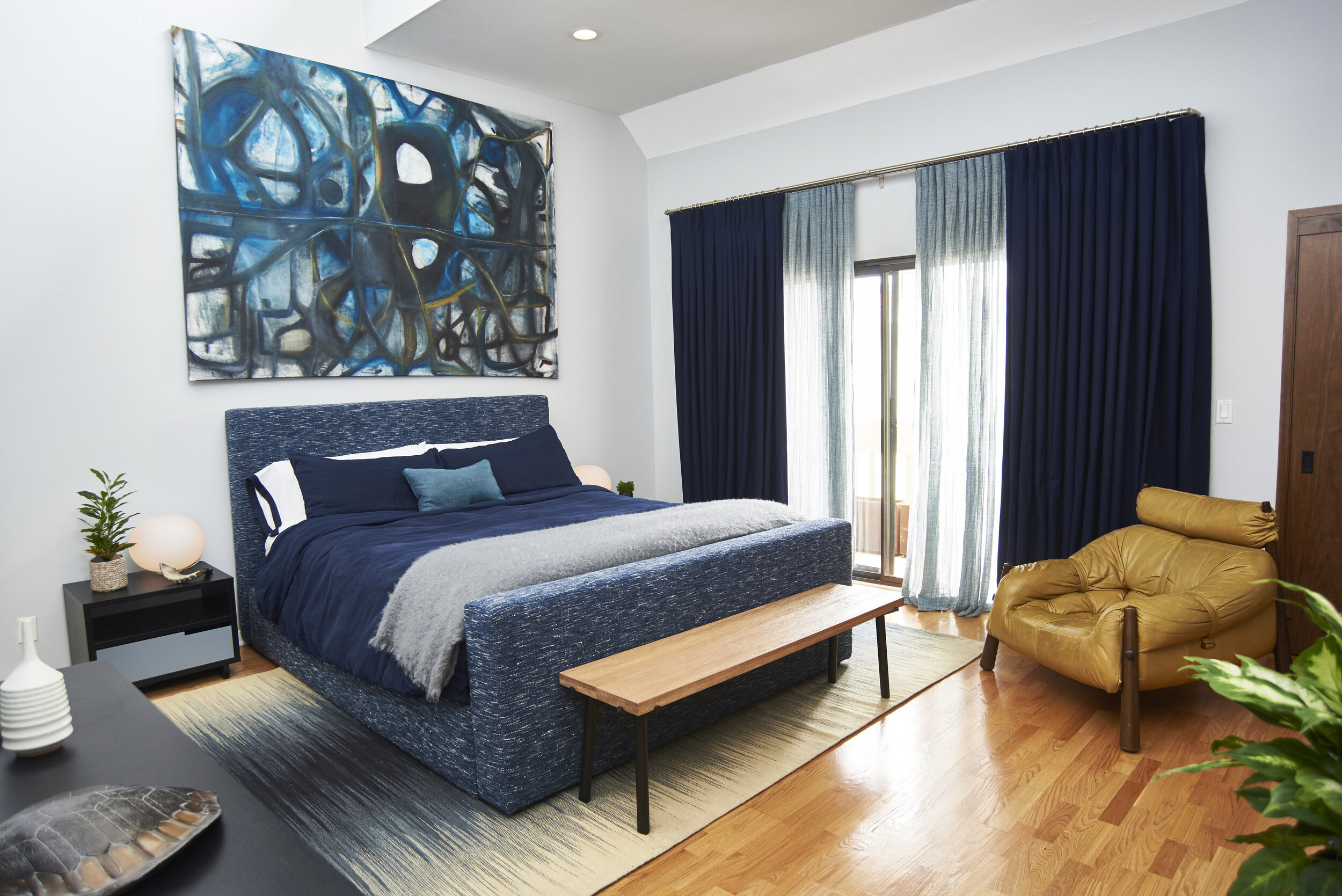
When acting as a base layer, Classic Blue can be paired with a multitude of colors, including other shades of blue. For the client's bedroom, I selected a handmade upholstered bed, Belgian linen bedding, wool drapery, and an abstract painting by Jonathan Elder, all wed by various blue tones. The buttery vintage leather chair and wooden bench at the foot of the bed complete the space, providing visual warmth and balance.

Consider adding serene, calming, earth-focused tones to your home in the new year. Whether you choose Classic Blue as an all-over hue or an accent, you can't go wrong with a color that takes its cues from nature.

Sarah Barnard, WELL AP, and LEED AP specializes in creating calming restorative environments that support physical, emotional, and mental well-being. Her interior design practice centers around her client's health and wellness while incorporating natural elements into every space she designs.

Pantone’s Color of the Year: Living Coral

The family cat is the primary resident of this guest suite featuring a pink and coral color scheme.

The family cat is the primary resident of this guest suite featuring a pink and coral color scheme.

Coral reefs are disappearing from our oceans at an alarming rate. It is imperative to the ocean’s ecosystems, and as much as a quarter of all ocean species depend upon it for food and shelter. Precious marine lifeforms are also the inspiration for Pantone’s color of the year: Living Coral.

Coral and lush greens create a lively and inviting atmosphere for an outside space.

Coral and lush greens create a lively and inviting atmosphere for an outside space.

Sarah Barnard, a Los Angeles-based interior designer, WELL AP and LEED AP, specializes in home design that contributes to her client’s health and wellness and strives to make nature a part of each home she creates. “A happy and uplifting color reminiscent of the ocean is the perfect starting point for a happy, healthy home.”

Coral colored tiles and beautiful glossy stone slabs make this coastal bathroom warm and bright.

Coral colored tiles and beautiful glossy stone slabs make this coastal bathroom warm and bright.

This color takes its name from the beautiful coral marine invertebrates that build extensive coral reefs, habitats for a vast diversity of life in the ocean. Sometimes referred to as the "rainforests of the sea," coral reefs are quickly dying, and are projected to reduce to 10% by 2050. Half of the world's coral has died since 2016, due to rising sea temperatures, pollution, destructive fishing, invasive species, and changing sea chemistry.

"The timely selection of this color by Pantone should be an important reminder to all of us that nature inspires beautiful interiors. If we aren't careful to preserve the natural world, we will have nothing left to take inspiration from," said Barnard.

Coral naturally complements with blues and ocean tones. Coral embroidery was a perfect companion (complement?) for a throw pillow in a coastal home.

Coral naturally complements with blues and ocean tones. Coral embroidery was a perfect companion (complement?) for a throw pillow in a coastal home.

Pantone is most widely known for their color swatch books. It is the company responsible for color matching paints and graphics; and now devotes the time and resources of Pantone Color Institute to research the purchasing trends of various industries. With this information, Pantone determines this year's color. The naming process regularly pulls inspiration from the natural and human-made world, naming colors such as "rose quartz" or "millennial pink." Pantone's color of the year for 2018 was ultraviolet, a beautiful, energizing shade of purple reminiscent of bright flowers and the sky at sunset. This year's choice is PANTONE 16-1546 Living Coral, a potent reminder to preserve and protect ocean life.

Coral colored ceramic provides earthy contrast against the ebonized table and black lamp.

Coral colored ceramic provides earthy contrast against the ebonized table and black lamp.

Coral is vibrant, cheerful, delicate and energizing, and the perfect shade to start the New Year. Living coral, described by the Pantone team as “An animating and life-affirming coral hue with a golden undertone that energizes and enlivens with a softer edge.”

The bath and shower feature locally sourced handmade ceramic tiles in a coral gloss.

The bath and shower feature locally sourced handmade ceramic tiles in a coral gloss.

Pantone published, “Vibrant, yet mellow PANTONE 16-1546 Living Coral embraces us with warmth and nourishment to provide comfort and buoyancy in our continually shifting environment. [...] Representing the fusion of modern life, PANTONE Living Coral is a nurturing color that appears in our natural surroundings and at the same time, displays a lively presence within social media.”

Coral and pink shades blend beautifully with wood tones. Art is a subtle and seamless way to introduce colors like coral.

Coral and pink shades blend beautifully with wood tones. Art is a subtle and seamless way to introduce colors like coral.

While top interior designers don’t necessarily recommend painting one’s home to match the color of the year, art, accents, and of course plants are an easy and safe way to introduce vibrancy to your living or work space through home decorating.

Pinks and coral create an inviting atmosphere.

Pinks and coral create an inviting atmosphere.

For those interested in using Living Color in their home, Sarah Barnard said,  "Living Coral is a perfect complement to blue shades, and pairs well with coastal or beachy interiors. For the daring, reupholstering a treasured piece in a bright color like Living Coral can revitalize a space. For those who prefer to mix pops of color with neutrals, I recommend starting with small accents."

Pantone's Color of the Year is an excellent opportunity to add lively, earth-focused tones to your home. Make having a happy and healthy home your New Year's resolution.

Cream and coral ceramic jars are a perfect storage solution for bathroom necessities.

Cream and coral ceramic jars are a perfect storage solution for bathroom necessities.

Sarah Barnard designs healthy, happy, personalized spaces that are deeply connected to nature and art.

To learn more about Sarah Barnard Design, please visit www.SarahBarnard.com.

Photos by Abby Siniscal, Chas Metivier, and Charlie Daniels