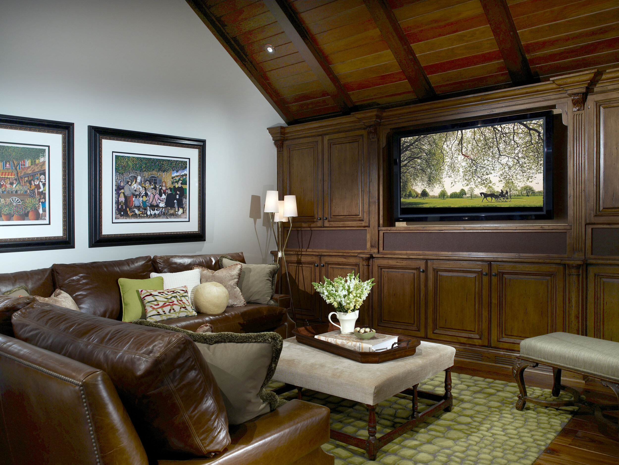
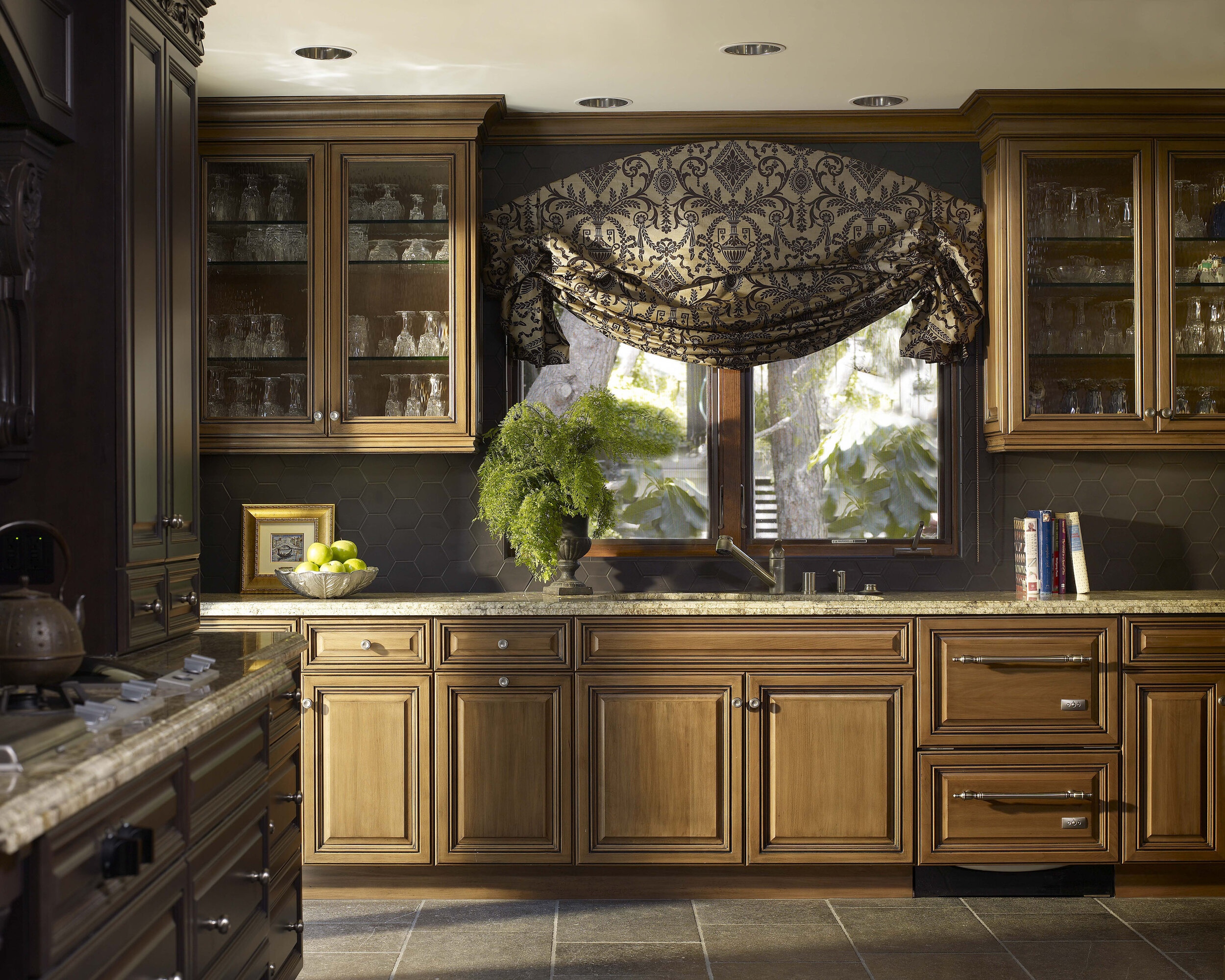
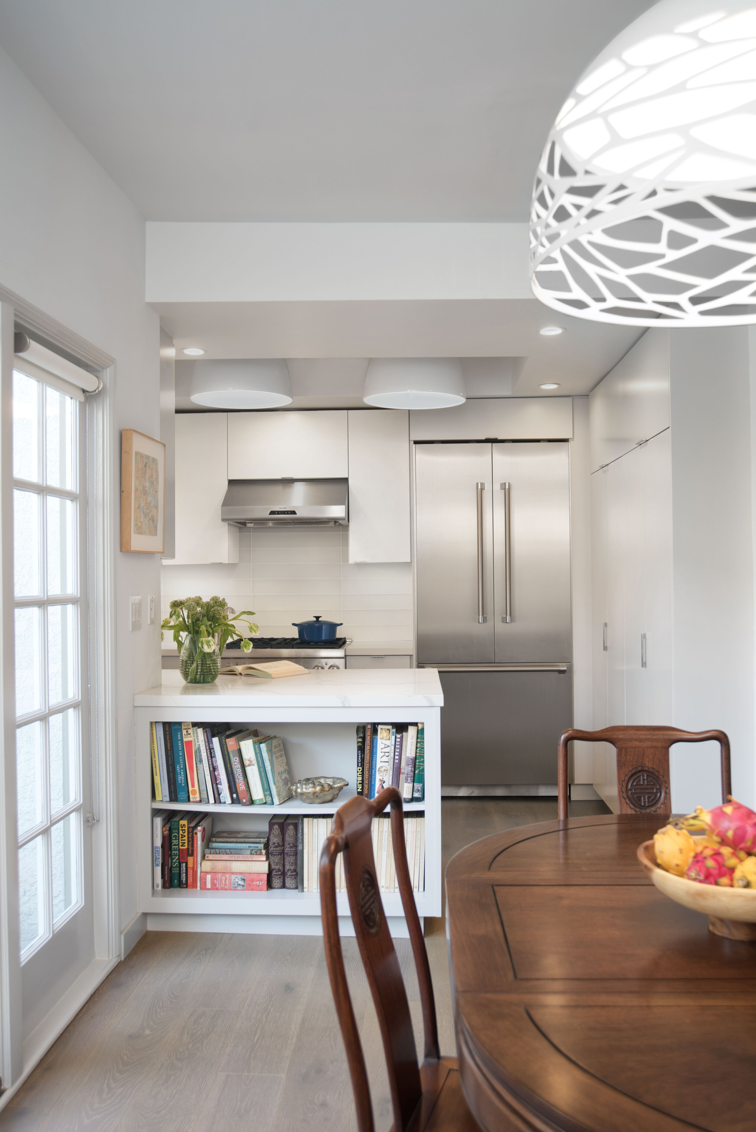
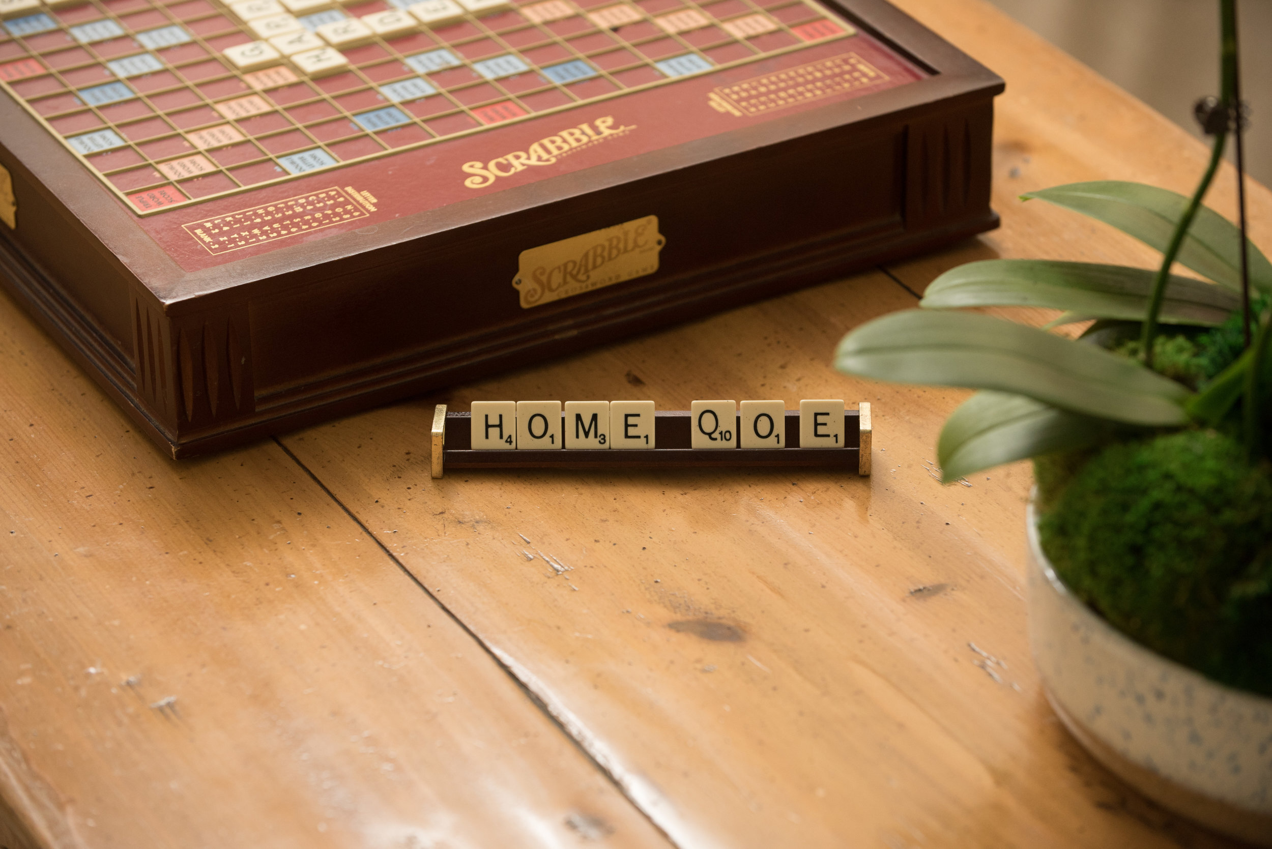
Inclusive Design Language : Building a Foundation for Wellbeing

Scrabble game, tile holder with tiles spelling "home" on brown table next to green plant.

The first step in any home design process is learning who you are designing for and their design needs. Particularly when designing for something as intimate as a residential space, effective home design requires a great deal of honesty, vulnerability, and open communication with all parties. When clients are open with us, we can design genuinely supportive spaces. If clients feel embarrassed or guarded, they may not feel comfortable being honest about their lifestyle, limiting the ability of the designed space to serve them.

Open book on black desk with plants, agate inspired wallpaper, and black pillow with embroidered face.

For example, someone who fears judgment may not want to admit to the amount of time they spend curled up watching movies in the evenings, despite being a common way to escape the day and recover. They may perhaps instead overemphasize time spent devoted to their yoga practice. A home designer may then place ample attention on building a dream yoga studio instead of investing in a beautiful, ergonomic, and supportive movie viewing space that would contribute more to daily life. While this is a lighthearted example, there are many instances where this may play out in a more harmful or isolating way. Creating an open dialogue is crucial in preventing any missteps when designing a home.

sarah-barnard-beachybachelor-25.jpg

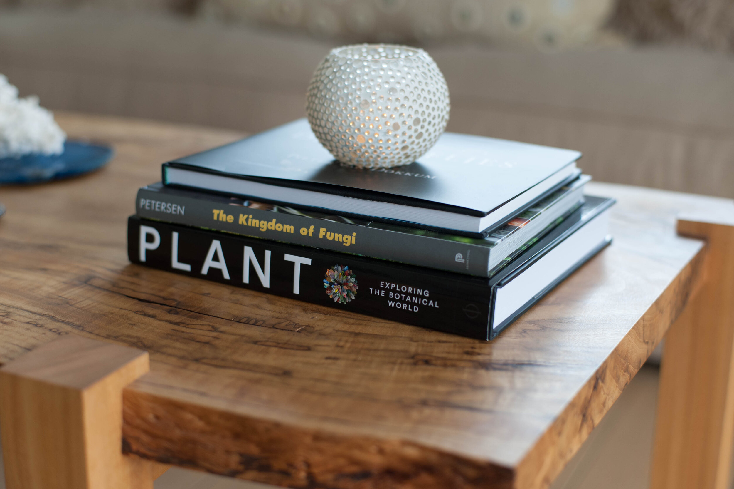
One piece of creating open and safe relationships with clients is by using inclusive design language. Inclusive language is defined by the Linguistic Society of America as language that "acknowledges diversity, conveys respect to all people, is sensitive to differences, and promotes equal opportunities." Considering language choice does not only help create a more understanding environment between designer and client, but the entire studio team, vendors, and tradespeople. Using inclusive home design language is a small but crucial step in creating open communication and trust between everyone involved in a project.

Blue vase with heliconia vellerigera

There is a long history of home design, grounded in tradition. Learning the historical context of the language used both within design and frequently in any workplace helps us understand if the language is supportive or can cause hurt or harm. Our design studio encourages continued education and learning for our whole team. At our weekly meetings, we share information we've learned in classes we've taken, articles or books we've read, or even conversations that may have opened our thinking. Recently, we have put effort into considering the language surrounding home design.

Table with small objects and thank you card

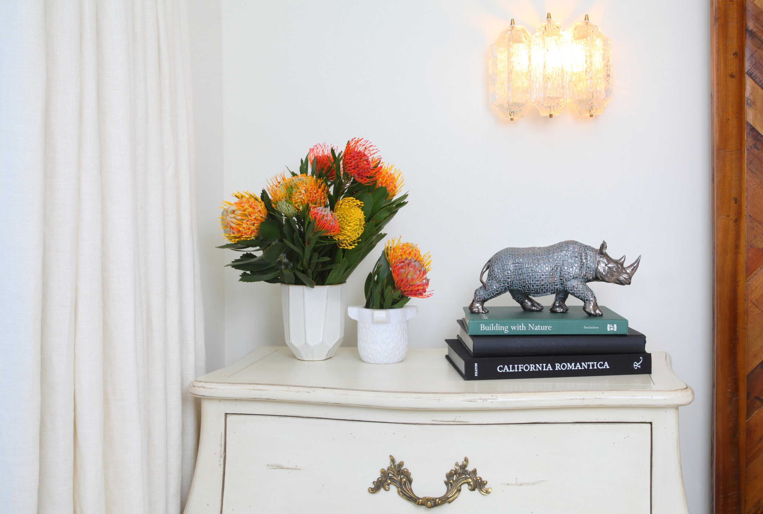
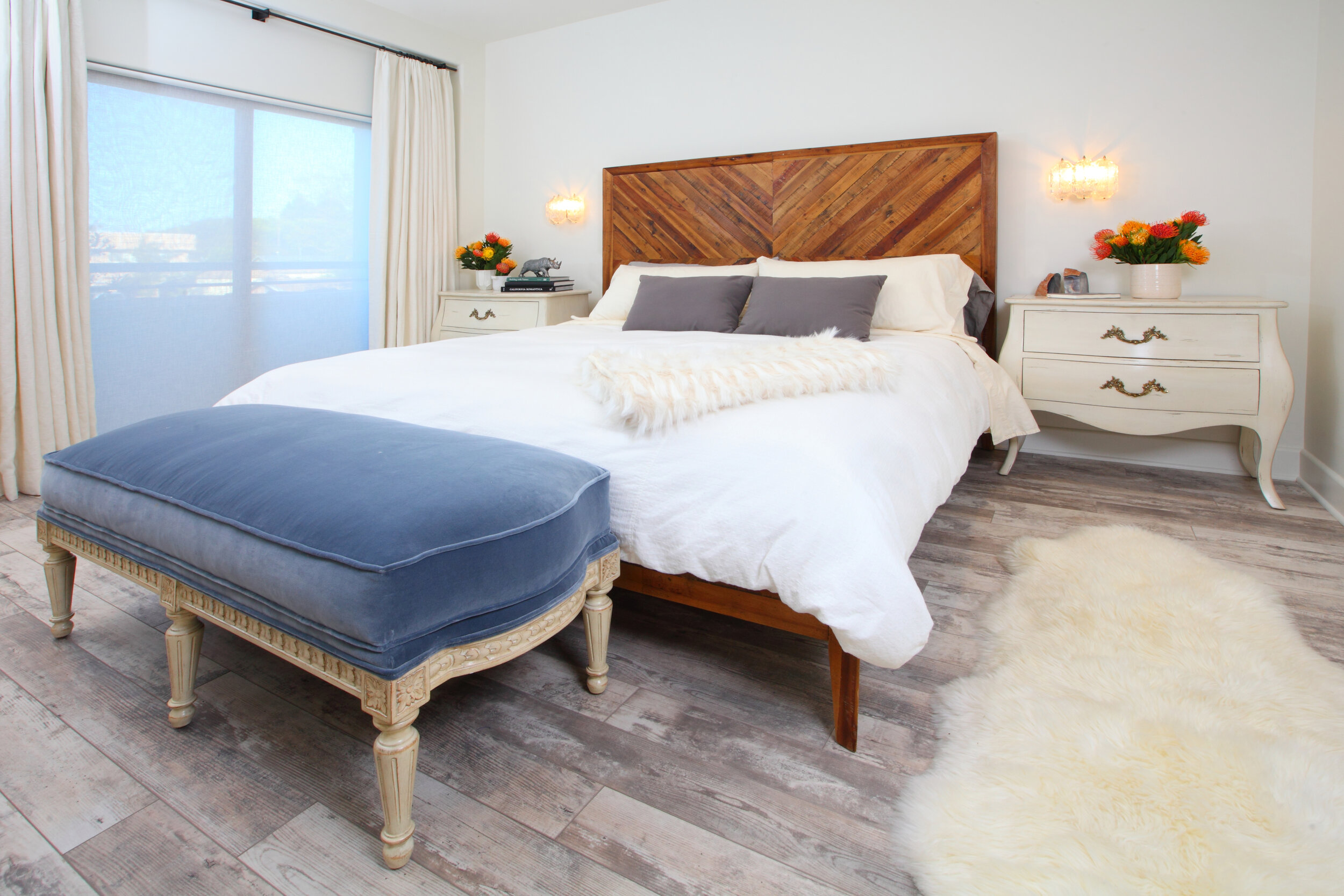
Recently there was a push in the real estate and home design community to eliminate the term "master bedroom" due to its loaded history, replacing it with "primary bedroom." This step towards considering the legacy of language so frequently overlooked had us wondering, where does other common design language originate? How can we improve our communication to match our intentions as home designers and create welcoming, inclusive, and adaptive spaces?

Yellow white and green floral arrangement in blue planter on wooden table


Through conversations and research, here are a few of the terms we have opted to replace as a studio and the alternatives we have adapted:

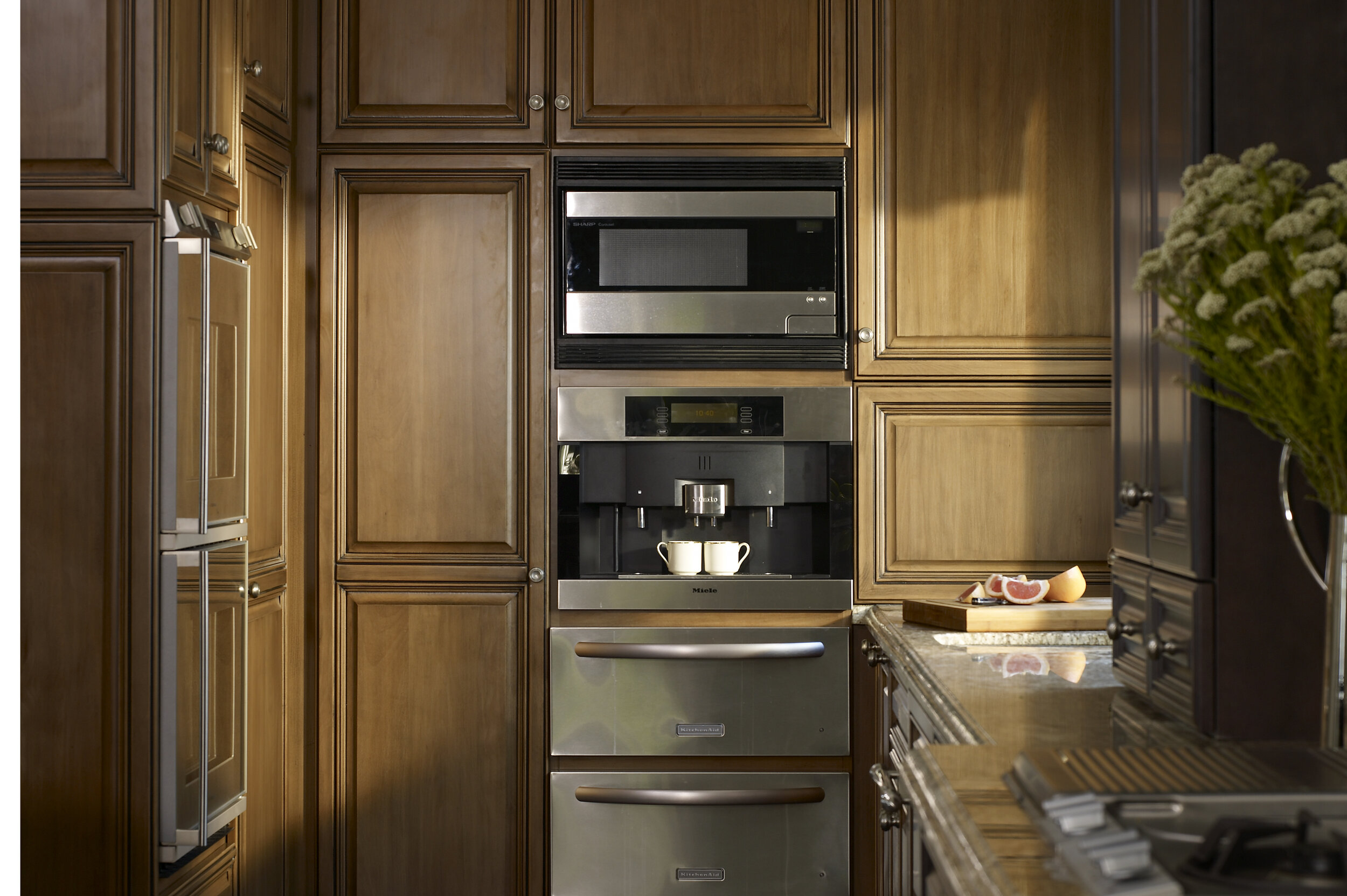
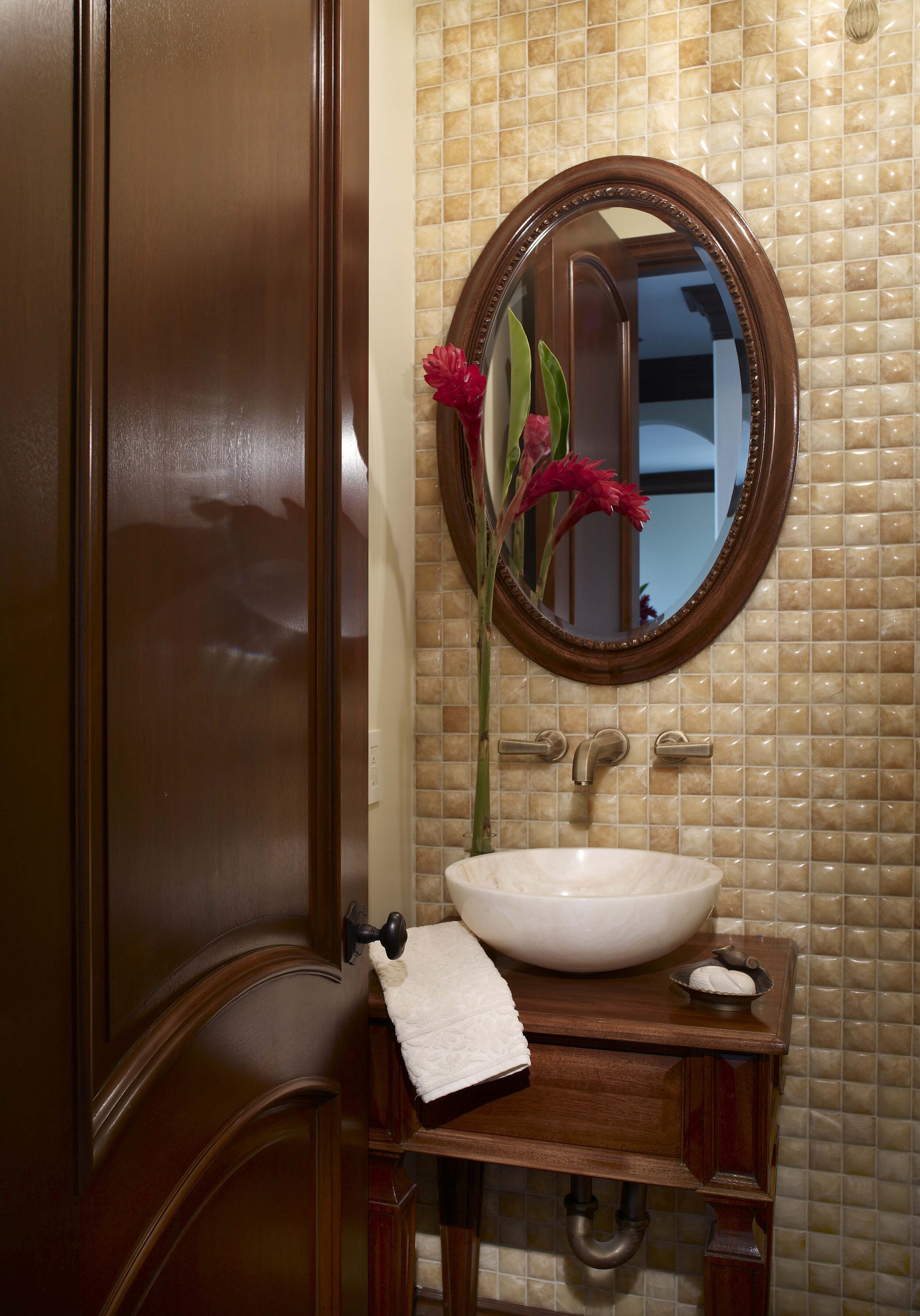
Powder room: While the term originated to reference a room where one powdered their wig, the phrase later took on gendered connotations around "powdering one's nose." The language has been replaced with "half-bath" for a more approachable and less gendered option. 

Ladies and gentlemen or guys/gals: We have opted for folks, team, or friends for an option that does not assume or exclude gender identities. 

"Man" as in, man the front desk, manmade, manpower:  Our studio is replacing these with human-made, human power, staff the front desk for options that do not assert gender dominance or preference. 

Grandfather: This phrase, commonly used in home design practices to indicate a non-conforming, pre-existing condition that may remain in violation of the building code, originated in the American South in the 1890s to defy the 15th Amendment and prevent Black Americans from voting. We've opted to use legacy or exempted.

Tipping Point: The phrase was first popularized when referencing white families leaving a neighborhood when a certain number of Black people moved in. We have opted for climax, peak, or crossroads.

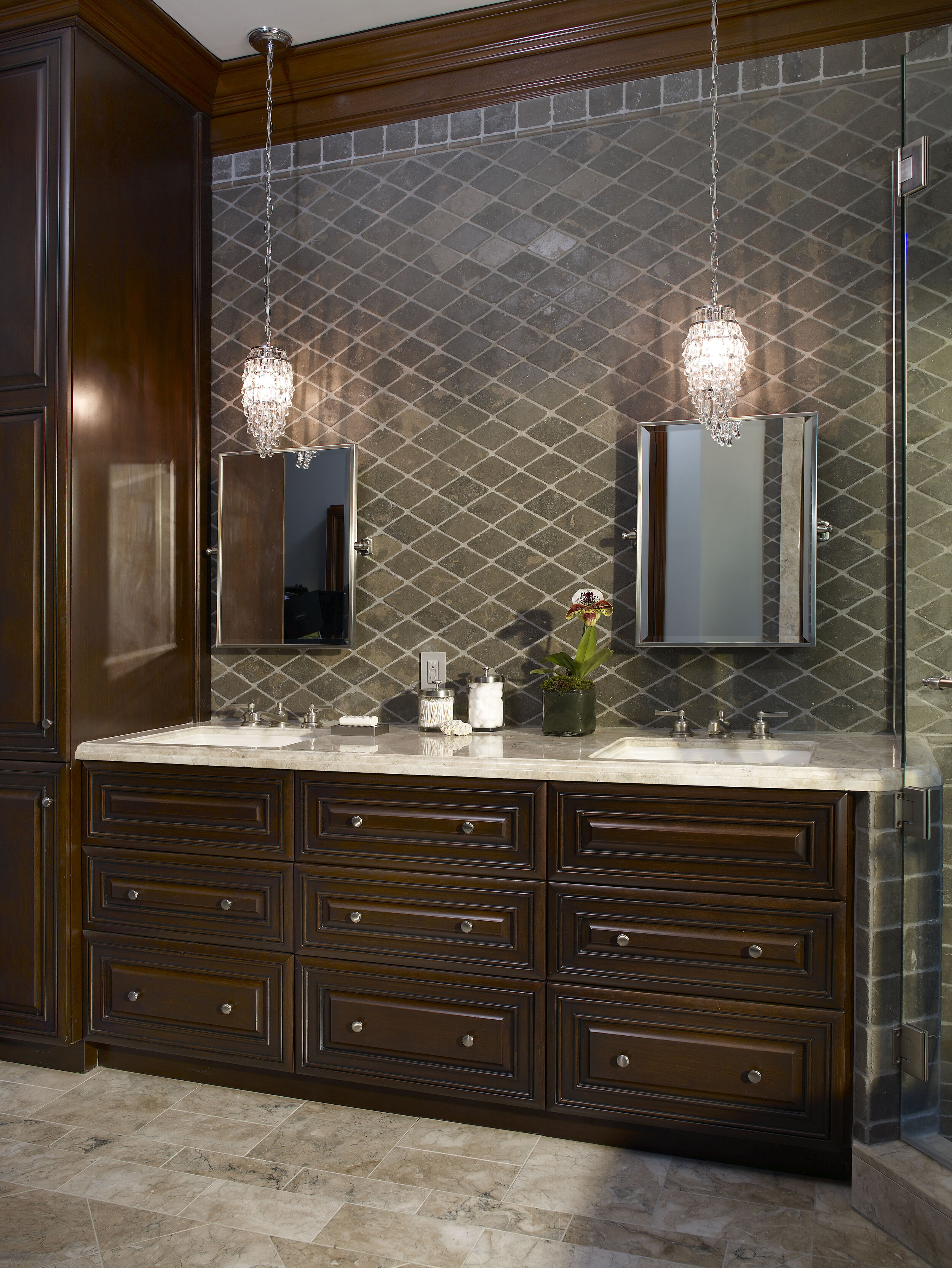
His and hers closets or bathrooms: While commonly used in housing and real estate, the wording is gendered and assumes a hetero-normative lifestyle. We have switched to dual closets or dual bathrooms to describe the spaces without attaching any presumptions to their use. 

Walk-up building: We are opting for non-elevator building to avoid language associated with ability. 

Allowed: Frequently used conversationally, allowed implies power over another person to grant permission, and is being replaced with invited. 

Discovered:  In the context of "we discovered this artist's work," the word reinforces colonialist language and systems. We are opting for "we have learned of". 

Blind approval: We are instead using unquestioned approval, automatic approval. 

Idioms: Our studio is making an effort to avoid any idioms and instead speak literally. Many of these phrases have loaded historical origins, and because they are often regional, they may also be confusing or unclear, muddling communication.

If you are interested in learning more about inclusive language, here are a few of many available resources: 

A Progressive's Style Guide 

Conscious Style Guide 

Diversity Style Guide 

While language is only a piece of creating a safe and welcoming space, it is an important one to set the stage for accessibility and break a language pattern that carries an outdated and harmful legacy. This process is an ongoing one, and we are continuing to learn and adapt, both in our language use and in our design practice. We encourage you to join us in a collaborative effort to adapt, update, and improve our communication and continue in the ongoing conversation surrounding compassionate home design.

Sarah Barnard is a WELL and LEED accredited designer and creator of environments that support mental, physical and emotional wellbeing. She creates highly personalized, restorative spaces that are deeply connected to art and the preservation of the environment. An advocate for consciousness, inclusivity, and compassion in the creative process, Sarah has been quoted by Architectural Digest, Elle Décor, Vouge, Real Simple, HGTV and many other publications. In 2017 Sarah was recognized as a “Ones to Watch” Scholar by the American Society of Interior Designers (ASID).

Cosmopolitcal Design: A New Modality Harnesses the Connection between Home and Nature

With global society and climate in flux, mapping out new ways to live and create in the world has become an essential project. Amid the competing approaches to this transformation, the philosophical school of cosmopolitics, as its name suggests, addresses this challenge in a uniquely holistic way and presents an entirely new perspective on the human relationship with the world.

Albena Yaneva, in her introduction to What is Cosmopolitical Design?: Design, Nature, and the Built Environment, explains that “Cosmopolitical thinkers...see nature as no longer being unified enough to provide a stabilizing pattern for the experience of humans; it is not ‘out there,’ a simple backdrop for human activities.” Cosmopolitics distinguishes itself from cosmopolitanism by positing a relationship with nature and its non-human denizens defined by cohabitation rather than dominance. As Yaneva writes, “These thinkers abandon the modernist idea of nature as being external to the human experience—a nature that can be mastered by engineers and scientists from outside.” 

How does this cosmopolitical perspective manifest in the world of home design? To Yaneva, “It challenges design...to encourage the enactment of new relationships both within and potentially outside the designed space.” Cosmopolitical home design is deeply tied to its locality and integrated with its environment. Yaneva describes cosmopolitical design as “required more than ever to address the primordial question of what it means to live together. That is, the co-existence of humans and non-humans, of how they share space and find ways to live together in peace.”

Because the cosmopolitical way of thinking is so all-encompassing, the approaches to incorporating cosmopolitics into home design are fittingly varied and can be scaled to projects as vast as urban planning or as circumscribed as landscaping a backyard. Manifestations of cosmopolitical home design can range from home renovation with the local climate in mind (for example, placing windows for optimal warmth or cooling of interior spaces) to pollinator-friendly gardens teeming with plants indigenous to their region.

To interior designer Sarah Barnard, WELL AP + LEED AP, bringing cosmopolitics into her home design practice means cultivating spaces that are specific both to her clients and as well as to the local environment and that encourage an accord with the natural world. Sarah says, “Finding ways to harmonize the design of a space to a specific environment instead of working against it is both challenging and rewarding. When a designed space and its greater environment are fully integrated, the effect is almost easier to feel than observe.”

Sarah explains, “I always look for opportunities to create inviting connections between the indoors and the outdoors. This continuity with the natural world is beneficial for emotional and mental health—it’s not just a source of beauty but nourishment.” For an artist’s bungalow, Sarah created a visual continuity between lush indoor plant life and the garden outside, and then took it a step further. Sarah designed the outdoor garden to support pollinators, birds, and other wildlife. The garden is a Certified Monarch Waystation, providing resources to support migrating Monarch butterflies by providing food, water, cover. Sarah said, “Designing homes for wellbeing doesn’t have to stop at the comfort of the client. Incorporating elements of design that nurture the local ecology deepen our relationship with nature and result in spaces that are unified with their surroundings.”

This particular expression of cosmopolitical home design can be achieved even with limited outdoor space. For an oceanview penthouse, Sarah transformed a balcony into an inviting habitat for local and migrating wildlife by adding potted olive trees and an herb garden. “Considering plants not just for their decorative beauty but also what they can offer to the local environment is a concept that works on virtually any scale,” Sarah says. To decorate the interiors, Sarah selected natural and eco-friendly furnishings and textiles, adding that “Organic materials have a gentler environmental impact, and from a wellness perspective, are kinder to the people who live with them.”

When selecting materials and furnishings for home decorating, Sarah often looks to her clients’ priorities to guide her approach to creating spaces that embody a cosmopolitical perspective. For one high-rise suite, the owner’s love of animals was demonstrated not only through the choice of art and decorative objects, but also wanted this care toward animals extended outside home design and beyond aesthetics. Sarah addressed this by using exclusively vegan materials and furnishings for this project. Sarah explains, “No space exists in a vacuum—every object and material we use has a footprint that goes well beyond the front door, so considering the story of the materials we use and the impact that they have on the world is a way to invite cosmopolitical ideas into home design.”

Sustainable materials can also have unexpected origins. For the kitchen of a historic craftsman bungalow, Sarah installed a countertop made of recycled beer bottles, a non-extractive alternative to a more traditional quarried stone countertop. “Not only is the material beautiful and environmentally conscious, but there’s also a little whimsy in how it reinvents something ordinary and adds character to the space,” Sarah says. The implications behind cosmopolitical home design may be weighty, but there is always room for playfulness.

“When I look at my work from a cosmopolitical perspective,” says Sarah, “I see tremendous opportunity for creativity. We are seeing our way of life change in real-time, and as a home designer, I’m lucky to be able to be a part of facilitating that transformation for my clients.”

Sarah Barnard is a WELL and LEED accredited designer and creator of environments that support mental, physical and emotional wellbeing. She creates highly personalized, restorative spaces that are deeply connected to art and the preservation of the environment. An advocate for consciousness, inclusivity, and compassion in the creative process, Sarah’s work has been recognized by Architectural Digest, Elle Décor, Real Simple, HGTV and many other publications. In 2017 Sarah was recognized as a “Ones to Watch” Scholar by the American Society of Interior Designers (ASID).

Birding for Well-being: How Connecting with Nature Can Improve Mental Health

Western Tanager

Western Tanager

There are many proven health benefits to being in nature daily. For example, walking in the woods, also known as the Japanese custom "forest bathing," or "shinrin-yoku," lowers stress levels and boosts overall well-being.

Scaly Breasted Munia

Scaly Breasted Munia

Researchers from the University of Exeter recently found that bird watching can have a positive effect on mental health. They discovered that people who are able to watch birds from their homes have a lower risk of depression, stress, and anxiety compared to people who live in less nature dense areas with fewer birds…

Biophilia, the hypothesis that humans innately seek a connection with nature, drives biophilic design. This central home design principle aims to create healthy and comfortable spaces through the incorporation of natural elements. As a WELL and LEED accredited interior designer, I use biophilic design to create happy and healthy spaces for my clients. Biophilic home design ranges from adding indoor plants to ensuring proper air circulation throughout the home, to one of my frequent design priorities, arranging spaces to showcase natural views. I invite you to consider amplifying the soothing properties of your view by creating a safe-haven for birds in your yard.

Goldfinch

Goldfinch

Birding as a hobby currently ranks second to gardening as America's favorite pastime, with an estimated 43% of all U.S. households, or about 65 million people, participating each year. Watching birds and their behavior may contribute to feelings of relaxation, which in turn leads to reduced stress and improved mental health. As a bird enthusiast, I would agree that watching birds in my garden helps me expand my perspective, gain focus and ultimately feel more at ease.

Bewick’s Wren

Bewick’s Wren

Based on my experience, I've put together a list of helpful tips for beginning bird watchers.

To first attract birds to your garden, observe the birds that currently frequent your neighborhood. Investigate their eating preferences and offer their favorite foods in your garden. In Los Angeles county, sprinkling mixed seeds about in the garden will likely attract mourning doves, white-crowned sparrows, and other ground feeders. Towhees love a protein-rich diet, and will eagerly indulge in dried mealworm. Orioles have a sweet tooth and fancy grape jelly and fresh oranges. Goldfinches love thistle seed, and house finches, while willing to eat most seeds, seem most excited for shelled sunflower seeds.

Goldfinch

Goldfinch

I began with a tube feeder that only accommodates tiny birds. For the first few months, I solely had house finches visit. The mourning doves came soon after eating the seeds on the ground that the finches dropped. I soon realized that I would need more diverse feeding stations to attract larger birds.

Black-headed Grosbeak + Mourning Dove

Black-headed Grosbeak + Mourning Dove

If you are hoping to have a greater variety of bird species come to your garden, try adding a platform tray feeder. Last year, I hung a platform tray feeder from a tall post and was delighted when the first scrub-jay arrived. Since then, I've had an ever-expanding variety of visitors that include black-headed grosbeaks, scaly breasted munia, juncos, European starlings and the occasional red-tailed hawk. I've found that somehow birds bring more birds. Once word gets out in the neighborhood that free food is served, they find their way.

Rufous Hummingbird

Rufous Hummingbird

If you're still not having much luck attracting birds to your garden, this could be because some species, like Beswick’s wrens, are shy and seldom visit feeders located out in the open. I've outfitted the perimeter of a covered outdoor area in leafy shade plants like an assortment of ferns, Ficus triangularis, and abutilon. Nearby I've nestled a suet feeder among the ferns and hanging baskets of plants. I found that placing the suet feeder amongst the plants provides wrens the security of leafy cover while offering the opportunity to watch the birds feed just feet away. Hummingbirds will also visit to drink from the abutilon blossoms, sometimes only inches away from where I'm sitting. It's magical.

Foxglove

Foxglove

If you're interested in having hummingbirds come to your garden, many plant species attract them. Although they do like hummingbird feeders, they seem even more interested in drinking nectar from flowering plants. Interestingly, bugs comprise a third of a hummingbird's diet; they don't just live on nectar. By planting nectar-abundant plants, you'll also attract more bugs for them to eat. Brightly colored, tubular flowers hold the most nectar and are, therefore, particularly attractive to hummingbirds. Examples of these types of flowers include salvia, foxglove, and fuchsia.

European Starling

European Starling

Try adding a water feature to your yard. Birds love moving water, and it has been such a delight watching them bathe in a simple multi-tiered fountain. A bird-friendly fountain does not need to be anything elaborate that requires special plumbing; it can be as simple as buying a solar-powered water feature at your local nursery or online retailer. A solar-powered water feature is a cost-effective and energy-friendly option, and its cordless design allows for mobility.

Female Black-headed Grosbeak + Male House Finch

Female Black-headed Grosbeak + Male House Finch

Whenever possible, orient furniture to face views of the outdoors and place bird feeders in locations visible from the indoors, without spooking the birds. It is delightful to watch the early risers, pecking around the garden for insects before sunrise, drinking my morning tea.

Mourning Dove

Mourning Dove

As more of us are working from remotely now, nature and home design are imperative to promote calmness, serenity, and healthy living. I hope this time at home can provide new opportunities to appreciate our surroundings, and the beauty and pleasure of observing local birds.

White-crowned Sparrow

White-crowned Sparrow

Sarah Barnard, WELL AP, and LEED AP designs healthy, happy, personalized spaces that connect deeply to nature and art. Empathy and mindfulness are the foundation of her practice creating healing, supportive environments that enhance life.

The Healing Power of Home: Sustaining and Nourishing our Bodies and Minds

Custom kitchen design by Sarah Barnard, Photo by Steven Dewall.

Custom kitchen design by Sarah Barnard, Photo by Steven Dewall.

As we collectively navigate this new way of living, I am thinking of you and your family and wishing wellness and security. With so many unknowns, I am grateful for the sureness of a community that uplifts with compassion, resilience, and ingenuity, and offers inspiration to forge forward. 

During a time when our world feels new and uncertain, our studio is drawing on the core foundational beliefs and principles behind our approach to home design. We create spaces that support health, emotional security, and wellness, that is the bedrock of our work. These ideals go beyond our creative process and into our working methods of designing homes. As a studio, we are building upon many of the systems we've previously had in place.

Bespoke American Walnut kitchen cabinets paired with handmade ceramic tiles by California based artisans. Interior design by Sarah Barnard, WELL AP + LEED AP. Photo by Steven Dewall.

Bespoke American Walnut kitchen cabinets paired with handmade ceramic tiles by California based artisans. Interior design by Sarah Barnard, WELL AP + LEED AP. Photo by Steven Dewall.

Our studio has always aimed to work with local artisans and craftspeople when possible, and value these relationships now more than ever. Many supply chains are experiencing disruptions throughout the home design industry. We are working together with trusted vendors to source materials and find creative solutions during this difficult time. 

In our homes, this time has offered an opportunity to examine our routines, and to look at our needs. Health, functionality, and wellbeing informed our process before the spread of COVID-19, and these factors are more crucial than ever as we continue to build supportive spaces for you and your family through mindful home design. 

Interior design by Sarah Barnard, Photo by Steven Dewall.

Interior design by Sarah Barnard, Photo by Steven Dewall.

Many of us are facing challenges in caring for our loved ones, evolving and uncertain circumstances with work, homeschooling children, and maintaining our physical and emotional wellbeing. In addressing these struggles, we are turning to our homes for solutions, realizing more than ever the need for multi-functional and high performing living spaces. 

Our regular team meetings are an opportunity for the studio to brainstorm and problem solve collectively, and recent conversations frequently turn to personal solutions for managing this time at home. We wish to extend this conversation to our community and clients and offer some of our favorite approaches for adapting our home design to these changing times. 

Colors inspired by nature create the palette for this traditional home. Interior design by Sarah Barnard, photo by Steven Dewall.

Colors inspired by nature create the palette for this traditional home. Interior design by Sarah Barnard, photo by Steven Dewall.

HOME HEALING QUICK TIPS

  • Structure your spaces for ease of movement, connectivity, and peace of mind. Move your workspace in front of your favorite exterior view. 

  • Open your windows and cross-ventilate your home any day weather permits to improve indoor air quality and enjoy the mood-lifting benefits of watching birds and butterflies

  • Scoot your coffee table to the side for extra room to play and exercise, and set it up with floor pillows for a new homework station for children. 

  • Move your favorite painting to the room where you spend the most time, whether it's a home office, kitchen, or nursery, and enjoy the beauty and transcendence of art

  • Use your occasion dishes more often, and if you're spending more time than you'd like inside the kitchen, bring your cutting board to the back yard. 

  • Think about how your home is supporting your physical health and invest in materials that benefit indoor air quality. Be mindful when bringing new items in your home, avoid air fresheners, and fill vases with aromatic mint and rosemary. 

  • Make sure your bedroom is supporting your sleep habits by clearing out clutter and adjusting lighting to meet your needs. 

  • Carve out time with nature, even if it is tending to a favorite indoor plant or watching hummingbirds in your garden.


kitchen sarah barnard design (11).jpg

Be resourceful, get creative, trust your instincts, and listen to what your mind and body needs, and mold your home to fulfill those needs. And you can always call us if you need some ideas. Our studio and local craftspersons are here to serve. 

While we discover methods to care for ourselves, we have learned the necessity and power of turning to others for support and assistance. We offer our support by helping create functional homes so that your safe place is also your ideal space. 

We hope that this time to reassess, rearrange, and reconnect, can carry us into a healthier and more positive future, supported by homes that sustain and nourish our bodies and minds. 

kitchen sarah barnard design (18).jpg

Sarah Barnard, WELL AP, and LEED AP designs healthy, happy, personalized spaces that connect deeply to nature and art. Empathy and mindfulness are the foundation of her practice creating healing, supportive environments that enhance life.

The Inclusive Kitchen: Universal Home Design Improves Quality of Life

Interior Design by Sarah Barnard. Photos by Steven Dewall. Originally published in LADESIGN Quarterly, by the Los Angeles chapter of the American Society of Interior Designers.

Interior Design by Sarah Barnard. Photos by Steven Dewall. Originally published in LADESIGN Quarterly, by the Los Angeles chapter of the American Society of Interior Designers.

Universal home design is intended to improve the quality of life for all users, regardless of age or ability. When applied to the kitchen, these principles should ensure safety, efficiency, and comfort. The term was first coined in the 1970s by architect and disability rights advocate Ronald Mace. Since then, universal home design practices have been rising steadily due to its inclusion in formal design education and support from professional associations like ASID, who provide research and case studies for universal design and aging in place.

In my practice, as a WELL and LEED accredited designer specializing in healthy, sustainable interiors, I often find that planning for the future can be intimidating for clients, but doing so ensures they will be happy spending a lifetime in their homes. 

I recently completed a home remodel for a retiree, who wanted the kitchen to function well when cooking for one. However, she often hosts friends and family, so it also had to be designed with entertaining in mind.

MinimalKitchen-5.jpg

Knowing the kitchen would be widely used, we considered universal home design principles to increase its functionality. The aesthetic was inspired by the cool, collected nature of the home's coastal locale and the utility and simplicity of Scandinavian design.

I specified a U-shape layout to provide unobstructed traffic flow and ample counter space. The kitchen is open to the dining area, and there are no barriers, such as steps or a doorway, to separate them. It's a confined space, which reduces the amount of back and forth travel. 

I find that most clients are unwilling to plan for a mobility challenge they may never have. While we can't always get them to agree to a design that accommodates a wheelchair, clients are often comfortable with a clearance of 54 inches for mobility aids such as a walker or cane. If designing for wheelchair mobility, knee to toe clearance allows for easy access.

NeutralKitchen10.jpg

I used both upper and lower cabinets to give the homeowner plenty of storage. Keeping countertops clear, in turn, mitigates safety risks. The slide-out drawers are gentler on the back — she doesn't have to bend over or reach up high to access what she needs.

A large window provides views of the outdoors and welcomes natural light. Connecting with nature, even through a window, positively impacts our wellbeing by reducing blood pressure, slowing down our heart rate, and alleviating stress. Natural light, combined with the recessed lighting and oversized pendants, relieves eye strain and helps the homeowner safely perform tasks like chopping or peeling. 

For the hardware, I chose large, integrated pulls instead of knobs because they're easier for stiff or shaky fingers to grasp. According to the Centers for Disease Control, 54.4 million Americans are affected by arthritis, the majority of whom are 65 and older. While a knob requires the user to bend their fingers to latch onto it, a cabinet with a pull can be opened with limited dexterity using only one or two fingers. 

Minimalitchen-8a.jpg

The homeowner preferred a single-lever faucet; however, if increased accessibility is the primary concern, touch-less faucets can be an excellent alternative. Clients may be hesitant to select this high-tech feature if their experience has been limited to unreliable public restrooms. Fortunately, more and more stylish options for residential spaces are becoming available. 

If the homeowner were to change her mind, the electrical components could be concealed in a base cabinet or behind an access panel. It's essential to consider your surroundings when installing a touch-less model as some products will not operate correctly if they are in proximity to other metals, like a copper sink or stainless-steel backsplash.

The French door refrigerator can be opened without much exertion thanks to its oversized pulls, and the efficient design means everyday ingredients are displayed for easy access. It has a well-lit interior to aid those with vision loss.

The kitchen countertop is white engineered quartz with subtle gray veining. This human-made material is durable and stain-resistant, requiring less maintenance on behalf of the homeowner. People with impaired vision will be better able to identify the kitchen tools and ingredients in front of them, as the brilliant white creates high contrast. I sourced a cream-colored matte glass tile backsplash to prevent surface glare.

Natural French oak flooring was used throughout the open-concept space, eliminating any unsafe transitions. The material has a matte finish and was designed to be slip-resistant — an absolute must in the kitchen where spills are common. It also feels comfortable underfoot and has more spring to it than other flooring types, which is easier on the joints.

Open shelving on the back of the peninsula adds a pop of color to the space. This bookshelf created an opportunity to display some of her most treasured collectibles, which spark joy each and every time she sees them.

The antique rosewood dining table, sourced from Thailand by the homeowner, is located within close reach of the kitchen, so heavy platters of food needn't be carried far. The open floor plan makes it easy to converse with guests who are seated at the table while she's whipping up hors d' oeuvres in the kitchen. The built-in server provides an additional surface to set down dishes and clears up the dining table to prevent any accidents.

Universal home design can and should be both stylish and seamless. Reexamine the products, materials, and finishes you already use, and consider how they might be implemented in a way that supports people of all abilities. With this project, the homeowner was conscious of her potential future needs and entrusted us with creating a healthy, natural, and minimalist space that would suit her well in the long-term.

Sarah Barnard, WELL AP, and LEED AP designs healthy, happy, personalized spaces that connect deeply to nature and art. Empathy and mindfulness are the foundation of her practice creating healing, supportive environments that enhance life.

Classic Blue, Pantone's Color of the Year creates calm and inspires clarity in interior spaces.

Interior Design: Sarah Barnard, Photos: Steven Dewall, Painting: Reid Winfrey

Interior Design: Sarah Barnard, Photos: Steven Dewall, Painting: Reid Winfrey

Blue brings us a sense of peace, offers us refuge, aids concentration, and brings us clarity. It is a reflective tone that fosters resilience and gives us hope, qualities we look toward during this uneasy time in the world. Pantone's Color of the Year is Classic Blue, chosen to reflect our desire for a stable future as we enter into a new decade. TIME calls the Color of the Year, "both constant and classic." It is reminiscent of a serene sea and the sky at dusk.

Pantone provides a universal language of color that is used by more than ten million designers and producers around the world to define colors accurately across different platforms and industries. Their Color Institute is dedicated to researching purchasing trends across various industries to determine each year's color. Pantone has been naming a Color of the Year since 2000 and has influenced product development and purchasing decisions in fashion, interior design, industrial design, graphic design, and advertising.

beachy bachelor (8).jpg

Classic Blue is akin to the very first Color of the Year, Cerulean. The hue represented the excitement of a new millennium, while also offering a sense of protection and serenity amidst the feared approach of Y2K. This year, we are experiencing a similar feeling of trepidation from the United States to the United Kingdom, Hong Kong, Syria, and across the globe.

beachy bachelor (14).jpg

The reigning Color of the Year offers reassurance, confidence, and connection for us in a time of uncertainty. "When we look at the world around us, we know that we're living with a lot of unrest, where some days don't feel quite as secure," said Leatrice Eiseman, Executive Director of the Pantone Color Institute, in an interview with Architectural Digest. "Blue from an emotional, psychological standpoint, has always represented a certain amount of calm and dependability. It's a color that you can rely on."

beachy bachelor (30).jpg

Classic Blue is the color of deep ocean water or a handful of ripe blueberries. It is a part of the art market, the beauty industry, automotive manufacturing, tech, and space sciences. Its associations with dependability, trustworthiness, and constancy make it a great color to incorporate into your home design.

beachy bachelor (17).jpg

My work as a LEED and WELL-accredited home designer is deeply rooted in wellness and biophilia. Biophilia is our innate desire to be close to nature, and biophilic design aims to create healthy and comfortable interiors by meaningfully incorporating natural elements into our home and work environments. Integrating Classic Blue into our spaces builds on the principle of biophilic design because of its presence in nature.

beachy bachelor (31).jpg

Art, textiles, furniture, and accents are all great ways to introduce soothing Classic Blue to your home or office. A project I recently completed features oceanic shades of blue that act almost like neutrals. I took inspiration from the home's beachy surroundings, bringing in a Classic Blue velvet sofa. I then repeated the color through vintage ceramic vases, books, and toss pillows.

When acting as a base layer, Classic Blue can be paired with a multitude of colors, including other shades of blue. For the client's bedroom, I selected a handmade upholstered bed, Belgian linen bedding, wool drapery, and an abstract painting by Jonathan Elder, all wed by various blue tones. The buttery vintage leather chair and wooden bench at the foot of the bed complete the space, providing visual warmth and balance.

Consider adding serene, calming, earth-focused tones to your home in the new year. Whether you choose Classic Blue as an all-over hue or an accent, you can't go wrong with a color that takes its cues from nature.

Sarah Barnard, WELL AP, and LEED AP specializes in creating calming restorative environments that support physical, emotional, and mental well-being. Her interior design practice centers around her client's health and wellness while incorporating natural elements into every space she designs.

Pantone’s Color of the Year: Living Coral

The family cat is the primary resident of this guest suite featuring a pink and coral color scheme.

The family cat is the primary resident of this guest suite featuring a pink and coral color scheme.

Coral reefs are disappearing from our oceans at an alarming rate. It is imperative to the ocean’s ecosystems, and as much as a quarter of all ocean species depend upon it for food and shelter. Precious marine lifeforms are also the inspiration for Pantone’s color of the year: Living Coral.

Coral and lush greens create a lively and inviting atmosphere for an outside space.

Coral and lush greens create a lively and inviting atmosphere for an outside space.

Sarah Barnard, a Los Angeles-based interior designer, WELL AP and LEED AP, specializes in home design that contributes to her client’s health and wellness and strives to make nature a part of each home she creates. “A happy and uplifting color reminiscent of the ocean is the perfect starting point for a happy, healthy home.”

Coral colored tiles and beautiful glossy stone slabs make this coastal bathroom warm and bright.

Coral colored tiles and beautiful glossy stone slabs make this coastal bathroom warm and bright.

This color takes its name from the beautiful coral marine invertebrates that build extensive coral reefs, habitats for a vast diversity of life in the ocean. Sometimes referred to as the "rainforests of the sea," coral reefs are quickly dying, and are projected to reduce to 10% by 2050. Half of the world's coral has died since 2016, due to rising sea temperatures, pollution, destructive fishing, invasive species, and changing sea chemistry.

"The timely selection of this color by Pantone should be an important reminder to all of us that nature inspires beautiful interiors. If we aren't careful to preserve the natural world, we will have nothing left to take inspiration from," said Barnard.

Coral naturally complements with blues and ocean tones. Coral embroidery was a perfect companion (complement?) for a throw pillow in a coastal home.

Coral naturally complements with blues and ocean tones. Coral embroidery was a perfect companion (complement?) for a throw pillow in a coastal home.

Pantone is most widely known for their color swatch books. It is the company responsible for color matching paints and graphics; and now devotes the time and resources of Pantone Color Institute to research the purchasing trends of various industries. With this information, Pantone determines this year's color. The naming process regularly pulls inspiration from the natural and human-made world, naming colors such as "rose quartz" or "millennial pink." Pantone's color of the year for 2018 was ultraviolet, a beautiful, energizing shade of purple reminiscent of bright flowers and the sky at sunset. This year's choice is PANTONE 16-1546 Living Coral, a potent reminder to preserve and protect ocean life.

Coral colored ceramic provides earthy contrast against the ebonized table and black lamp.

Coral colored ceramic provides earthy contrast against the ebonized table and black lamp.

Coral is vibrant, cheerful, delicate and energizing, and the perfect shade to start the New Year. Living coral, described by the Pantone team as “An animating and life-affirming coral hue with a golden undertone that energizes and enlivens with a softer edge.”

The bath and shower feature locally sourced handmade ceramic tiles in a coral gloss.

The bath and shower feature locally sourced handmade ceramic tiles in a coral gloss.

Pantone published, “Vibrant, yet mellow PANTONE 16-1546 Living Coral embraces us with warmth and nourishment to provide comfort and buoyancy in our continually shifting environment. [...] Representing the fusion of modern life, PANTONE Living Coral is a nurturing color that appears in our natural surroundings and at the same time, displays a lively presence within social media.”

Coral and pink shades blend beautifully with wood tones. Art is a subtle and seamless way to introduce colors like coral.

Coral and pink shades blend beautifully with wood tones. Art is a subtle and seamless way to introduce colors like coral.

While top interior designers don’t necessarily recommend painting one’s home to match the color of the year, art, accents, and of course plants are an easy and safe way to introduce vibrancy to your living or work space through home decorating.

Pinks and coral create an inviting atmosphere.

Pinks and coral create an inviting atmosphere.

For those interested in using Living Color in their home, Sarah Barnard said,  "Living Coral is a perfect complement to blue shades, and pairs well with coastal or beachy interiors. For the daring, reupholstering a treasured piece in a bright color like Living Coral can revitalize a space. For those who prefer to mix pops of color with neutrals, I recommend starting with small accents."

Pantone's Color of the Year is an excellent opportunity to add lively, earth-focused tones to your home. Make having a happy and healthy home your New Year's resolution.

Cream and coral ceramic jars are a perfect storage solution for bathroom necessities.

Cream and coral ceramic jars are a perfect storage solution for bathroom necessities.

Sarah Barnard designs healthy, happy, personalized spaces that are deeply connected to nature and art.

To learn more about Sarah Barnard Design, please visit www.SarahBarnard.com.

Photos by Abby Siniscal, Chas Metivier, and Charlie Daniels

CODAWorx: National Immigration Law Center

Sarah Barnard organized a pro bono art and design project featuring local artists and the National Immigration Law Center, one of the leading organizations in the U.S. dedicated to defending and advancing the rights to low-income immigrants.

Gardeners, Exodus, and Nabe by Jose Ramirez. Photo by Chas Metivier.

Gardeners, Exodus, and Nabe by Jose Ramirez. Photo by Chas Metivier.

Overview

National Immigration Law Center recently expanded/relocated. Their new suite would nearly triple the square footage of their existing space (almost 13,000). NILC is a non-profit and has minimal financial resources. Sarah Barnard Design was asked to take on the project on a pro-bono basis through the 1% for the Design Program. In addition to creating specifications for the construction project and overseeing the interior design/furnishings purchasing, Barnard curated a long term exhibition for the organization that would feature 16 artists from around the globe. The artworks were created specifically for NILC’s space and with their organization mission in mind.

Cherry Picker I and Cherry Picker II by Narsiso C. Martinez. Photo: Chas Metivier

Cherry Picker I and Cherry Picker II by Narsiso C. Martinez. Photo: Chas Metivier

Goals

Defend & Advance is a temporary exhibit of 39 original artworks by 16 artists that celebrates the establishment of the National Immigration Law Center’s permanent art collection. With broadly varied approaches and narratives, the artists in this exhibition explore current conditions of immigration and migration, displacement and labor, and struggle against collective amnesia. The artists are from a diverse range of geographic, political and social backgrounds. Considering their work in dialogue allows us not only to reflect on their differences but also to discuss their shared concerns. The exhibit offers new perspectives on issues we may have previously thought familiar. The curation seeks to discover shared experiences that can be explored in conversation and used to promote intellectual and emotional engagement with the presented subjects. The artwork becomes a critical component in the overall design experience.

Soul of Food and Nutrition by Jose Ramirez. Photo: Chas Metivier.

Soul of Food and Nutrition by Jose Ramirez. Photo: Chas Metivier.

Process

The designer was entirely responsible for curating the works made only for this space. Sixteen exceptional artists were selected from a pool of nearly 300 and commissioned to create site-specific works for the National Immigration Law Center. Working closely with the fine artists, Barnard encouraged works that explore controversial political themes and offer opportunities to contemplate socio-political issues that affect us all. Access to healthy foods and education, farmworker rights, border politics, the terror of uncertainty, domestic worker rights, transportation issues, and the plight of the refugee are some of the many poignant themes explored in the works exhibited. Painting, printmaking, photography, mixed media installation and fiber sculpture are among the mediums employed by the participating artists. The curator/designer held an artist potluck at her home so that the artists might form permanent relationships with one another before the show opening. While the design project helps NILC staff to work more productively, the art installation encourages hope by way of connecting people with ideas and each other. This collaboration of designers, artists and non-profit attorneys to promote social justice may be the first partnership of its kind.

With Her Own Hands by Xilomen Rios. Photo: Chas Metivier.

With Her Own Hands by Xilomen Rios. Photo: Chas Metivier.

Additional Info

Established in 1979, the National Immigration Law Center (NILC) is one of the leading organizations in the U.S. exclusively dedicated to defending and advancing the rights of low-income immigrants. NILC believes that all people who live in the U.S.—regardless of their race, gender, immigration or economic status—should have the opportunity to achieve their full potential. Over the years NILC has been at the forefront of many of the country’s most significant challenges when it comes to immigration issues and plays a vital leadership role in addressing the real-life impact of policies that affect the ability of low-income immigrants to prosper and thrive.

https://www.codaworx.com/project/national-immigration-law-center-national-immigration-law-center

 Sarah Barnard designs healthy, happy, personalized spaces that are deeply connected to nature and art.

To learn more about Sarah Barnard Design, please visit www.SarahBarnard.com.

Elle Decor: Designers Reveal Their Favorite Kitchen Paint

Sarah shares one of her favorite paint colors for kitchens.

elle.decor.design.favorite.paint.color

FARROW & BALL CABBAGE WHITE 269

"It's a delightful, versatile neutral that pairs brilliantly with blues, greens, and grays. The hint of green elicits thoughts of the first days of spring and the taste of fresh garden vegetables."

Kloss, Kesley. Designers Reveal Their Favorite Kitchen Paint Colors. Elle Décor. April 2016

http://www.elledecor.com/design-decorate/color/tips/g3027/best-kitchen-paint-colors/

Sarah Barnard designs healthy, happy, personalized spaces that are deeply connected to nature and art.

To learn more about Sarah Barnard Design, please visit www.SarahBarnard.com.