Vegan Interior Design Week
/
Join us at the inaugural Vegan Interior Design week, as Sarah shares her experience designing spaces for vegan clients to improve their health and happiness.
Hosted by interior architect and animal rights activist Aline Dürr, this year's event will feature a wide range of global speakers, including Sascha Camilli (PETA) and Johannes Schmidt (Institute of Building Biology and Sustainability). Speakers will discuss a range of topics exploring ethical design.
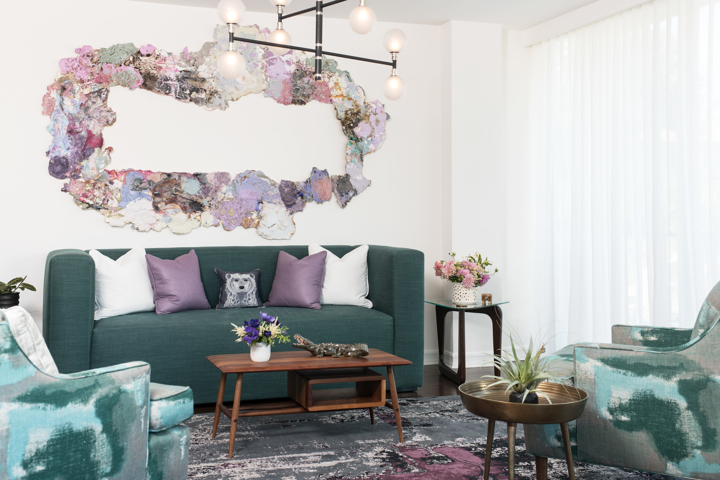
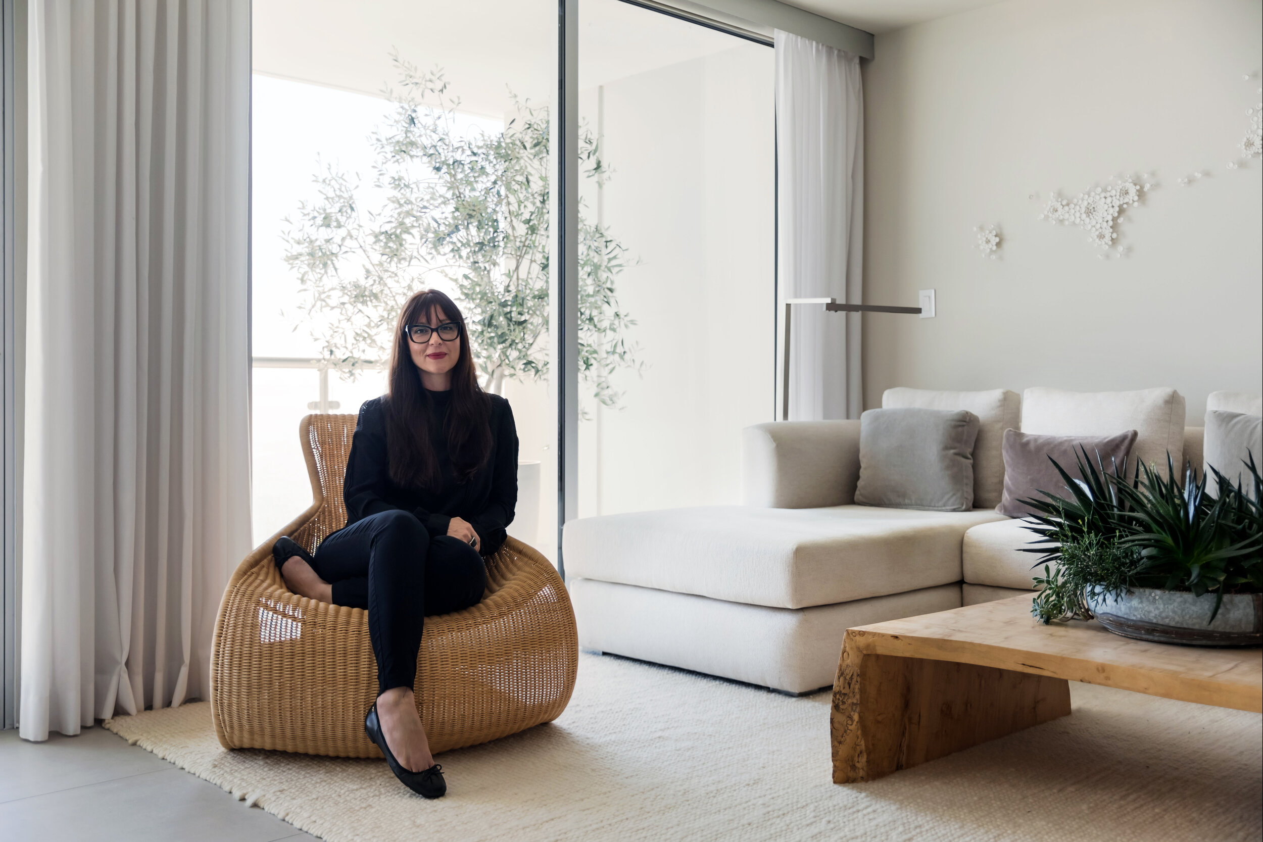
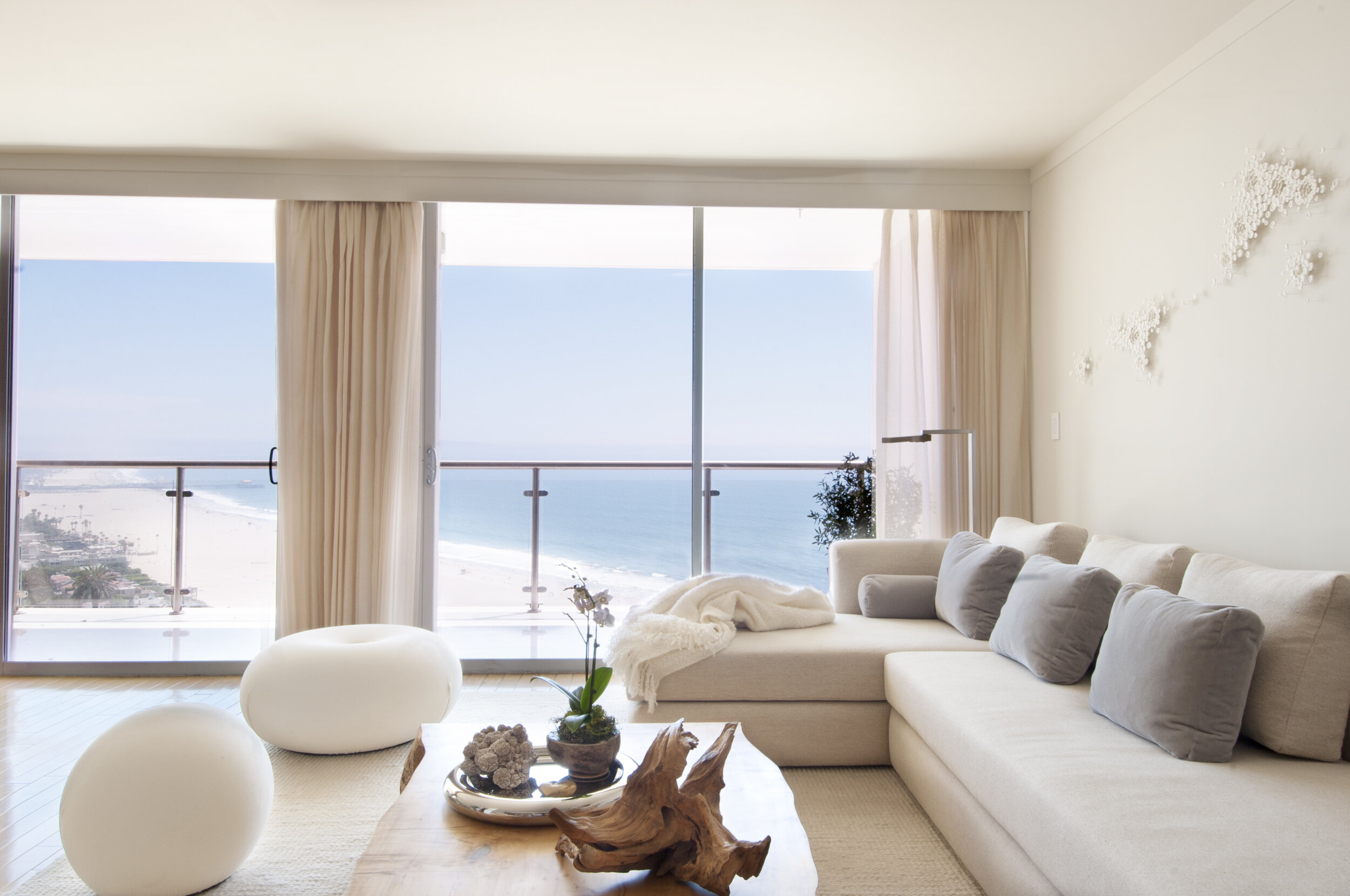
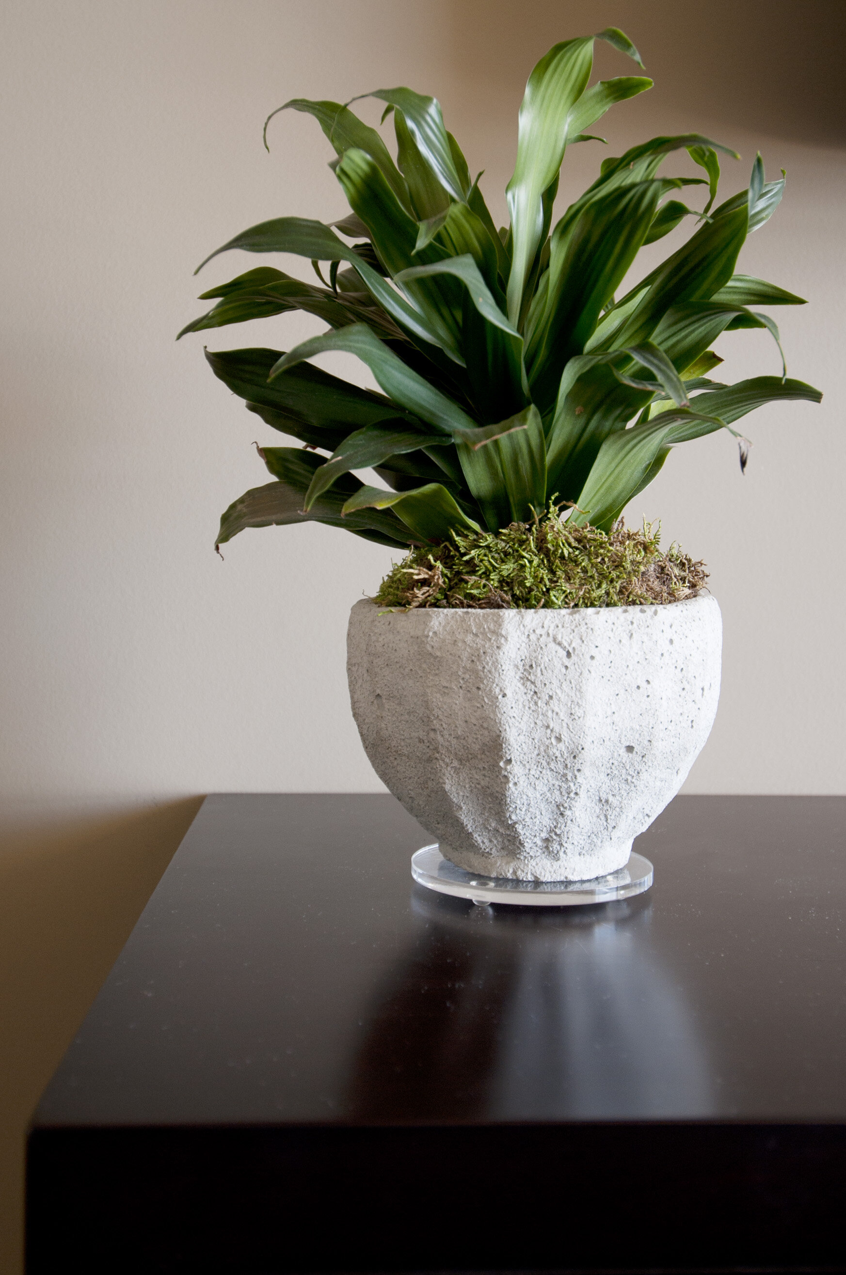
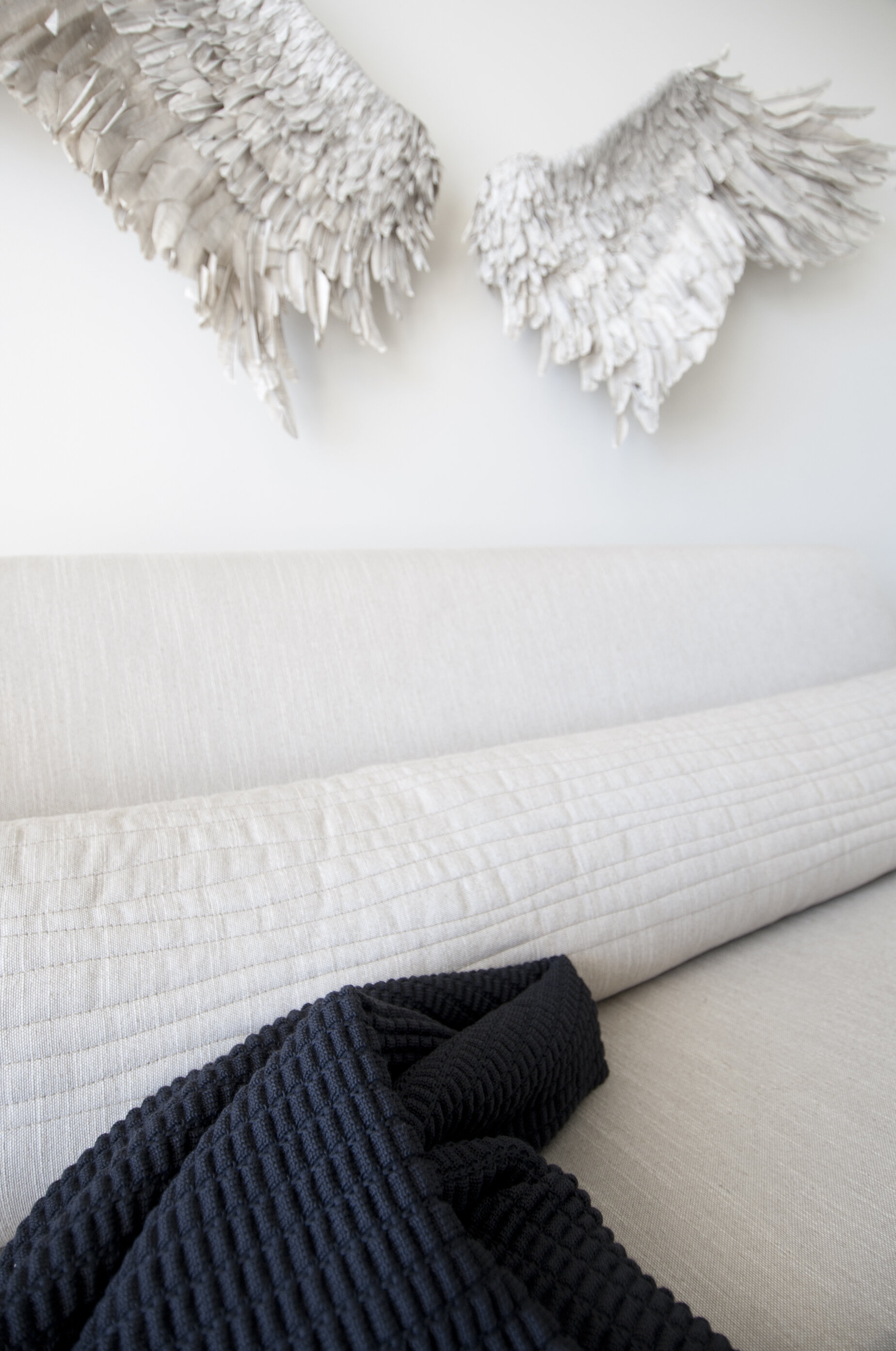
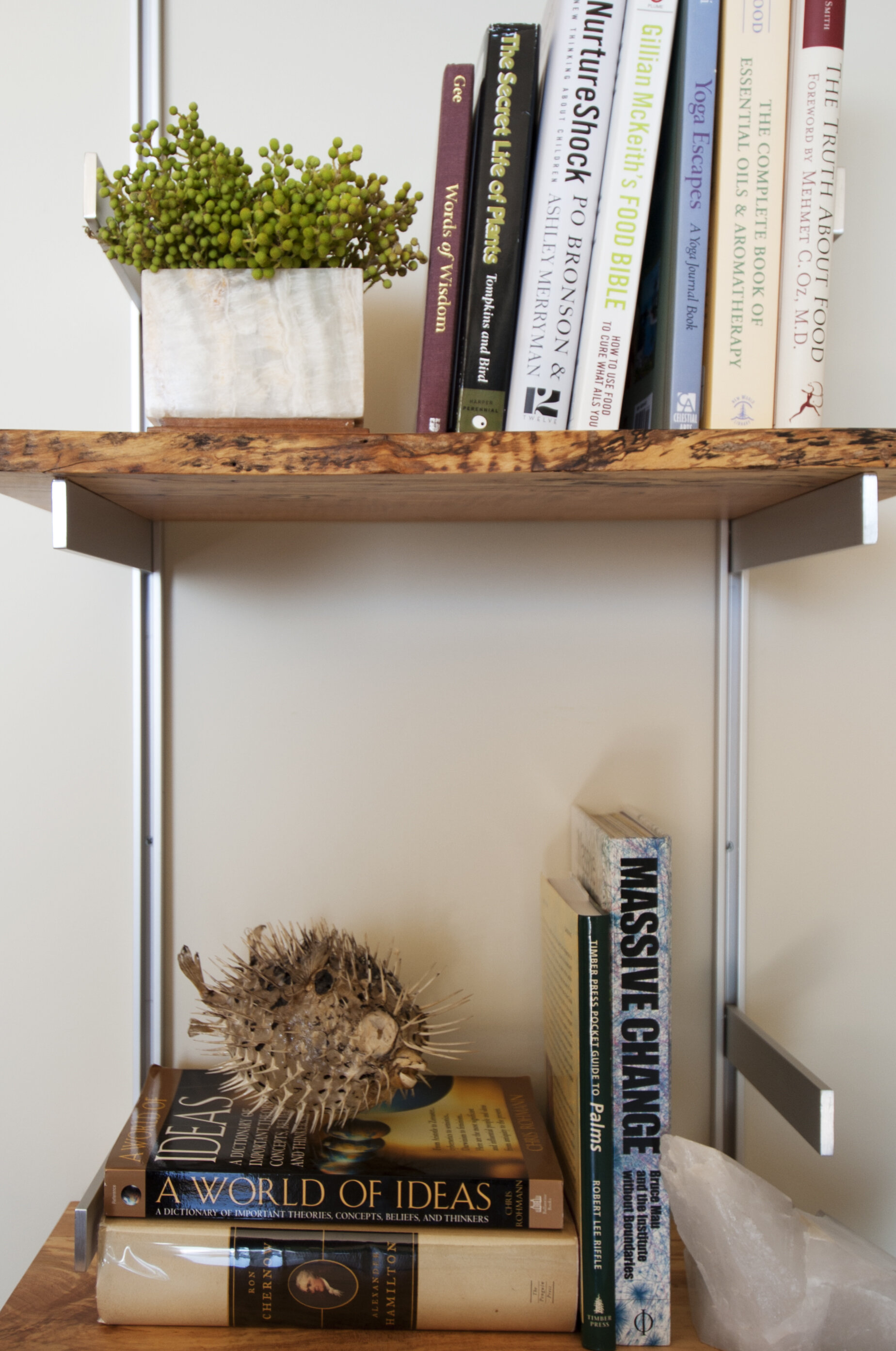
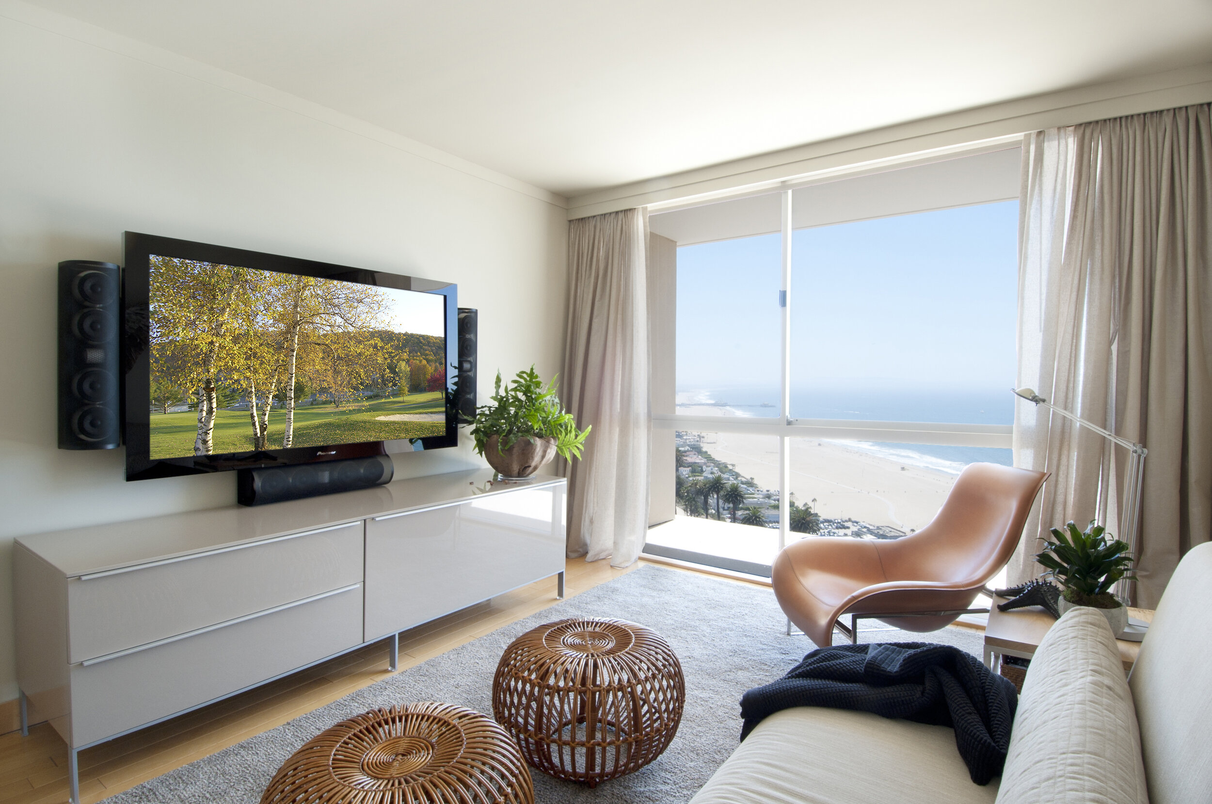
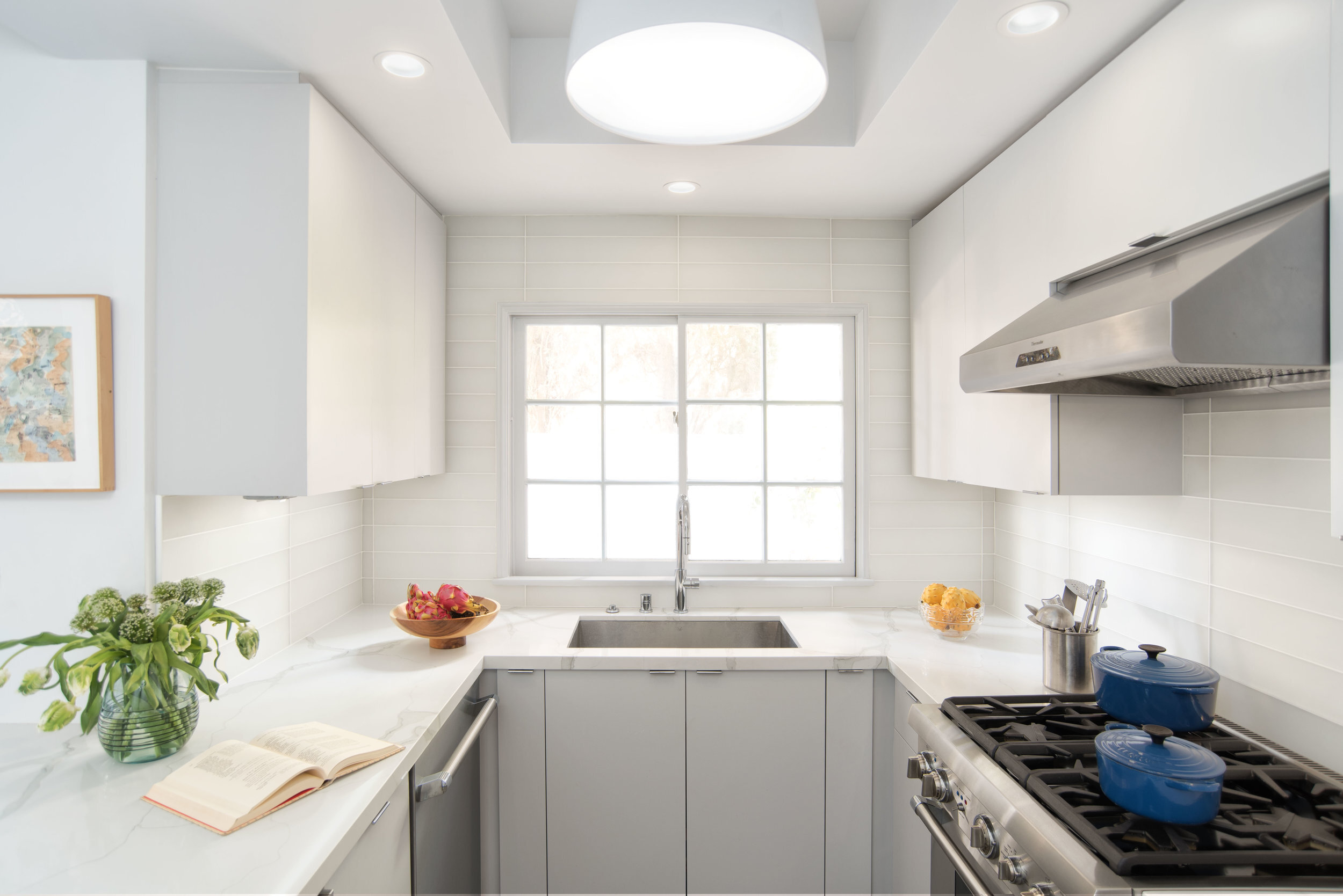
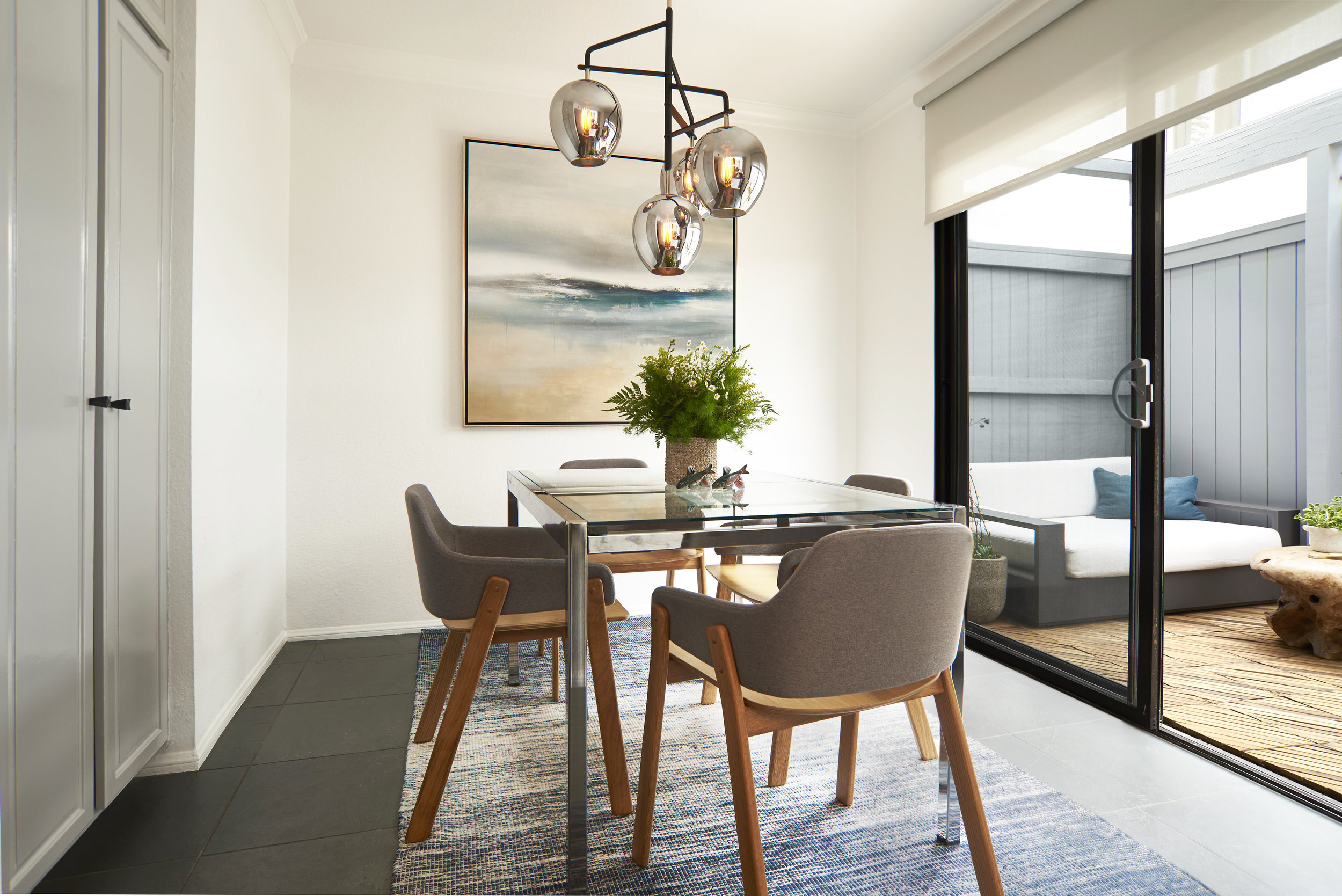
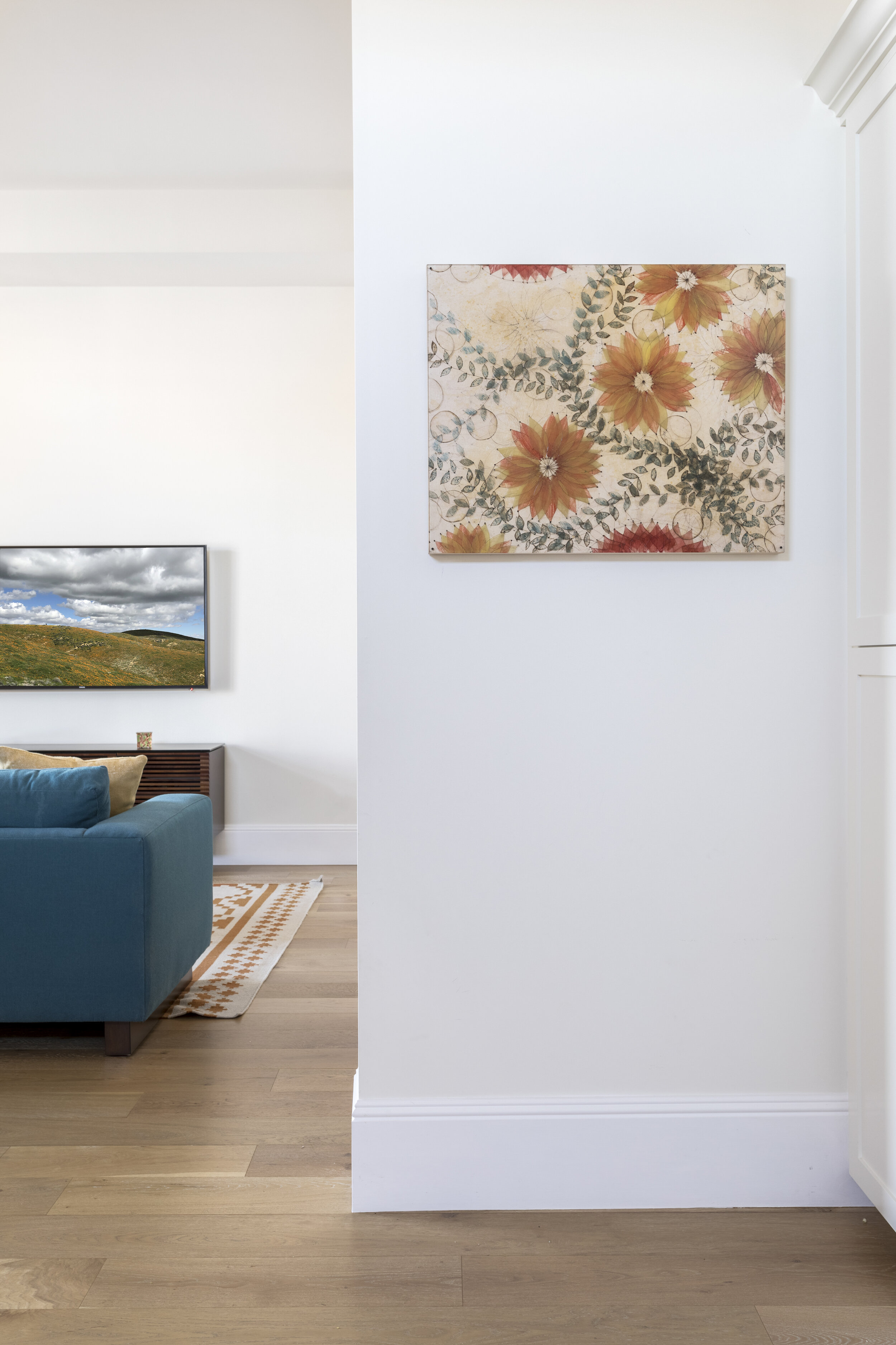
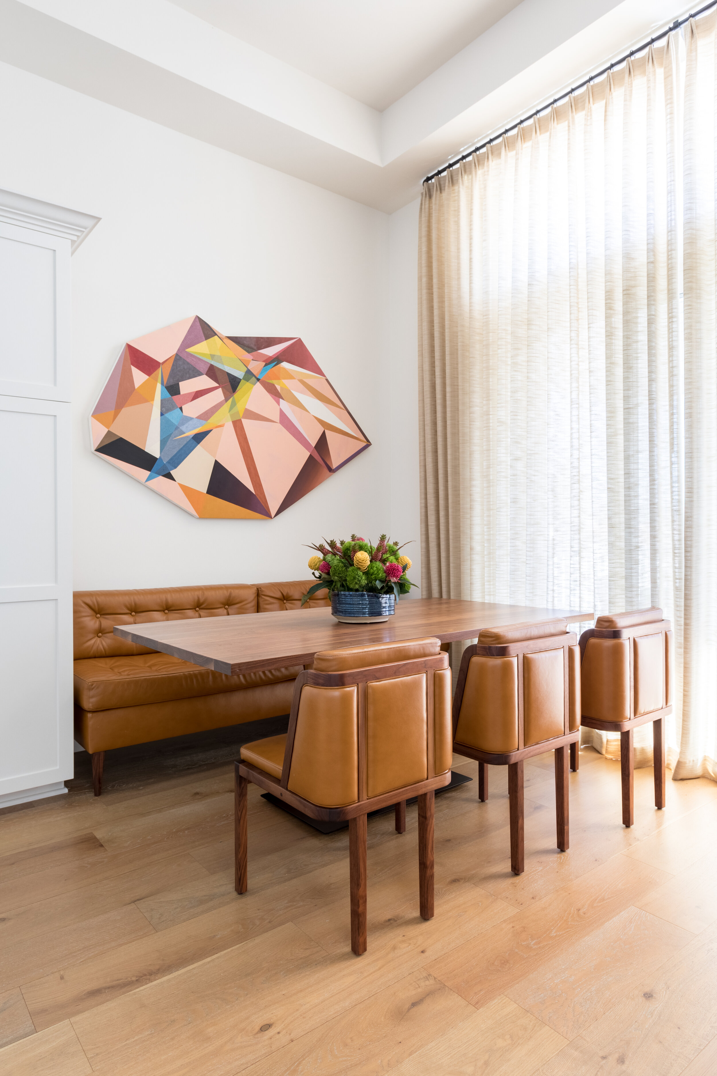
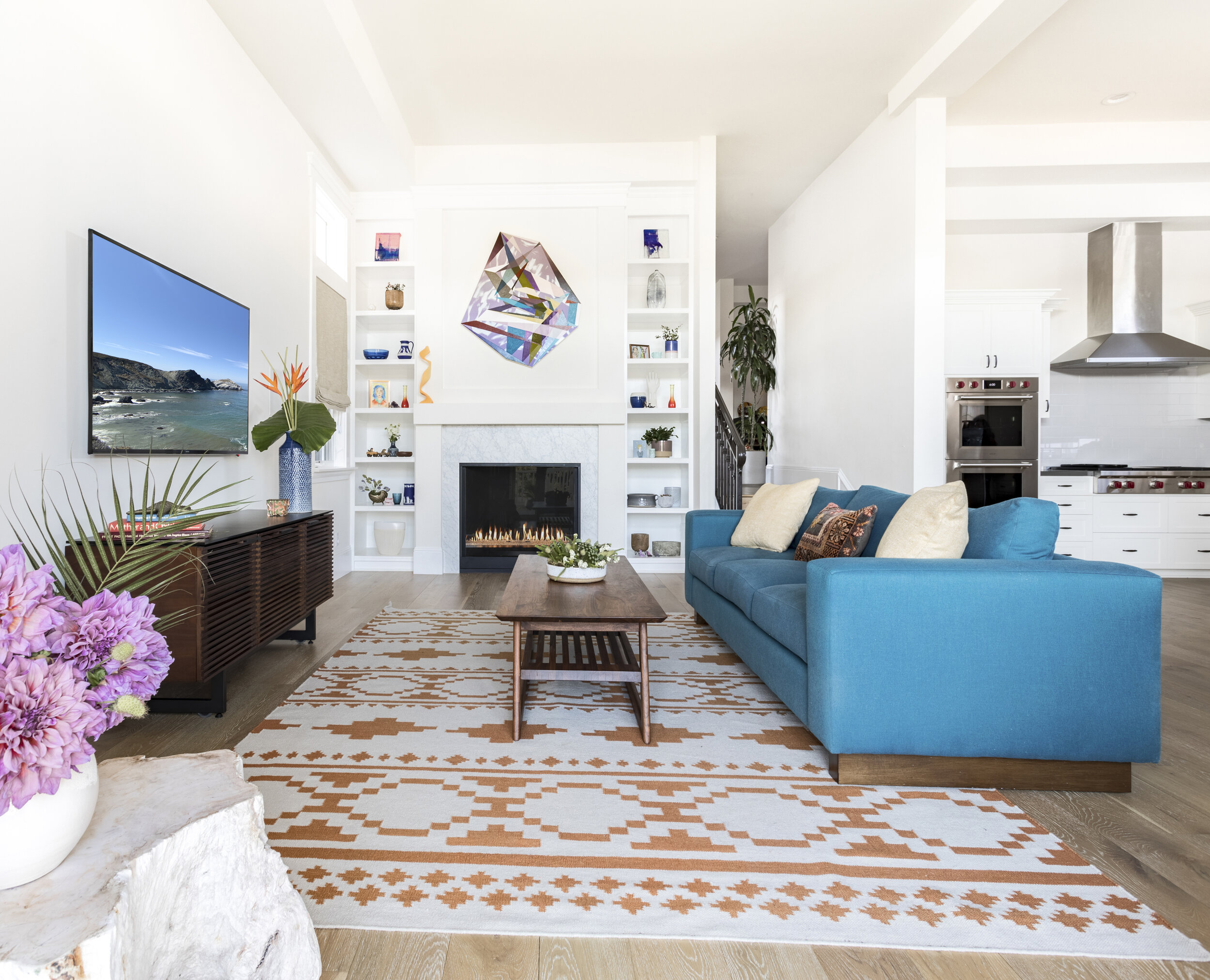
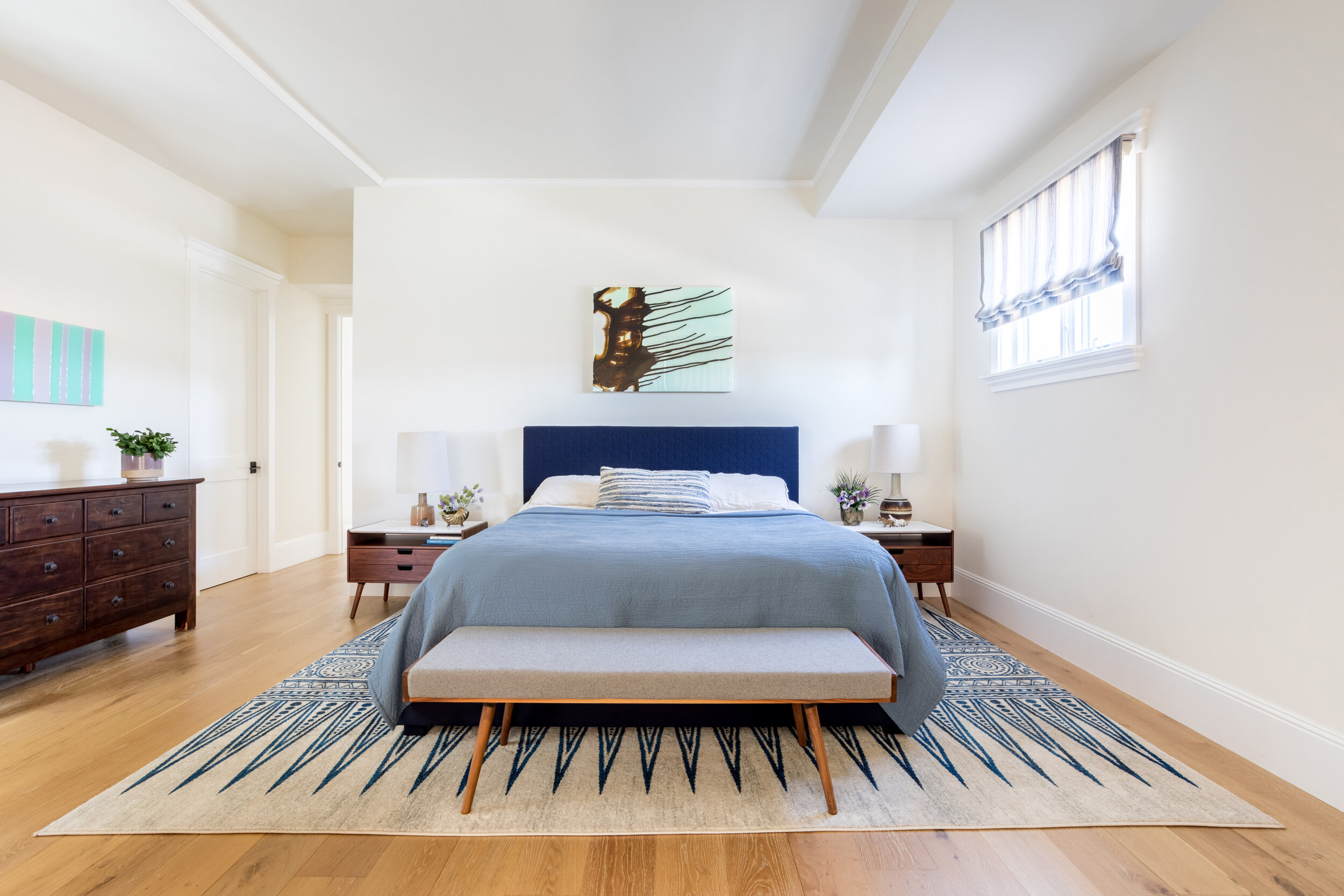
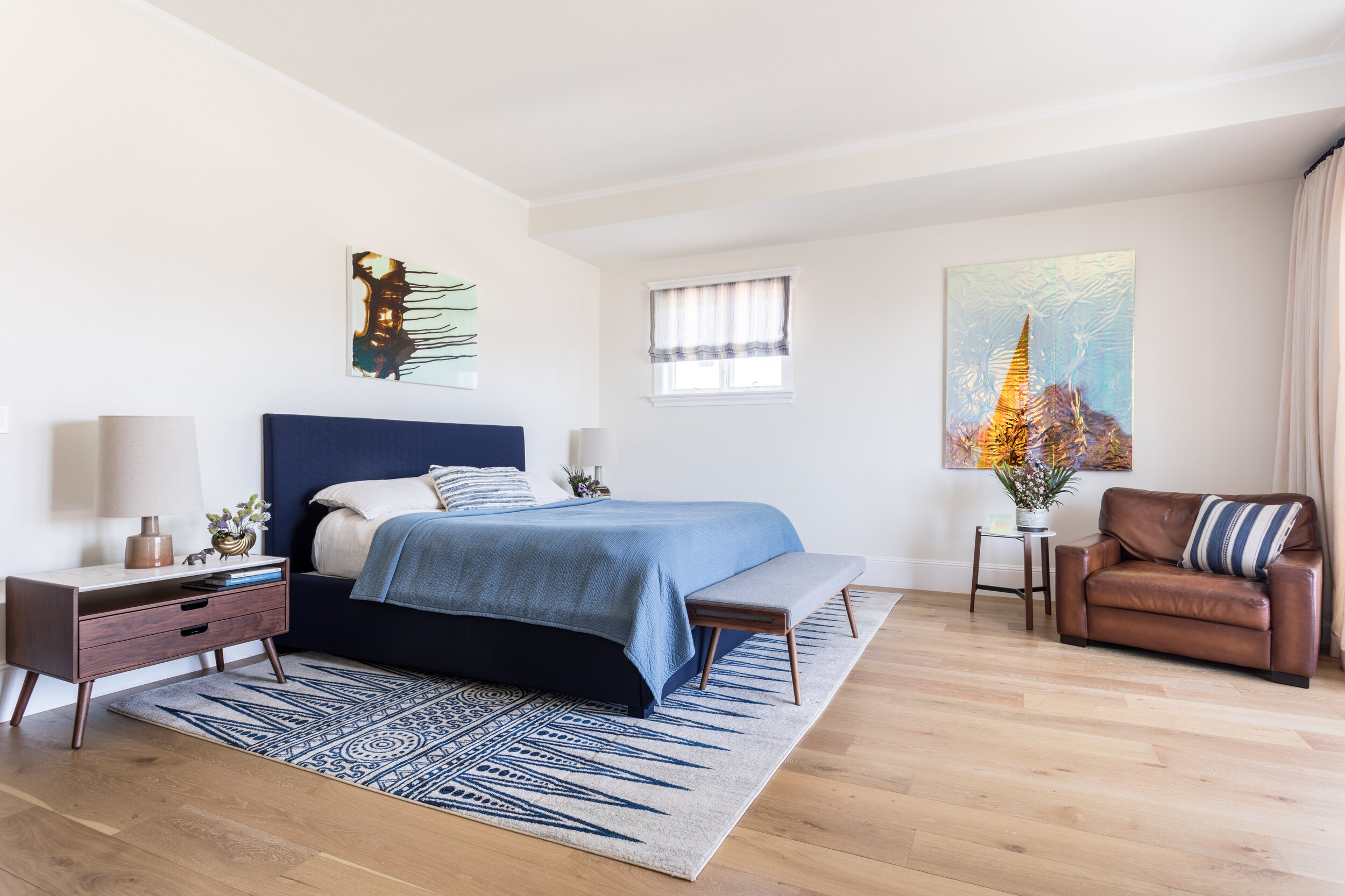
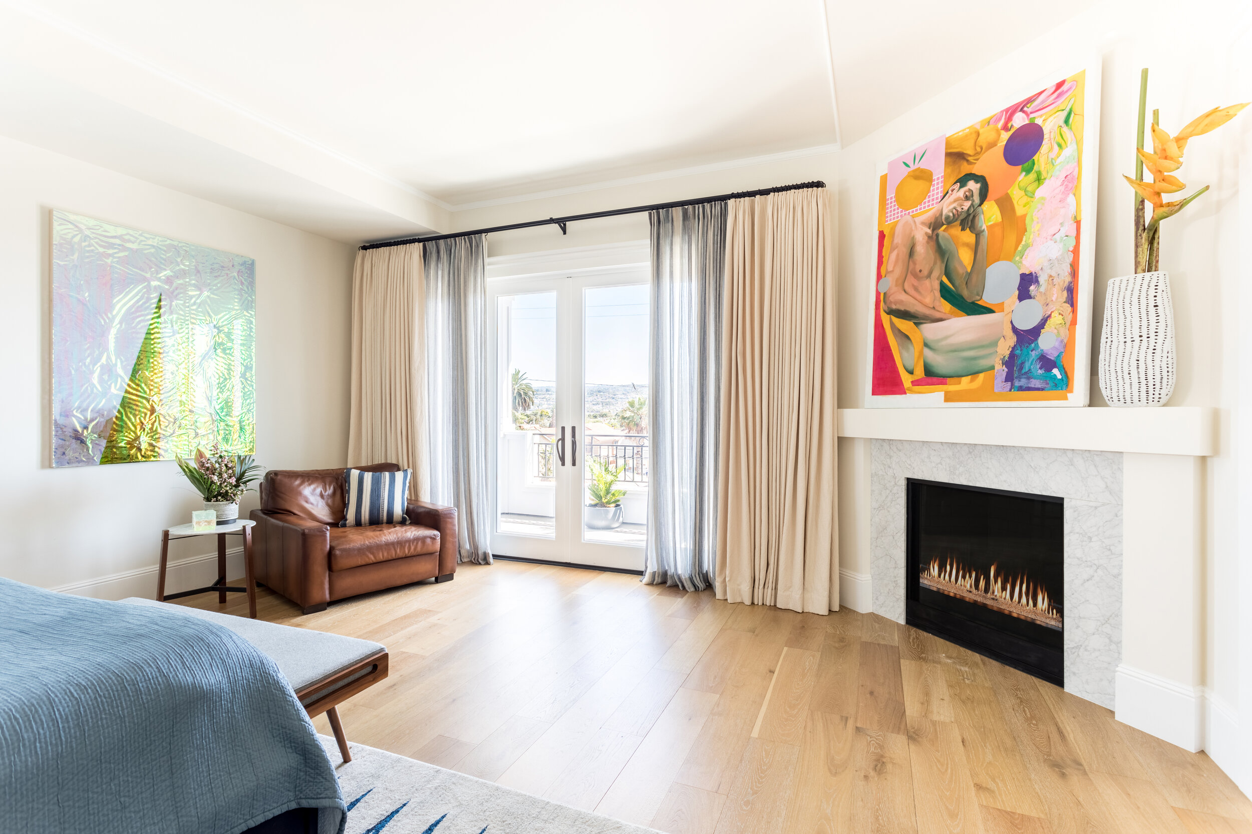
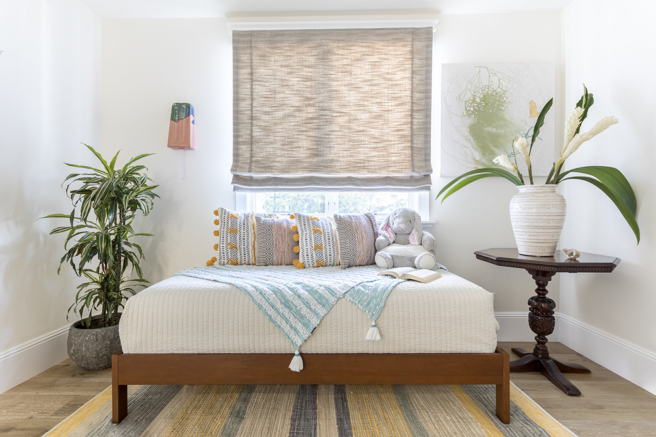
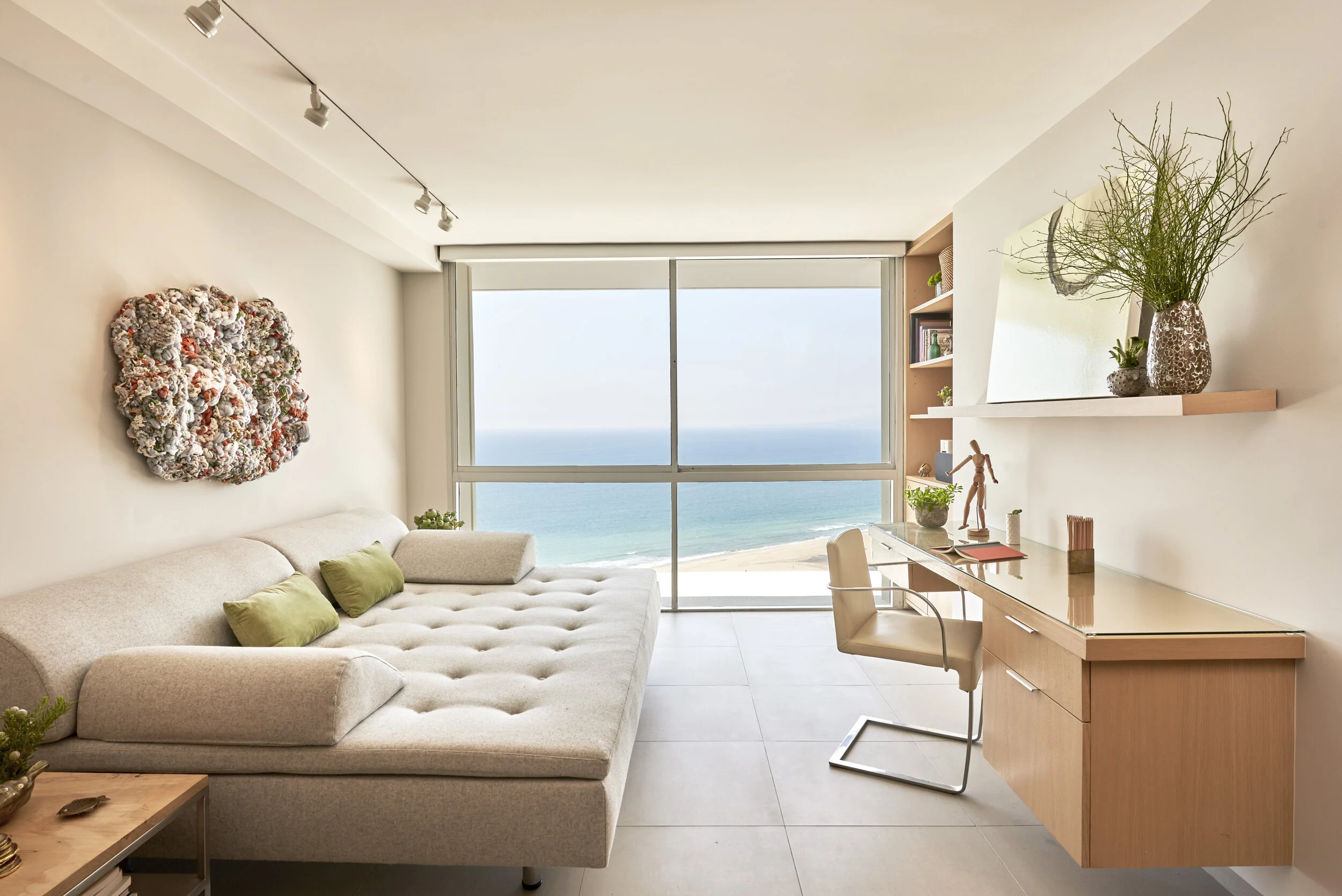
Sarah's talk, "Interior Design for Well-being: an Empathetic Approach," will discuss how vegan home design plays a part in personal and planetary wellbeing. She will explore how home designers can push the boundaries of interiors to improve both individual and global health through physical, mental, and cosmopolitical considerations. Many people are already acutely conscious that, as humans, we are participants in a much larger ecosystem. Sarah will share how we can expand ethical values into our interiors while caring for ourselves and our planet.
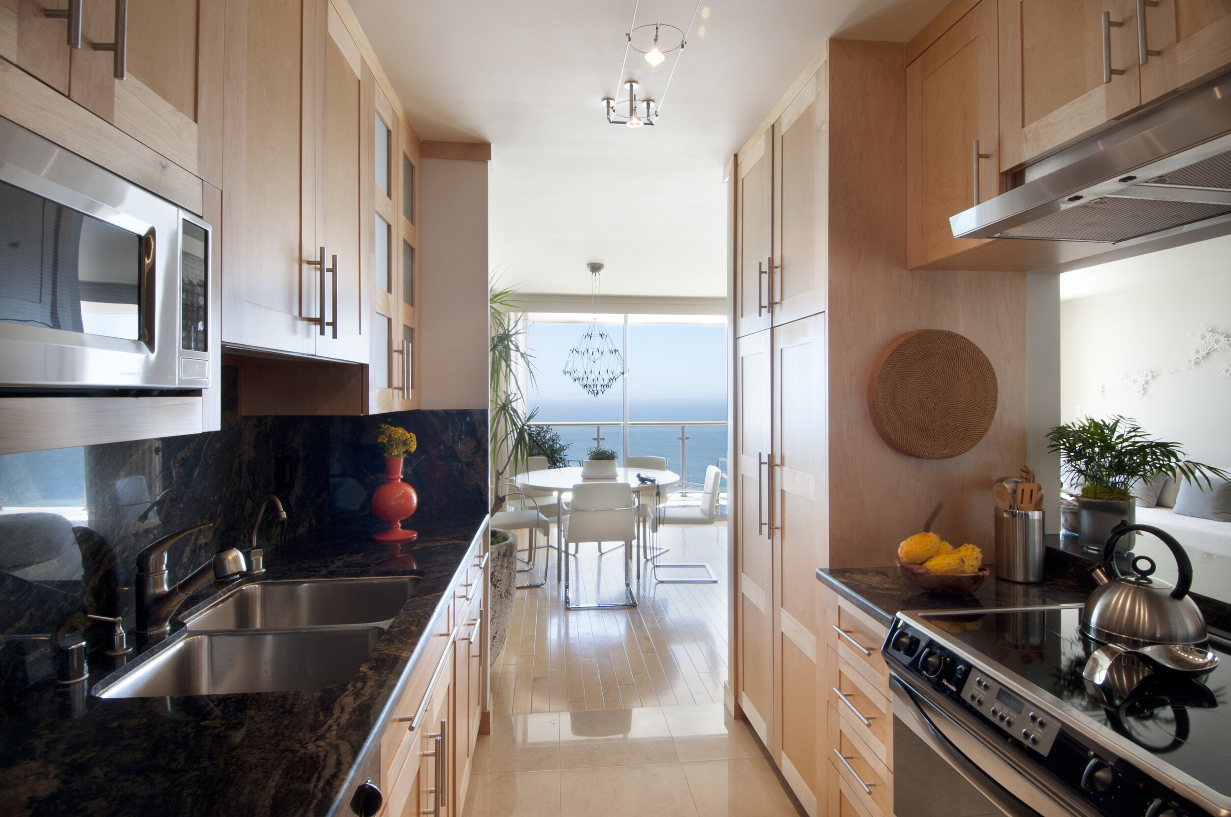
As a LEED and WELL AP, Sarah supports vegan clients through sustainable home design that encourages physical and mental well-being. Sarah's vegan design work has been featured in several publications, including The Hollywood Reporter, LIVEKINDLY, and Aline Dürr's book "Vegan Interior Design."
Vegan Interior Design Week will take place November 01-05, 2021. To register for the event, please visit https://www.veganinteriordesignweek.com.
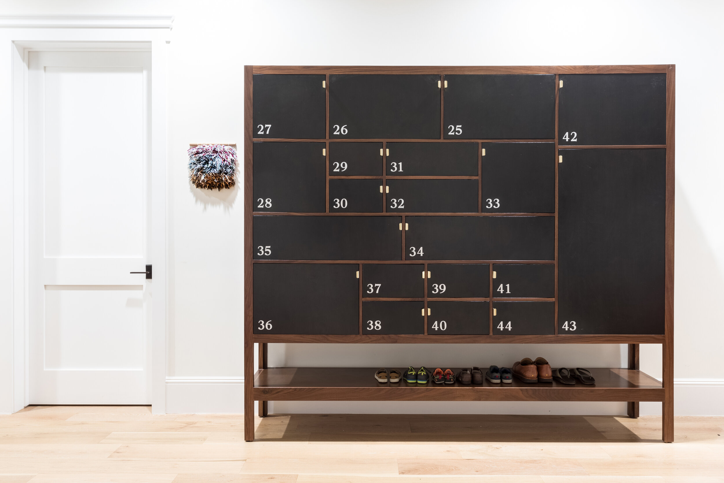
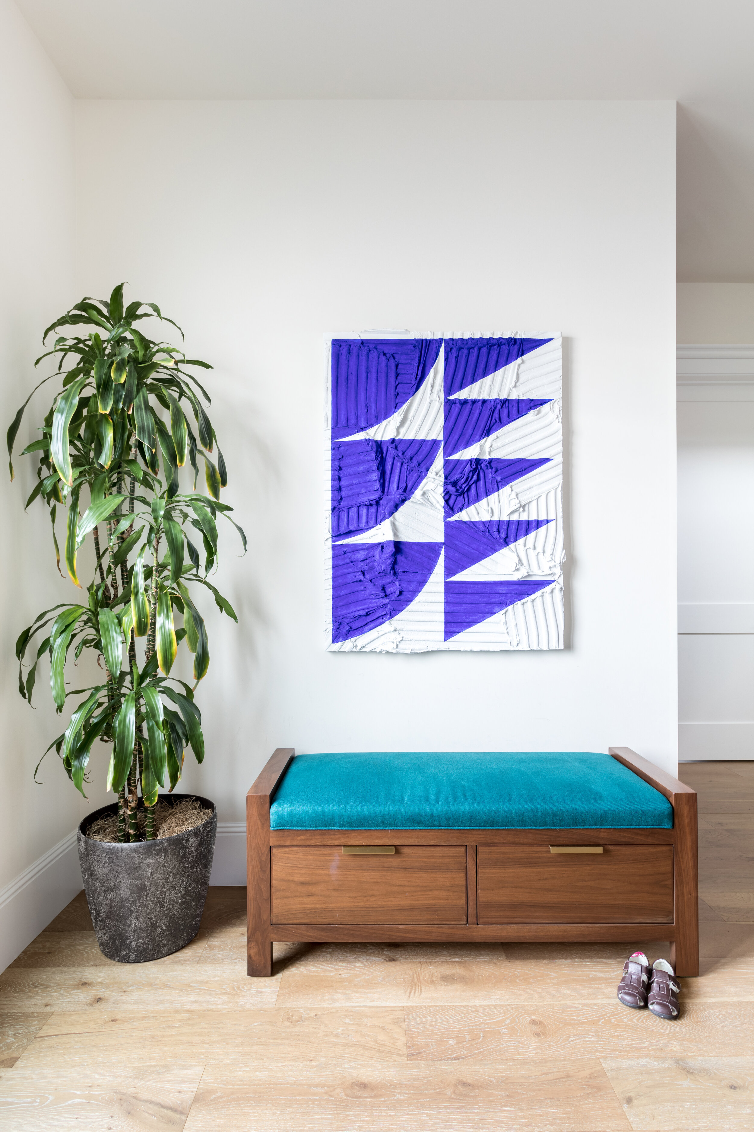
Sarah Barnard is a WELL and LEED accredited designer and creator of environments that support mental, physical and emotional wellbeing. She creates highly personalized, restorative spaces that are deeply connected to art and the preservation of the environment. An advocate for consciousness, inclusivity, and compassion in the creative process, Sarah’s work has been recognized by Architectural Digest, Elle Décor, Real Simple, HGTV and many other publications. In 2017 Sarah was recognized as a “Ones to Watch” Scholar by the American Society of Interior Designers (ASID).