A Carefully Curated Beach Home
/Curating a collection of artwork for the home can be a gratifying process. While we are only beginning to understand the science behind our emotional response to art, humans have produced and sought artwork throughout the history of their existence. Researchers from the University College London found that looking at art that we perceive as beautiful activates the pleasure centers in our brains and produces a response that’s akin to falling in love, as many of us can confirm anecdotally.
It only makes sense that while designing a space, we should turn to artwork to help influence our emotional experience. As a home designer with a fine art background, Sarah Barnard recognizes the significance of using art for well-being in home design. For a recent residential project by the beach, Barnard sourced an impressive collection of artwork to enhance the lifestyle of the homeowners.
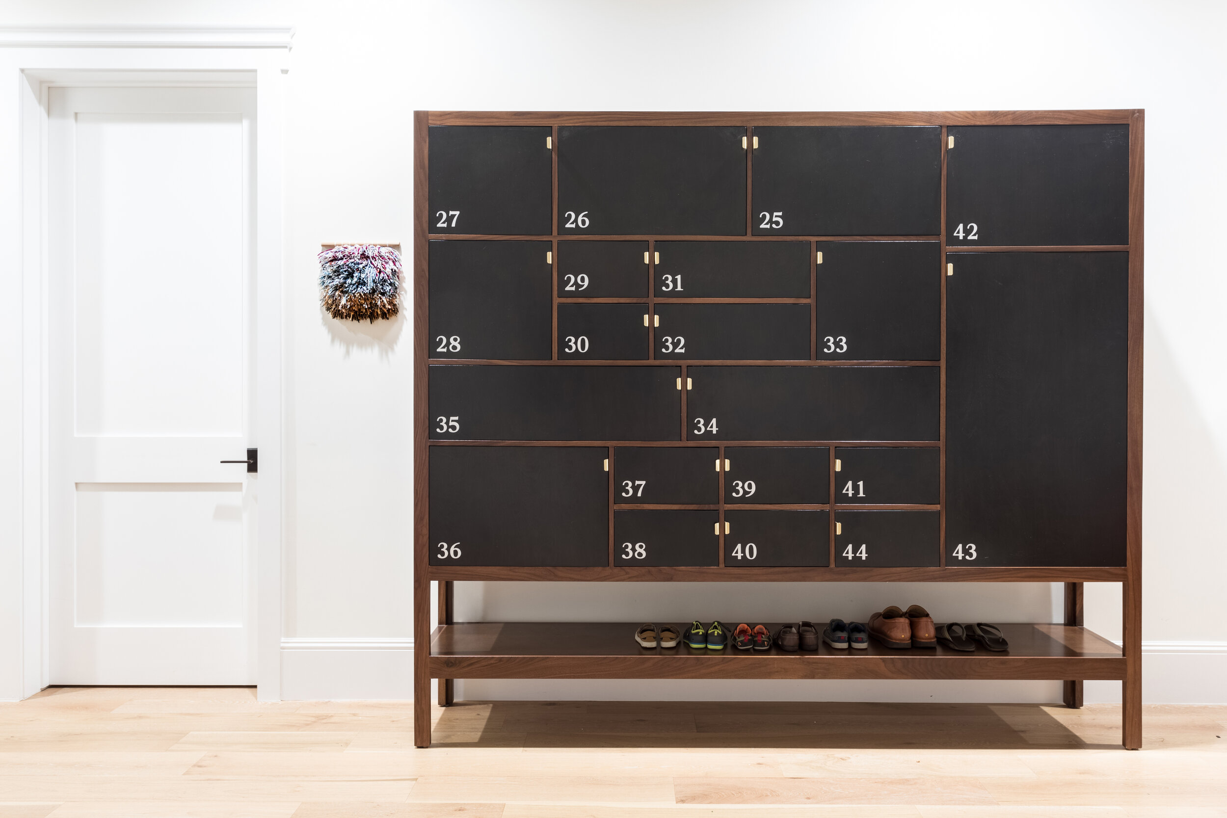
PHOTO BY: ACE MISIUNAS
Textile artwork by Aneesa Shami.
A textile piece by artist Aneesa Shami warmly greets visitors at the entrance, supporting her assertion that attention to detail can “bring comfort and peace of mind from the chaotic world.” Barnard fills the corner with playful, order seeking pieces, most literally seen in a bespoke getabako cabinet used for organization and storage. Nearby hangs Michelle Jane Lee’s painting Blue (Wave On). Its heavily textured and undulating canvas finds structural contrast in geometric blue forms, painted with pinpoint precision.
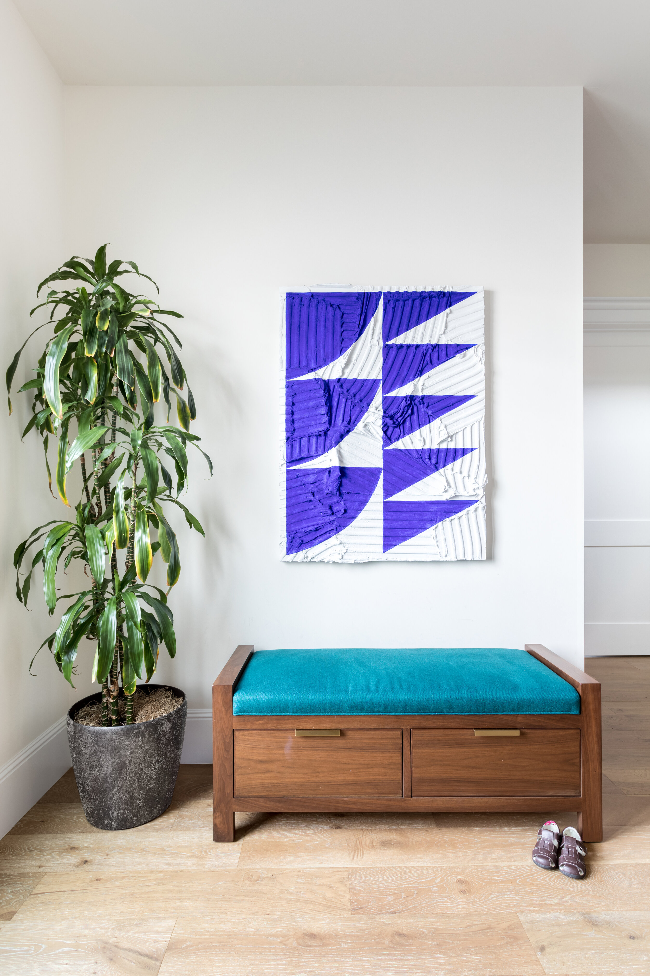
PHOTO BY: ACE MISIUNAS
Painting by Michelle Jane Lee.
In the kitchen nook, an engraving on lucite by artist Karen Sikie entitled Sunflowers lends an ethereal touch. “I hope my work is a reminder of our intrinsic connection to the natural world,” explains Sikie. Here, Barnard’s selection of artwork connects the home to nature in an area where architectural limitations prevent plants or windows.
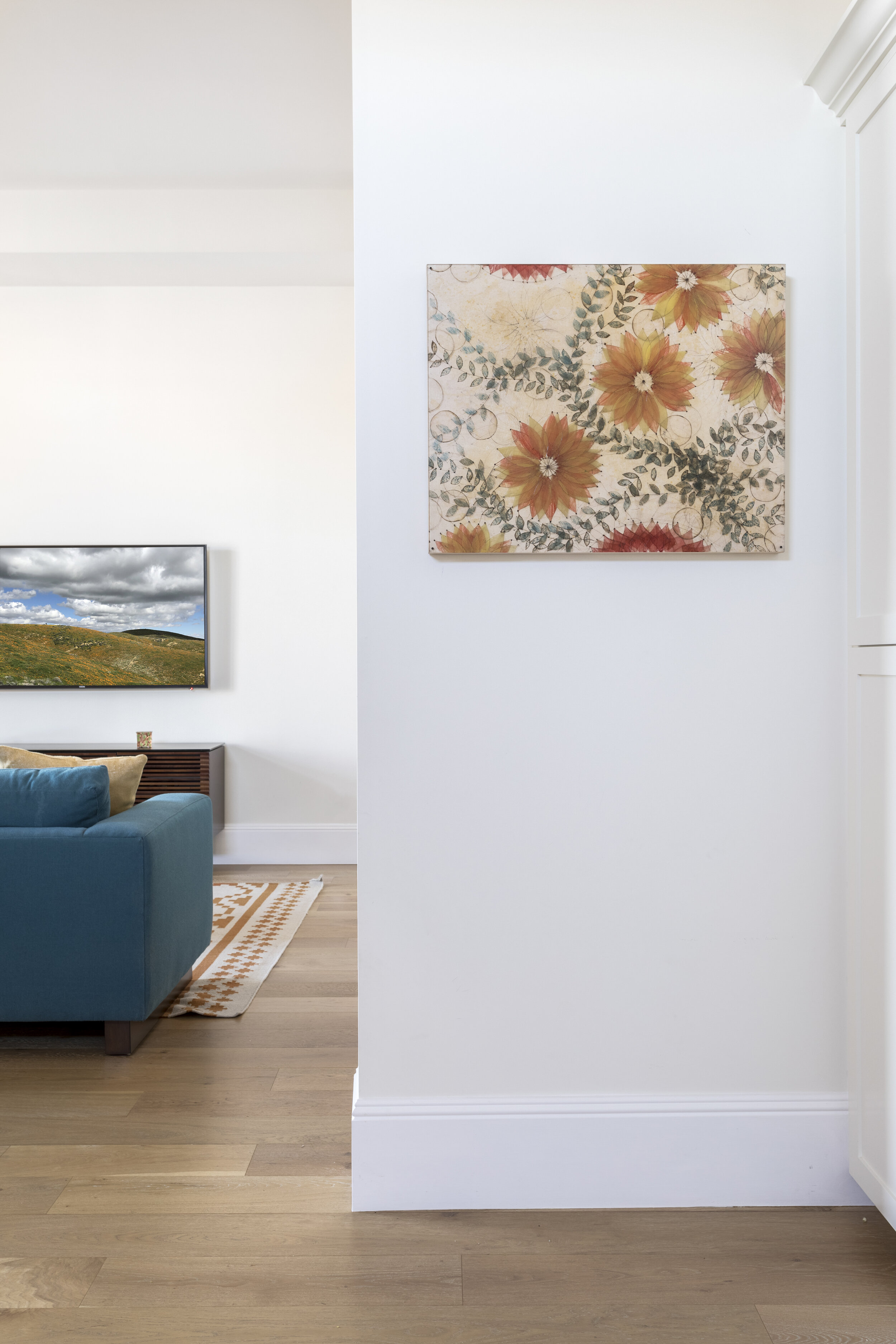
PHOTO BY: ACE MISIUNAS
Painting by Karen Sikie.
Continuing to consider the home’s structural components, Barnard installed Kevin Moore’s Scalard Field above the kitchen table. Selecting artwork with an unconventional shape can add architectural interest to an interior without the commitment of a remodel. “The shaped canvas I make are meant to interact with the architectural lines in the home,” says Moore. “There is a symbiotic relationship between the form in my paintings and architecture.”
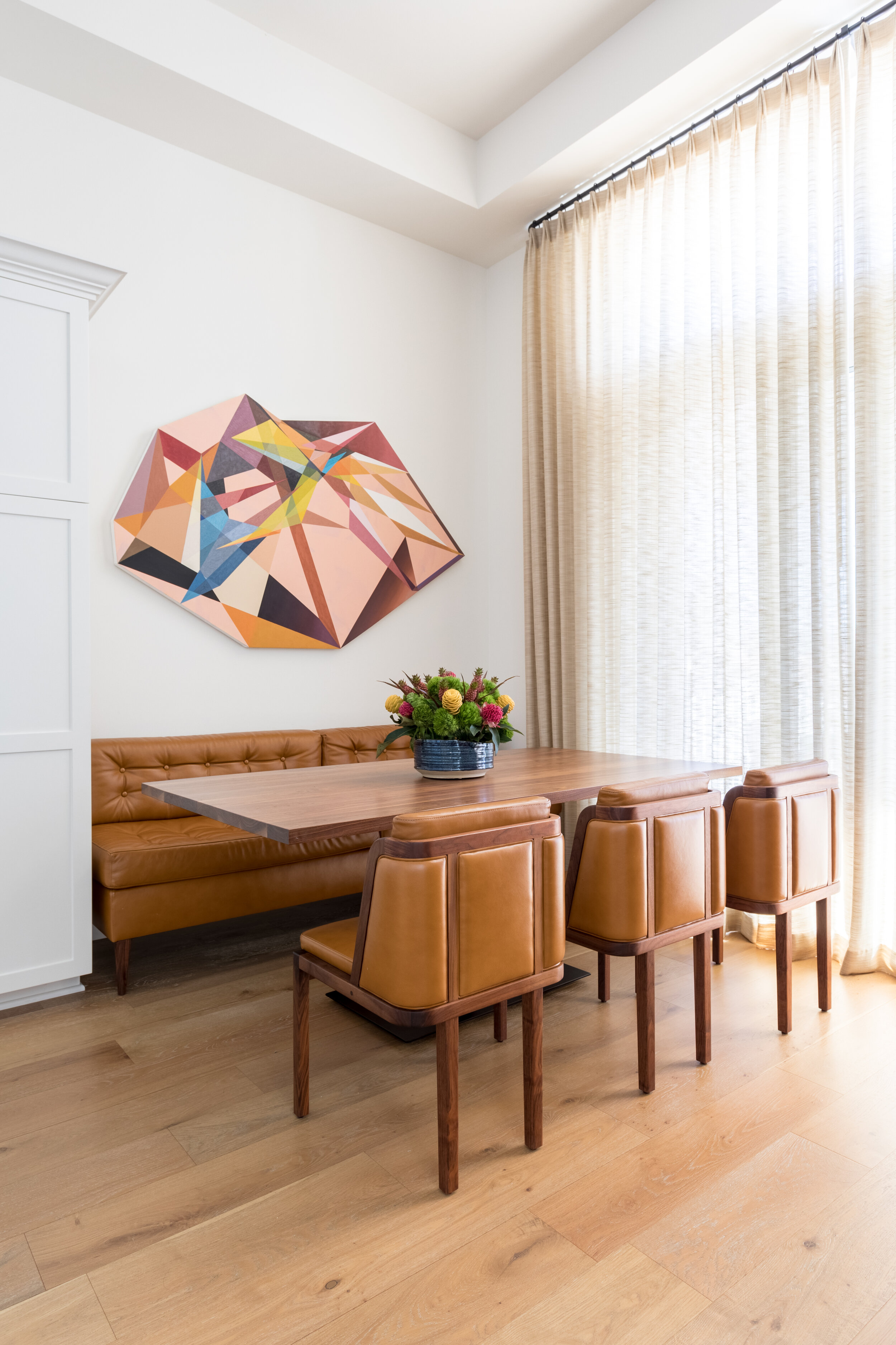
PHOTO BY: ACE MISIUNAS
Painting by Kevin Moore.
Finding Home, an abstract painting by Karrie Ross, mimics the flow of water and compliments an elegantly crafted dining table. Combining multiple works can feel intimidating — especially in an open-concept space such as this — but Ross insists there is no ‘wrong’ way to choose art for your home. “Collectors buy art for whatever reason they want to, whether it’s to match a color, a mood, or just because they can’t take their eyes or mind away from the way it touches them,” she says. Working with an interior designer is an excellent way to relieve the stress of incorporating several beloved pieces of art into the home.

PHOTO BY: ACE MISIUNAS
Painting by Karrie Ross.
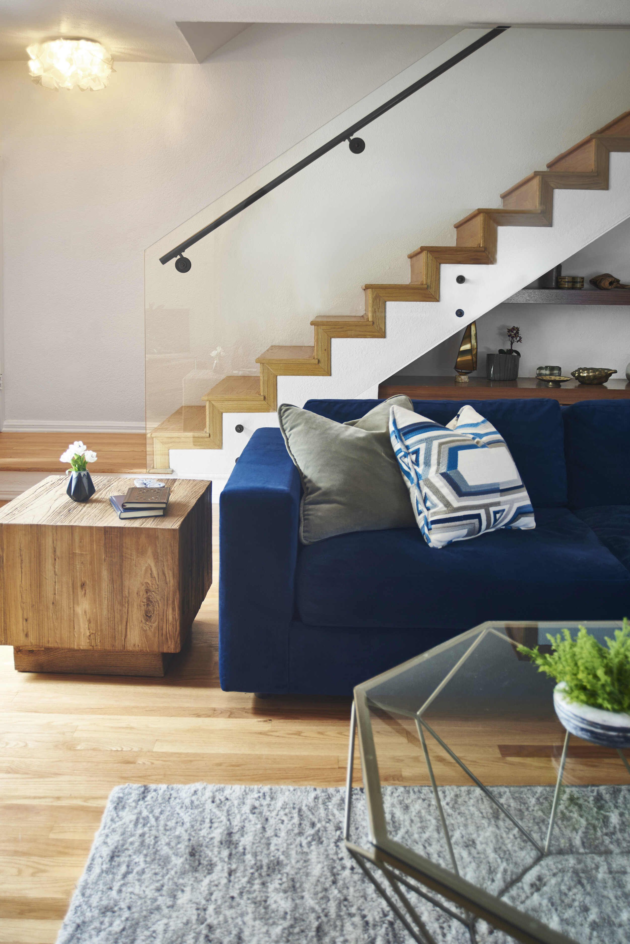
Barnard expertly combined artwork in the living area, where a painting by Kevin Moore sits above the fireplace. Built-in bookshelves frame the piece, showcasing work by Renae Barnard, Kitty Cooper, Melissa Halozan, Katie Hoffman, and Abby Sin.
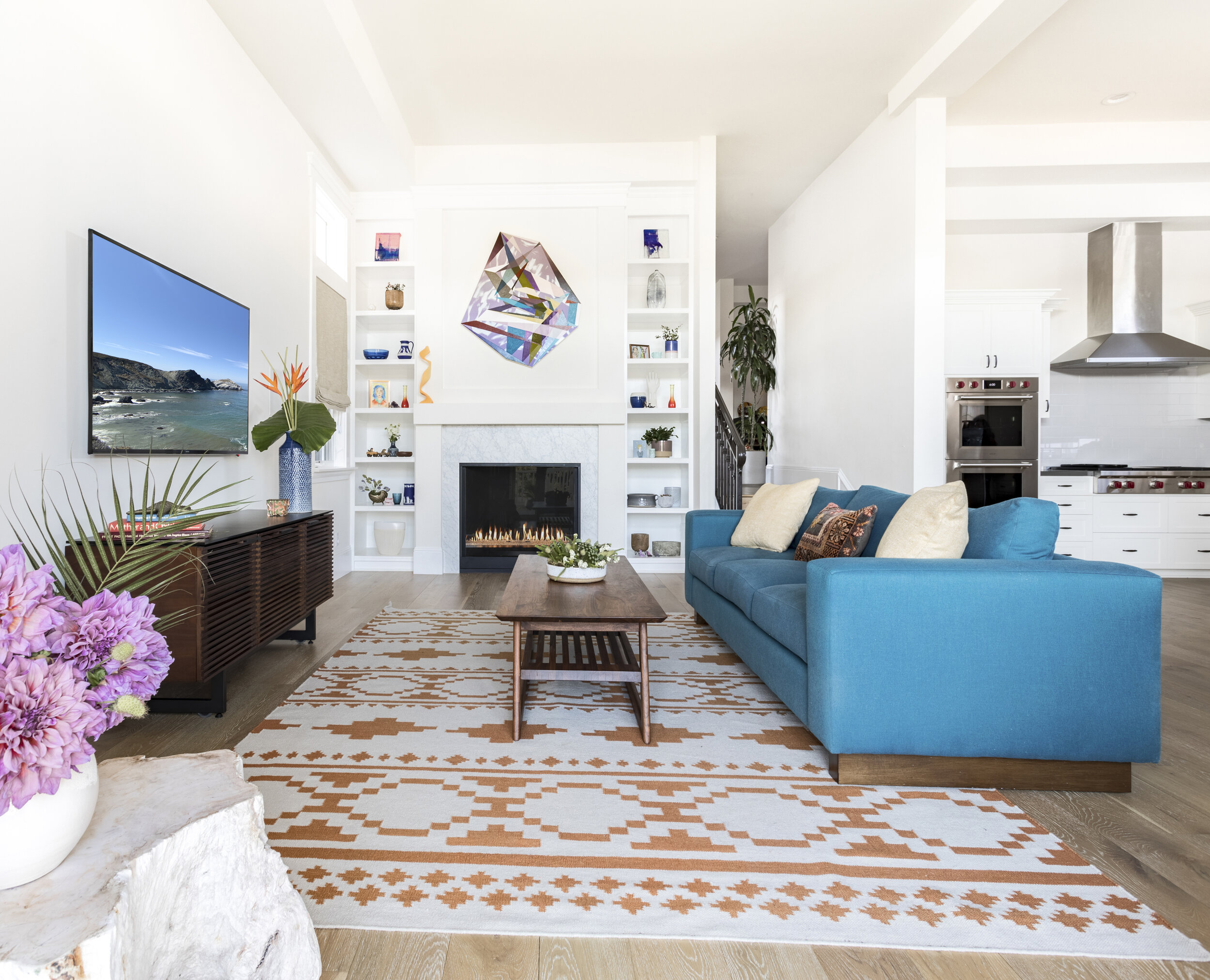
PHOTO BY: ACE MISIUNAS
Art by Renae Barnard, Kitty Cooper, Melissa Halozan, Katie Hoffman, Kevin Moore, and Abby Sin.
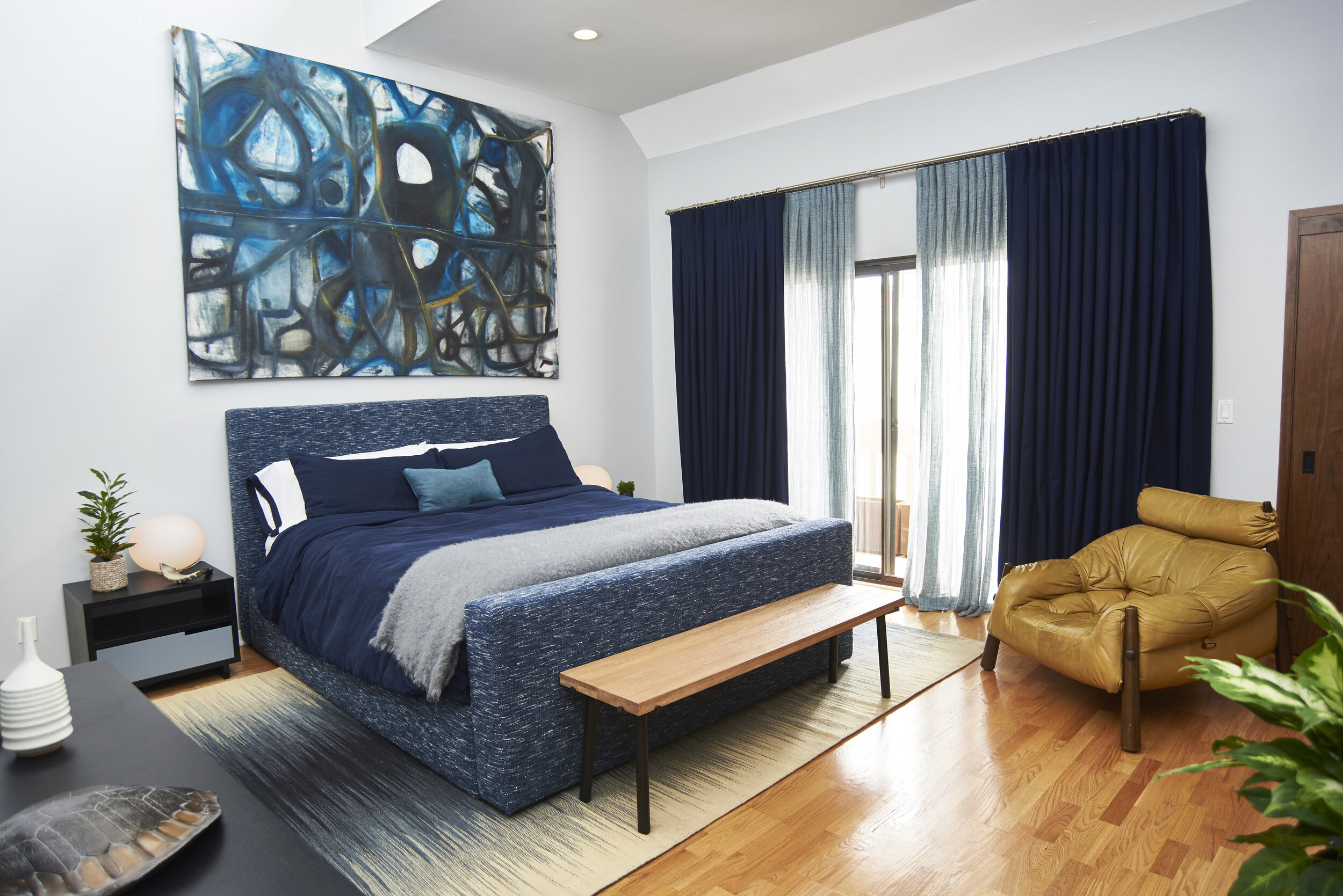
In the bedroom, Ruben Vincent’s mixed-media paintings hang over the bed and an heirloom dresser. “For me painting is a form of thinking that fuses knowledge of materials, a fascination with surface qualities, and an obsession with color,” he explains.
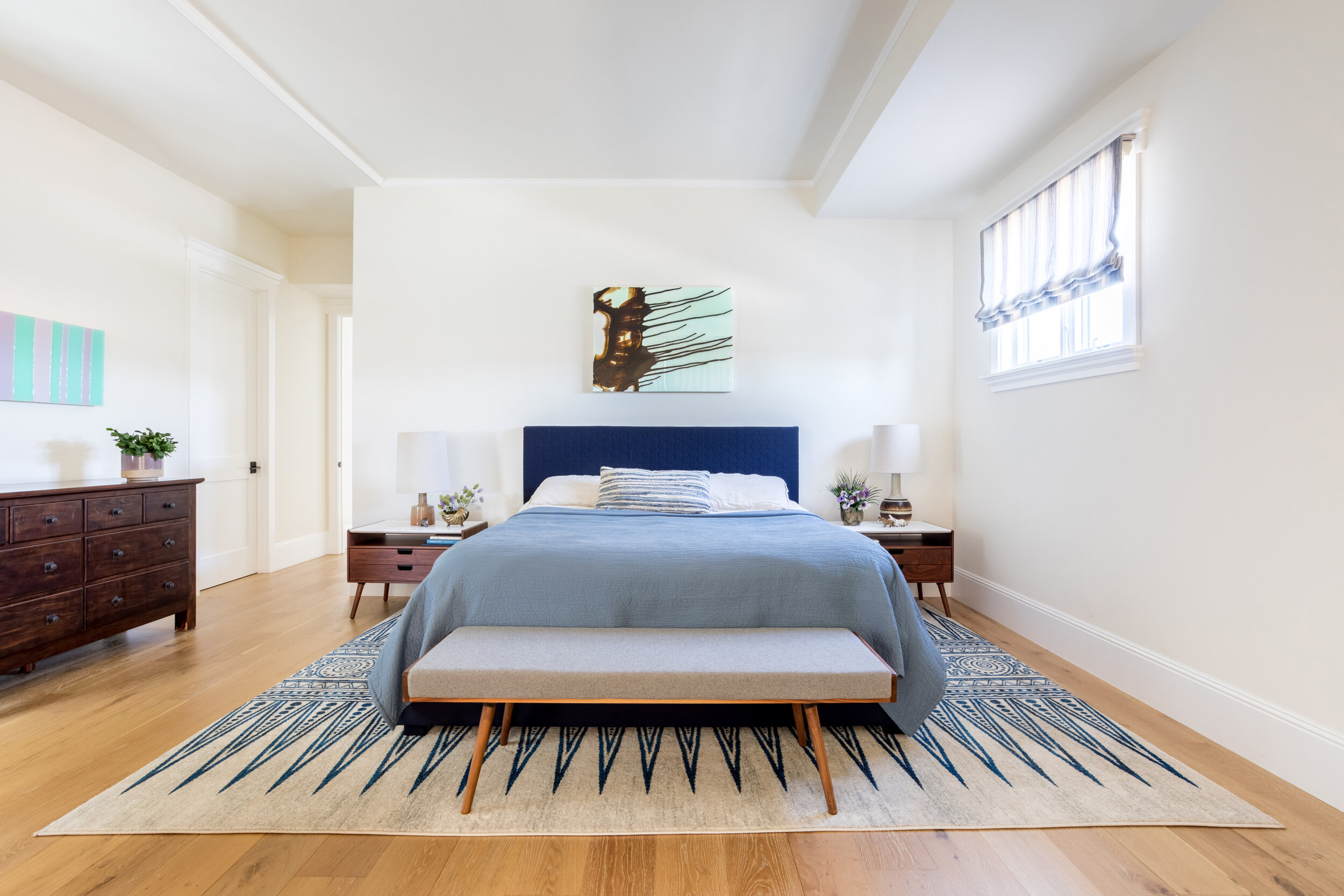
PHOTO BY: ACE MISIUNAS
Paintings by Ruben Vincent.
While clients often use mirrors to open spaces and spread light, Barnard used a reflective painting by Sin to serve the same function while adding depth and color to the room. “Paintings can become so much more than wall decor when expertly placed within a home,” notes Sin, the creator of North, which glitters behind the reading nook. “My work incorporates light-reactive films to create bold color and metallic effects. When placed in an area with ample natural light, iridescent colors shift, and the artwork functions as a prism casting reflected light.”
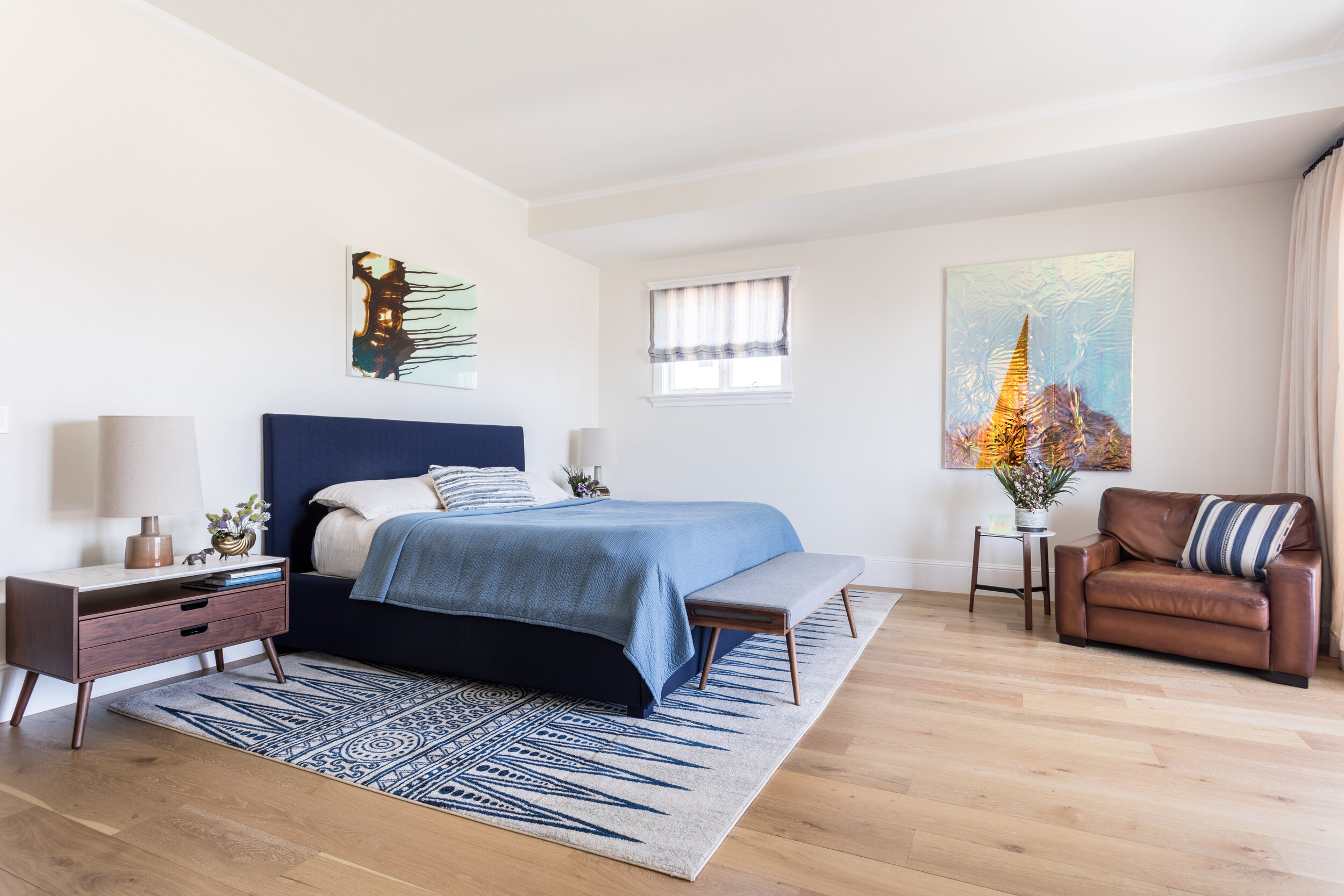
PHOTO BY: ACE MISIUNAS
Paintings by Ruben Vincent and Abby Sin.
An oil painting on canvas by Jennifer King entitled Dream Boy sits above the fireplace mantel. It’s surreal imagery, saturated colors, and a brooding subject serve as the bedroom’s focal point. “I enjoy the idea of art being incorporated into people’s lives, not just as an investment but as something they love enough to see every day,” says King. This philosophy is at the root of Barnard’s selections, as these works of art become integrated with the client’s daily routines.
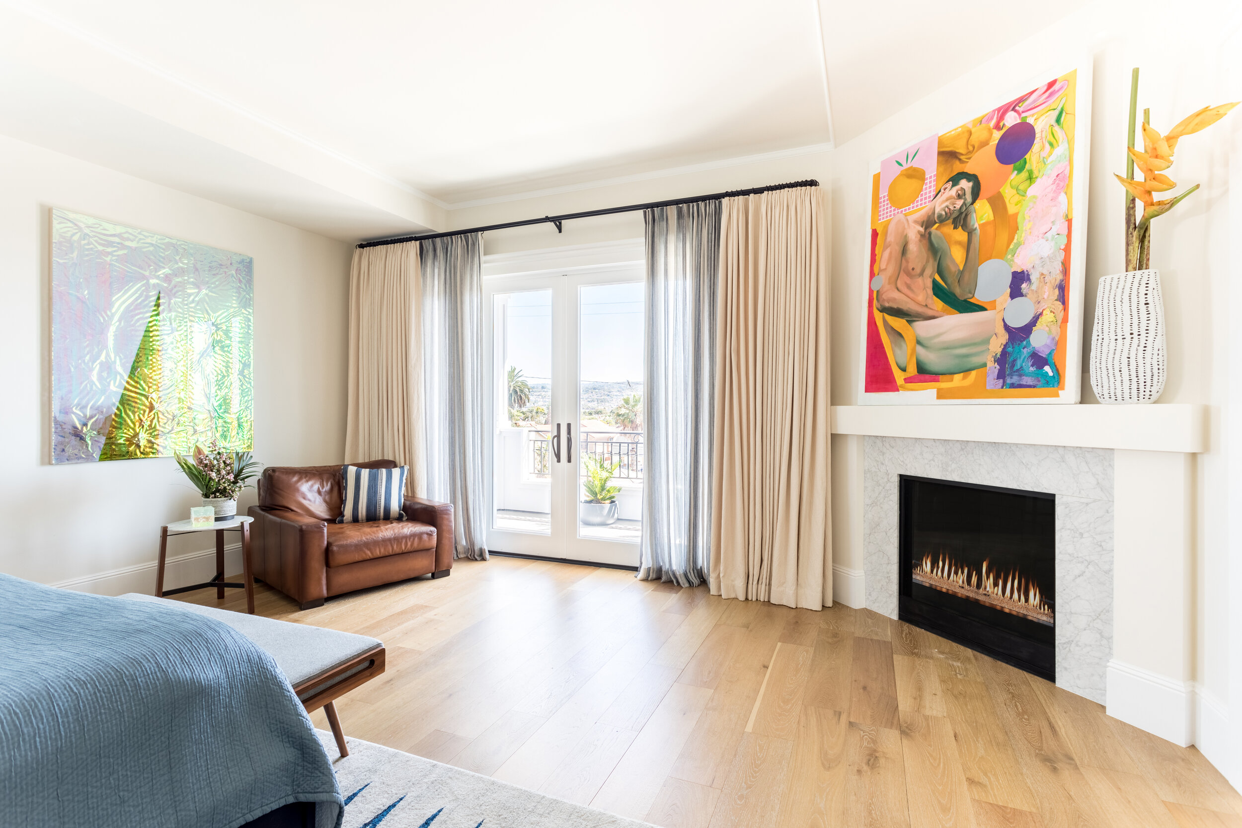
PHOTO BY: ACE MISIUNAS
Paintings by Jennifer King and Abby Sin.
In the sports and entertainment room, Gianna Vargas’ painting Phoenix brings depth and intrigue to a casual and comfortable space. Even the ensuite bath is embellished with art and features a custom roman shade trimmed with delicate embroidery and a small painting on panel by Sin.
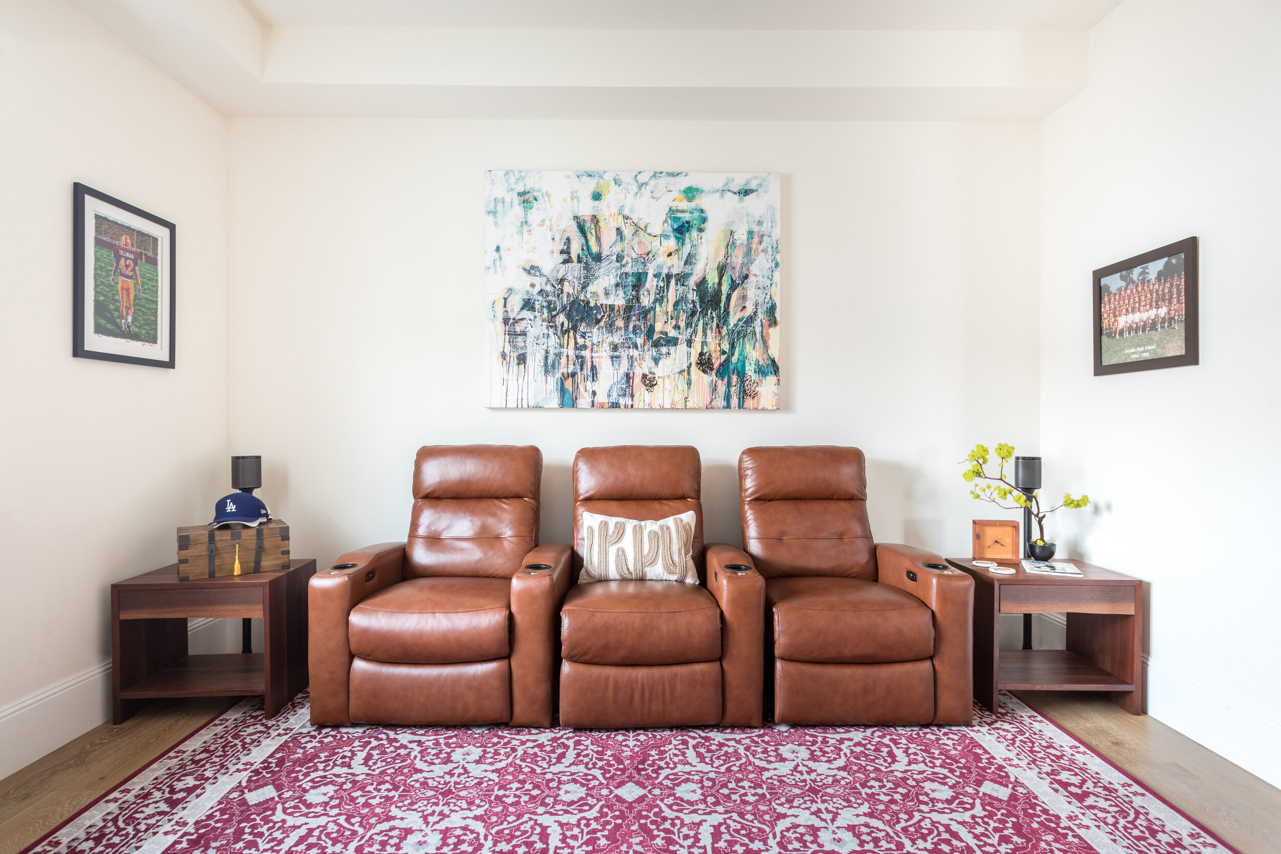
PHOTO BY: ACE MISIUNAS
Painting by Gianna Vargas.
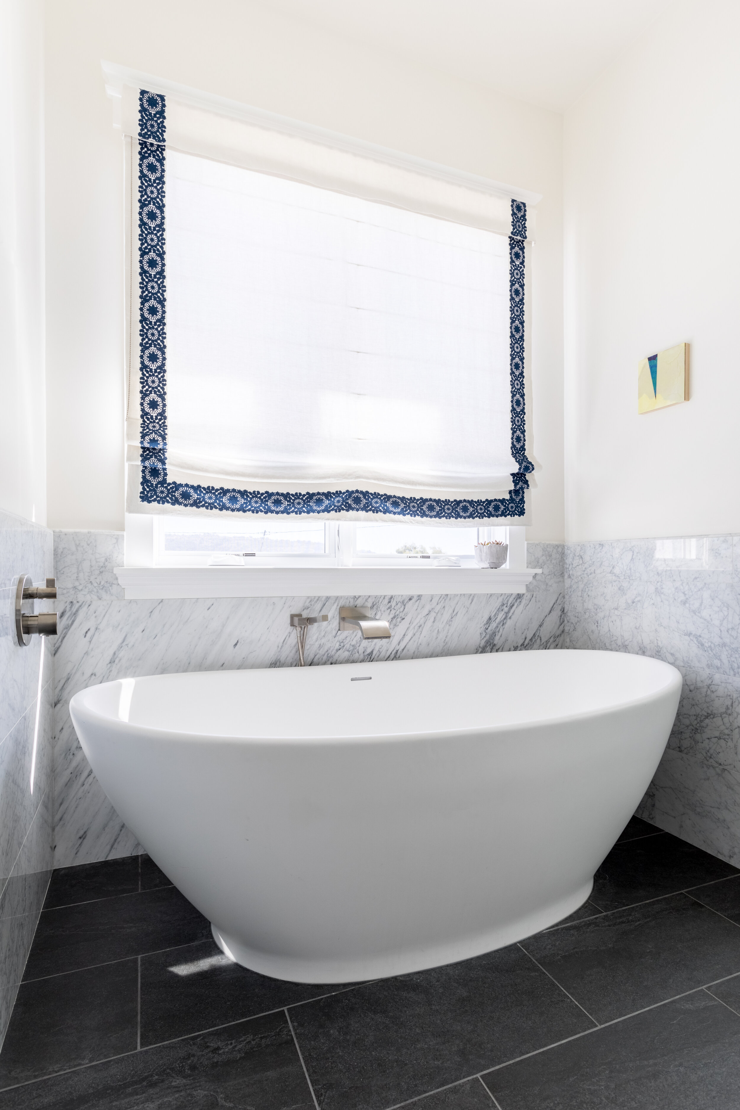
PHOTO BY: ACE MISIUNAS
Painting by Abby Sin.
The artwork featured in the guest suite feels playful and unpredictable — Rose Gold Popsicle, a resin sculpture by Betsy Enzensberger, is placed opposite Reaching 2, another painting by Karrie Ross. “With my work, the message is simple: Joy,” affirms Enzensberger. “This is what drives me to keep creating. It makes me happy to bring others joy.”
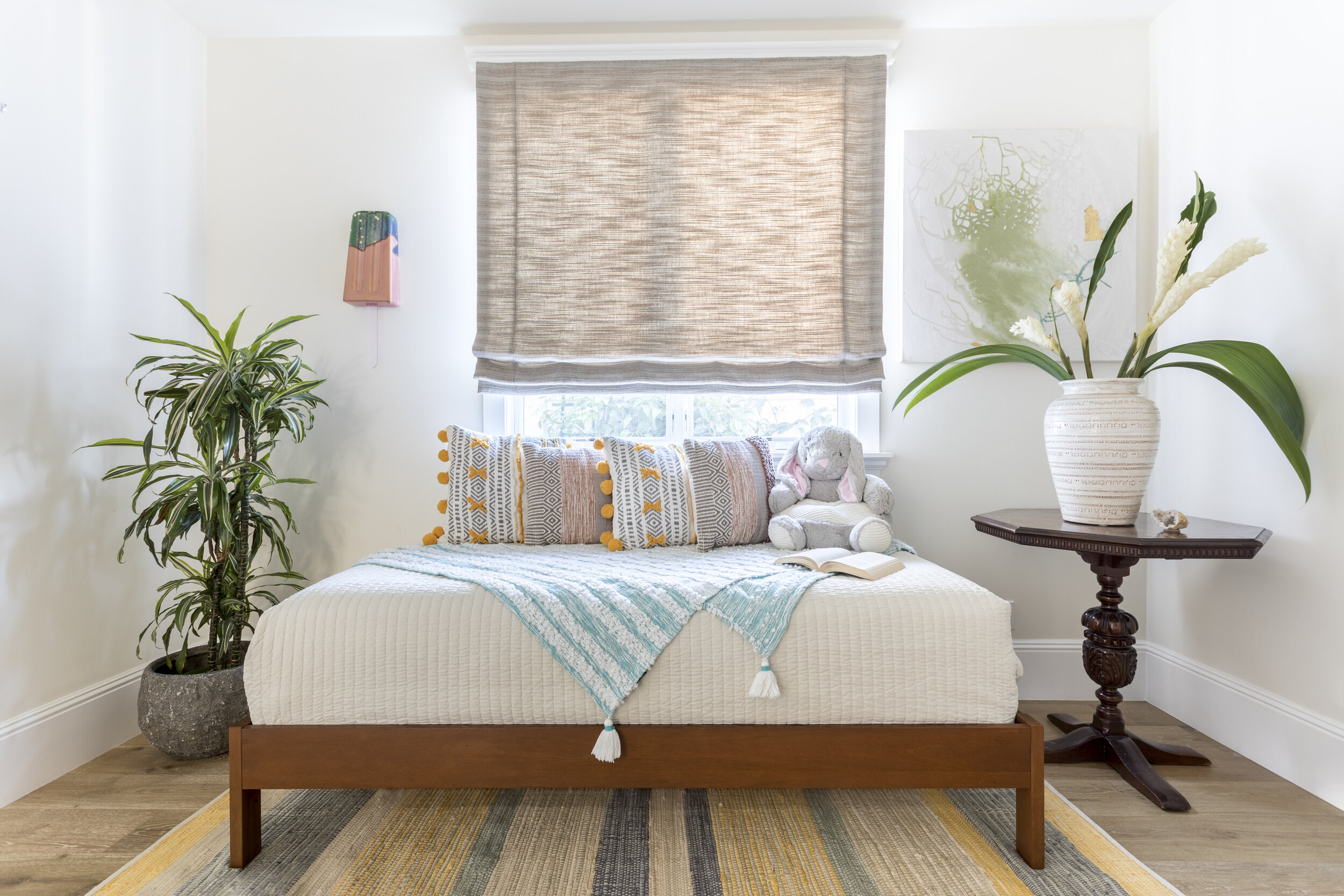
PHOTO BY: ACE MISIUNAS
Art by Betsy Enzensberger and Karrie Ross.
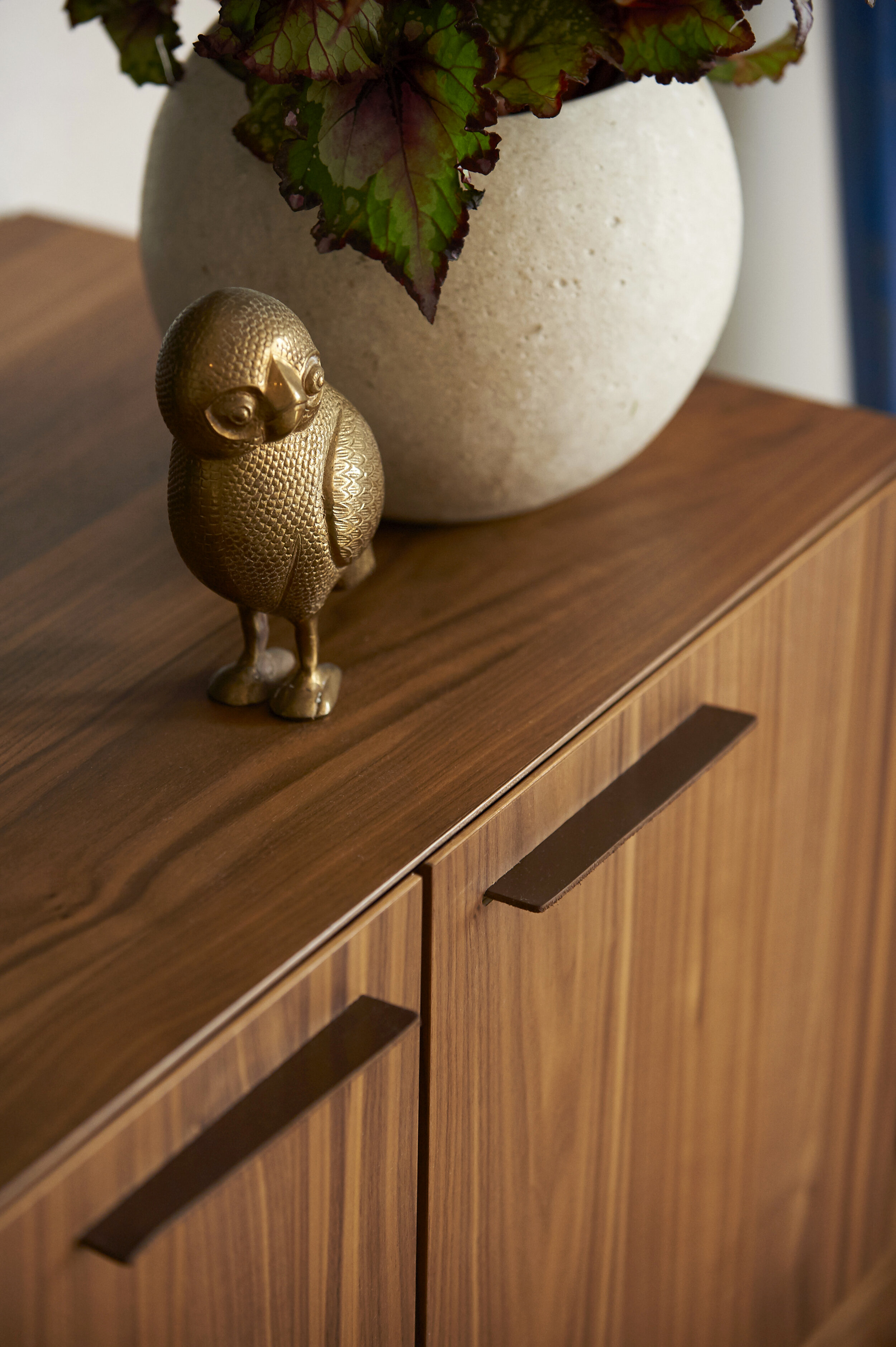
Barnard utilized her long-standing relationships with local artists to curate a collection to inspire her clients and contribute to their wellbeing. The result is a colorful, kid-friendly space featuring a wide range of pieces that have the potential to appreciate in value— from handmade textile art to abstract paintings and tabletop sculptures.
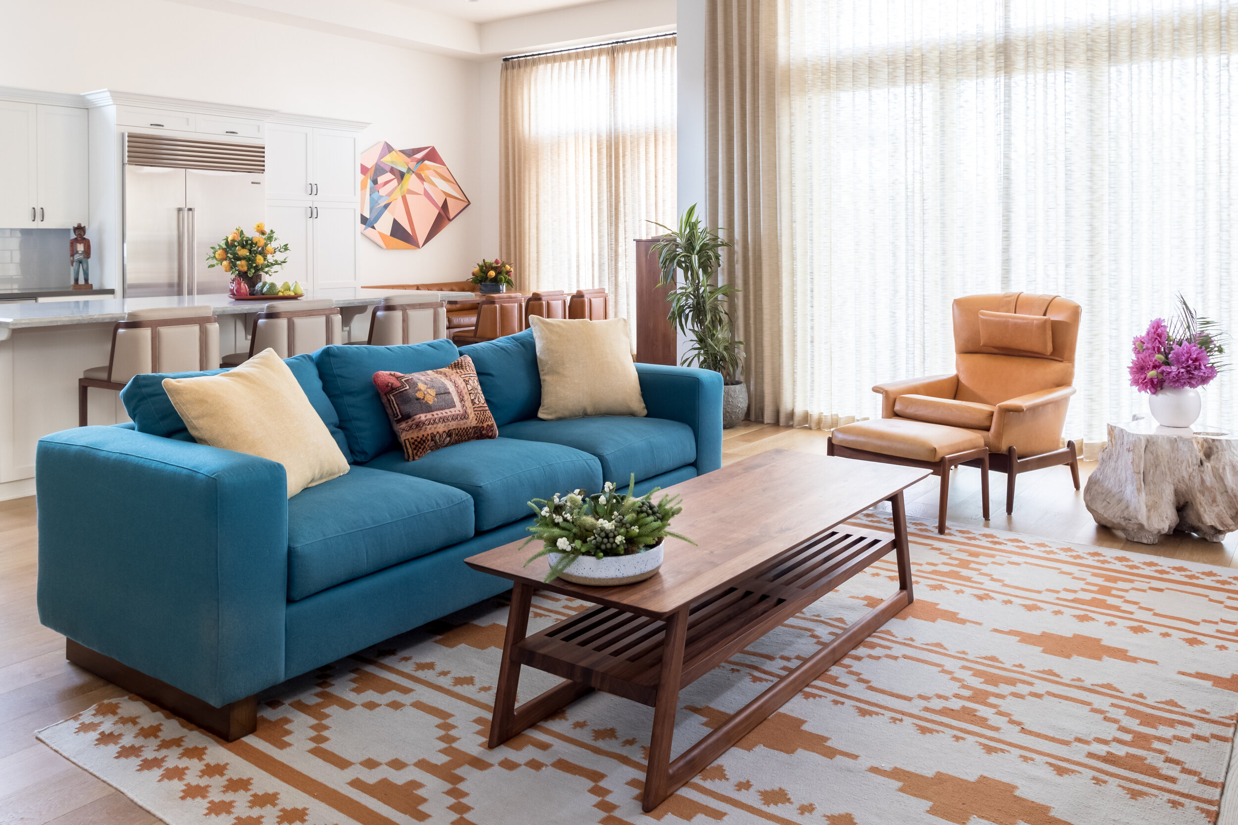
PHOTO BY: ACE MISIUNAS
Painting by Kevin Moore.
Sarah Barnard designs healthy, happy, personalized spaces that connect deeply to nature and art. Empathy and mindfulness are the foundation of her practice creating healing, supportive environments that enhance life.